Forms and Surveys UI kit: neat form design made easy
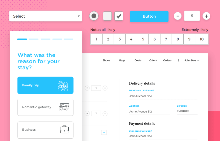
Forms can often cause users to run for the hills. Avoid this by designing forms your users will appreciate with Justinmind’s Forms and Surveys UI kit.
Here at Justinmind, we know all about the importance of correct forms design. Both forms and surveys have the power to not only gather real data from your users and score outstanding conversion rates, they also deliver a sense of satisfaction on completion. They make your user’s day that little bit easier.
On our website, you’ll find many UI kits that contain form widgets. However, maybe you have something specific in mind? If so, why not try out our Forms and Surveys UI kit? There you’ll discover more component and form varieties free for you to edit and make your own or leave as they are.
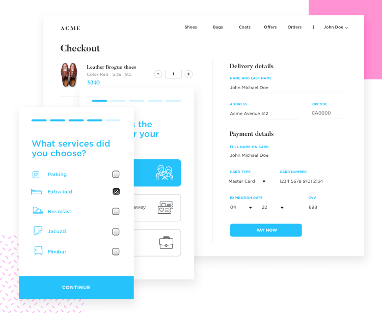
The kit has over 50 components and forms and surveys to take the stress out of form design and get you on the fast track to designing a simple yet effective, high converting form with the Justinmind prototyping tool.
At Justinmind, we understand the complexity of designing good forms that drive conversion rates instead of driving your users up the wall. To save you time and hassle, our UI kit comes complete with elements and components entirely dedicated to web and mobile form design.
Each component and element in our UI kit comes ready-made, with built-in interactions. All you have to do is add the relevant links and pages. The forms and components you’ll find in our UI kit can be used as they are or you can modify them to suit your needs.
We’ve built our forms and components according to the various principles that underpin great form design. Everything in the entire UI kit has a minimalist design, with questions and buttons grouped together in logical hierarchy, followed by the right amount of spacing and contrasting color designs.
We’ve also added in those important microinteractions, such as button state changes when clicking or tapping. Other built-in interactions include editable textboxes and placeholders that disappear as you start typing. You can test these interactions out in your prototype by just hitting “simulate” or “view on device”. More importantly, you can test them out with real users!
In this UI kit you’ll find a plethora of forms such as sign in, sign up and credit card forms, as well as surveys. You’ll discover that all these forms are minimalist in design with just the right amount of fields and controls for each situation.
Forms are available for both mobile and desktop devices, each one scaled perfectly to size.
Everything in mobile design needs to be planned and tested vigorously. This is even more so the case with mobile form design. That’s why we’ve taken the time to put together mobile forms that take into account both the limited resolution and good form design principles.
All our forms take button design into account, with large rectangular action control buttons and a developed hierarchy between primary and secondary buttons. The premade forms also come with labels positioned above each field to help add clarity to the forms. They also come with placeholders already installed, in addition to real-time validation texts which appear below the fields with details of the error.
Whether you choose to build your own form using individual components or to use the forms provided, our forms and surveys UI kit will save you time in your form prototyping.
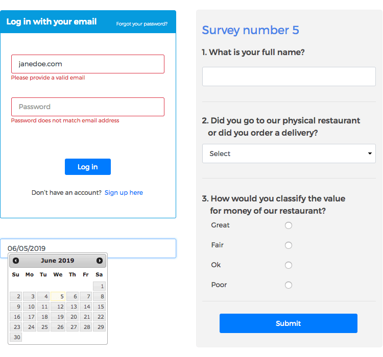
Here’s a list of categories in our forms and surveys UI kit and what they include:
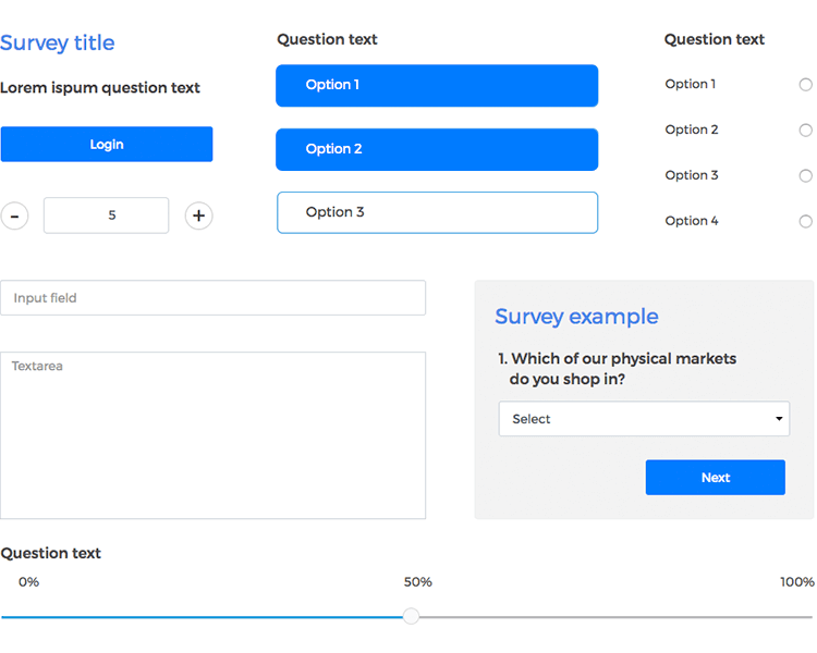
Groups together titles, labels, buttons complete with microinteractions, input fields with labels and placeholders, along with editable text areas, scales, radio buttons, selection lists and sliders.
Contains a set of components with built-in field validation, including email and password fields with labels and placeholders. You’ll also find two surveys complete with radio buttons, progress bar and slider.
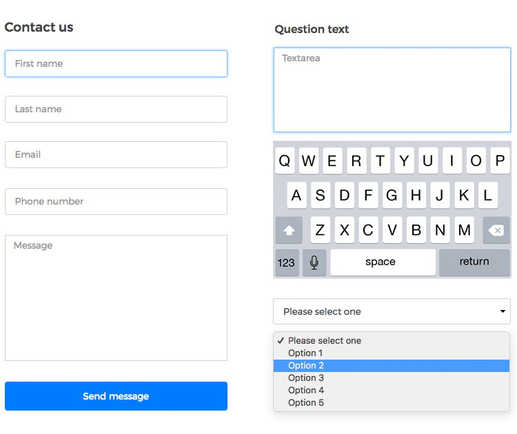
A selection of website forms consisting of log in and signup forms including a profile data submission form and a “contact us”, “contact sales” and “contact department” form. Each of these web forms come with interactions such as editable text, customizable dropdown menus and buttons with microinteractions.
Here you’ll find a series of survey components. Each component has fields with editable text (both with and without placeholders). You’ll also find an adjustable satisfaction scale, various sets of radio buttons, dropdown menus, a checklist, a survey landing page and customized buttons with built-in interactions.
Basically an extension of the previous category. You’ll also find two types of selection list – one that hides all other options on selection of one, and another that merely highlights the option selected, in addition to dates with pop-out calendars. In this section, we’ve also included a special survey with a built-in interaction that slightly fades out and gradually reveals components as the user progresses.
This section contains basically the same elements and components as the web forms but optimized for smaller screen resolutions and for touch screens. Special consideration has been given to the size of the text fields, buttons and menu controls based on finger friendly design.
Like the desktop surveys category, this one contains a wide selection of satisfaction surveys comprising of various elements such as text fields with placeholders, adjustable scales, dropdown menus and date fields. It also contains a survey landing page and a special survey with hidden elements that reveal themselves upon completion of fields in the correct order.
In this post we’ll show you the types of forms and surveys you can make with our UI kit. To get started, just follow the steps below and get prototyping your high converting forms and surveys quickly and easily today!
- Download Justinmind and start your free trial.
- Download the Forms and Surveys UI kit from our widgets page.
- Import the UI kit into the prototyping tool. You’ll see the widgets there, on the left-hand side.
- Design a new web or mobile form for your prototype.
Here at Justinmind, we encourage creativity. However, with respect to form design, we recommend that you try and keep it as simple as possible. Creating great forms is not really about creating something visually appealing, but rather, reducing cognitive load and interaction cost.
Your users want to be able to complete your forms as quickly as possible and with the least amount of effort required. Providing the user with the path of least resistance is a win-win for everyone.
Let’s look at how we might add a simple form to an online fashion retailer website. Our form will be broken up into three easy sections and will enable the user to order and pay for a pair of shoes.
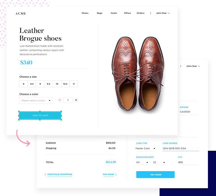
We’ll drag and drop a simple scale to let our users choose what size shoe they want. The microinteraction of highlighting the buttons on the scale has already been added, meaning we don’t need to add any events.
Next, we’ll drag and drop a dropdown widget to the canvas to let them select from one of three colors: red, blue and brown. By right clicking the element and choosing edit values, we can change the names of the options by highlighting them, selecting the gear option typing in the name you like and clicking OK.
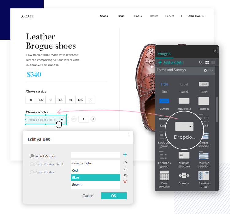
To go with our dropdown menu, we’ll add a box to display the different color shoes available on the right. We’ll do this using a dynamic panel and adding a few conditional events. First, we’ll add a dynamic panel with an image of a different color pair of shoes on each panel.
Then we’ll link each panel up to a color option in the dropdown box, adding a conditional event that displays a certain panel when a specific dropdown option is selected. For example, displaying the panel with blue shoes when “Blue” is selected. If you want to know more about this process, check our tutorial on how to add conditions to interactions.
For good measure, we’ll throw in a counter to the right of the dropdown menu to let our users select the quantity of pairs they want to purchase.
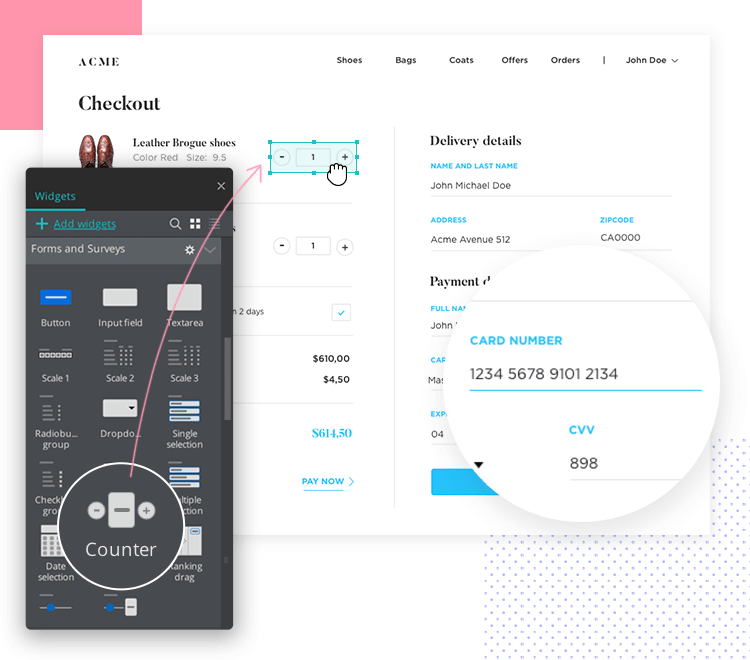
Lastly, we’ll drag and drop a button and edit the text to “Add to cart” and link it up to a fresh new screen. Here we’ll add a few more counters to calculate the price and, for the last section, some fields with editable placeholders for the user’s contact and credit card details. We’ll also add a couple more dropdowns for card type and card expiration date.
And that’s it. All it takes is a few easy steps, like in the example above, to end up with a simple, high converting form!
How about a mobile form? Perhaps you’d like to add a survey regarding a recent trip the user made to a hotel.
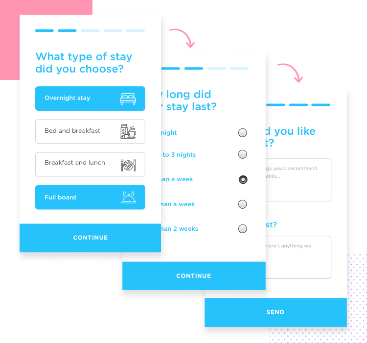
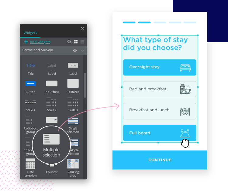
To give an example of how easy it is, let’s create six screens for this mobile survey, with a different type of widget on each. At the top of the template, we’ll add a standard progress bar widget to show the user how much they have left to complete. Next, we’ll drag over a single selection button widget to the canvas. When the user selects one option, the others will disappear.
But let’s go further than that. Let’s link that button to the next page. The effect of the other button options fading away is pretty cool, so we’ll add in a transition of 500 milliseconds to slightly delay the next screen showing up.
On the next page, we’ve added a vertical radio button form widget and a continue button that links to the next screen, in addition to a “return” arrow. Our next screen will be the same but for a checklist.
The following page will contain a multiple selection button widget and the last page of the survey will be a Textarea field. The cool thing about this widget is that you just drag it to the canvas and hit simulate and you can already interact with it. The keypad automatically displays in the prototype without having added that interaction.
Adding a mobile form or survey to your prototype is that easy – just give it a try!
A good form is like a polite way to ask your user to share their data. Great care is needed when crafting a form that your users won’t hate. Justinmind’s forms and surveys UI kit lets you take the stress out of great form design from the start, so why not give it a try?
Get something that you can test on your users and validate your form design today!