
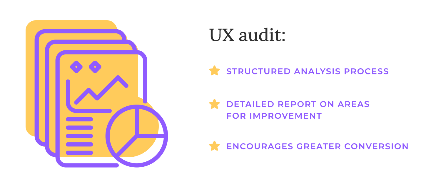
A UX audit digs deep into usability, accessibility, design, and content to pinpoint what's working and, more importantly, what's not.
Ever walked into a store and immediately felt lost or frustrated? Maybe you couldn’t find what you were looking for, the layout was confusing, or the checkout process was a nightmare. That’s a bad user experience, and it’s exactly what a UX audit helps you avoid with your website or app.
Design wireframes and prototypes with Justinmind.

Think of it as a comprehensive health check for your product’s UX design. It examines everything from navigation ease to content clarity of your content. Let’s get into it!
A UX audit is more than just a casual glance; it’s a structured process employing a variety of research methods. The outcome is a detailed report outlining areas for improvement and providing a clear roadmap for your team to create a healthier, more successful online presence.
So, why bother with this “health check”? Because a positive user experience is the cornerstone of online success. When users enjoy using your product, they’re more likely to stick around, explore, and ultimately convert – whether that means making a purchase, signing up for a newsletter, or simply engaging with your content.
First of the three key UX evaluation methods is the heuristic evaluation. Because it relies on expert knowledge rather than user feedback, a heuristic evaluation is a relatively fast and cost-effective way to identify obvious usability flaws, especially early in the design process. It’s a great tool for catching those low-hanging fruit and ensuring your product adheres to established best practices.
These experts, armed with established usability principles (heuristics), examine your product’s interface. They basically are looking for common red flags: is the navigation confusing? Is the language clear? Are important elements easy to find?
Next, we have usability testing. This is where we bring in the “patients” – real users – to interact with your product. Imagine observing people trying to complete tasks on your website or app.
Where do they stumble? What confuses them? Usability testing provides invaluable insights into how real people actually use your product, revealing pain points that even the most experienced designers might miss.
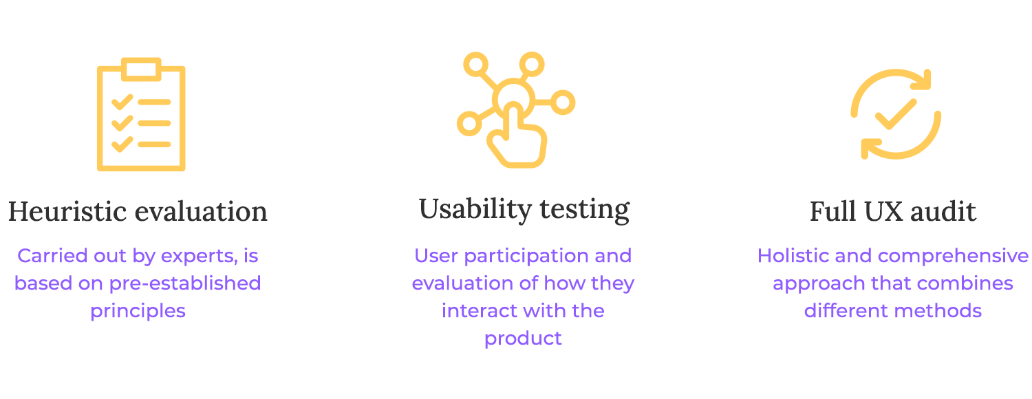
While it’s more resource-intensive than a heuristic evaluation, the direct user feedback makes it incredibly powerful for identifying specific areas of improvement. It’s like getting a detailed report from the people who matter most: your users.
Finally, we have the full UX audit. This is the most comprehensive approach, combining elements of both heuristic evaluation and usability testing, along with other research methods like user surveys, analytics analysis, and competitive analysis. A UX audit takes a holistic view of the entire user experience, examining everything from usability and accessibility to design, content, and even the overall user journey.
Because of its breadth, a UX audit requires a great investment of time and resources. However, the payoff is a detailed roadmap for significant UX improvements, perfect for informing major redesigns or strategic product decisions. It’s the equivalent of a full body scan, revealing not just surface issues, but also deeper, systemic opportunities for improvement.
A UX audit carefully studies how people use your product, runs usability tests (where we get to see real users in action!), and compares your product to industry best practices. It reveals exactly where users might be struggling, feeling confused, or even giving up.
This in-depth understanding of their pain points allows us to pinpoint the specific areas that need improvement, whether it’s a navigation system that’s hard to follow, a checkout process that’s a bit clunky, or content that could be clearer.
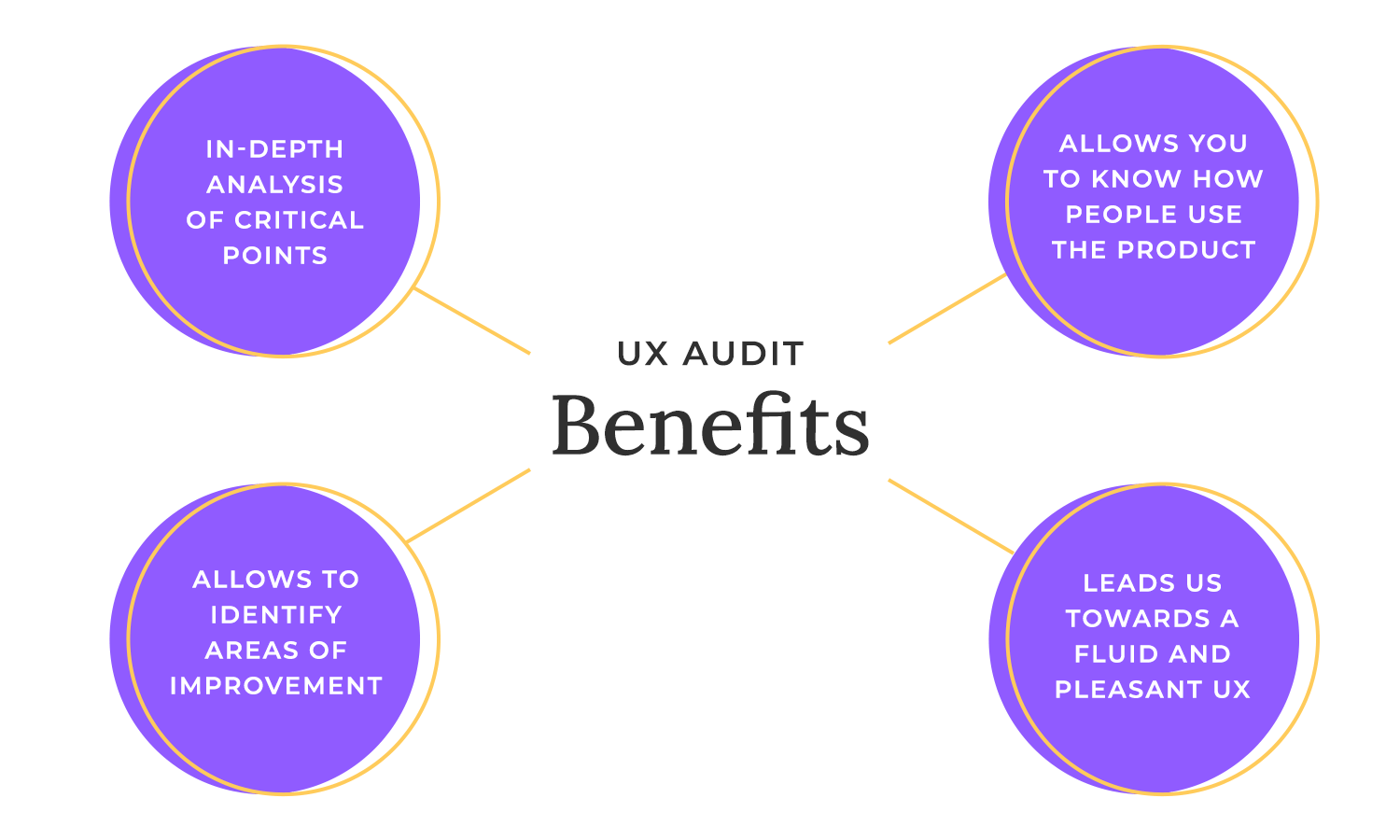
Once we’ve identified these areas for improvement, we can strategically address them to make the user journey much smoother and more enjoyable. A more intuitive experience naturally encourages users to explore your product, understand its value proposition, and ultimately take the desired action – whatever that may be!
Catching and dealing with UX issues early in the design process offers significant cost and time savings compared to fixing them after launch. Imagine trying to renovate a house after the foundation has already been laid – it’s much more expensive and disruptive than making changes during the initial planning phase. The same principle applies to UX.
Also, fixing UX issues post-launch can be incredibly time-consuming and damaging to your reputation. Not only do you have to invest significant resources in redesign and development, but you also risk frustrating your users, leading to negative reviews, and potentially losing customers.
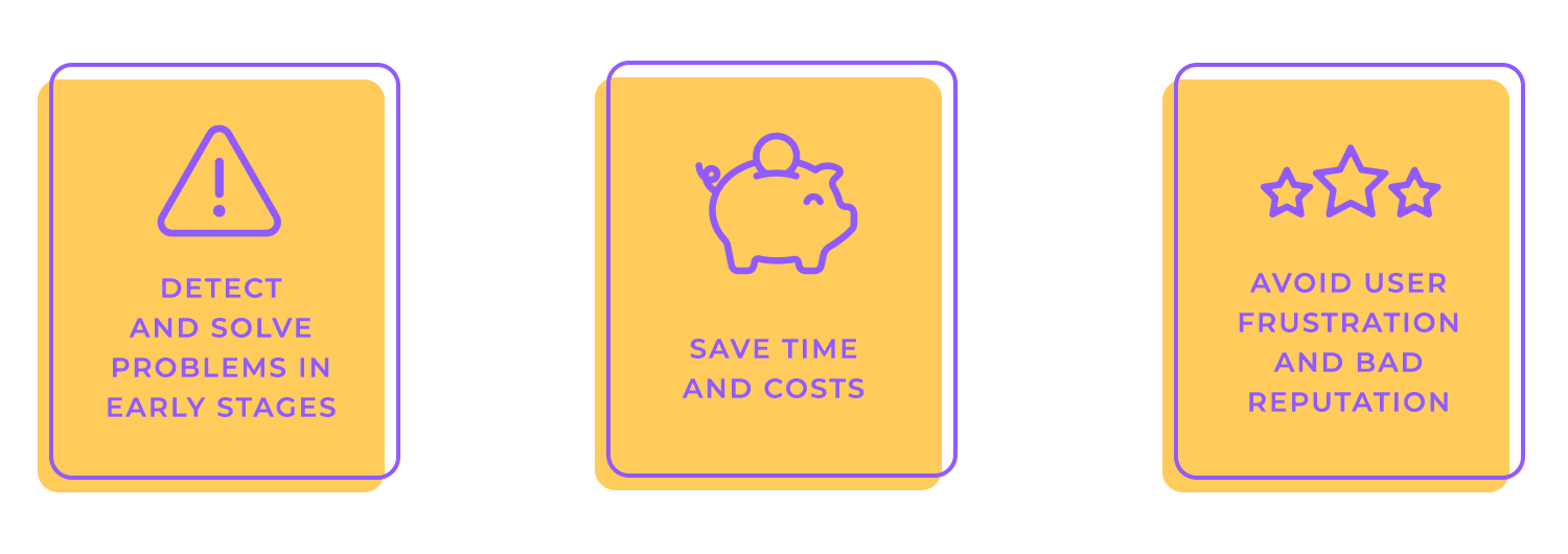
Basically, conducting a UX audit early on is a great way to save time, money, and hassle. It helps you launch a strong product and avoid expensive fixes later. Let’s get into how to plan one!
When defining your audit scope, consider which product areas, user flows, or platforms are most critical to your business goals. For example, suppose your primary objective is to increase conversions on your e-commerce website. In that case, you might focus your audit on the checkout process and related user flows, such as adding items to the cart and managing user accounts.
Alternatively, if you’re launching a new mobile app, you might prioritize the mobile platform and key user flows within the app. Strategically selecting the areas to audit maximizes the value of your UX audit and ensures that it addresses your most pressing needs.
A crucial part of defining the scope is setting clear boundaries for the depth of your audit. Will you be evaluating the entire website or application, or will you focus on specific key funnels?
Auditing an entire site provides a comprehensive overview but can be resource-intensive. Focusing on key funnels, like the checkout process or user onboarding, allows for a deeper dive into the most critical user flows.
Choosing the right level of depth depends on your goals, resources, and timeline. If you’re looking for a broad overview of your UX, auditing the entire site might be appropriate.
However, let’s say you’re facing specific challenges in a particular area, like a drop-off in conversions during checkout, focusing on that funnel will most likely bring in more actionable insights.
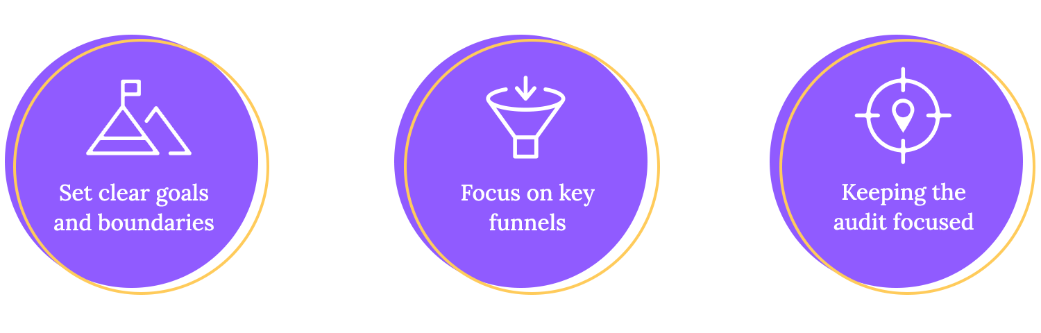
Defining clear boundaries now prevents the audit from expanding beyond what’s needed, ensuring you get the most bang for your buck.
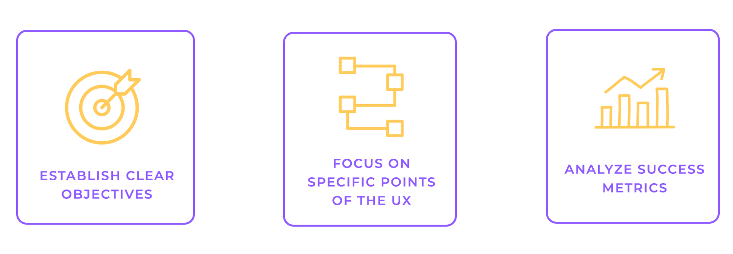
Before diving into the audit itself, it’s essential to establish clear objectives and success metrics. This involves explicitly linking your business goals to specific UX goals.
Let’s say your top priority is tackling cart abandonment – a common challenge for online businesses. A smart UX audit can be your secret weapon! It should zero in on the checkout process, acting like a detective to uncover those pesky friction points that are causing users to abandon their purchases.
Think of it as carefully examining every step of the checkout journey, from adding items to the cart to clicking that final “purchase” button. Are there any confusing forms? Is the process too long or complicated? Are there any unexpected costs or hidden fees popping up at the last minute?
This kind of strategic focus is key because it ensures your UX improvements aren’t just about making things look pretty (although that’s important too!). It’s about making changes that actually move the needle and help you achieve your business goals.
Defining these linkages provides a clear purpose for the UX audit and helps you prioritize your efforts. It allows you to focus on the UX elements that have the greatest impact on your business outcomes—a win-win!
Once you’ve linked your business and UX goals, it’s time to define the specific Key Performance Indicators (KPIs) and metrics you’ll use to track your progress. These metrics provide quantifiable measures of your UX performance and allow you to assess the impact of your improvements. For example, if your goal is to reduce cart abandonment, you might track the cart abandonment rate as a key metric.
Other common UX metrics you might want to track include:
- Conversion rates: percentage of visitors who make a purchase.
- Task success rates: percentage of users who successfully complete a specific task.
- Net Promoter Score (NPS): measuring customer loyalty.
- Time on task: how long it takes users to complete a specific task.
- Error rates: how often users make mistakes while interacting with your product.
- User satisfaction scores: gauging how happy users are with their experience.
The metrics you select should be directly related to your UX goals and provide actionable insights. For instance, tracking time on task can help you identify areas where users are struggling or getting confused, while monitoring conversion rates can reveal the impact of UX changes on your bottom line.
A smooth and productive UX audit depends on teamwork. The first step is getting everyone involved – identifying all the key stakeholders across your organization.
This typically includes product owners who define the product vision and roadmap. Depending on your organization’s structure, other stakeholders might include designers, marketing, customer support, sales, and, let’s not leave out, executive leadership.
With the stakeholders identified, we can now set the stage for a smooth audit by clearly defining the purpose, scope, methods, expected outcomes, and timelines.

Setting realistic timelines for each stage of the audit, from planning and research to analysis and reporting, helps to keep the project on track and ensures that stakeholders are aligned on the overall schedule.
Open communication and regular updates throughout the process are essential for managing expectations and fostering collaboration among stakeholders.
A comprehensive UX audit often requires a diverse team with specialized skills to cover all aspects of the evaluation. The specific roles needed will depend on the scope and complexity of the audit, but some common roles include:
- UX researcher: Conducts user research, including usability testing, user interviews, surveys, and competitive analysis. They are crucial for gathering insights into user behavior, needs, and pain points.
- UX designer: Evaluates the user interface and user experience design, looking for areas of improvement in usability, accessibility, and aesthetics. They might also be involved in developing design recommendations based on the audit findings.
- Data analyst: Analyzes website or app analytics data to identify patterns in user behavior, such as drop-off points, popular features, and areas of engagement. They help to quantify the impact of UX issues and track the effectiveness of UX improvements.
- UX writer/content strategist: Assesses the clarity, effectiveness, and consistency of the content, ensuring it aligns with user needs and business goals. They might also develop content recommendations to improve user understanding and engagement.
- Project manager: Oversees the entire audit process, managing timelines, resources, and communication among stakeholders. They ensure that the audit stays on track and delivers valuable results.
Sometimes, especially in smaller organizations or for simpler audits, one person can handle several roles. But for bigger, more complex projects, it’s often best to bring in a dedicated team with specialized skills to make sure we’re thorough and effective.
The goal is to build a team with the right mix of expertise to cover all bases and give us solid, actionable recommendations.
Design wireframes and prototypes with Justinmind.
Quantitative data provides measurable insights into user behavior and performance. It answers questions like “how many,” “how often,” and “how long.”
Web analytics
Tools like Google Analytics are incredibly helpful for understanding how people use your website or app. They give us hard data on things like where visitors are coming from, what pages they’re looking at, and how well they’re converting.
This data can pinpoint problem areas, like pages with high bounce rates or low conversions for certain groups of users. Analytics also help us see how users navigate your site, so we can identify any roadblocks they might be hitting. This information is crucial for figuring out where things are going wrong and seeing if our UX improvements are actually working.

Heatmaps and click tracking
Heatmaps and click-tracking tools give you a visual look at how people are using your website. Heatmaps show you where users click, move their mouse, and scroll, highlighting the “hot” areas where they’re most active and the “cold” areas they’re ignoring.
Click tracking specifically shows you what people are clicking on, so you can see which elements are popular and which are being overlooked. These tools are great for understanding how users interact with specific parts of your pages.
For example, a heatmap might show users clicking a banner image but ignoring your main navigation – a sign the banner might be too eye-catching. Click tracking can show you which links in your navigation are most popular or which buttons in your forms are most effective (and which aren’t).

Conversion funnels and event tracking
Conversion funnels track the steps users take to complete a desired action, such as making a purchase, signing up for a newsletter, or completing a form. Visualizing the user journey through these steps helps you identify where users are dropping off and pinpoint areas of friction in the conversion process. For example, if you see a significant drop-off between the “add to cart” and “checkout” steps, you know that there’s likely a problem with the checkout process.
Event tracking allows you to track specific user interactions on your website or app, such as button clicks, form submissions, video plays, and file downloads. This granular data provides insights into how users are engaging with your content and features.
Putting this in perspective, tracking button clicks can tell you which calls to action are most effective, while tracking form submissions can help you identify issues with form usability.
Let’s talk about gathering those all-important qualitative insights for your UX audit. This is where we move beyond the numbers and start understanding the why behind user behavior. Think of it as getting to know your users on a deeper level, understanding their motivations, frustrations, and what truly makes them tick. We do this through a few key methods, each offering a unique perspective.
User interviews, surveys, and focus groups
First up are user interviews, which are like having a one-on-one chat with your users. These conversations allow you to really examine their experiences, exploring their needs, pain points, and the reasons behind their actions. It’s a fantastic way to uncover hidden gems of information and gain a richer understanding of the user’s perspective, especially when dealing with complex issues or trying to understand the nuances of specific user groups. Imagine it as a friendly coffee chat where you get to seek advice from a good old friend who knows your intricacies.
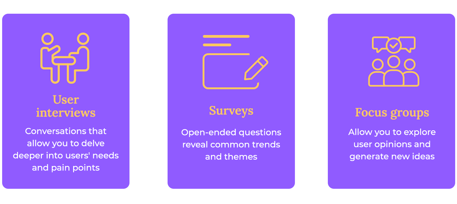
Then we have surveys. While surveys can also include quantitative questions, the open-ended questions are where the qualitative gold lies. These open-ended responses allow users to share their thoughts and feelings in their own words, providing valuable insights into specific aspects of the user experience and revealing trends in user preferences. Think of surveys as casting a wide net to gather a diverse range of opinions and identify common themes.
And finally, we have focus groups, which bring together small groups of representative users for guided discussions. These sessions allow you to observe user interactions and gather feedback in a more natural, conversational setting.
Focus groups can be particularly helpful for exploring user opinions and generating new ideas. It’s like a brainstorming session with your target audience, where you can observe how they interact with your product and each other. While focus groups can be a bit more challenging to manage, they offer a unique opportunity to gather rich qualitative data and gain valuable insights into user perspectives.
Session recordings, screen sharing, or user diaries
Beyond interviews, surveys, and focus groups, there are other excellent ways to gather qualitative data for your UX audit. Session recordings, for example, are like having a video replay of a user’s interaction with your website or app. You can watch how they navigate, where they click, and how they interact with different elements. They offer a less intrusive, yet still insightful, way to understand user behavior. It’s like having a fly on the wall, observing real user interactions in real-time (or rather, recorded time).
Screen sharing takes this a step further, allowing you to observe users interacting with your product while also hearing their thoughts and comments. This “think-aloud” approach provides valuable context for their actions, helping you understand the reasoning behind their clicks and movements.

Last but certainly not least, user diaries. They offer a unique perspective by allowing users to document their experiences over time. Users can record their thoughts, feelings, and challenges as they interact with your product in their daily lives. This longitudinal data can reveal patterns and trends that might not be apparent in a single session.
Customer support tickets, feedback forms, and social media mentions
Customer support tickets are a treasure trove of information about user problems and frustrations. Each ticket represents a user who encountered a challenge and reached out for help. Analyzing these tickets can reveal recurring issues, common pain points, and areas where users are struggling.
Feedback forms, whether they’re embedded on your website or sent out after a purchase, are another great source of qualitative data. These forms allow users to share their thoughts and opinions in a more structured way. It’s like asking your users directly for their feedback, giving them a platform to share their thoughts and help you improve.
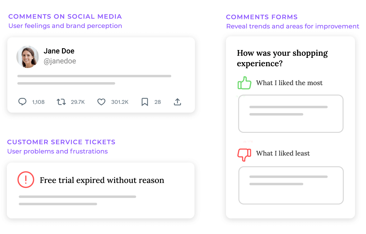
Don’t forget social media! While it can be a bit of a wild card, it’s a goldmine of unfiltered feedback. Keeping an eye on mentions of your product or brand can tell you what people really think about their experiences – the good, the bad, and the unhinged.
This can give your UX audit some valuable context and show you how your product is perceived in the real world. Think of it as eavesdropping on conversations about your product – you get to hear what people are saying when they think no one’s listening.
Benchmarking against industry standards and competitor features
Want to know where you stand? Benchmarking in your UX audit allows you to compare your product’s user experience against the best in the industry, revealing opportunities to gain a competitive edge.
What are your competitors doing well? What can you learn from their successes (and their failures)? Studying their features and user flows helps you gain valuable insights and avoid reinventing the wheel.
Identifying best practices and differentiators
Competitive analysis isn’t just about copying what your competitors are doing. It’s about identifying best practices and, more importantly, discovering opportunities for differentiation.

Studying your competitors allows you to learn from their successes and incorporate best practices into your product. This might include adopting effective navigation, familiar UI patterns, or key UX design principles.
However, true success lies in differentiation. Identify opportunities to offer something unique, whether it’s a specific feature, a distinct user flow, or a novel approach to solving a user problem.
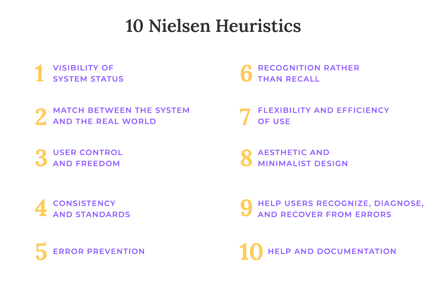
Using recognized usability heuristics
Heuristic evaluations in UX audit rely on established usability principles, or heuristics, as a framework for analysis. Think of these heuristics as a set of best practices or guidelines for good user interface design. They provide a common language and a structured approach for experts to evaluate a product’s usability.
Several sets of usability heuristics exist, but some of the most well-known and widely used are those developed by Jakob Nielsen and Donald Norman. Nielsen’s 10 general principles for interaction design cover a broad range of usability considerations, from visibility of system status and match between system and the real world to error prevention and help documentation. These heuristics provide a comprehensive checklist for evaluators to assess the user interface.
Identifying critical usability issues through expert reviews
Heuristic evaluations are conducted by UX experts who review the product’s interface, applying the chosen heuristics as a lens. These experts, often UX designers or researchers, examine the product from the user’s perspective, looking for areas where the interface might violate established usability principles. They’re essentially simulating the user experience and identifying potential roadblocks or points of confusion.
The goal is to uncover critical usability issues – those problems that are most likely to negatively impact the user experience. These might include things like confusing navigation, unclear labeling, inconsistent design, or inaccessible features. Experts typically work independently, evaluating the product against the heuristics and noting any potential problems they encounter.
They then compile their findings into a report, often prioritizing the issues based on their severity and potential impact. This expert review process provides a valuable, relatively quick, and cost-effective way to identify and address key usability problems early in the design or development process. It’s like having a team of experienced detectives scrutinizing your product for clues to a better user experience.
Mapping out key paths
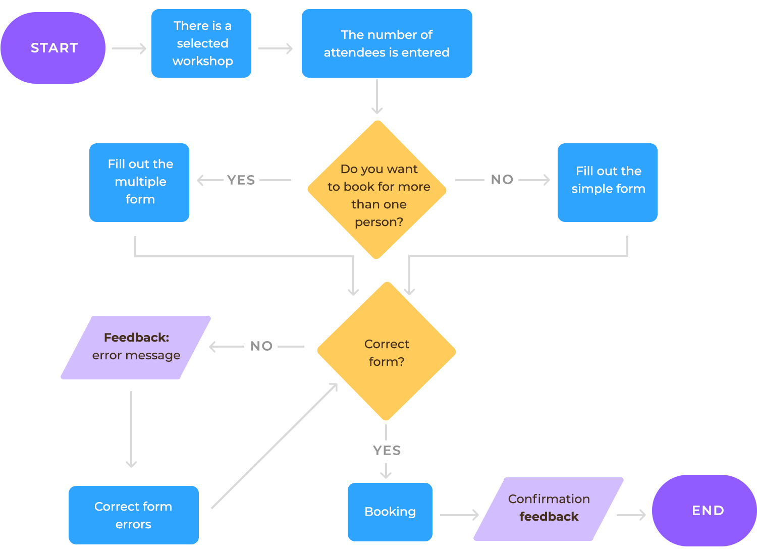
Task analysis and user flows are essential tools for understanding how users interact with your product and identifying potential areas of friction. They involve mapping out the steps users take to accomplish specific tasks, such as signing up for an account, completing a purchase, or discovering content. This mapping process helps visualize the user journey and pre-emptively identify anything that might hinder the UX.
User flows typically start with the user’s initial trigger or goal and then outline each step they take to achieve that goal. For example, a user flow for signing up might include steps like: arriving at the signup page, filling out the form, verifying their email address, and setting up their profile.
Task analysis provides a more detailed breakdown of each individual step within the user flow, examining the specific actions and decisions users make at each point. For example, task analysis might reveal that users spend excessive time selecting a delivery date due to a poorly designed calendar interface, highlighting a specific usability issue within the checkout process.
Evaluating friction points, errors, or unnecessary steps
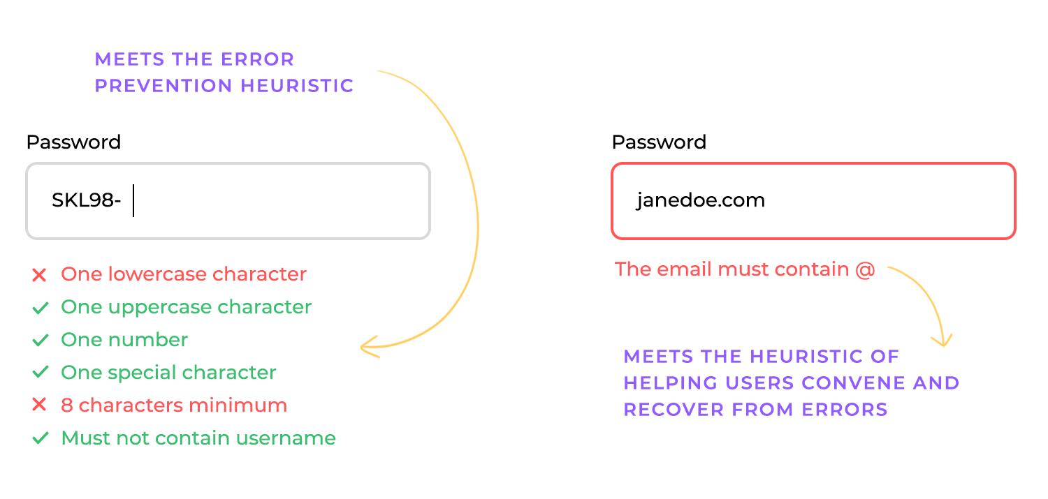
Once you’ve mapped out the key user flows, the next step is to critically evaluate them for friction points, errors, and unnecessary steps. These are the elements that can disrupt the user journey, frustrate users, and ultimately lead to abandonment. Friction points are any obstacles or difficulties users encounter while trying to complete a task. This might include things like a confusing navigation menu, a complex form to fill out, or a slow loading page. Errors occur when users make mistakes while interacting with the product, such as entering incorrect information or clicking the wrong button.
These errors can be frustrating for users and can lead to them giving up on their task. Unnecessary steps are those actions that don’t contribute to the user’s goal and can add complexity to the user journey. These extra steps can make the process longer and more cumbersome, increasing the likelihood of user frustration and abandonment.
Doing this might involve asking questions like: Is this step clear and easy to understand? Are there any potential points of confusion? Are there any unnecessary steps that could be eliminated?
Before diving into the data collection and analysis phase of your UX audit, it’s crucial to gather requirements. These are the documentations related to your product and its users. This preparation step sets the stage for a more informed and efficient audit process. Think of it as putting together all the background information before starting an investigation. This documentation can provide valuable context and help you understand the product’s goals, target audience, and intended user experience.
User personas, if they exist, offer a representation of your ideal users, including their demographics, needs, goals, and frustrations. Reviewing these personas can help you focus your audit on the specific needs of your target audience. User stories, which describe how users interact with the product to achieve specific goals, can provide valuable insights into user flows and potential pain points.

Design guidelines, style guides, and other documentation related to the product’s design can help you assess the consistency and usability of the interface.
Once you’ve gathered existing documentation, it’s time to prepare for the active data collection phase. This often involves setting up analytics dashboards to monitor key metrics and ensure you’re capturing the necessary data. If you’re using web analytics platforms, make sure your dashboards are configured to track the specific metrics relevant to your audit, such as conversion rates, bounce rates, and user flows.
Sorting and organizing existing data, such as customer feedback or support tickets, can also be a valuable preparatory step. This will make it easier to analyze the information later on and identify trends or patterns.
If your audit involves user testing, now’s the time to start planning and scheduling those sessions. This includes recruiting participants who represent your target audience, developing test tasks, and setting up the testing environment. Proper planning is crucial for ensuring that your user testing sessions are productive and provide valuable insights.
Design wireframes and prototypes with Justinmind.
A crucial part of a UX audit is a thorough assessment of the user journey. This involves reviewing the key paths users take from their initial entry point to the successful completion of their goal. Think of it as following the user’s footsteps through your product, from the moment they arrive to the moment they achieve what they set out to do. This end-to-end analysis provides a holistic view of the user experience, revealing any friction points or roadblocks that might hinder their progress.
This review should cover all critical user journeys, such as signing up for an account, making a purchase, finding information, or completing a specific task. For each journey, map out the steps involved, from the initial trigger that prompts the user to start the journey to the final confirmation or success message.
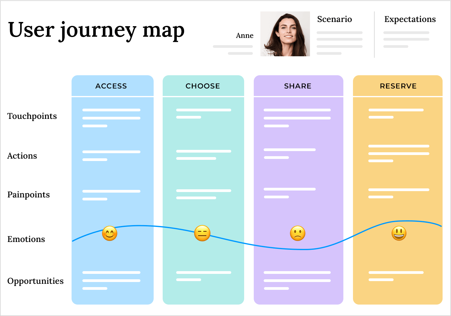
Pay close attention to how users navigate between different pages or screens, how they interact with various elements, and how they perceive the overall flow.
As you review these user journeys, it’s vital to meticulously record your observations. Note anything that seems confusing, inefficient, or frustrating. Pay attention to how users interact with different elements, where they hesitate, and any verbal or non-verbal cues that suggest confusion or frustration. This qualitative data provides valuable context for the quantitative data you’ll gather.
In addition to qualitative observations, you should also track key quantitative metrics. Time on task measures how long it takes users to complete a specific task. Longer times on task may indicate usability issues or inefficiencies in the process.
Errors occur when users make mistakes while interacting with the product. Tracking the frequency and types of errors can highlight areas where users are struggling. User drop-off points are the points in the user journey where users start feeling frustrated and abandon the process, indicating the areas where you need to make improvements.
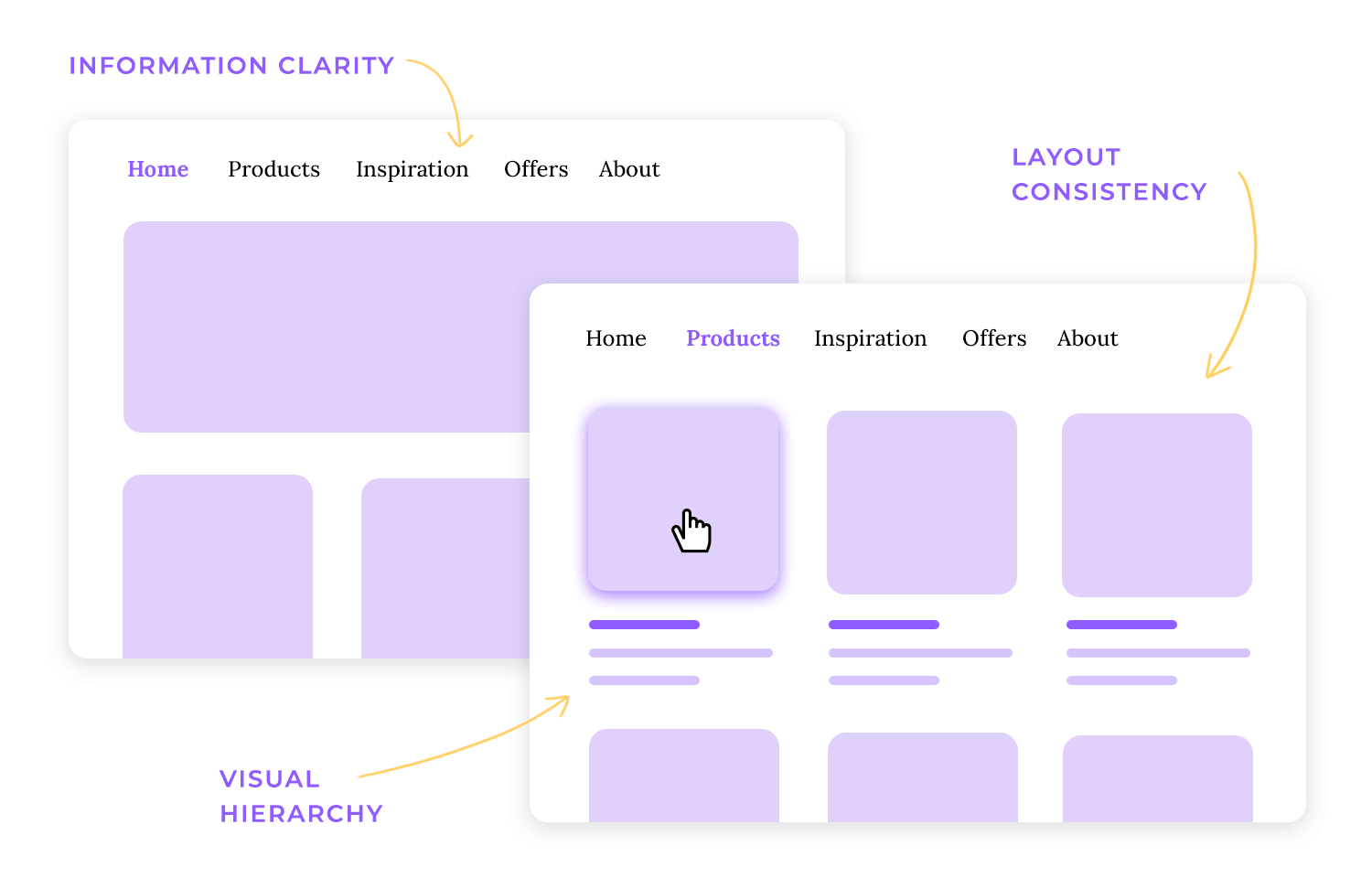
A crucial aspect of a UX audit is a thorough evaluation of the design and interaction elements of your product. This involves scrutinizing how information is presented, how users interact with the interface, and whether the overall design is effective in guiding users and supporting their goals. Three key areas to focus on are visual hierarchy, layout consistency, and information clarity.
Visual hierarchy
This refers to the arrangement of elements on a page in a way that guides the user’s eye and emphasizes important information. A strong visual hierarchy uses size, contrast, color, and spacing to create a clear focal point and direct the user’s attention to the most critical elements. During the audit, assess whether the visual hierarchy effectively communicates the relative importance of different elements. Are calls to action prominent? Is key information easily scannable? Does the visual design support the user’s tasks and goals?
Layout consistency
Consistency in layout across different pages and screens is essential for creating a predictable and user-friendly experience. Users should be able to navigate your product without having to relearn the interface on each new page. Check for consistency in the placement of navigation menus, buttons, form fields, and other key elements. A consistent layout makes it easier for users to understand how the interface works and reduces cognitive load.
Information clarity
Clear and concise communication is paramount for a positive user experience. Evaluate the language used in your product, ensuring that it is easy to understand, free of jargon, and appropriate for your target audience. Check for clarity in labels, instructions, error messages, and other text elements. Ensure that information is presented in a logical and organized manner, making it easy for users to find what they need. Assess whether the information architecture of your product is intuitive and supports the user’s mental model. Is it easy for users to find the information they are looking for?
Beyond visual elements, a UX audit should thoroughly assess the interaction design of your product. This focuses on how users interact with the interface and whether those interactions are intuitive, efficient, and satisfying. Key areas to examine include button behavior, navigation labels, and feedback states.
Button behavior
Buttons are essential interactive elements, and their behavior should be clear and predictable. Are buttons easy to identify as clickable? Do they provide visual feedback when clicked (e.g., a change in color or appearance)? Is the action associated with each button clear and unambiguous? Inconsistent button behavior can confuse users and lead to errors. Ensure that buttons are appropriately sized and spaced for easy clicking, especially on mobile devices.
Navigation labels
Clear and concise navigation labels are crucial for helping users find their way around your product. Are navigation labels easy to understand and free of jargon? Do they accurately reflect the content or functionality they link to? Ambiguous or misleading navigation labels can lead to frustration and wasted time.
Feedback states
Users need clear feedback from the system to understand the results of their actions. Do buttons provide feedback when clicked? Does the system provide feedback when a form is submitted or a process is completed? Are error messages clear and helpful? Lack of feedback can leave users wondering whether their actions were successful, leading to uncertainty and frustration. Make sure that your product provides timely and informative feedback to keep users informed and in control.
Let’s talk about the words on your website or app – the copy. It’s not just filler; it’s a crucial part of the user experience. A good UX audit always includes a copy review, making sure your content is doing its job effectively. Think of it as fine-tuning the language to truly connect with your users.
First and foremost, your copy needs to be concise. Let’s face it, no one wants to wade through walls of text. Users are busy, and they want information quickly. So, keep your sentences short, get straight to the point, and eliminate any unnecessary fluff. Think of it as delivering your message with laser-like focus, ensuring every word counts. Clear and simple language is key here – avoid jargon or overly technical terms unless your audience specifically requires them.
Clarity is equally important. Your copy should be easy to understand and free from any ambiguity. No one should have to struggle to decipher your message. Use straightforward language, avoid complex sentence structures, and make sure your meaning is crystal clear. Pay special attention to instructions, error messages, and calls to action – these need to be absolutely unambiguous. Think of it as guiding your users with clear and confident language, making their journey smooth and effortless.
Finally, your copy should always be aligned with user expectations. Use language that resonates with your target audience and speaks to their needs and motivations. Make sure your copy accurately reflects what your product does and sets clear expectations for the user experience. Avoid misleading or exaggerated language, as this can quickly erode trust.
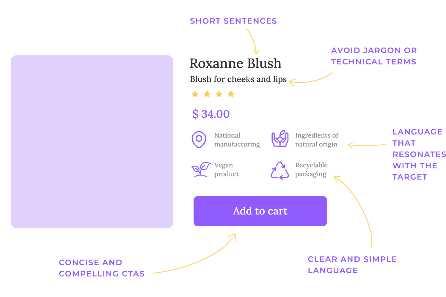
Jargon, while sometimes necessary for specialized audiences, can be a major barrier for many users. If your copy is filled with technical terms or industry-specific language that your target audience doesn’t understand, you’ll likely confuse and frustrate them. During your copy review ste of your UX audit, identify any instances of jargon and consider replacing them with simpler, more accessible language. If jargon is unavoidable, provide clear definitions or explanations to ensure that all users can understand your message.
Unclear calls to action can also be a major problem. Your calls to action should be clear, concise, and compelling, telling users exactly what you want them to do. Vague or ambiguous calls to action can leave users unsure of what to do next, leading to confusion and potentially lost conversions. Review your calls to action and ensure that they are specific, action-oriented, and visually prominent.
Finally, check for any missing content. Is there any crucial information that users might be looking for but can’t find? Have you addressed all their potential questions or concerns? Missing content can leave users feeling frustrated and uninformed, potentially leading them to abandon your product or seek information elsewhere.
Review your copy and ensure that it is complete and comprehensive, providing users with all the information they need to make informed decisions.
A beautiful design and intuitive interface mean nothing if your website or app is slow, clunky, or prone to errors. Users expect a smooth and efficient experience, and technical hiccups can quickly sour their perception of your product. That’s why a thorough UX audit always dives into the technical underpinnings.
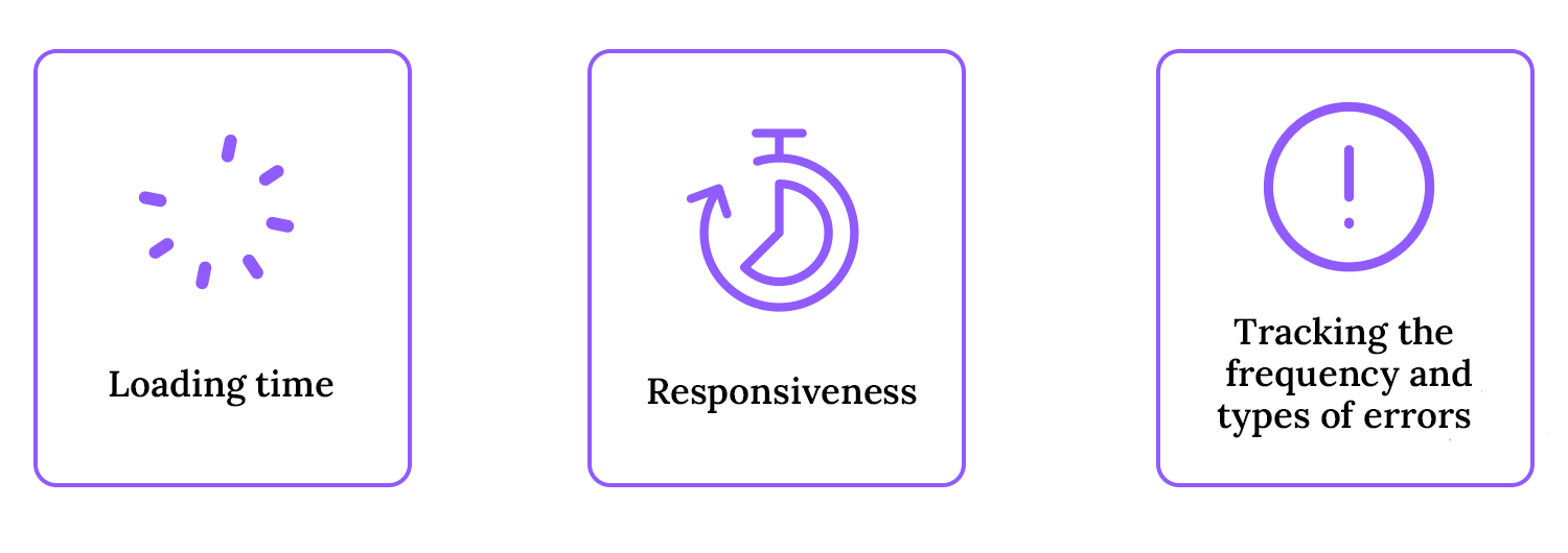
First up is page load time. Think about it: how quickly does your website load? Nobody enjoys staring at a spinning wheel, and slow loading times are a major source of frustration. During your UX audit, measure how long key pages take to load and pinpoint any bottlenecks that might be slowing things down. There are some great tools out there, like Google PageSpeed Insights and GTmetrix, that can help you analyze your website’s performance and offer specific recommendations for improvement.
Next, we have responsiveness. This is all about how quickly and smoothly your product reacts to user input. Does the interface respond instantly when a toggle button is clicked? Are animations smooth and fluid? A laggy interface can make your product feel amateurish and frustrating. So, test your product’s responsiveness on various devices and browsers, paying close attention to how it performs under different network conditions.
Finally, we need to talk about errors. Errors, whether users see them or they’re happening behind the scenes, can seriously damage the user experience. Keep track of how often and what types of errors pop up during user interactions. Are users running into broken links? Are forms throwing up validation errors? Dive into your error logs and user feedback to identify any common error patterns. Fixing these errors is absolutely essential for building a reliable and trustworthy product. Think of it as squashing those pesky bugs, ensuring your product is stable and provides a smooth, error-free experience.
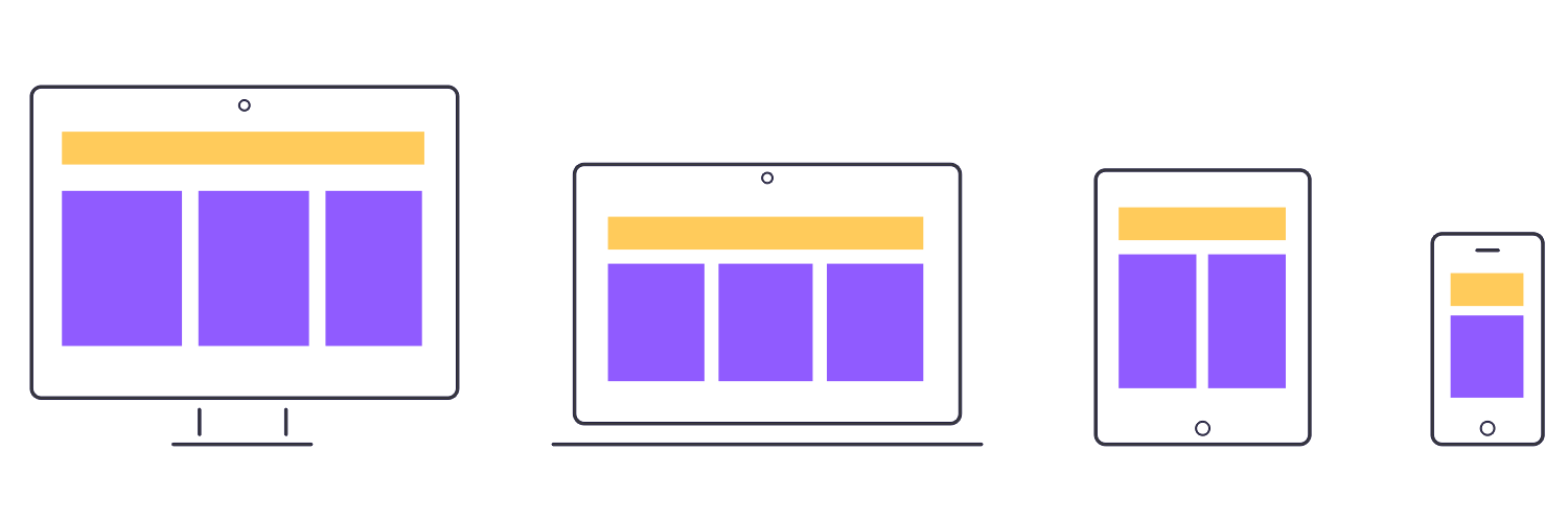
A modern UX audit simply must address mobile-friendliness and cross-browser compatibility. In today’s diverse digital landscape, users access products from a multitude of devices and browsers, and your product needs to deliver a consistent and high-quality experience across all of them. Failing to address these factors can leave out a significant portion of your user base and severely impact your product’s success.
Mobile-friendly design is no longer a “nice-to-have” – it’s a fundamental requirement. Your product should be responsive, adapting seamlessly to different screen sizes and orientations. This means ensuring that content is easy to read, navigation is intuitive on touchscreens, and interactive elements are appropriately sized and spaced for mobile devices. Test your product on a variety of mobile devices, paying attention to how it performs on different screen sizes and operating systems. Think of it as optimizing your product for the mobile-first world, ensuring it’s accessible and enjoyable on the go.
Cross-browser compatibility is equally important. Users access the web using a variety of browsers, including Chrome, Firefox, Safari, and Edge. Your product should function correctly and consistently across all major browsers. Test your product on different browsers, paying attention to how it renders and performs. ddress any browser-specific issues to ensure a consistent experience for all users, regardless of their browser preference. Think of it as ensuring your product is universally accessible, providing a consistent and reliable experience for everyone.
A UX audit isn’t just a one-time event; it’s a process that should lead to tangible improvements. A crucial final step is setting clear success metrics to track post-implementation. This allows you to measure the effectiveness of the changes you make based on the audit’s findings and demonstrate the return on investment of your UX efforts. Without these metrics, you’re essentially making changes in the dark, with no way to know if they’re actually having a positive impact.
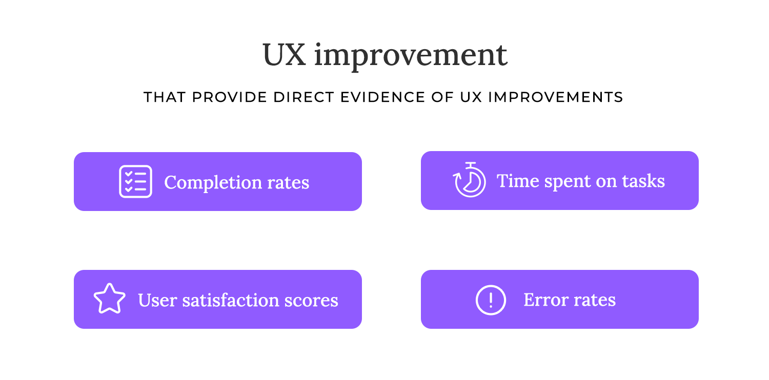
Defining these success metrics before you implement any changes is essential. These metrics should be directly tied to the goals you set for your UX audit. For example, if your goal was to increase conversion rates, your success metric might be the percentage increase in conversions after the changes are implemented. Other common success metrics include task completion rates, time on task, error rates, user satisfaction score, Net Promoter Score (NPS), and support ticket volume.
Once you’ve defined your success metrics, establish a baseline by measuring these metrics before implementing any changes. This baseline data will serve as a benchmark against which you can compare your post-implementation results. After you’ve made the changes, continue to track these metrics over time.
This will allow you to see the impact of your UX improvements and make any necessary adjustments. Think of it as conducting an experiment, where you’re measuring the effectiveness of your UX interventions.
Combining analytics with user feedback
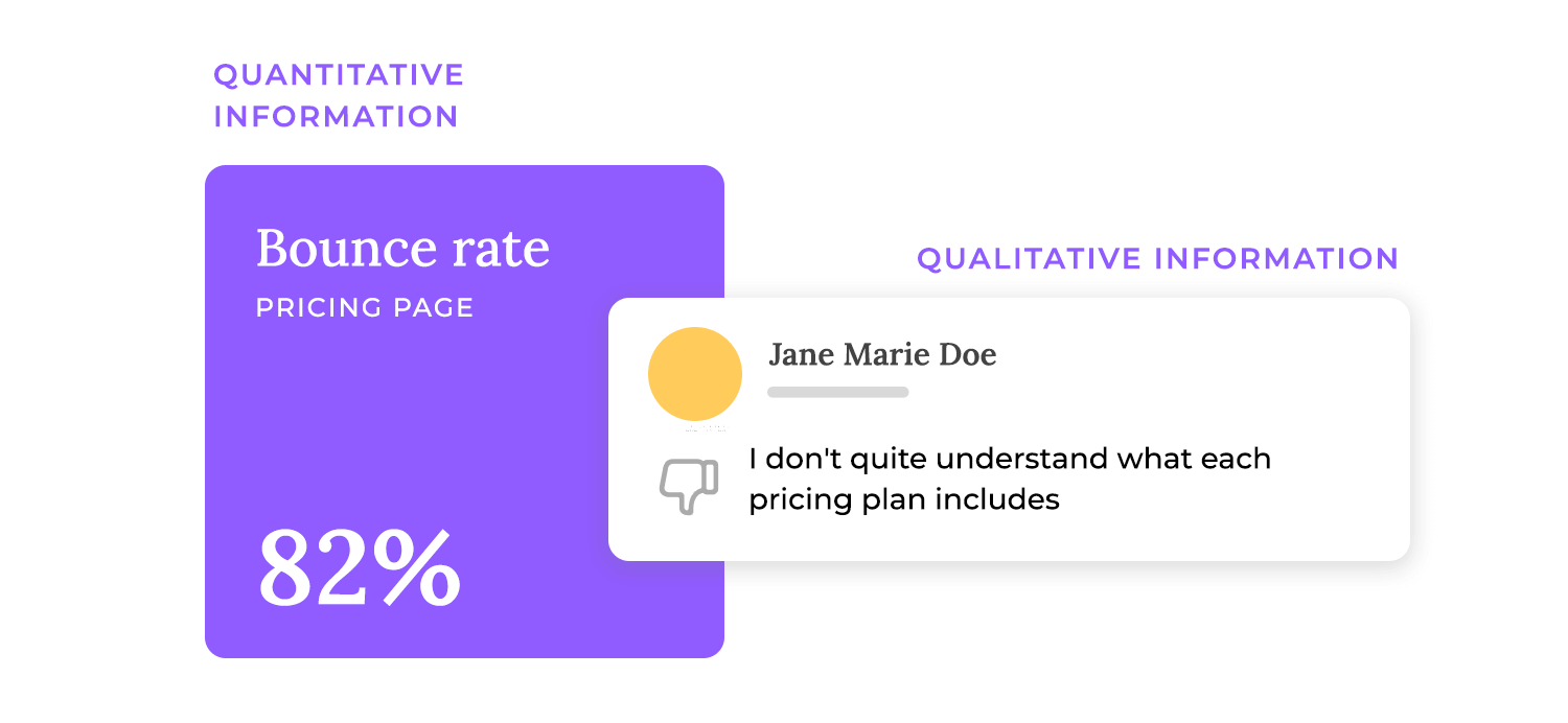
The culmination of a UX audit is the synthesis of all the data you’ve gathered. This involves collating both the quantitative and qualitative insights you’ve collected, weaving them together to create a comprehensive understanding of the user experience. Think of it as assembling all the pieces of a puzzle to reveal the complete picture. Quantitative data, like analytics and performance metrics, tells you what is happening – for example, a high bounce rate on a particular page. Qualitative data, like user feedback and observations, tells you why it’s happening – for example, users are abandoning the page because the content is unclear or the call to action is confusing.
Identifying recurring patterns or anomalies
For example, if your analytics show a high bounce rate on your pricing page, that’s a red flag. But it’s not until you combine that with user feedback, such as comments about confusing pricing plans or a lack of a clear value proposition, that you truly understand the problem.
Similarly, if user testing reveals that users are struggling to complete a specific task, and your analytics show a high error rate or a long time on task for that particular flow, you have strong evidence that there’s a recurring usability issue.
Categorizing issues by severity
Once you’ve identified a range of UX issues, it’s crucial to prioritize them based on their severity. Not all usability problems are created equal. Some issues might be minor annoyances, while others can completely block users from achieving their goals. A common approach is to categorize issues by severity levels:
- Critical (Blocking): These are the most severe issues, preventing users from completing essential tasks or accessing key features. They effectively block the user journey and often lead to frustration and abandonment. These issues require immediate attention. Think of a broken checkout process on an e-commerce site – this is a critical, blocking issue.
- High: These issues significantly impact the user experience, making it difficult or frustrating for users to complete tasks, even if they can eventually find a workaround. They can lead to decreased user satisfaction and lower conversion rates. These issues should be addressed promptly. An example might be a confusing navigation structure that makes it hard for users to find the information they need.
- Medium: These issues have a noticeable impact on the user experience, but they don’t prevent users from completing tasks. They might cause minor frustration or inefficiency. These issues should be addressed in a timely manner. A slightly cluttered page layout, for example, might be a medium-severity issue.
- Low: These are minor usability issues that have minimal impact on the user experience. They might be aesthetic flaws or minor inconsistencies that don’t significantly hinder user tasks. While it’s good to address these issues eventually, they shouldn’t be prioritized over more severe problems. A slightly misaligned icon, for instance, might be a low-severity issue.
Estimating impact on business goals and user satisfaction
Beyond severity, prioritizing issues also requires estimating their impact on business goals and user satisfaction. A highly severe issue that only affects a small number of users might be less important to address immediately than a medium-severity issue that affects a large number of users and directly impacts conversion rates. Consider how each issue affects key business metrics. Which issues are most likely to drive the biggest improvements in these areas?
Also, consider the impact on user satisfaction. Even if an issue isn’t directly impacting business goals, it might be causing significant frustration for users and damaging your brand reputation. Prioritizing issues based on both business impact and user satisfaction ensures that you’re focusing your efforts on the areas that will deliver the greatest value.
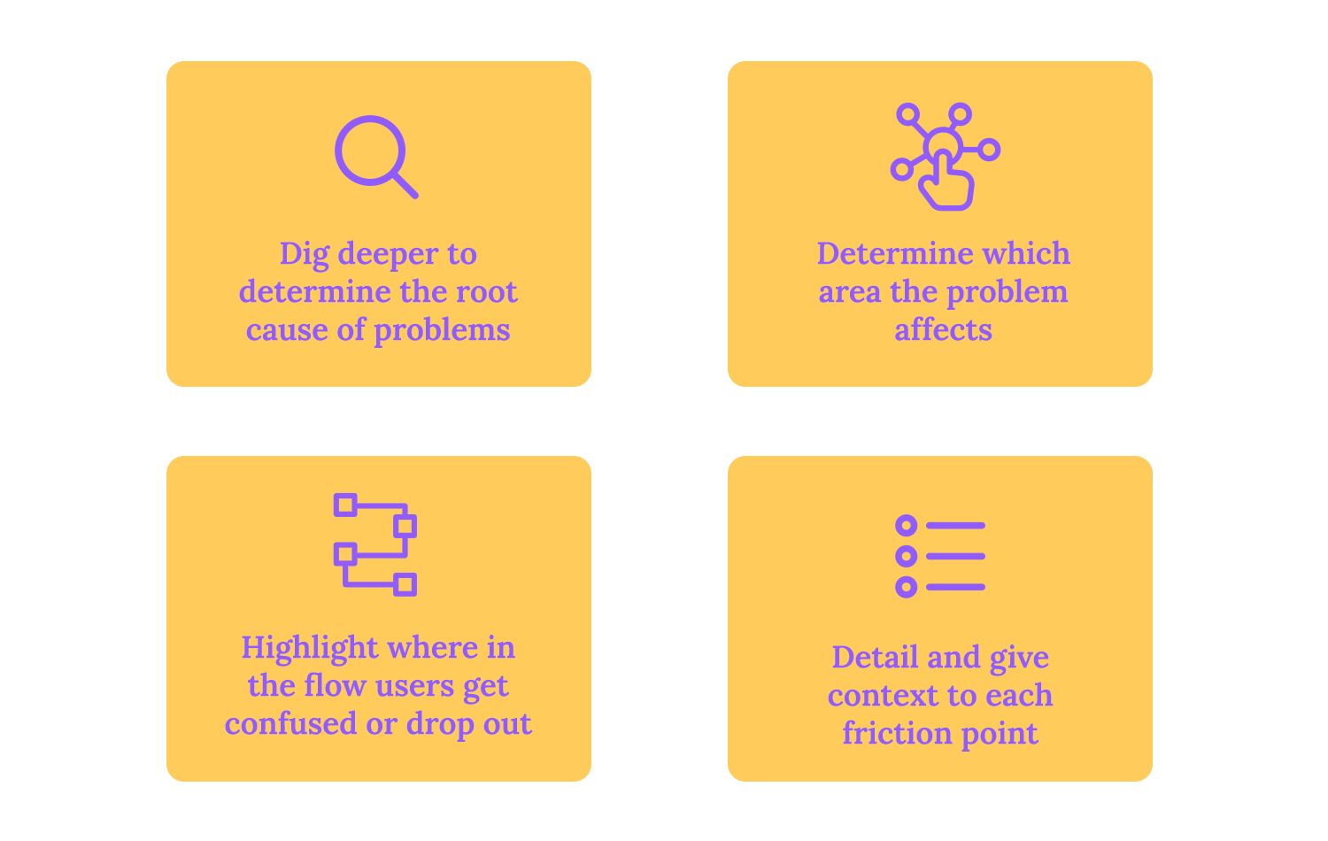
Identifying a UX issue is only the first step. To truly solve the problem, you need to delve deeper and understand the root cause of why the issue is occurring. Think of it like a doctor diagnosing an illness – simply treating the symptoms won’t address the underlying cause.
For example, if you’ve identified that users are struggling to find information on your website, the surface-level problem might be “confusing navigation.” But the root cause could be something deeper, like a misaligned information architecture, inconsistent labeling, or a lack of clear search functionality.
Checking if the problem is technical, design-related, or content-based
When conducting root cause analysis, it’s helpful to categorize the problem as technical, design-related, or content-based. This helps you pinpoint the area where the issue originates and identify the appropriate team to address it.
For example, performance lags are often a technical issue related to server response times or code inefficiencies. Misaligned navigation might be a design issue related to information architecture or user interface design. Unclear labeling is clearly a content issue.
Highlighting exactly where in the flow users drop off or become confused
Once you’ve identified and prioritized UX issues, the next crucial step is to map them directly to the relevant user journeys. This involves pinpointing the exact location within the user flow where users encounter these problems. Think of it as creating a detailed map of the user’s journey, marking each “X” where they encounter a friction point, get confused, or ultimately drop off. This mapping process provides crucial context for understanding the impact of each issue and prioritizing solutions. It allows you to see how these individual problems contribute to the overall user experience and identify which parts of the journey are most problematic.
Providing context for each friction point
Simply stating that there’s a “problem with the sign-up form” isn’t enough. You need to provide specific context for each friction point. Where in the sign-up process are users encountering difficulties? Is it with a particular form field? Are they confused by the instructions? Are they abandoning the process at a specific step?
Providing this level of detail is essential for understanding the true impact of the issue and developing targeted solutions. The same principle applies to other user journeys, such as the checkout process, content discovery, or any other key flow.
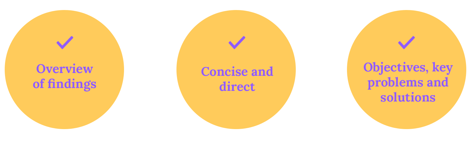
The executive summary is the first section of the report and should provide a high-level overview of the audit’s key findings and recommendations. This section is designed for busy stakeholders who may not have time to read the entire report. It should be concise and to the point, summarizing the most critical issues and highlighting the most impactful recommendations.
Think of it as the “elevator pitch” for your audit – a brief but compelling summary that captures the essence of your findings and motivates stakeholders to take action. It should clearly state the purpose of the audit, the key issues identified, and the recommended solutions, focusing on the potential impact on business goals and user satisfaction.
Following the executive summary, the report should provide a detailed breakdown of each identified issue. For each issue, the report should include:
- A clear description of the problem: Explain the issue in detail, providing specific examples and screenshots where relevant.
- Supporting data: Present the data that supports the existence and severity of the issue. This might include user feedback from interviews or surveys, analytics data such as bounce rates or time on task, usability testing results, or heuristic evaluation findings. Clearly link the data to the problem being described.
- Root cause analysis: Explain the underlying cause of the issue. Why is this problem occurring? Is it a technical issue, a design flaw, or a content problem?
- Proposed solutions: Offer specific and actionable recommendations for addressing the issue. These solutions should be based on best practices, user research, and a deep understanding of the problem’s root cause. For each solution, consider outlining the potential benefits, the estimated cost and effort required for implementation, and any potential trade-offs.
Design wireframes and prototypes with Justinmind.
Design improvements are often a key component of UX changes. These can range from minor tweaks, like adjusting button styling or improving microcopy, to more substantial overhauls, like updating entire page layouts or redesigning key user flows. When suggesting design improvements, it’s crucial to be specific and provide clear visual examples. Which brings us to the next point.
To truly bring design proposals to life and demonstrate their impact, interactive prototypes and revised user flows are invaluable. Instead of simply describing changes, show stakeholders how the proposed solutions will improve the user experience. Interactive prototypes allow users (and stakeholders) to experience the changes firsthand, simulating the actual product interaction.
This provides a much clearer understanding of the proposed improvements than static mockups or wireframes. Users can click through the prototype, interact with elements, and experience the flow of the new design. This not only helps stakeholders visualize the changes but also allows for valuable user testing before development begins, catching any remaining usability issues early on.
“Before and after” user flows are another powerful tool for illustrating the impact of proposed changes. These “before and after” diagrams should highlight the specific steps that have been added, removed, or modified, making it easy for stakeholders to understand the rationale behind the changes and their potential impact.

For example, if the audit revealed a cumbersome checkout process, the revised user flow could show how the proposed changes simplify the process, reducing the number of steps required and making it easier for users to complete their purchases.
Even a beautiful and intuitive interface can fall flat if it’s plagued by technical issues. Slow loading times, unstable code, and other technical problems can frustrate users and drive them away.
That’s why a good UX audit should also include recommendations for technical improvements. These might include optimizing images, minimizing HTTP requests, or improving server response times to speed up loading.
The audit might also identify code instabilities and suggest ways to make it more reliable. And caching strategies can be recommended to boost performance. These technical recommendations should be specific and actionable, giving developers clear instructions on what needs to be done.
For example, instead of just saying “improve loading times,” the report could suggest specific image compression techniques or database query optimizations.
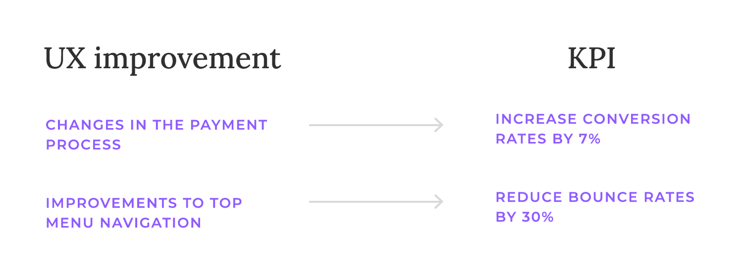
To really show the value of your UX work, every recommendation in your audit report should be tied to a potential improvement in your key performance indicators (KPIs). This helps stakeholders see the return on their investment.
For example, if you suggest changes to the checkout process, you might aim to increase conversion rates. If you’re recommending navigation improvements, you might target a reduction in bounce rates or an increase in time on site.
Linking your UX recommendations to KPIs not only shows why investing in UX is a smart move, but it also lets you track your progress and make data-driven decisions about future improvements. Putting numbers on the potential impact of each recommendation makes your report more convincing and helps you figure out which changes to tackle first.
Tackling every UX audit recommendation at once can be overwhelming. A better approach is to break it down into manageable steps. Start with the most critical issues and roll out updates in sprints or phases. This helps you address the biggest problems first and get feedback before moving on to less urgent items.
Prioritizing what matters most ensures you’re tackling the roadblocks that are hurting users and your business the most. Sprints or phases make implementation smoother. Instead of one huge release, you make changes in smaller, more manageable chunks. This makes it easier to track progress, spot any unexpected problems, and adjust as you go. Plus, you can get user feedback on the changes you’ve made before tackling the next phase.
Time to put your UX improvements to the test! Getting real users to try out the updated product is essential. It’s the best way to see if your changes are actually making a difference. Use the same testing methods you used before (usability testing, interviews, surveys, etc.) to get a clear comparison. Keep an eye on things like task completion rates, time on task, and user satisfaction to see how your changes have impacted the user experience.
User testing isn’t just about confirming successes; it’s also about identifying any new issues that might have been introduced by the changes. Sometimes, well-intentioned changes can have unintended consequences, creating new usability problems or even breaking existing functionality.
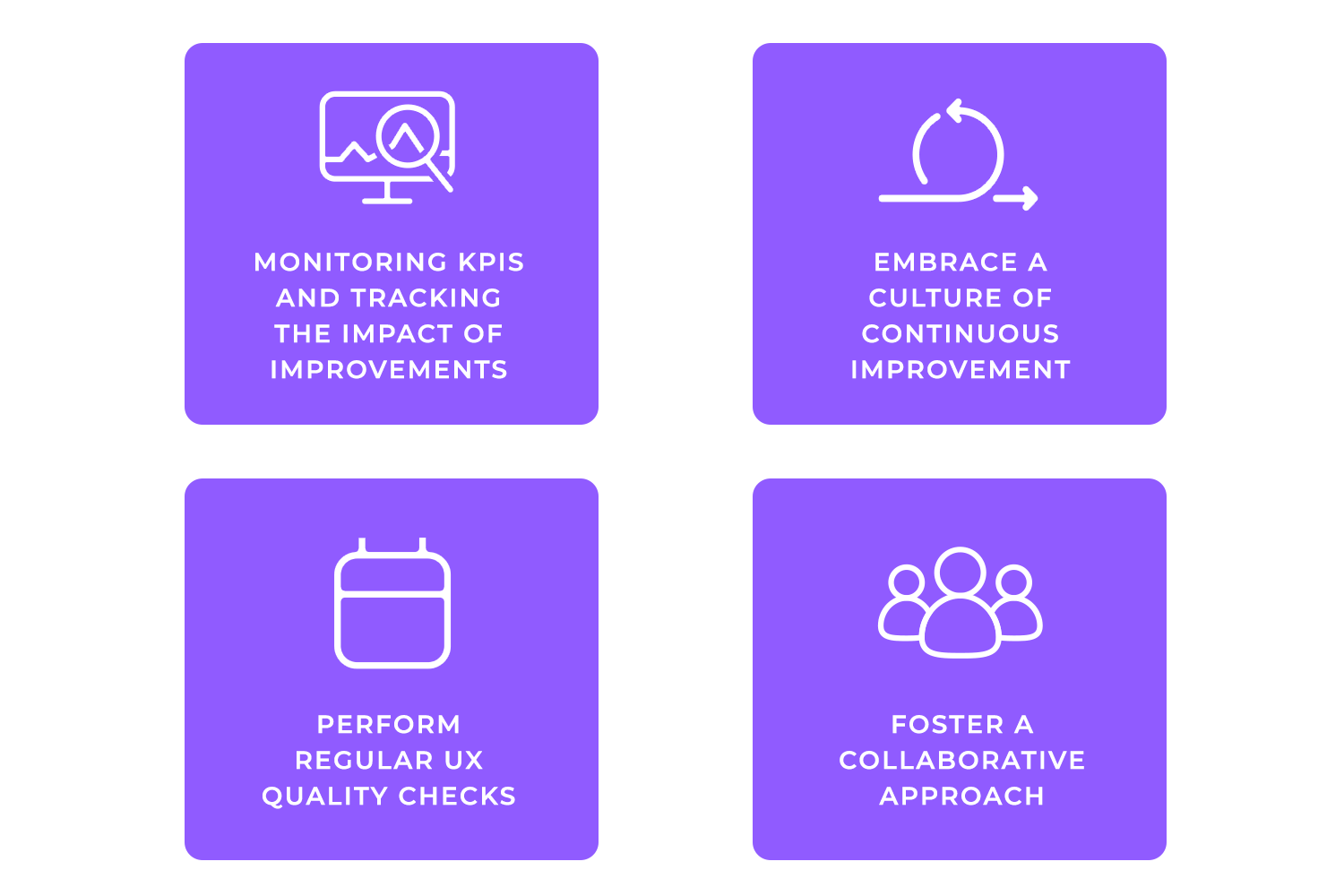
Once changes are live, it’s essential to update your analytics dashboards to specifically monitor the KPIs you identified as success metrics. This allows you to track the real-world impact of your UX improvements and see if they’re achieving the desired results.
Regularly review these dashboards to identify trends, spot any unexpected changes, and understand how users are interacting with the updated product. This data-driven approach provides valuable insights for further optimization.
No solution is perfect, and even with thorough testing, new data or user feedback might reveal areas for further refinement. Be prepared to iterate on your solutions as new information becomes available.
This might involve making minor tweaks to the design, adjusting the copy, or even revisiting the underlying architecture. Embrace a culture of continuous improvement, recognizing that UX is an ongoing process of learning and adaptation.
To maintain a high level of UX quality, consider adopting a regular schedule for UX audits or heuristic evaluations. Whether it’s quarterly, after major releases, or on some other cadence, these regular check-ups help you identify emerging issues, ensure consistency with best practices, and keep your product aligned with evolving user expectations.
Regular audits help you stay proactive rather than reactive, addressing potential problems before they significantly impact the user experience.
Finally, foster a culture of knowledge sharing and cross-functional cooperation. UX is not just the responsibility of the design team; it’s a shared responsibility across the entire organization. Encourage designers, developers, product managers, and other stakeholders to share their insights and collaborate on UX improvements.
This collaborative approach ensures that everyone is invested in creating a positive user experience and that UX considerations are integrated into all aspects of product development.
A UX audit is a powerful tool for understanding and improving the user experience. By systematically evaluating your product, gathering data from various sources, and prioritizing issues based on their impact, you can create a roadmap for creating a more user-friendly and effective product.
Remember that UX is an ongoing process. Regular audits, user testing, and a commitment to continuous improvement are essential for ensuring that your product consistently meets the needs of your users and achieves your business goals. Now that you’re a UX audit pro, go ahead and start your audit today!
Related Content
 Learn how to design better e-learning platforms with user-centered UX principles, real examples, and high-fidelity prototyping tips to boost engagement and learning outcomes.13 min Read
 Infinite scroll keeps users engaged, but it’s not always the best choice. This guide breaks down when to use it, when to avoid it, and how to design it right.14 min Read
 Learn how to design web and mobile app prototypes, how to test them and what to look for in a prototyping tool in this complete guide.15 min Read


