Designing a data table might seem straightforward—but when you're dealing with complex data, user interaction, and performance demands, it gets tricky fast.
It’s not just about fitting rows and columns on a screen. It’s about making the data easy to read, easy to explore, and easy to act on. So where do you start? And how do you make sure your table UI actually helps users instead of overwhelming them?
Design and prototype data table UIs with Justinmind
In this guide, we’ll walk you through everything from table types and best practices to real-world challenges and tools like Material UI. Whether you’re designing for a dashboard, admin panel, or data-heavy app, you’ll learn how to create table UIs that are clean, powerful, and user-friendly.
You’ve definitely seen a data table UI before, maybe without even realizing it. Think of those spreadsheet-like layouts packed with rows and columns, helping you scan and compare lots of information quickly. That’s what a data table UI is all about: organizing complex data in a clean, structured way so it’s easier to read, use, and act on.
You’ll find data table UIs pretty much everywhere data lives. From dashboards in business tools and admin panels to CRM systems, financial apps, and e-commerce inventory pages. If there’s a ton of data that needs to be sorted, filtered, and explored, there’s probably a table behind it.
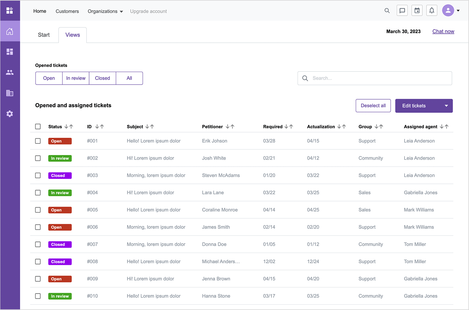
Let’s be honest; tables can get overwhelming fast. A cluttered or clunky layout makes it harder to find what you’re looking for, which slows everything down. That’s why good data table UI design is key. When done right, it brings some serious benefits:
- Improved readability and usability: especially when you’re working with big datasets, a clean design makes scanning and understanding the data way easier.
- Faster data exploration: features like sorting, filtering, and search help users get to the info they need without digging through a mess.
- Better decision-making: when the information is well-structured and scannable, it’s easier to make sense of it and take action.
- Boosted efficiency: in data-heavy environments like business apps, a smartly designed table UI means less time wrestling with data and more time actually using it.
So whether you’re building something from scratch or refining an existing product, keeping UI best practices for large data tables in mind can make a world of difference. And don’t worry, we’ll get into types, those best practices, patterns, and even some sleek Material UI data table examples next.
Design and prototype data table UIs with Justinmind

Now that we’ve got the basics down, let’s talk about the different types of data table UIs you’ll come across. Not all tables are created equal, some are simple and straightforward, while others are built to handle seriously complex datasets. The key is to match the table design to the complexity of the data and the user’s needs.
Not all data tables are built the same, and they shouldn’t be. The way you design a table should match the complexity of the data it holds. Sometimes a simple list is enough. Other times, you’ll need expandable rows, filters, or even virtualized content to keep things smooth. Let’s walk through the different types of table UIs and when each one makes sense.
These are your lightweight, no-fuss tables. Perfect for small datasets or situations where users just need to view and maybe sort a few columns. They’re usually read-only, with minimal interactivity, maybe a basic filter or a column sort, but that’s about it.
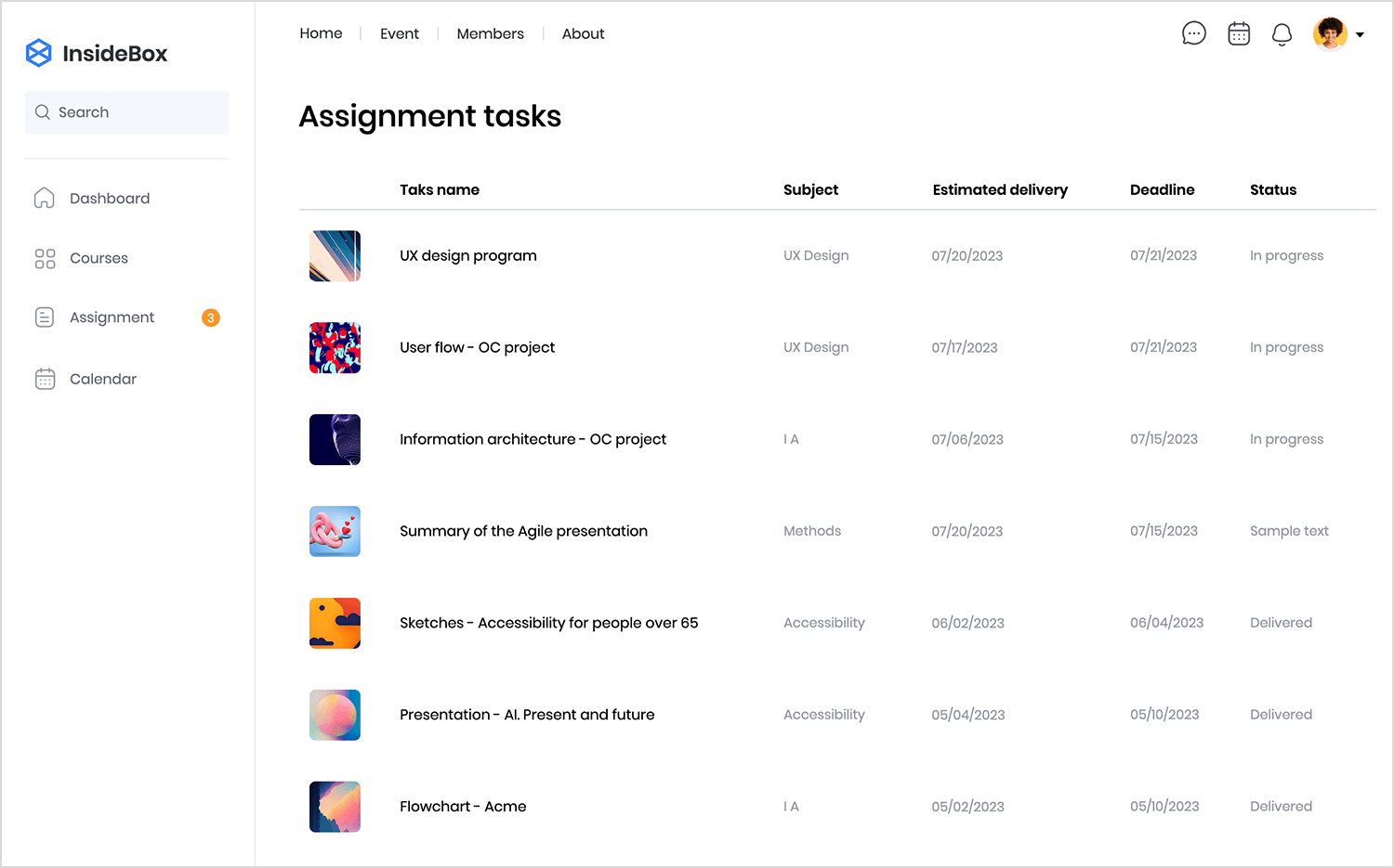
Example: a simple list of assignment tasks showing the topic, delivery date, and current status. It’s clean, easy to scan, and does the job, no extra bells and whistles needed.
This is where things get heavy-duty. Complex tables are made for large datasets with more moving parts. They often support multi-column sorting, advanced filtering, inline editing, bulk actions, grouping, and even nested rows or hierarchical data.
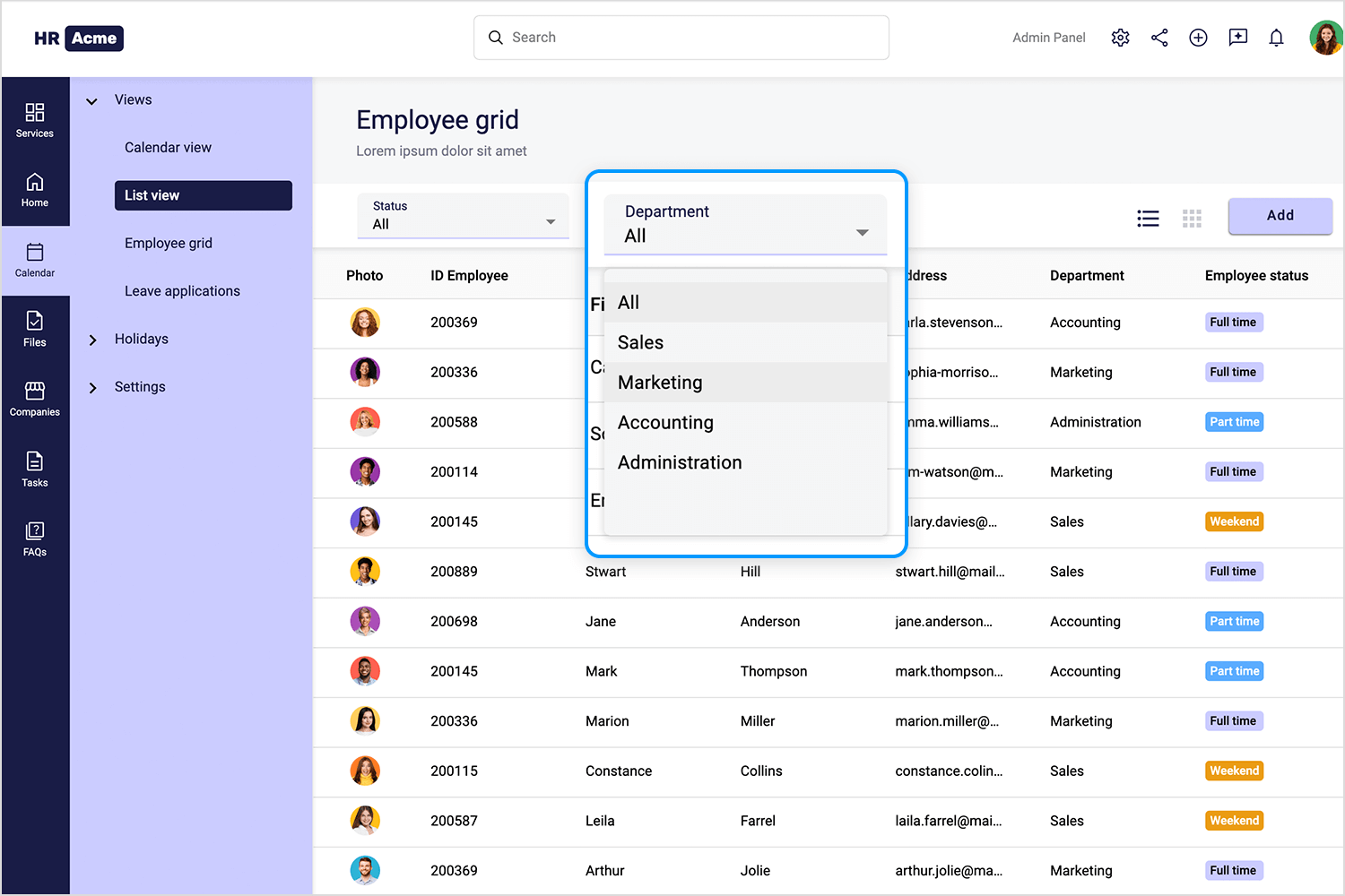
Example: an internal company dashboard showing employee performance metrics across departments, roles, and time periods; sortable, filterable, editable, and packed with insights.
Another way to break down data tables is by how users interact with them. Some tables are just there to display information, while others invite users to really dig in and work with the data.
These are designed strictly for viewing. There’s no sorting, no editing, just a clean presentation of information. You’ll usually see these in places where the data shouldn’t (or can’t) be changed, like official reports, regulatory filings, or academic research.

Example: a downloadable PDF of quarterly earnings with a table summarizing revenue, expenses, and profit.
Now we’re talking power tools. Interactive tables give users the flexibility to sort columns, filter results, edit data inline, and even customize how the table looks. You might see drag-and-drop column reordering, expandable rows for more detail, or personalized views that users can save.
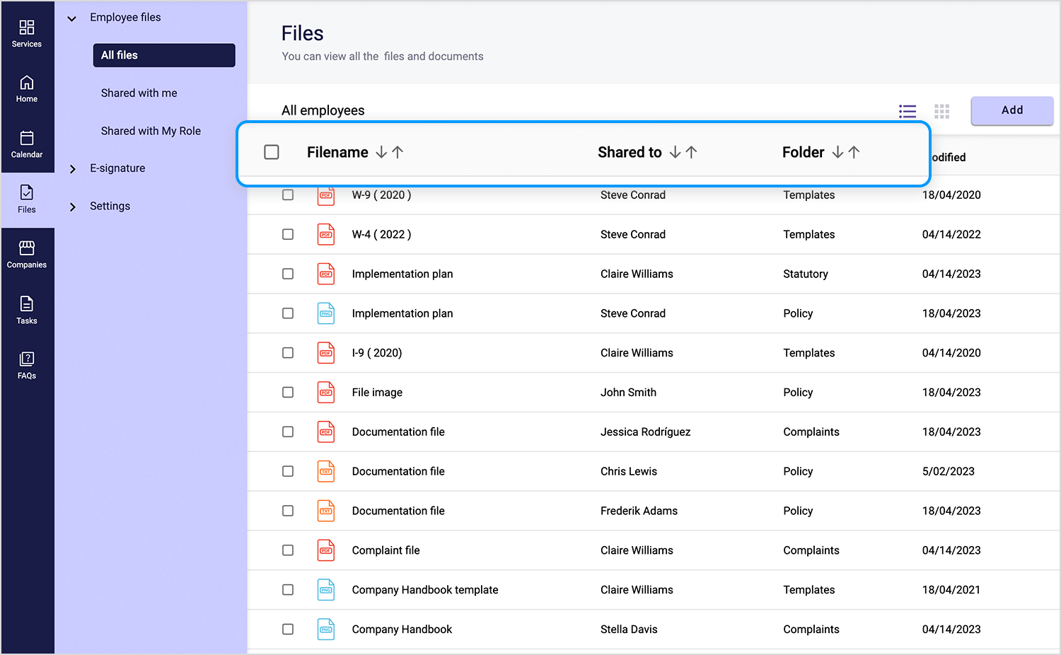
Example: a CRM dashboard where users can sort contacts by last interaction date, filter by status, and update fields directly in the table.
One more way to think about data table types is by looking at how the data itself is structured. Is it flat and simple, or does it have layers and relationships between items? The structure of your data should guide how you design the table.
These are the most common kinds of tables, each row stands on its own, with no dependencies or nesting. They’re great when you need to display data side by side for quick comparisons or summaries.
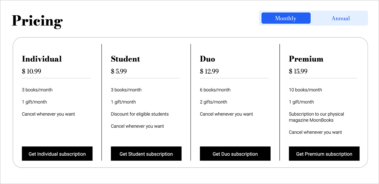
Example: a side-by-side pricing table comparing subscription plans by cost and features; perfect for helping users quickly spot the one that fits their needs.
Sometimes, your data has depth; think tasks with subtasks, categories with subcategories, or accounts with multiple users. In these cases, nested tables help you show parent-child relationships clearly. You’ll often see expandable rows that reveal more details without cluttering the view.
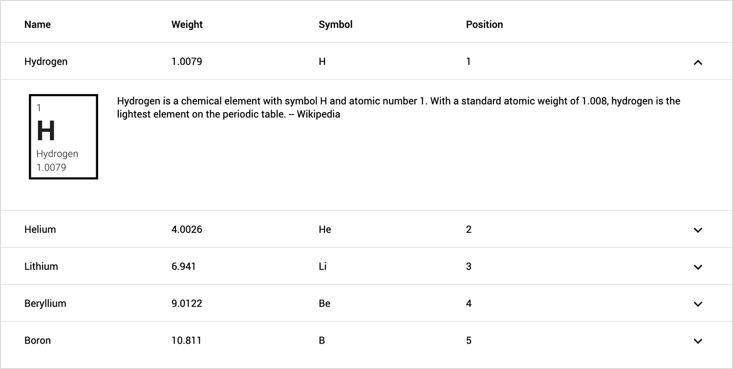
Example: a table where users can click to expand a row and see more details; great for keeping things tidy while still giving access to deeper info when needed.
Design and prototype data table UIs with Justinmind

Let’s be real; when you’re working with huge amounts of data, performance starts to matter just as much as design. A smooth, snappy table UI can make or break the user experience. That’s why there are a few different approaches depending on how much data you’re dealing with and how fast it needs to load.
This is the classic approach. When there’s too much data to show at once, pagination breaks it down into smaller, more manageable pages. It keeps things fast and avoids overwhelming the browser, or the user.
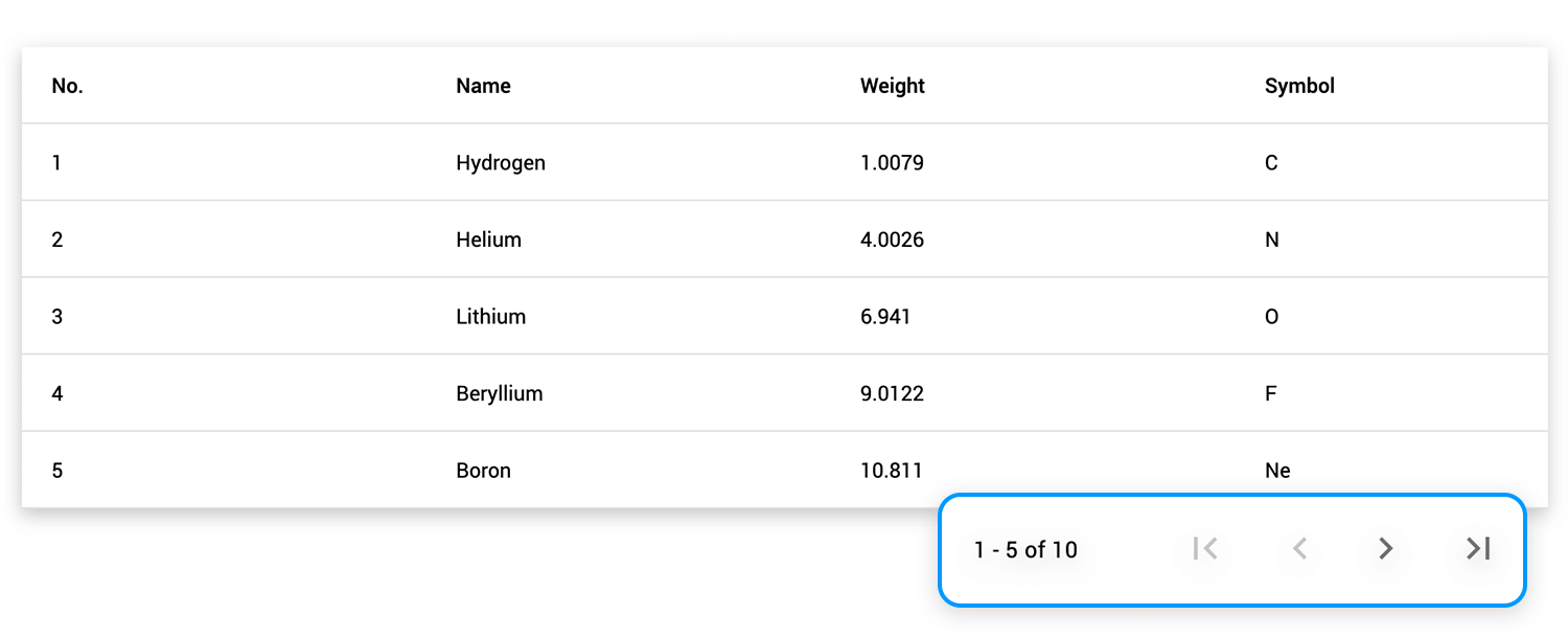
Example: a simple table with built-in pagination to browse through chunks of data; great when there’s too much info to show all at once.
Instead of clicking through pages, infinite scroll loads more data as you move down the list. It’s a seamless experience, especially useful for content that feels continuous, like logs, social feeds, or real-time updates.
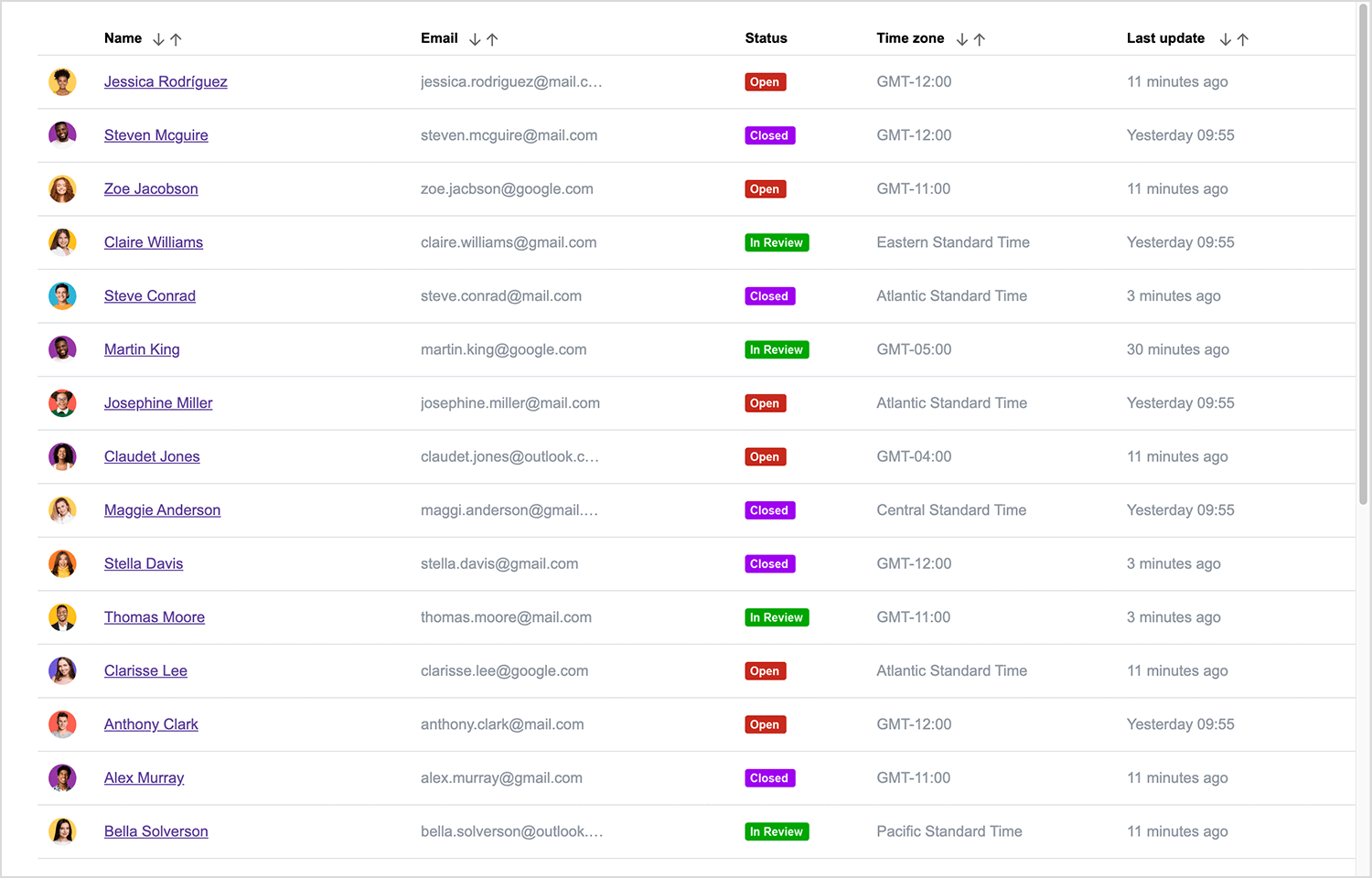
When you’re dealing with really massive datasets, think thousands or even millions of rows, virtualization is your best friend. It only renders the rows currently visible on the screen, which keeps things lightning fast.
Example: an enterprise analytics dashboard displaying granular sales data across multiple regions and time periods, all without lag.
Not every table is just for looking, some are built for doing. Depending on what users need to do with the data, the table UI can offer different levels of interactivity. Here’s a breakdown based on the kinds of actions users might take.
These are strictly for viewing; no editing, no input, just clean data presentation. They’re ideal when the data needs to stay untouched, like historical records or audit logs.
Example: a compliance report showing a history of system access events, locked down to prevent changes.
Here, users can jump in and make changes directly in the table, whether it’s updating a field, editing a value inline, or even making bulk edits. These tables are all about making data management fast and efficient.
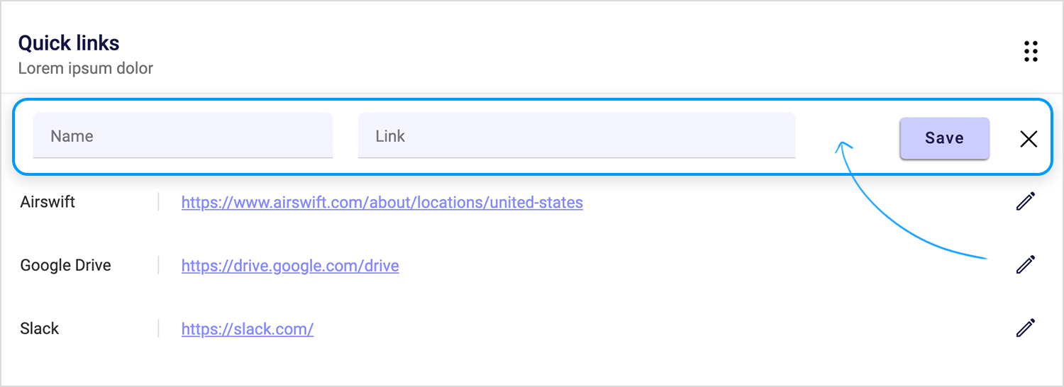
Example: a quick-edit table where users can add or update links directly in the row; no need to open a separate screen.
When users need to perform the same action on multiple rows at once, like deleting, exporting, or tagging, a bulk action table makes it easy. These tables typically include checkboxes for selecting multiple rows and a toolbar with batch options.
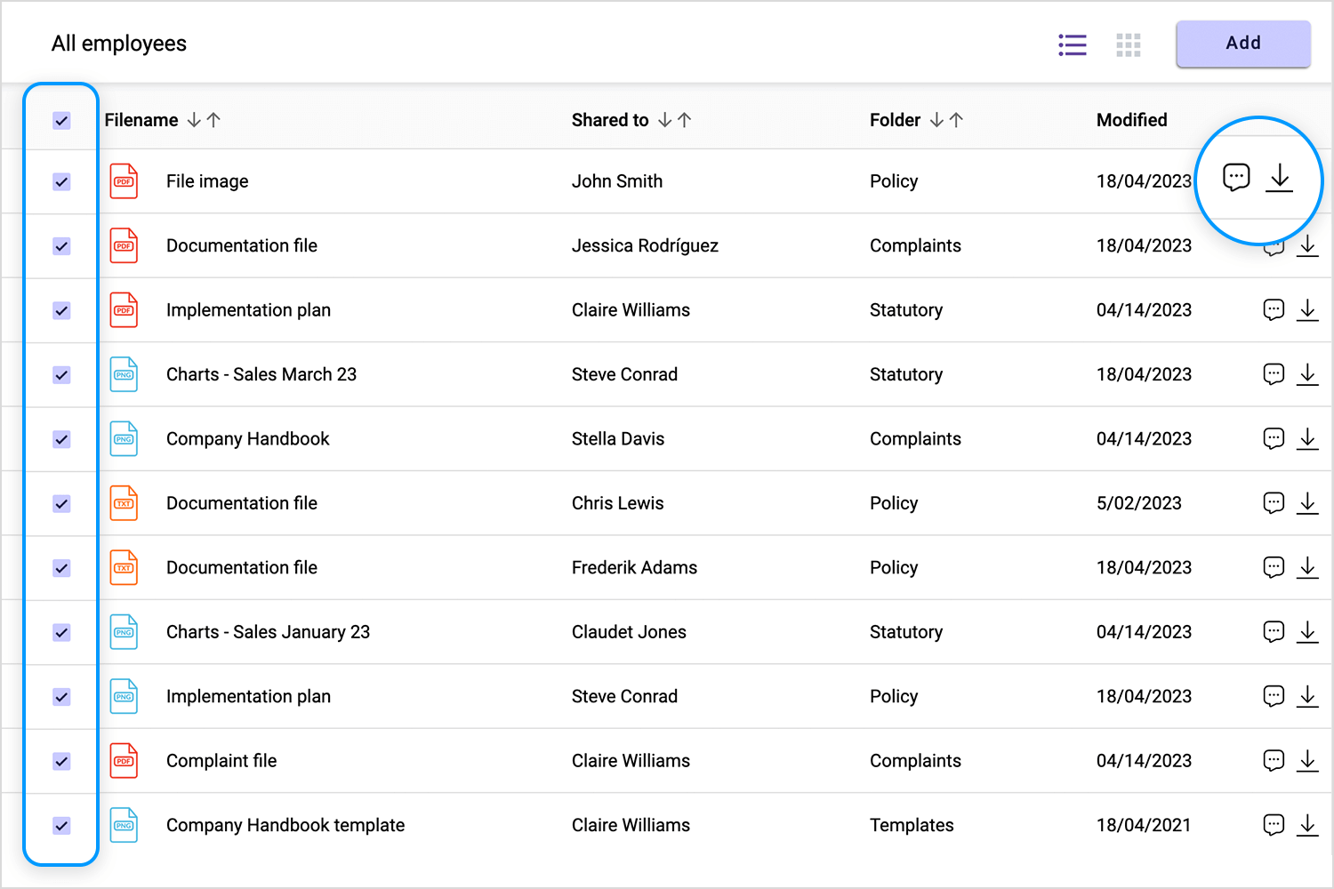
Example: a file management table where users can select multiple documents and perform batch actions like downloading, commenting, or moving them; all in one go.
Tables aren’t just rows and columns of dry numbers anymore. Depending on how the data needs to be presented, your table UI can range from plain text to fully visual. Let’s break it down by how rich (or not) the content inside the table gets.
These are your classic, no-frills tables. Mostly made up of text and numbers, with little to no visual elements. Simple, clean, and focused on raw information.
Example: a financial report showing quarterly revenue, expenses, and profit in a straightforward grid.
These tables spice things up with images, icons, badges, color coding, and more. They help users scan and interpret data faster by adding visual context to each row.
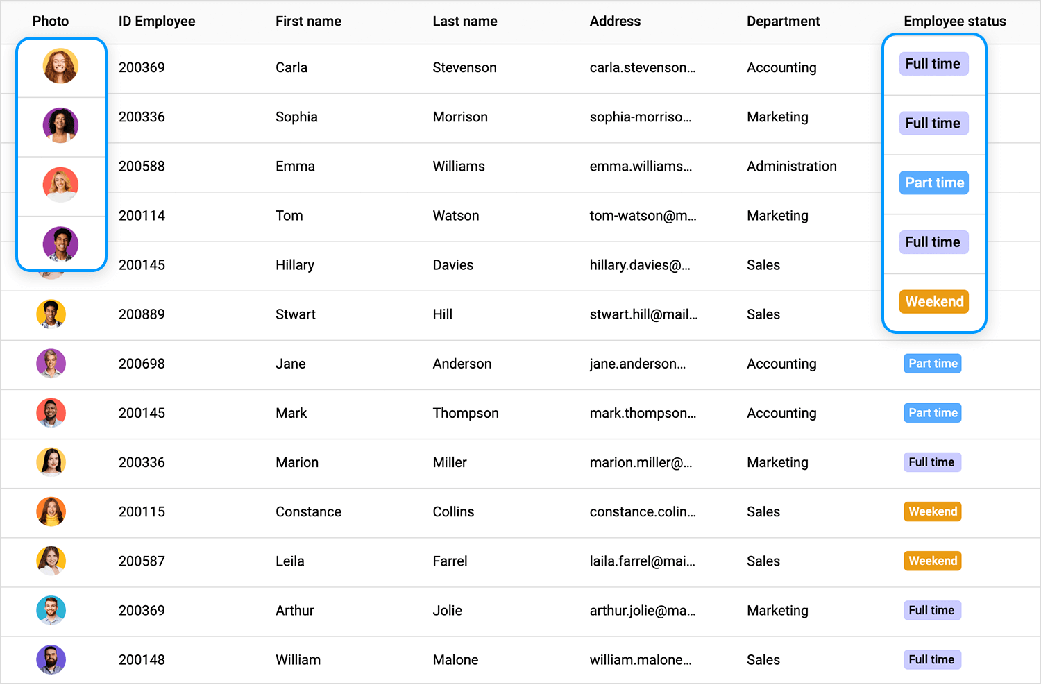
Example: a user management table that includes profile pictures, role icons, and colored status indicators for active/inactive users.
Here’s where things get fancy. Some tables go beyond simple visuals and actually embed charts, graphs, or trend lines right inside the cells. It’s a great way to give users quick insights without needing to leave the table.
Example: a sales performance table that includes mini bar charts or trend lines showing monthly growth next to each salesperson’s name.
Nobody wants to squint at a wall of data. One of the most important things you can do when designing a data table UI is make it easy to read and scan. Here’s how to do that without overcomplicating things:
- Align text and numbers the smart way: left-align your text and right-align your numbers. It might sound small, but it makes scanning so much easier, especially when users are comparing values in a column.
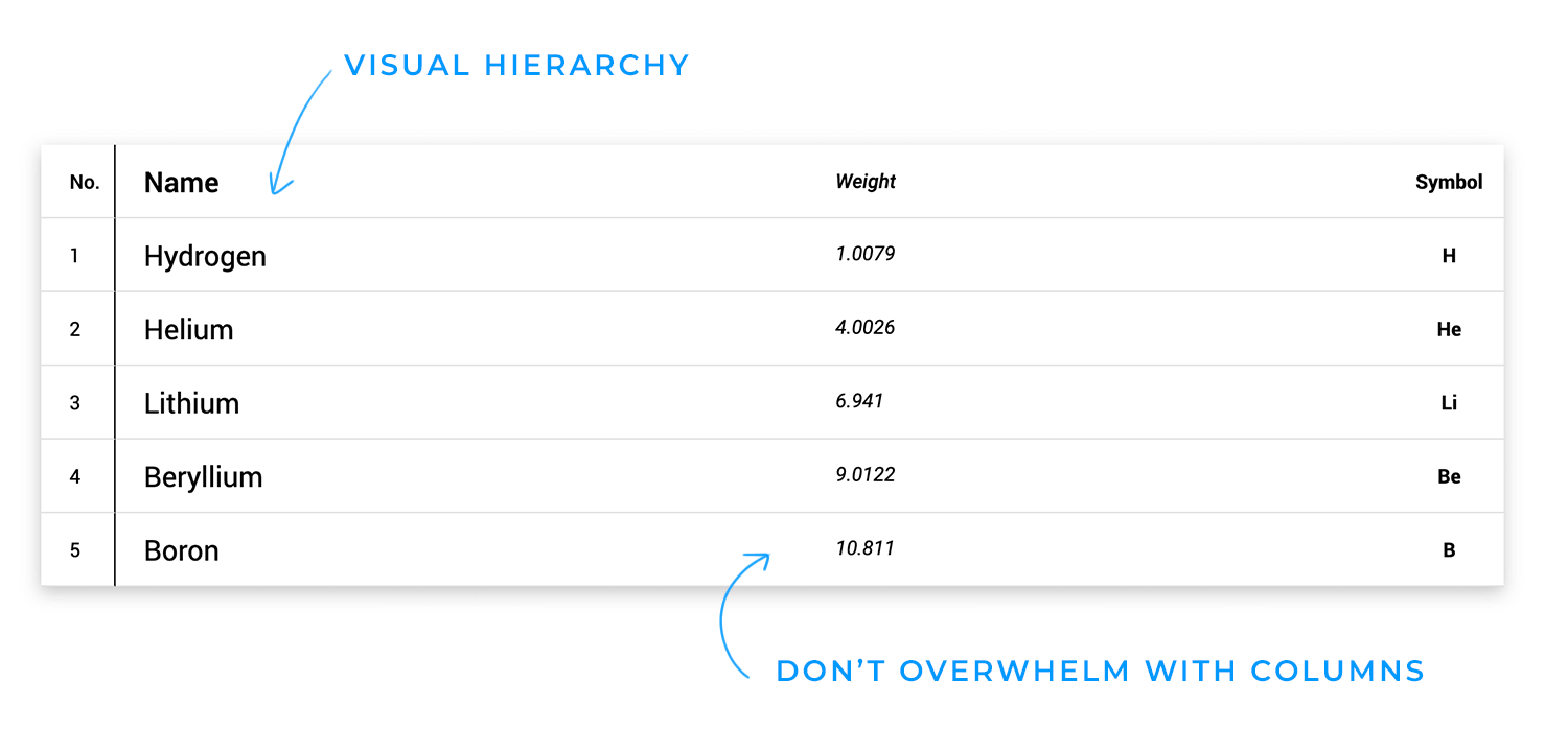
- Use visual hierarchy: help the eye know where to look. Bold your headers, use zebra striping (alternating row colors), and add just a hint of color to draw attention to key info, without making it look like a rainbow.
- Don’t overwhelm with columns: show only what’s essential up front. If there’s extra info, consider using expandable rows or tooltips so things stay clean and easy to digest.
When people interact with tables, they’re usually looking for something specific. A name, a date, a total, a status, something. That’s where sorting, filtering, and search come in. These aren’t just nice-to-haves, they’re the keys to fast, frustration-free data exploration.
- Let users sort: make columns clickable so users can reorder data by whatever makes sense to them, A to Z, highest to lowest, most recent first, etc. It’s a tiny feature that makes a huge difference.
- Make filtering intuitive: don’t overthink it. Use dropdowns, checkboxes, or multi-select menus; whatever makes the most sense for the data. The goal is to help users slice and dice the table without getting lost.
- Add a global search bar: sometimes users just want to type and go. A top-level search with full-text support (and maybe even predictive suggestions) helps them find exactly what they need in seconds.
Big tables can get heavy, fast. If you’re not careful, your UI can start to lag, freeze, or just feel clunky. The trick is to handle large datasets in a way that keeps things fast and user-friendly.
- Pick the right navigation style: if your data is well-structured and users need to jump between specific chunks, pagination is your friend. But if the data feels more like a feed, think logs or messages, infinite scroll can make it feel smoother and more natural.
- Keep key information visible: Sticky headers and frozen columns help users stay oriented as they scroll. When names, dates, or categories stay in place, it’s way easier to understand what you’re looking at, especially in wide or long tables.
- Keep performance top of mind: for really massive tables, virtual scrolling (aka windowing) is a game-changer. It only renders what’s visible on screen, so users get a fast, seamless experience, even when there are thousands of rows behind the scenes.
Tables aren’t just for looking, they’re often built for doing. Whether it’s editing info, checking details, or taking action on multiple items, good row-level interactions can seriously boost usability.
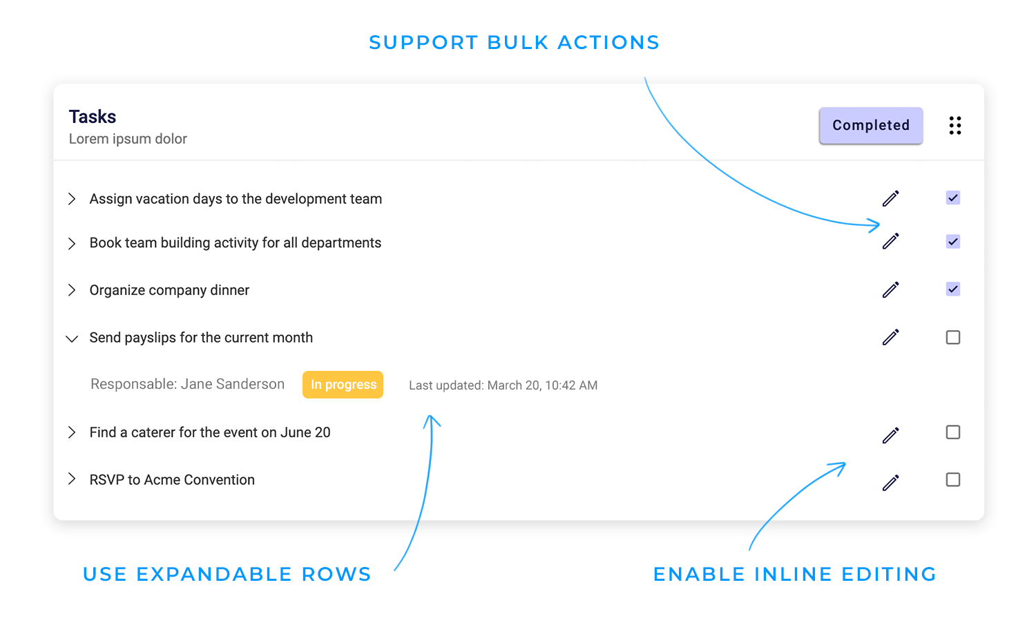
- Use expandable rows: not everything needs to be shown up front. Let users click to reveal more info when they need it, like notes, metadata, or timelines, without cluttering the main view.
- Enable inline editing: let users update fields directly in the table. No need to jump to a separate form just to fix a typo or change a status. It’s faster and feels way more natural.
- Support bulk actions: sometimes users need to select multiple rows to perform the same action, like tagging, exporting, or deleting. Make it easy with checkboxes and a simple bulk action toolbar.
Data tables aren’t just for desktops anymore. People expect to view and interact with data on the go, so your table UI needs to adapt without becoming a headache on smaller screens.
- Adapt the layout for small screens: tables don’t always shrink well, so consider using collapsible rows or even transforming the table into a stacked card layout. It keeps things readable without endless side-scrolling.
- Make interactions touch-friendly: on mobile, hovering isn’t a thing. Avoid actions that rely on hover states and make sure buttons, checkboxes, and other touch targets are big enough to tap comfortably.
- Prioritize important data: space is limited, so let users choose which columns matter most to them. Hide secondary info or give users the option to customize their view to keep the most relevant data front and center.
Good table design should work for all users, whether they’re navigating with a keyboard, using a screen reader, or have visual limitations. Small adjustments can make a big impact on usability.
- Support keyboard navigation: users should be able to move through rows and columns using only the keyboard. Clear focus states and logical tab order make the experience smoother.
- Make it screen reader-friendly: use semantic HTML and ARIA labels so assistive technologies can accurately describe the structure and content of the table.
- Add more than color cues: color-coded statuses are helpful, but they shouldn’t be the only signal. Pair colors with icons, text labels, or shapes so everyone can interpret the data with ease.
Even when you follow all the best practices, designing a great data table UI isn’t always straightforward. Real-world use cases can throw curveballs that force you to balance usability, performance, and clarity; all at once. Here are some of the most common challenges designers run into.
It’s tempting to show everything, but too much data on screen can overwhelm users fast. The challenge is to surface what matters most while keeping the rest accessible without creating visual clutter.
It’s not just a performance issue. Large datasets can drag down the user experience if they’re not broken up or rendered smartly. Choosing the right approach, pagination, infinite scroll, or virtualization, depends on how the data will be used.
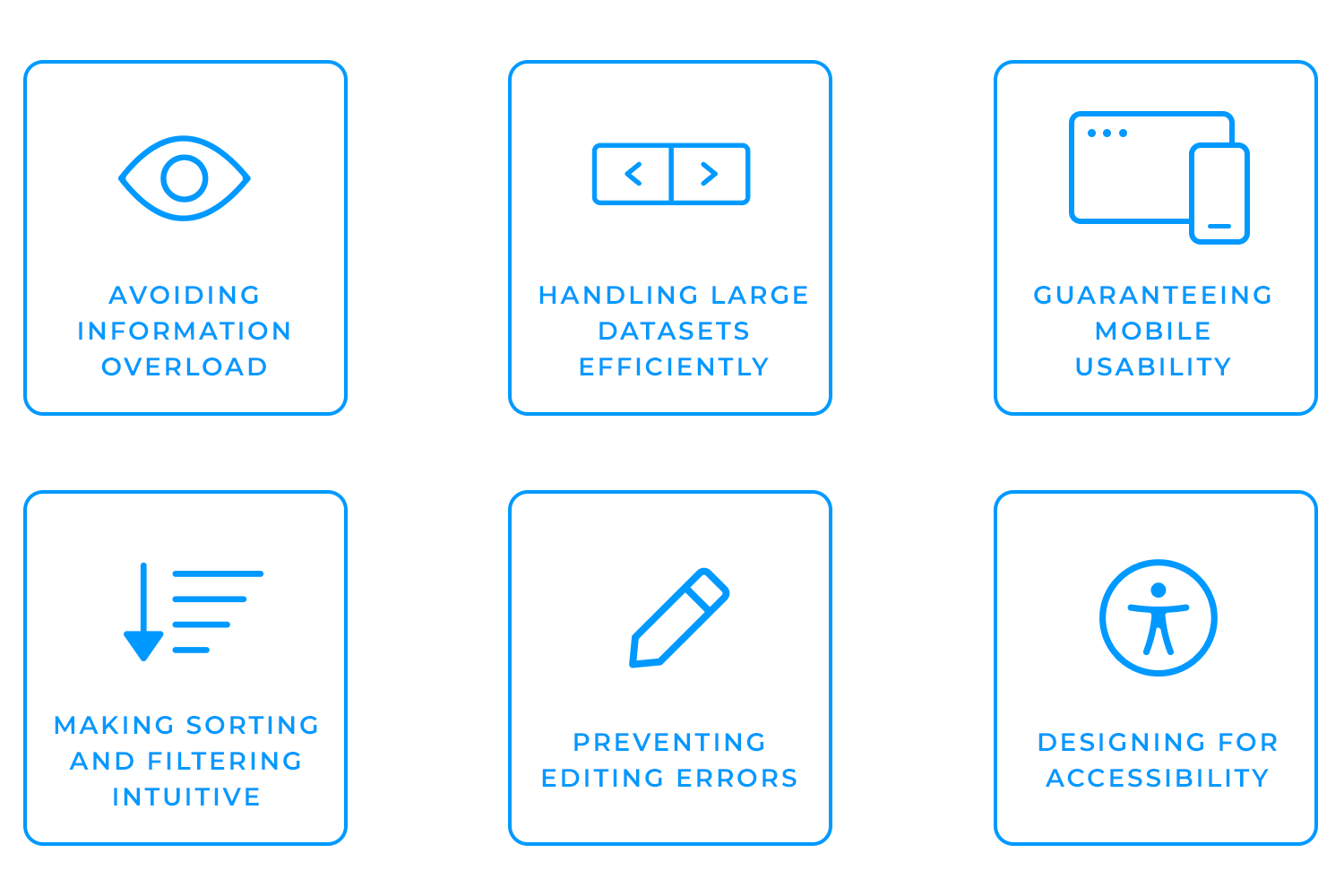
Tables and small screens don’t naturally get along. Making data tables responsive often means rethinking the entire layout so that users can still access and interact with the data comfortably on mobile devices.
When users can’t find what they’re looking for, frustration sets in. Designing sorting and filtering tools that are both powerful and easy to understand takes finesse, and lots of user empathy.
Inline editing is fast and convenient, but it also opens the door to accidental changes. Thoughtful design patterns, like save confirmations or undo options, can help users feel more in control.
Tables are inherently complex, which can make them difficult to navigate for users with assistive tools. Structuring them properly, supporting keyboard navigation, and offering visual alternatives to color cues are all essential steps.
Design and prototype data table UIs with Justinmind

If you’re designing for a React-based product and need a functional, clean-looking table fast, Material UI’s data table component is a strong starting point. It follows Google’s Material Design system and comes pre-equipped with all the essentials; sorting, pagination, search, row selection, without needing to build those features from scratch.
It’s a pre-built table component from the Material UI library (MUI), designed to match the Material Design guidelines. You can drop it into a React app and get a fully interactive table with consistent styling and built-in accessibility, perfect for dashboards, admin panels, or any data-heavy interface where speed and functionality matter.
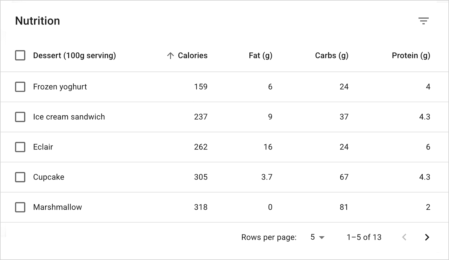
- Pre-styled and consistent: comes with default styling that aligns with Material Design, helping teams move fast while keeping the UI cohesive.
- Built-in accessibility: includes keyboard navigation and ARIA support by default, which helps meet accessibility standards without extra design or dev effort.
- Fast to integrate: developers can plug it into React apps with minimal setup, which means less back-and-forth and quicker turnaround from design to production.
- Limited visual flexibility: customizing the look and feel beyond Material Design can be tricky. If your brand aesthetic veers away from Google’s design system, it may take extra work (or feel like a mismatch).
- Not ideal for highly tailored UIs: if you’re designing a complex table with layered interactions or micro-interactions, this component can feel a bit rigid out of the box.
- Client-side rendering limitations: with very large datasets, performance can lag unless additional optimizations (like virtualization) are added by the dev team.
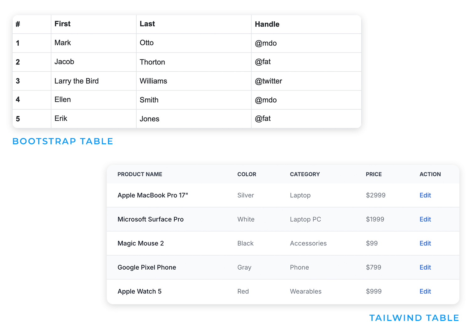
- Material UI vs. Bootstrap tables: Bootstrap tables are simpler and easier to style freely, but they don’t offer interactive features or accessibility out of the box like MUI does.
- Material UI vs. Tailwind tables: Tailwind gives you total control over styling, but it’s more manual; every interaction (sorting, filtering, etc.) needs to be built or added separately.
- Material UI vs. custom-built tables: custom tables offer unlimited flexibility, but they’re time-intensive. Material UI strikes a balance between speed and functionality, which works well for MVPs or internal tools.
Pro tip: if you’re prototyping a data-heavy UI and want to map out table interactions before handing it off to devs, Justinmind is a great way to design, test, and validate your ideas, without writing a single line of code.
So, with all that in mind, when does it actually make sense to go with Material UI’s data table? If you’re working on a React project and need a solid, pre-built table that just works, Material UI is a strong choice. It’s especially handy when:
- You’re using React and want something quick and reliable: the setup is straightforward, and it saves time by handling the basics out of the box.
- Your product already follows Material Design: the table will fit right in, visually and behaviorally, without needing extra styling work.
- You don’t need tons of customization: if you’re building something functional—like an internal tool, MVP, or admin dashboard; Material UI gives you exactly what you need without overcomplicating things.
- You’re not working with massive datasets: while it performs well for most use cases, you may need additional optimization if you’re dealing with thousands of rows.
It’s all about choosing the right tool for the job, and Material UI is a great option when speed, consistency, and usability are your top priorities.
Designing a great data table UI isn’t just about making it look clean—it’s about helping users make sense of complex information quickly and confidently. Whether you’re working with simple tables or building out full-featured data dashboards, getting the structure, interactions, and usability right can make all the difference.
And if you’re designing in React, tools like Material UI can give you a head start—especially when paired with a prototyping platform like Justinmind to bring your table ideas to life before passing them off to developers.
At the end of the day, the goal is simple: make data easier to read, explore, and act on. Get that right, and your users will thank you.
Design and prototype data table UIs with Justinmind

Related Content
 Single page design v multi-page design – everything you need to help you choose the right design for your site’s content18 min Read
 Website backgrounds can be a powerful tool in creating an experience. But what kind of experience can you convey and how? We got the full run-through for you!14 min Read
 Redesigning a website? Learn how to do it right, from planning and prototyping to testing and launching, so your site looks great and works even better.18 min Read
