Lean UX is all about changing the focus and gaining perspective in the design - but why is it so popular? What does it mean in practice? Read on to find out!
Lean is a UX design method that unites product development, design, and business in a way that promotes continued development, constant iteration, and validation. This process which involves using a prototyping tool to help you build, measure, learn, and closer to a mind-blowing user experience way faster than most other methods.
Free UX design tool to create wireframes, prototypes and user flows

Lean UX techniques can be applied to enhance a traditional UX process and give it a boost in both performance and efficiency. And so, let’s take a closer look at a much discussed but misunderstood methodology: Lean UX.
- What is Lean UX?
- Principles of Lean UX
- The Lean UX process
- Experimentation and testing hypothesis in Lean UX
- Iterative design and feedback loops
- How the Lean UX canvas works - Q&A with Jeff Gothelf
- Building Lean UX teams
- Designing with minimum viable products (MVPs)
- Integrating Lean UX with Agile
- Challenges in implementing Lean UX
Lean UX is a dynamic approach to design that blends the best of Lean and Agile methodologies. It prioritizes collaboration, iteration, and a strong focus on user needs. With an emphasis on efficiency and experimentation, the Lean UX design process helps you and your team deliver high-quality products quickly and effectively.
This design process emerged as a solution to the limitations of traditional ones. Inspired by the principles of Lean Manufacturing and Agile software development, the process of Lean UX design aims to reduce waste, maximize value, and foster a culture of continuous improvement.
The combination of iterative development, customer collaboration, and a relentless focus on user experience that Lean UX design uses empowers you to create innovative and user-centric products that win over the market.
Lean UX design offers an increasingly compelling alternative to traditional UX methodologies, delivering a whole bunch of benefits that can add the magic of innovation to your product:
In a nutshell, the Lean UX design process helps design teams like yours move super fast! It prioritizes rapid iteration and experimentation, allowing you to quickly validate ideas, identify potential issues, and refine your designs.
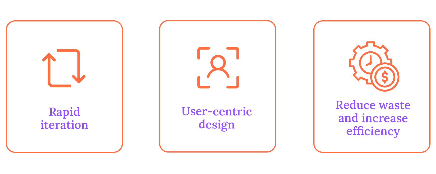
This helps eliminate unnecessary steps and allows you to focus on essential activities. All of this to say, the way the Lean UX design process is put together accelerates the product development cycle, helping products reach the market faster.
Lean UX puts the user at the heart of everything. Involving users in the design process through techniques like user research and usability testing helps create products that truly speak to users and meet their needs and expectations.
The Lean UX process is there to help you work smarter, not harder. It focuses on eliminating waste and inefficiency by engaging in activities that contribute directly to the product’s value.
This way, you avoid unnecessary work, reduce costs, and improve the overall efficiency of your product. Additionally, Lean UX’s iterative approach allows for continuous improvement and reduces the risk of making some costly, regretful mistakes.
Free UX design tool to create wireframes, prototypes and user flows

As a UX designer, you’re probably familiar with the traditional, waterfall approach to design. It’s a linear process that often involves extensive upfront planning, detailed documentation, and a rigid timeline. While this approach can be effective for certain projects, it can also be time-consuming, inflexible, and prone to scope creep.
Lean UX offers a refreshing alternative. It’s a more agile and iterative approach that prioritizes experimentation, rapid prototyping, and continuous feedback. By focusing on minimal documentation and emphasizing outcomes over deliverables, the Lean UX design process can deliver high-quality products faster and more effectively.
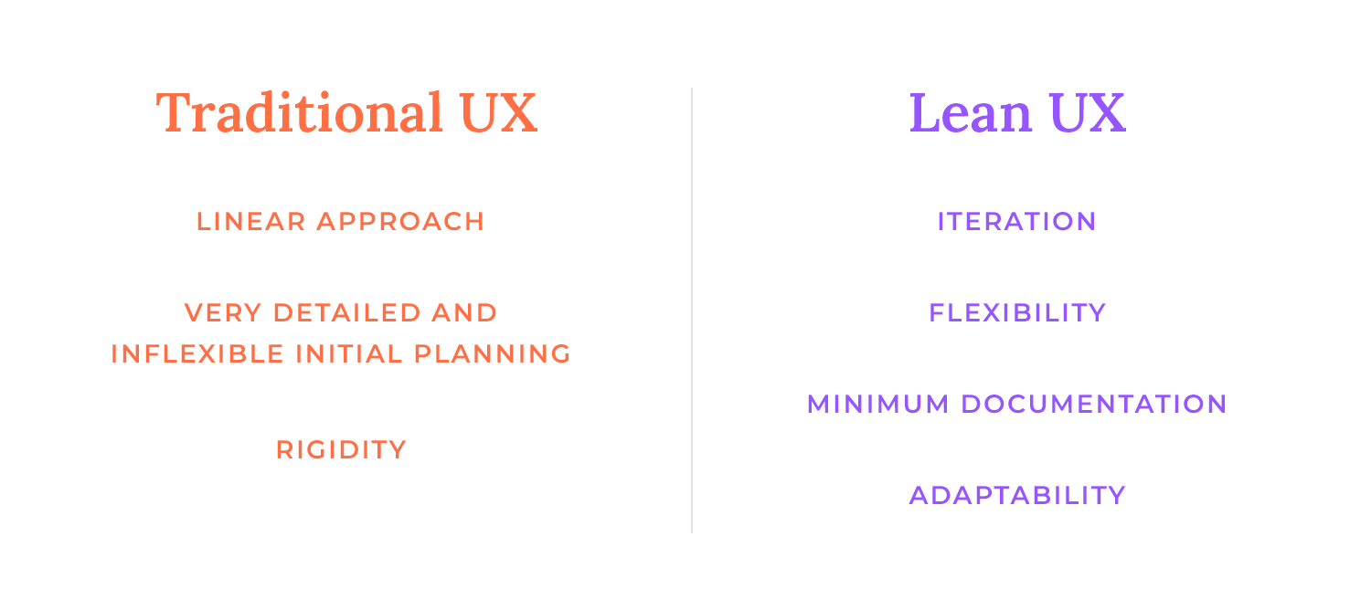
This agile approach allows for greater flexibility and adaptability, enabling you to respond quickly to changing requirements and user needs.
Additionally, Lean UX fosters cross-functional collaboration between designers, developers, product managers, and other stakeholders, breaking down silos and promoting a shared understanding of the product vision.
While Lean UX and Agile UX share some similarities, they have distinct focuses. Agile UX primarily focuses on the development side, ensuring design fits within the Agile framework. Lean UX, however, takes a broader view of the entire design process, including research, prototyping, and testing.
Agile UX focuses on collaboration between designers and developers to ensure a smooth development process. It often uses user stories and sprints to break down work into smaller chunks.
The Lean UX process, while also collaborative, emphasizes experimentation, learning, and rapid iteration, often using MVPs to validate ideas and gather feedback.
In terms of documentation, Agile UX often requires more detailed documentation, such as user stories and acceptance criteria. Lean UX, on the other hand, prioritizes outcomes over deliverables and focuses on minimal documentation. This allows for greater flexibility and adaptability, as it helps you respond quickly to changing requirements and user needs.
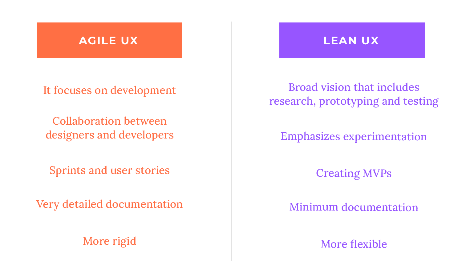
In essence, while Agile UX ensures that design aligns with the Agile development process, Lean UX takes a more holistic approach to the entire design process, emphasizing user-centeredness, experimentation, and rapid iteration.
In the realm of Lean UX, the emphasis shifts from delivering specific deliverables to achieving desired outcomes. Rather than obsessing over the completion of tasks or the creation of artifacts, Lean UX practitioners focus on the impact that these efforts have on the user experience.
Instead of fixating on creating detailed design specifications or comprehensive documentation, the Lean UX process encourages you to consider the end goal: how will these efforts enhance the user’s experience?
Collaboration is the lifeblood of Lean UX. Cross-functional teams, comprising designers, developers, product managers, and other relevant stakeholders, work together seamlessly throughout the entire design process. This breaks down silos and fosters open communication, both of which are essential for teams to achieve greater efficiency, innovation, and user satisfaction.
Cross-functional collaboration ensures that everyone involved in the project shares a common understanding of the product vision, user needs, and business objectives. This shared understanding reduces the risk of miscommunication, delays, and costly rework.
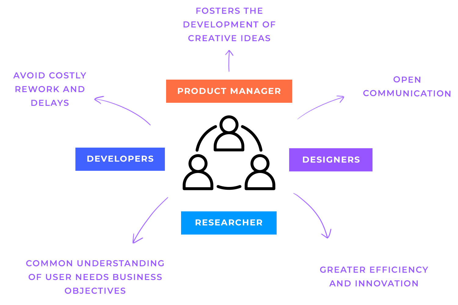
Additionally, by working together from the outset, teams can identify potential challenges early on and develop creative solutions.
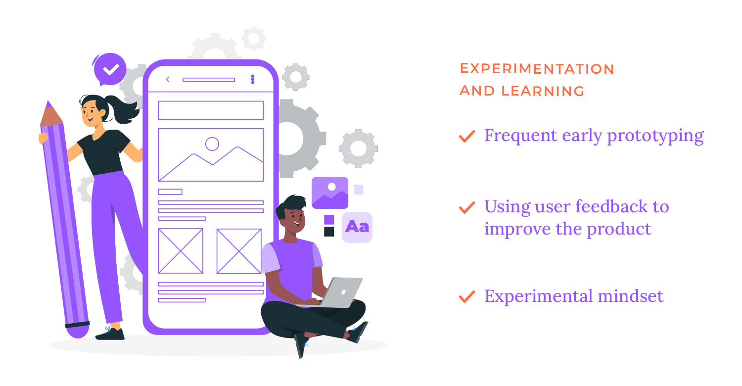
The Lean UX design process is all about that experimentation and learning business. You can make informed decisions and keep improving your designs by trying new things and obtaining user feedback. It’s similar to an enjoyable science experiment, except for building great products!
Early and frequent prototyping and testing allow you to identify issues and solutions. With user feedback, you can better grasp what users truly want, which is like being able to read their minds. It’s crazy!
Lean UX design teams can avoid creating products that no one wants by adopting an experimental mindset. This promotes an innovative culture where fresh concepts are valued and investigated. In the end, Lean UX teams can create products that people enjoy and businesses succeed by emphasizing experimentation and learning.
One of the core principles of Lean UX design is the relentless pursuit of eliminating waste. This involves cutting back on pointless meetings, documentation, and procedures that don’t immediately add value to the final output. You can increase productivity, cut expenses, and shorten time-to-market by concentrating on tasks that benefit the user.
Extensive paperwork, including comprehensive design requirements and protracted reports, is frequently part of traditional design procedures. Despite their apparent necessity, these documents can be time-consuming to produce and maintain, and they might not necessarily improve the final result significantly.
Conversely, the Lean UX design process places more emphasis on results than deliverables. It helps you steer clear of pointless paperwork and concentrate on tasks that directly influence the final product by focusing on the intended user experience.
The Lean UX process is characterized by a continuous cycle of build, measure, and learn. This iterative approach allows you to rapidly validate hypotheses, gather user feedback, and make data-driven decisions. Let’s take a closer look at what that means.
Rather than relying on assumptions or gut feelings, you can formulate testable hypotheses to guide your work. In the Lean UX process of incorporating hypothesis, you start by making educated guesses about how users might behave or what features they’ll like.
You then turn these guesses into testable hypotheses, such as “If we add a new feature, users will spend more time on our app.”

These hypotheses are specific, measurable, achievable, relevant, and time-bound (SMART) statements that address a particular aspect of the product or user experience.
You can create experiments, like as A/B testing or user surveys, to test these theories. This way you determine what works and what doesn’t by examining the outcomes, and then modify your designs accordingly.
A key component of the Lean UX design process is iterative feedback loops. With rapid testing and feedback, your team can make improvements and modifications that will ultimately improve the user experience.
This build-measure-learn-iterate cycle is the key to ensuring that products are always evolving and meeting consumer needs.
To formulate effective hypotheses, it’s essential to use the SMART method to ensure your hypothesis is clear and focused and to avoid vague or overly broad statements. Define specific metrics to measure the impact of your experiment, such as conversion rates, user engagement, or satisfaction scores.
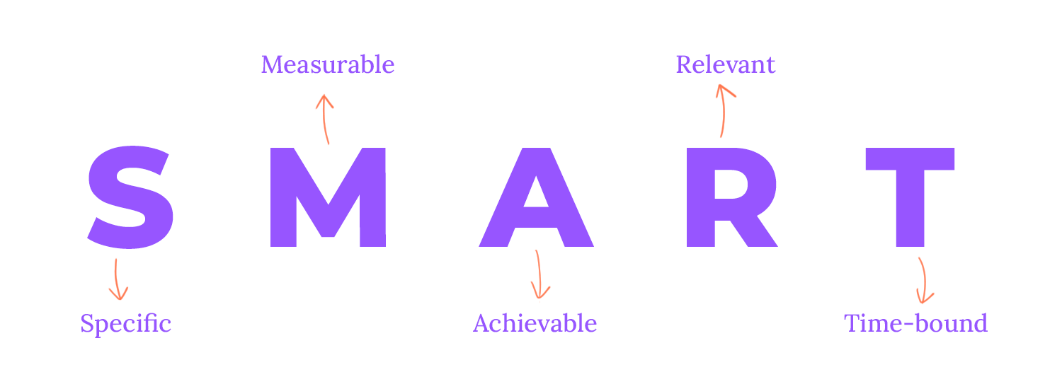
Your hypothesis should suggest a concrete action that can be taken to test it, such as redesigning a page or adding a new feature. Additionally, the hypothesis should align with your product goals and address user needs. Finally, set a clear timeframe for testing your hypothesis to ensure timely results and iterative improvement.
Example hypotheses
- Feature hypothesis:
“We believe that if we add a ‘quick checkout’ feature, we will increase conversion rates by 15% for mobile users.”
- Design Hypothesis:
“We believe that if we redesign the homepage with a more prominent call-to-action, we will increase click-through rates by 20% for first-time visitors.” - User Experience Hypothesis:
“We believe that if we reduce the number of steps in the onboarding process by 30%, we will increase user retention by 10% for new users.”
To validate hypotheses and accelerate improvements, the Lean UX process employs a variety of testing methods. A/B testing allows you to compare two versions of a design or feature to determine the most effective approach.
Usability testing involves observing users as they interact with a product to identify pain points and usability issues. Surveys and questionnaires provide valuable quantitative and qualitative data on user preferences and satisfaction. Card sorting and tree testing help understand how users categorize and navigate information.
Imagine watching someone try to use your website or app. You’d be surprised at the little things that can trip people up! That is what usability testing enables us to do. We can identify issues and make things simpler and more enjoyable by observing how real users interact with our products. It’s like getting a backstage pass to how users feel, and it’s incredibly valuable for creating great user experiences.
For websites and apps, A/B testing is similar to a scientific experiment. For example, we make two versions of a button or a headline and compare their performance. We can discover what works best for users by monitoring metrics like clicks and conversions. It’s a fantastic method to enhance our ideas and make data-driven decisions.
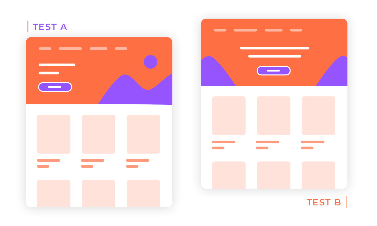
Similar to A/B testing, split testing involves comparing multiple variations of a design or feature. This technique is particularly useful for testing more complex changes, such as different page layouts or content structures.
You can determine the best strategy and adjust your designs by evaluating the success of several variations. This allows for an even more nuanced understanding of user preferences!
Particularly during early-stage design and rapid iteration, the Lean UX process frequently uses lightweight testing techniques to obtain fast feedback and validate assumptions. Guerrilla testing is one such technique, which entails evaluating your prototype or product in public settings with random individuals. You can quickly and easily get useful insights just by asking users to use your product and submit feedback.
Quick user feedback sessions are an additional efficient lightweight testing technique. A small group of users is gathered for these brief, unofficial sessions to provide input on a particular feature or design. You can spot possible problems and areas for development by observing user behavior and asking targeted questions.
These lightweight testing methods are incredibly valuable for gathering user feedback and validating design decisions. They are relatively low-cost, easy to implement, and can provide rich insights that inform the design process.
In the Lean UX design process, quick analysis of test results is crucial for rapid iteration and improvement. Instead of lengthy reports, you can just focus on identifying key insights and actionable takeaways.
Some strategies for efficient analysis include determining which metrics are most relevant to your hypothesis and focusing on analyzing those. For example, if you’re testing a new button design, you might prioritize the click-through and conversion rate.
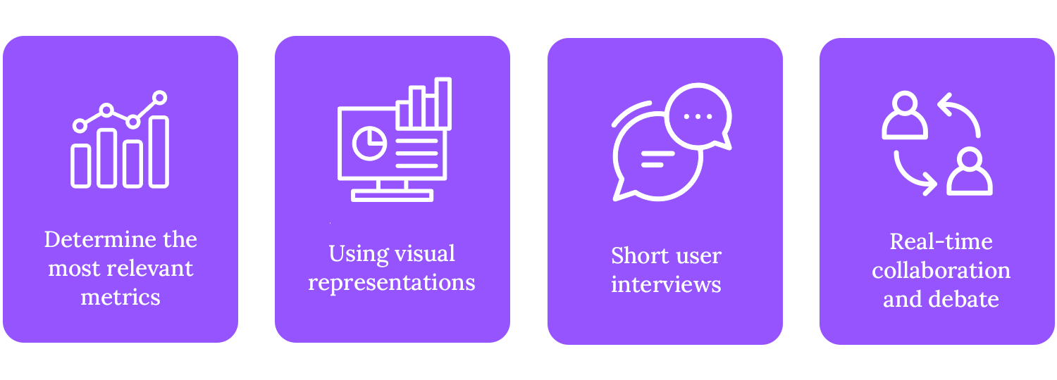
You can also employ data visualization by using charts, graphs, and heatmaps. Visual representations make it easier to spot patterns and anomalies. Also, it really helps to conduct short interviews with a few users to get their immediate feedback on the test results. This can help uncover unexpected insights and validate your findings.
And finally, remember to use tools that can facilitate real-time collaboration and discussion among team members to identify key insights and prioritize the next steps.
Free UX design tool to create wireframes, prototypes and user flows

Imagine a sprint – but for design! Lean UX design sprints are short, focused workshops where teams work together to solve specific challenges. It’s like a burst of creativity and problem-solving, all aimed at improving your product. These short, focused workshops are designed to tackle specific design challenges and generate innovative solutions.
A typical design sprint follows a structured approach:
First, clearly define the problem or opportunity they want to address. Next, unleash your creativity through sketching and brainstorming, generating a variety of potential solutions.
Then you can carefully evaluate these solutions based on their feasibility, desirability, and viability, selecting the most promising one. You can bring the solution to life using a prototyping tool, which can help you create a simple UI sketch, wireframe, or clickable mockup.

Finally, gather feedback from users through usability testing or other methods to validate their design and identify areas for improvement.
Design sprints foster collaboration, creativity, and a focus on user needs, making them an invaluable tool for any Lean UX team.
The Lean UX design approach is a continuous cycle of improvement where you regularly collect user feedback and modify accordingly. It functions similarly to a feedback loop, keeping our products fresh and exciting.
Regularly seeking feedback from users allows you to identify pain points, usability issues, and areas for improvement. This can be achieved through various methods mentioned previously, such as user testing, surveys, and analytics.
In addition to user feedback, it’s important to foster a culture of open and honest feedback within the team. Regular team retrospectives can be a valuable tool for reflecting on past projects, identifying lessons learned, and setting goals for future iterations.
When you receive feedback, you should analyze it carefully to identify key trends and insights. This information can be used to make adjustments to the design, such as refining the UI design, improving the user experience, or adding new features.
Feedback can occasionally point to a serious design problem or a change in the demands of the user. You might have to change course and go on a new path in certain situations. Lean UX is known for its agility, which enables you to react swiftly to shifting conditions.
In the fast-paced world of Lean UX, it’s crucial to balance effective documentation with efficiency. As we mentioned previously, lightweight documentation focuses on capturing the essential insights and actionable next steps, minimizing unnecessary overhead.
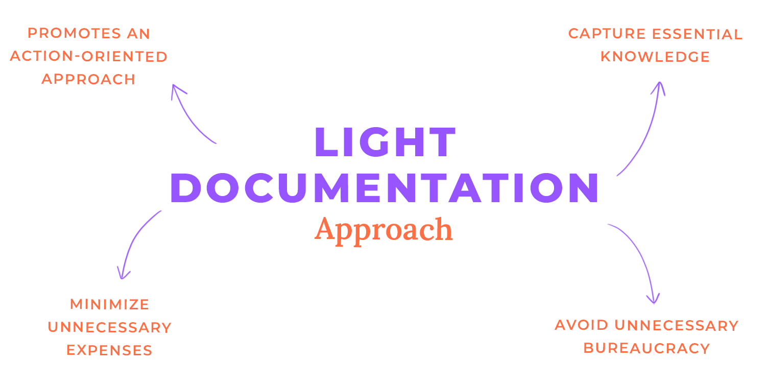
You can expedite the documentation process and devote more time to iterative design and testing by giving priority to essential components such as design decision diaries, usability testing reports, and user path maps.
These concise documents capture the essence of user feedback and design decisions, ensuring that insights are shared efficiently.
Adopting a lightweight documentation approach aligns with Lean UX principles, as it avoids unnecessary bureaucracy and promotes a focus on action. Furthermore, streamlining the documentation process helps you maintain momentum and deliver high-quality products more efficiently.
In the Lean UX deign process, visuals are a powerful tool for communication and collaboration. Visuals are more intuitive and easier to understand than lengthy written documents, making them ideal for quickly iterating on designs and gaining buy-in from stakeholders.
Wireframes, prototypes, flow diagrams, and storyboards are the visual tools that you and your team can use to collect feedback and efficiently communicate complicated concepts.
Let’s explore a bit of what those tools actually do. Prototyping for example, allow users to interact with a product before it’s fully developed, which helps identify usability issues and make necessary adjustments.
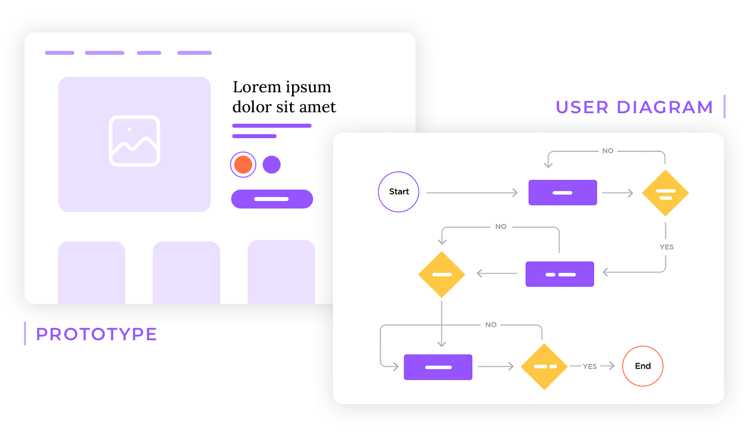
Wireframes and flow diagrams provide a clear overview of the user journey and information architecture, helping to ensure a seamless user experience. Storyboards, on the other hand, can be used to visualize user scenarios and explore different design possibilities.
Free UX design tool to create wireframes, prototypes and user flows

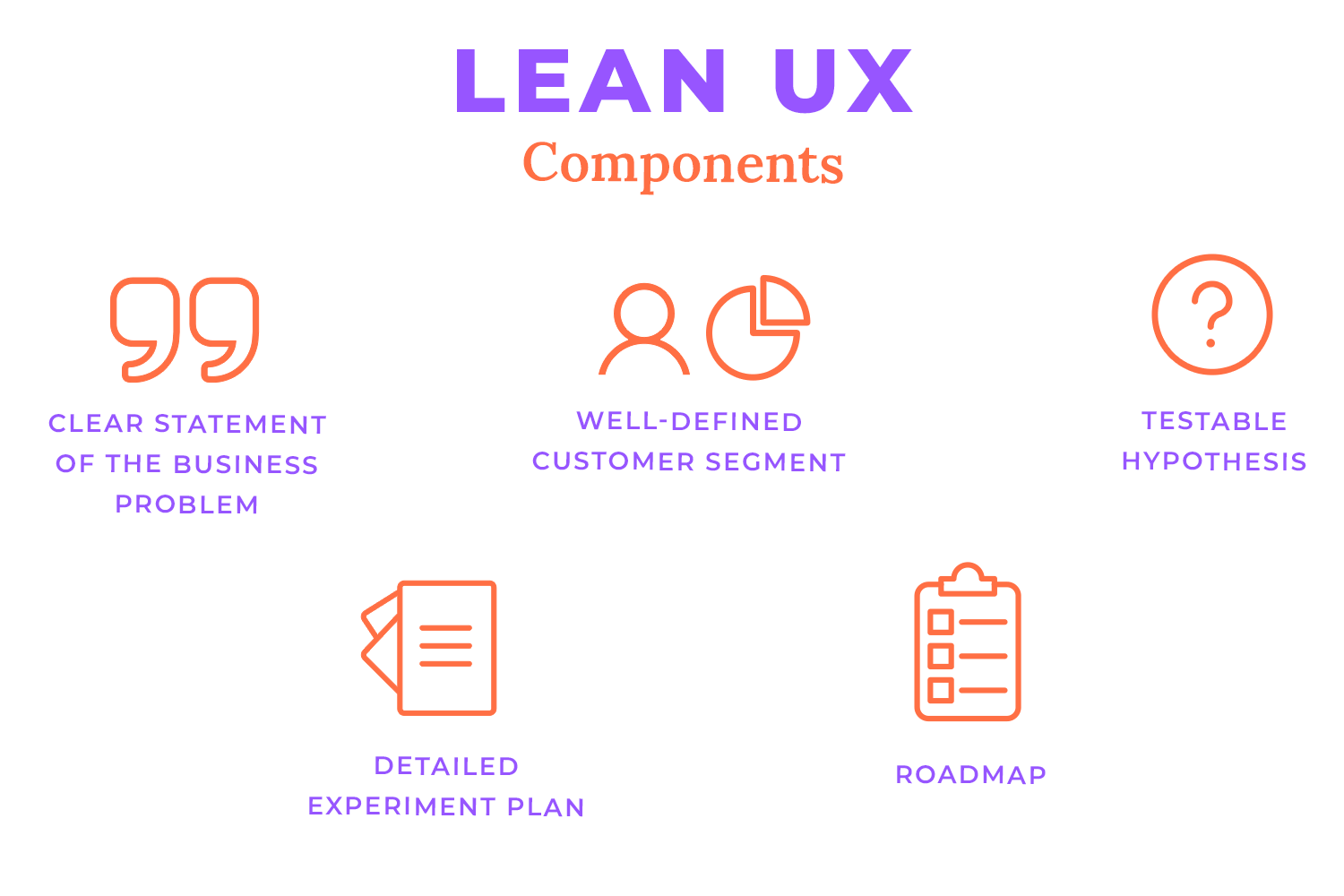
The Lean UX Canvas is a powerful tool that helps you focus on the “why” behind their work. It guides teams through a structured process of defining a business problem, identifying user needs, and developing hypotheses to test.
Key components of the Lean UX Canvas include a clear business problem statement, a well-defined customer segment, a testable hypothesis, a detailed experiment plan, and a roadmap for next steps.
Teams can use the Lean UX Canvas to prioritise hypotheses, stay focused on the issue, iterate rapidly, and bring the team together. With the use of this useful tool, you lower risk, and speed up development to enter the market faster.
As the co-author of Lean UX: Applying Lean Principles to Improve User Experience, Jeff’s hypothesis-based approach to user experience design has helped revolutionize product creation over the last ten years.
In the book, he and Josh Seiden combine lean ideas with design and strategy to build processes that are more collaborative, iterative and open. The result? Better teamwork, better transparency and, ultimately, better products. Products that people actually want to use.
In 2016, we spoke to Jeff about Lean UX, its impact on business, and his tips for building a user-centric design process. Oh, and he also told us about that time he ran away to join the circus. No, really.
Can you explain what Lean UX is, in your own words?
To explain it concisely: Lean UX is how we integrate user experience and design into Agile product development. It’s really an approach to bring the customer into the center of the conversation consistently, and to do so in a cross-functionally collaborative way, working with colleagues in engineering, product management, marketing, and QA.
The point of that is to experience our ideas together as a team, so that we build a shared understanding of what’s working and what’s not. Instead of debating “does this work, does this make sense”, we actually get to the fun part of making products and services, which is figuring out how to solve problems. I think that’s the biggest benefit of practicing Lean UX.
Give us an example of what a Lean UX product development process looks like and where it fits in with Agile
If you think about Agile in the way it’s being adopted today – which is different from the way it was intended– but if you think about it in the way it’s adopted by most companies, Agile is focused on increasing the pace of delivery of software. The Agile folks call it ‘velocity’ – how to get more stuff out the door faster.
Where that fails is it doesn’t help teams determine what they should actually be working on, and it doesn’t help teams understand what done actually means. When you optimize velocity, done means “it works, we shipped it”; but that doesn’t tell us whether customers use it, whether it adds value, whether it makes our business more successful, etc.
And so what Lean UX does is it adds a brain, a decision-making mechanism into the Agile software delivery process.
We do that by discovering collaboratively what we should be working on. We take a look at what we’re tasked with doing, and we try to understand the business problem that we’re trying to solve. Baked into that business problem are typically a whole lot of assumptions about who the customer is, what value they might gain from a product or feature, etc.
So let’s extract those assumptions, and then using those assumptions we create hypotheses – testable statements that help us think about how we can potentially solve this business problem.
We then start to run experiments round those hypotheses to get a sense of whether they’re valid. Those experiments take many forms – landing page tests or feature fakes, for example – but even earlier than those tests you can bring in a lot of design-based tests like prototyping, paper sketches or customer interviews.

These are all ways where you can start to build a dialogue with the folks you’re building products for, to understand whether or not you’re actually building something they want.
So, outlining the steps of a Lean UX process: we take a cross-functional team, we get them to declare their business assumptions and write hypotheses; we start designing some solutions together to figure out how to build lightweight experiments against those designs; then we use that feedback to determine whether this is still a good idea and whether we should invest in developing it.
We’re moving away from the feature as the measure of success, and proposing a change in customer behavior, an outcome, as a measure of success.
Tell us a true story that illustrates why large enterprises should be investing in UX, and how they should be doing that?
There are several case studies in the book. One of my favorite is PayPal . We started engaging with them 4 years ago, and when we started working with them they would write 30 page specs to change one line of copy on the website, and it would take 2 months to implement.
Now they’ve taken a tremendously healthy step forward in modernizing their processes, the integration of design, front-end engineering and product management. They’ve facilitated a tech environment that allows them to build experimental prototypes, and then if those prototypes succeed they can move seamlessly from prototype to production.
Integration of their various disciplines has moved them away from heavy documents and deliverables, which kept them from moving forward with any kind of speed for a long time.
Another example is AutoTrader UK. As an organization they realized that implementing Lean UX is not a standalone silver bullet; they’ve taken the ideas behind Lean UX and have built cross-functional teams that are tasked with changing customer behavior.
They realize that this is a cultural shift as well, so they are changing how the teams are incentivized, measured for success and they are shifting the way they assign work to the teams.
One of the biggest challenges of product discovery or Lean UX is you frequently discover something that goes against what you were tasked with doing; that happens a lot, because what we’re tasked with doing is built on assumptions, and if we go in there and start to test those assumptions we may find that that task is the wrong thing to be doing.
In many organizations that’s not a very comfortable or safe conversation to have; very few people feel comfortable going up to their boss and saying ‘that’s a bad idea, we shouldn’t do that’. And so what AutoTrader UK has done is create a culture where evidence trumps: you can come in, present the evidence and use it as a justification for doing one thing instead of another.
That’s a cultural shift that is needed to support this way of working. It’s a big shift for companies to adopt this way of thinking and this way of working.
Top tips for building a strong UX team within an enterprise?
I think the best thing you can do is to start engaging with customers as regularly and consistently as possible, and bring as many people as you can to the conversation. The more we can expose people to customers, the more humility we start to drive into the organization and the resistance to Lean UX, product discovery and outcome-based management starts to soften. That’s key.
Jared Spool talks about exposure hours – the minimum hours per month that staff are required to spend with customers – and companies that mandate exposure hours build more successful products. By far that’s the most successful tactic.
The second tip is to build small dedicated cross-functional teams. Build these pods of product, design and engineering that sit together (if they’re distributed at least make sure they’re in the same or very close time-zones) working on the same project for an extended period of time.
You want these folks to get to know each other, to build trust, shared language and rapport, and through that simple spending of time together they start to look at different ways of working and respect each other’s opinions more. They start to think of themselves as a unit that wins or loses together.
If you already work in a company and you’re trying to get this way of working to be more mainstream, find the one executive that has already bought into the idea. There are executives in your company that have read all the lean books; find that executive and ask them to sponsor some kind of pilot initiative.
One of the most important things to getting this way of working accepted is transparency: people fear change, they fear for their job, their bonus, their salaries, and if you try to change stuff too quickly without telling them why, they’ll resist.
The more transparent you can be about why you’re trying to change and what that change looks like, the more likely you’ll be to drive meaningful impact in your organization.
You’ve spoken about Amazon as something of a software development paragon – what do they do that works?
I’ve spoken about Amazon both for good and bad in the past! There are things they do culturally as company that are right in line with this way of thinking – they put the customer first, solving real customer problems, delivering customer value and waiting for the business value to come from that as opposed to just shooting for short-term business gains.
Amazon has always had a customer centric point of view, but on the other hand they also have CEO/Founder who is very smart and opinionated, and he forgets some of these customer-centric mantras sometimes. Look at the Fire phone – that was a Bezos driven project focused solely on competing with Apple, that didn’t take into account any assumptions about customer value and that delivered a product that was DOA.

The company learned a very valuable and expensive lesson. If you hear Bezos talk about it today, he says, “we’re a huge company, we took a huge risk, and they only way we’re going to continue to grow and get better as a company is to take these risks”.
Very few companies are on the scale of Amazon, but taking small risks, doing experiments and running tests provides insight into where to go next with products and services. Lean Start-Up, Agile, Lean UX, product discovery – all of these things are risk mitigation tactics. That’s it.
If you could make risk mitigation into a sexy book title, you could sell it just like that. You’re reducing the risk of making things that people don’t want.
The second edition of your book is coming out in October, co-written with Josh Seiden – what updates have you made, and how has the Lean UX landscape changed since you first published?
It’s been 4 years since we turned in that manuscript: in those 4 years there’s been an even more rapid adoption of Agile, there are a lot more people practicing Lean UX and our thinking around what we wrote initially has evolved.
We wanted to update the book to include new case studies, explicit conversations around design sprints, the concept of dual track Agile and dual track Scrum, and to really update the thinking to be more strategic.
While the book is still practical and tactical, when we wrote it initially it was a very tactical designer to designer conversation, and we wanted to be more strategic because that’s where they questions that we’re seeing these days are headed.
People want to know how to get buy-in for this way of working, how to build it into roadmaps and planning, and how to use data to make decisions. We added a lot of those elements into the book and modernized it, and frankly just wrote it a bit better. We’re just better writers than we were 4 years ago!
There’s a hunger for participation in the strategic planning process by UX designers and designers in general. In most organizations designers don’t get that privilege, so this way of working helps make the design process more transparent, and hopefully more obvious to the folks who strategic decisions. Design and UX are critical to those strategic conversations.
Is it true you ran away and joined the circus after graduating? What did it teach you? What out-there advice would you give young graduates hoping to start their careers in UX?
It’s true! I was in my last week of university I wasn’t sure what I was going to do. I was partially a music major and partially a media production major, the circus was coming through town and they needed a sound guy.
It was a gig, and it paid more money than I’d ever made in my life; so I graduated on Saturday and I joined the circus on Monday, travelling with them up and down the East coast for 6 months. It was crazy and I hated it for a while, then I kind of learned to love it.
My advice is, do that crazy shit. I’ve been telling circus stories for 20 years and I wouldn’t have those stories if I didn’t do this crazy thing. I learned a ton about a world that I never knew existed, and in hindsight I wouldn’t trade it for anything. As crazy stuff like that comes up, take the risk.
Folks always ask me what’s a good way to break into design or Lean UX, and my answer is just start doing something – you don’t have to do it all, or transform a company or department top to bottom, but pick a thing that you care about and activity that you think will add value and take the initiative to drive it forward – take that risk.
A well-rounded Lean UX team, ideally, should include a Product Manager to define the product vision and set strategic goals, a UX Designer to focus on user needs and create user-centered designs, a UI Designer to craft visually appealing and intuitive interfaces, a Developer to translate designs into functional code, and a UX Researcher to conduct user research and inform design decisions.
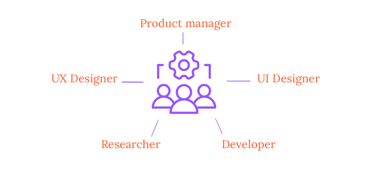
Depending on the specific needs of the project, additional roles like content strategists or UX writers may be included. Assembling a team with diverse skills and perspectives helps organizations create a collaborative and innovative environment.
Effective communication is essential for the success of any Lean UX team. Regular check-ins, such as daily stand-ups and weekly retrospectives help keep everyone aligned and informed about the project’s progress.
Additionally, using shared tools and platforms like Justinmind, Jira, and Slack facilitates collaboration and ensures that everyone is on the same page.
To foster a culture of open and honest communication, it’s important to create a safe space where team members feel comfortable sharing their ideas and concerns. Active listening and providing constructive feedback are also crucial for building strong relationships and resolving conflicts.
In a Lean UX team, clear roles and responsibilities are essential for effective collaboration and efficient workflow. While specific roles may vary depending on the project, common roles include Product Owners, UX Designers, UI Designers, Developers, and UX Researchers.
Product Owners are responsible for the product vision and strategy, while UX Designers focus on understanding user needs and creating user-centered designs.
UI Designers bring designs to life, focusing on the visual aspects of the product. Developers translate designs into functional code, and UX Researchers conduct user research to inform design decisions.
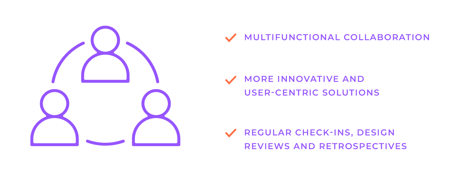
While each role has its focus, it’s crucial to foster a collaborative environment where team members can cross functional boundaries and contribute to different aspects of the project. This cross-functional collaboration can lead to more innovative and user-centric solutions. Regular check-ins, design reviews, and retrospectives are important to ensure alignment and address any issues that may arise.
An MVP is a version of a product with just enough features to attract early adopters and validate a product idea. In the context of Lean UX, the MVP is not the same as the concept of MVP in sports (most valuable player), however, it is a valuable tool for gathering user feedback early in the development process.
By launching a minimal product version, teams can quickly test their assumptions and identify potential issues. This iterative approach allows for rapid learning and improvement, ensuring that the final product meets the user’s needs.
To create a successful MVP, it’s essential to prioritize features that address the core problem or opportunity. Avoid feature creep – which often happens when additional features are added without consideration of their impact on the core functionality – and focus on delivering a simple, intuitive user experience.
Gather user insights through research and testing to ensure that the MVP meets user needs and expectations.
Once the MVP is launched, it’s crucial to gather feedback and analyze user behavior. Conduct A/B tests to compare different design variations and identify the most effective approach. Additionally, usability testing can help uncover pain points and areas for improvement.
Future growth and scalability are crucial factors to take into account when creating an MVP. Building a flexible foundation that can accommodate future changes and additions helps teams avoid costly redesigns and re-engineering efforts.
Finally, track key performance indicators (KPIs) to measure the success of your MVP. Use data-driven insights to inform future iterations and product improvements.
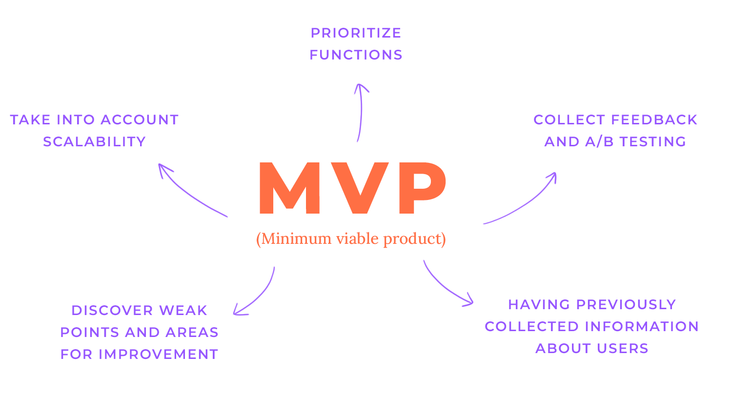
Iterative MVP development is a powerful approach that allows you to build, measure, and learn in rapid cycles key steps in iterative MVP development include:
- Initial launch: Release the MVP with core features to gather early user feedback.
- Gather user feedback: Conduct user testing, surveys, and analyze user behavior data.
- Identify areas for improvement: Analyze feedback and identify opportunities for improvement.
- Prioritize features: Determine which features to prioritize for the next iteration based on user needs and business goals.
- Iterate and re-launch: Update the product with new features and improvements, and relaunch it to gather further feedback.
Free UX design tool to create wireframes, prototypes and user flows

Aligning UX design activities with development sprints is essential to ensuring a smooth transition between Lean UX and Agile. This synchronisation guarantees that UX design is an essential component of the development process and permits a seamless flow of work.
Key strategies include creating a shared product backlog, conducting early user research and design, and conducting mini-design sprints within each Agile sprint. Teams can successfully close the gap between design and development and produce high-quality products by using these strategies.
To fit UX design into Agile’s two-week sprints, we need to be strategic. Prioritization is key. We should focus on the most important features that will deliver the most value to users.
Breaking down tasks into manageable chunks, focusing on high-value features, and allocating specific timeframes can align design work with the sprint timeline ensuring a steady flow of work and timely delivery of high-quality designs. This approach integrates UX design seamlessly into the Agile development process.
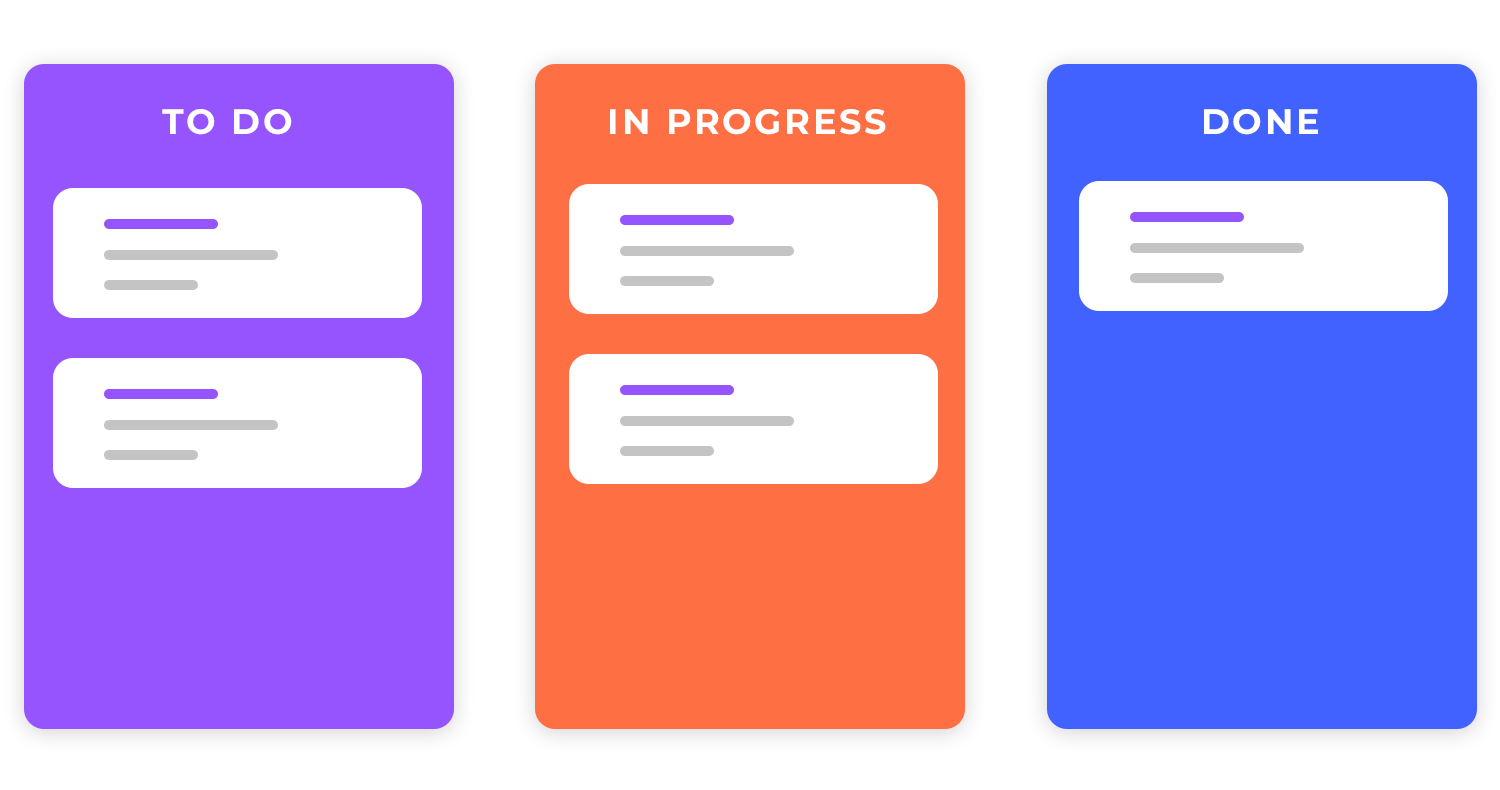
Teams may improve their workflows and produce even better outcomes by thinking back on previous sprints and recognising lessons learnt. UX design is kept in line with the changing requirements of the product and its users thanks to this iterative process.
Agile and Lean UX both emphasize ongoing development. We can produce better products by iterating on designs and continuously collecting consumer feedback. A/B testing facilitates data-driven decision-making, and low-fidelity prototypes enable rapid idea testing and feedback gathering.
So, if all it takes is a little Lean Startup magic, why aren’t all companies using this approach? Taking the Lean UX design approach isn’t always easy for big companies. Let’s go over why that is.
One big challenge in using Lean UX is that some people like collecting lots of paperwork. But Lean UX is about doing, not documenting. To address this, teams can prioritize essential documentation, leverage visual tools, and foster a culture of shared understanding to break down silos and ensure everyone is aligned.
As we keep drilling into your head, Lean UX is all about speed and agility. But sometimes, moving too fast can lead to quality issues. To balance speed and quality, you can use techniques like automated testing and continuous integration.
These tools help us catch bugs early and ensure that our product is always working as expected. Also, they help set clear quality standards that build a strong foundation for the product.
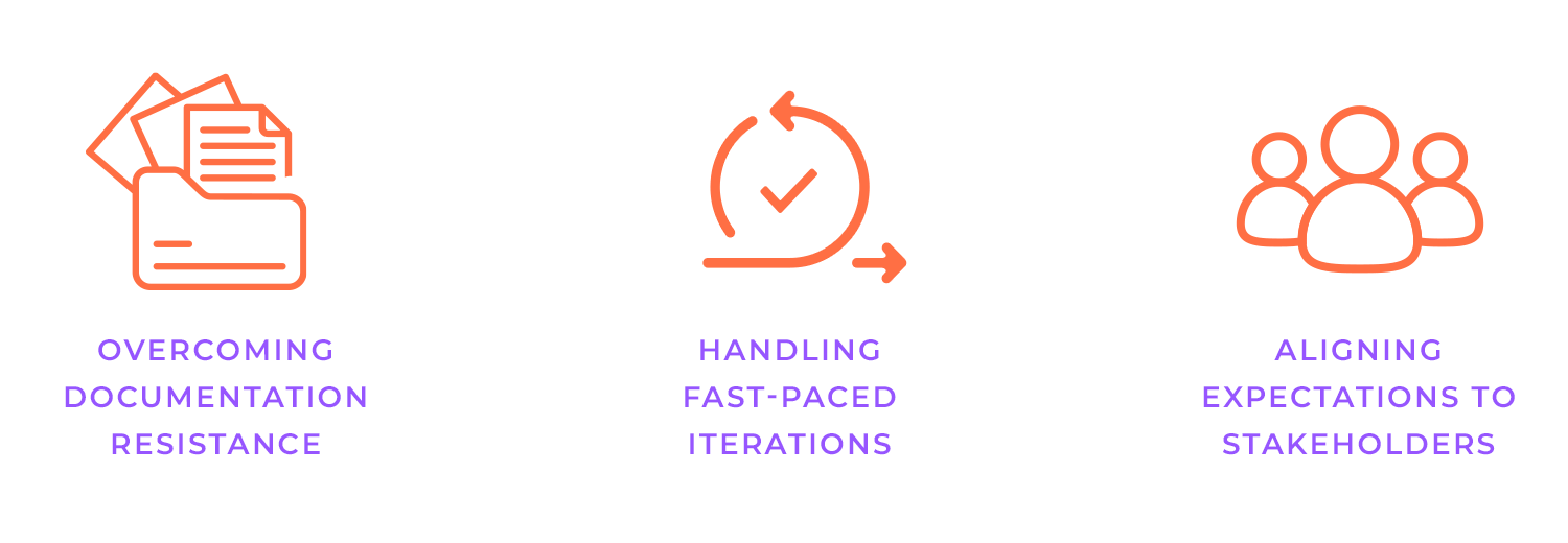
Stakeholders accustomed to traditional, waterfall-style development processes may struggle to adapt to the iterative nature of the Lean UX design process. They may prefer detailed plans and extensive documentation, rather than the more flexible and adaptive approach of Lean UX.
You can include stakeholders in the process to win everyone over to Lean UX. You can gradually win them over by explaining the advantages of Lean UX, such as faster releas dates and happier users. It all comes down to working together and demonstrating the benefits of this strategy.
To stay ahead of the game, Lean UX teams should always be learning and adapting. Regular team retrospectives, knowledge-sharing sessions, and experimentation are key to keeping things fresh. Teams can guarantee that their products are always state-of-the-art by staying up-to-date on the most recent developments in technology and trends.
Also, to ensure the successful implementation of Lean UX, consider the following tips: build strong relationships, prioritize user research, embrace failure as a learning opportunity, celebrate successes, and remember to stay flexible!
Hopefully, we have touched on just about everything you need to know to get started on your Lean UX design journey. If you’ve read until the end, then you obviously have the will to learn and change the tide at your workplace! This will be a decision that you won’t regret, trust us.
Best of luck to you!
PROTOTYPE · COMMUNICATE · VALIDATE
ALL-IN-ONE PROTOTYPING TOOL FOR WEB AND MOBILE APPS
Related Content
 Learn how to design better e-learning platforms with user-centered UX principles, real examples, and high-fidelity prototyping tips to boost engagement and learning outcomes.13 min Read
 Infinite scroll keeps users engaged, but it’s not always the best choice. This guide breaks down when to use it, when to avoid it, and how to design it right.14 min Read
 Learn how to design web and mobile app prototypes, how to test them and what to look for in a prototyping tool in this complete guide.15 min Read
