Microcopy may be mini, but it can have a macro impact on user experience. Check out these 15 examples and start writing great UX microcopy.
When was the last time you filled in a form online, subscribed to a newsletter, or even just clicked a button? It’s a safe bet that you did at least one of these today and, if you did, you interacted with microcopy. The thing is, you might not even have noticed it.
Design and prototype effective microcopy in your web and mobile apps with Justinmind

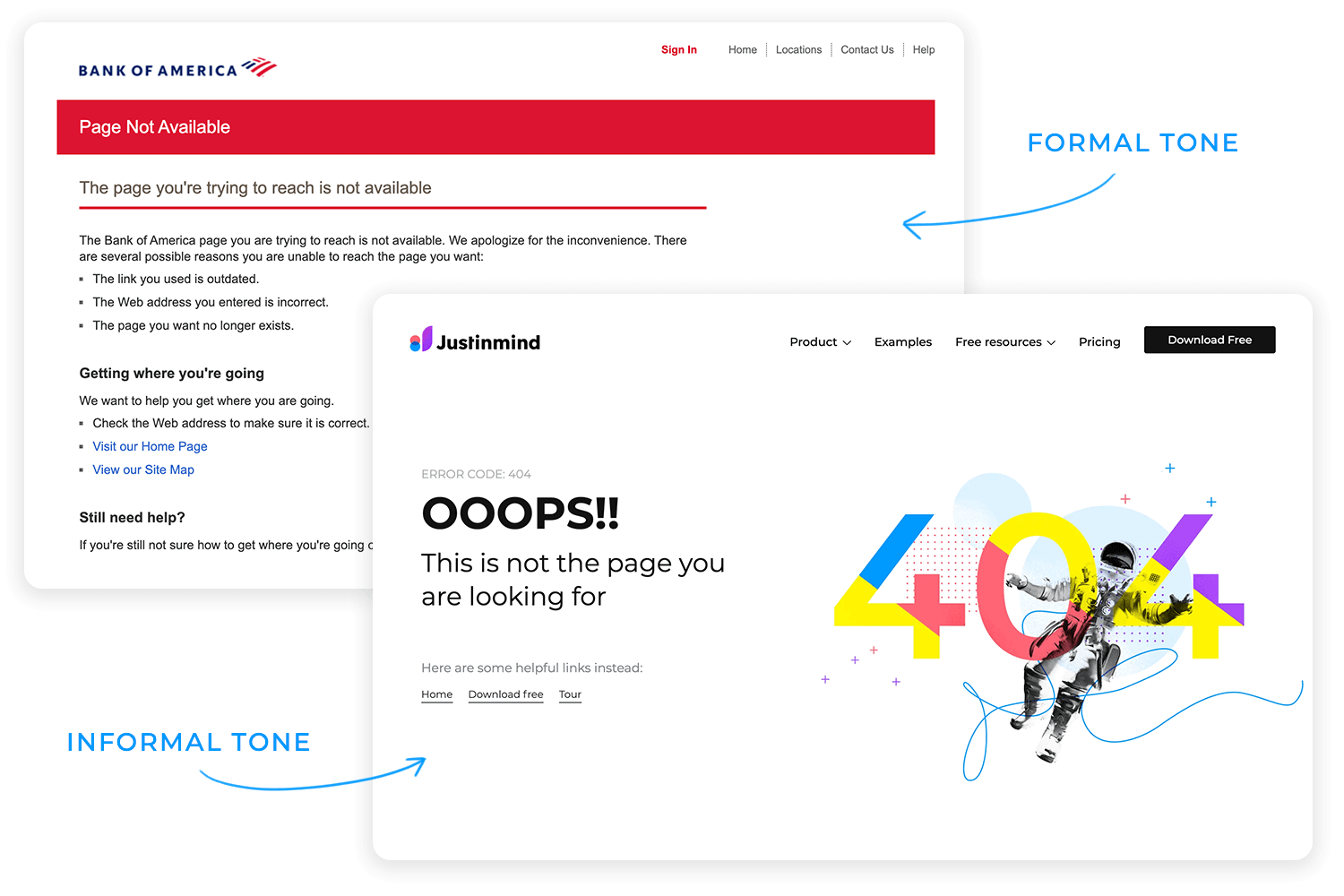
Good microcopy – those snippets of text that guide you through an interface – is often (but not always) unobtrusive and instructive. A phrase or even just a single word that changes your interaction with and your attitude to the interface, making both more positive. Think about it – you land on a 404 error message. Which one gives you a better user experience?
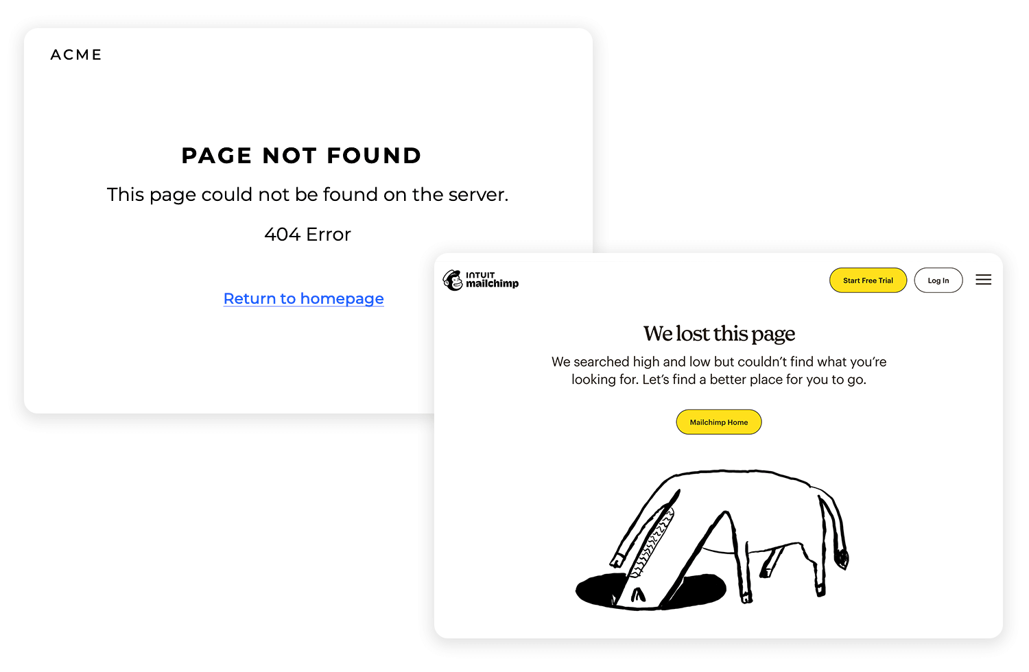
Exactly. And that’s good microcopy.
Despite its diminutive size, writing awesome microcopy can be a potent tactic for engaging your users: not only does it nudge them along user flows, but it also allows for better user interaction. Sure, marketing copy is vital for initiating dialogue with your users or potential users, but keeping them onboard with your product during months and years is equally important.
As designers, we tend to think about UI, flows, fonts, animations and interactions, but sometimes there’s nothing better than actually speaking to your user one to one. Or at least making them feel like you are.
Microcopy is the unsung hero of digital experiences. It’s those tiny bits of text sprinkled throughout apps, websites, and digital products like the words on buttons, the hints in forms, and even the messages that pop up when something goes wrong. These small pieces of writing might seem like background noise, but they do a lot of heavy lifting. They guide, reassure, and sometimes even delight users, making the whole experience feel more human.
Think of microcopy as the voice of the product, speaking directly to the user in moments where clarity or encouragement is needed most. For example, instead of a cold “Password invalid,” microcopy might say, “Oops! That password doesn’t match. Need help resetting it?” Suddenly, the message feels less like a scolding and more like a helping hand.
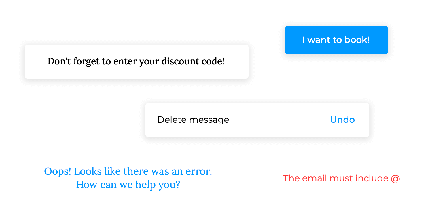
Microcopy works behind the scenes to make digital interactions seamless. It ensures users know where they’re going, what they’re doing, and why it matters. It’s the reassuring nudge to keep going or the playful comment that makes a 404 error page feel less like a dead end and more like an inside joke.
Microcopy might be small, but its impact is huge. It simplifies complex interactions, taking tasks that could be overwhelming like filling out a form or navigating a multi-step checkout, and making them feel approachable. It translates technical language into something users instantly understand, reducing friction and frustration. Like the difference between “I give up” and “I’ve got this.”
But microcopy does more than just clarify of course, it also builds trust. Imagine you’re about to enter your credit card details, and a line of text reassures you, “We’ll only charge you after your free trial ends.” That tiny phrase works wonders. It calms fears, answers unspoken questions, and encourages action. Trust is fragile online, but microcopy acts as a steady hand, guiding users through uncertainty.
It’s also the glue that holds the experience together. Without thoughtful microcopy, even the most visually stunning designs can fall flat. Imagine encountering an error message that says, “Error 104.” What does that mean? Now imagine instead, “Hmm, we couldn’t process that. Let’s try again or contact us if the problem persists.” It transforms confusion into clarity and makes users feel like the product is on their side.
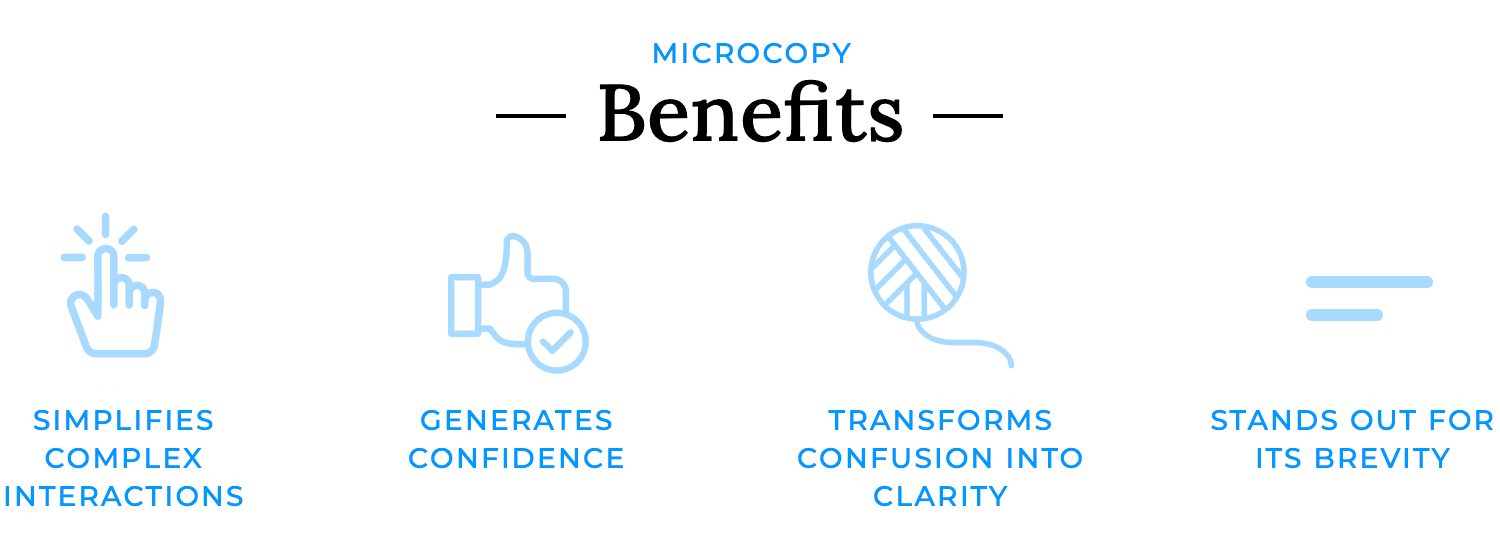
The beauty of microcopy is in its brevity. It doesn’t need to shout to be heard. A single word change like swapping “Submit” for “Let’s Go!” can shift the tone of an interaction from robotic to conversational. These small tweaks make a product feel alive and approachable, as if it’s built not just for users but with them in mind.
Microcopy doesn’t just smooth the user’s journey; it improves it. It turns ordinary interactions into moments of connection. It reassures when things go wrong, celebrates when things go right, and even sneaks in a bit of humor to lighten the mood. It’s not just writing, it’s an experience in itself. And while it might be small, microcopy is what makes users feel like they’re navigating a product designed just for them.
Design and prototype effective microcopy in your web and mobile apps with Justinmind

Creating effective microcopy isn’t just about writing, it’s about understanding your users, your brand, and the moment. Whether you’re helping someone complete a form or guiding them through a tricky error, these practices will guarantee your microcopy is clear, impactful, and user-friendly.
Be clear and concise: when it comes to microcopy, less is more. Users aren’t looking for a novel, they’re looking for direction. A short, direct phrase like “Create your account” is far more effective than a wordy explanation. Every word should earn its place, guiding users without overloading them.
Stay consistent with your brand: microcopy is your brand speaking to the user, so make sure it always sounds like you. Whether your tone is friendly, professional, or playful, keep it consistent across all interactions. This builds trust and reassures users that they’re in the right place.Understand user needs: great microcopy solves problems before they arise. If a form asks for a phone number, add a line like “We’ll only use this for order updates.” Addressing unspoken questions upfront makes users feel cared for and confident.

Test and iterate: microcopy is not a one-and-done deal. Test different options to see what resonates with users. For example, does “Sign Up” perform better than “Get Started”? User behavior will guide you to what works best.
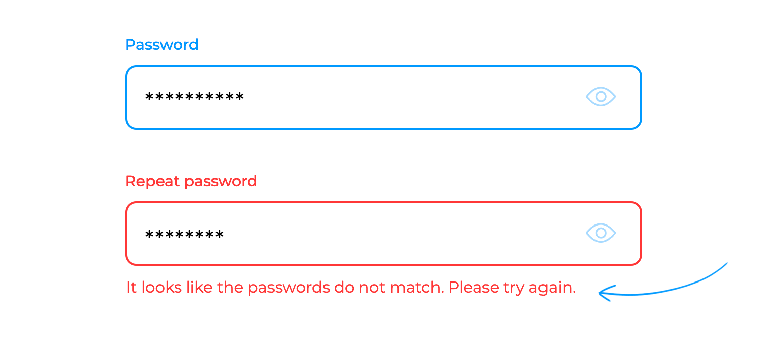
Write positive error messages: mistakes happen, but they don’t have to ruin the experience. A helpful error message like “Looks like there’s a typo, try again!” is far better than a blunt “Invalid input.” Use these moments to encourage and assist.
Be inclusive and accessible: good microcopy works for everyone. Use plain language, avoid jargon, and ensure it’s accessible to users with disabilities. A welcoming product is one that speaks clearly to all its users.
Adapt to your industry: not every tone works everywhere. A playful “Oops!” might be perfect for a fashion app but feels out of place in a financial platform. Tailor your microcopy to your audience and industry to keep it relevant and effective.
Even with the best of intentions, microcopy can sometimes trip up users instead of helping them. Here are some common missteps to watch out for, and how to steer clear of them:
- Writing in a way that’s unclear or confusing: if your microcopy leaves users scratching their heads, it’s not doing its job. Imagine seeing “Operation failed: code 458” and having no clue what to do next. Keep it simple, clear, and to the point. Users will thank you.
- Using complex or technical language: jargon is like a secret handshake that only a few understand. If a message sounds like it belongs in a developer’s manual, it’s time to rethink it. Swap out “authentication token invalid” for something human, like “Looks like there’s an issue with your login, try again.”
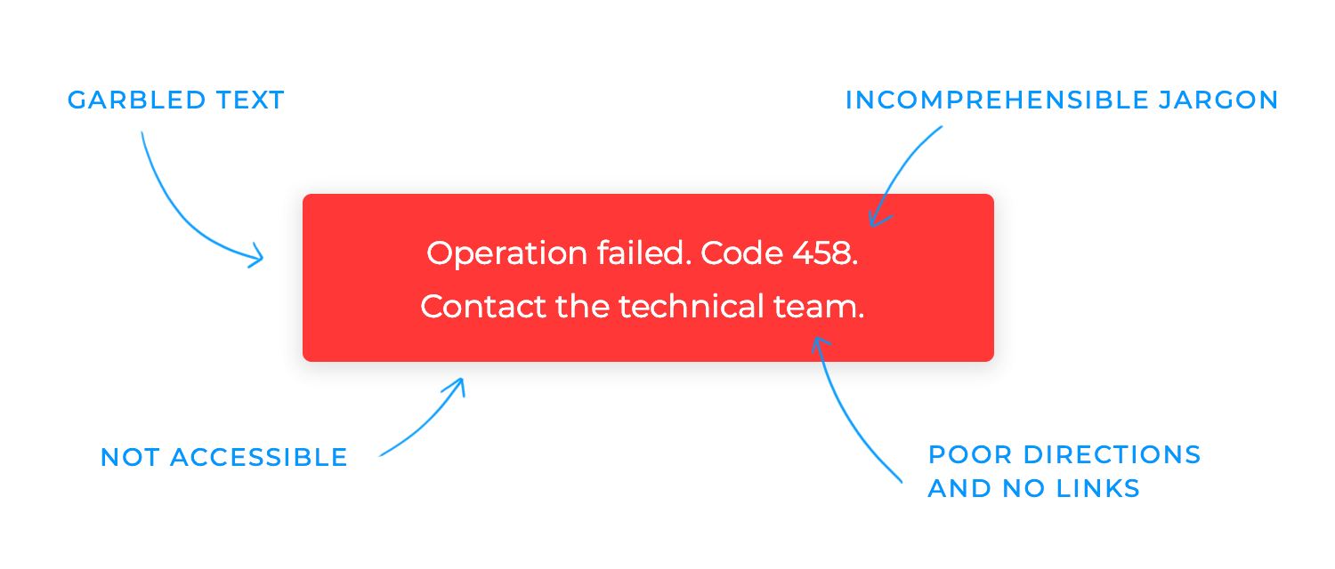
- Forgetting about accessibility: microcopy should work for everyone, not just those who see and interact with the interface the same way you do. Phrases like “Click the green button” leave out users who rely on screen readers or other assistive tech. Always think inclusively.
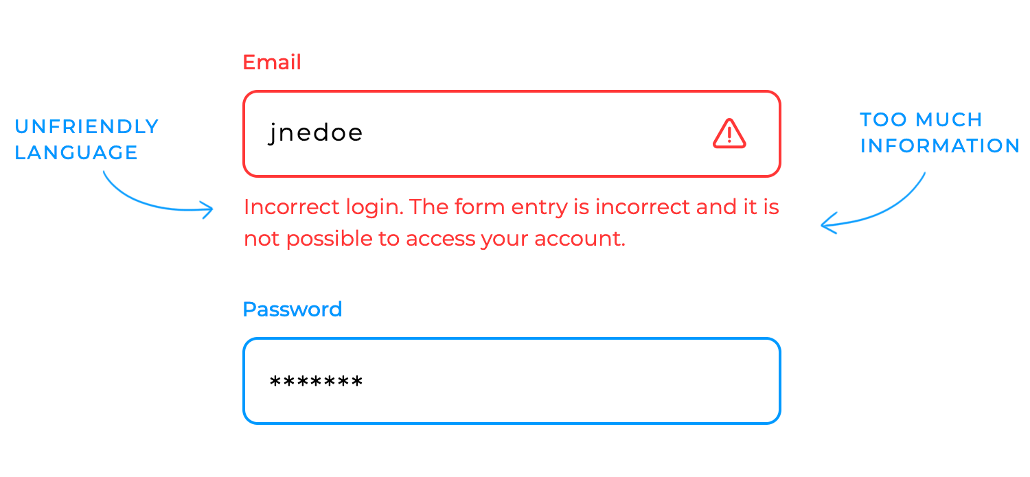
- Giving too much information at once: ever tried reading a form label that’s practically a paragraph? It’s overwhelming. Microcopy is meant to guide, not drown users in details. Focus on what’s most important for the moment.
- Using harsh or unfriendly language: mistakes happen, and users shouldn’t feel bad for making one. “You did it wrong” isn’t helpful. A gentler nudge, like “Oops! That didn’t work. Let’s try again,” can make all the difference.
- Being inconsistent in tone or style: imagine a fun, playful app suddenly throwing out a robotic error message. It’s jarring. Keep your tone steady and true to your brand so users feel like they’re in familiar territory.
- Skipping testing: what sounds great in your head might not land with real users. Skipping testing is like skipping a dress rehearsal; you’re setting yourself up for surprises. Test, tweak, and evolve your microcopy based on feedback.
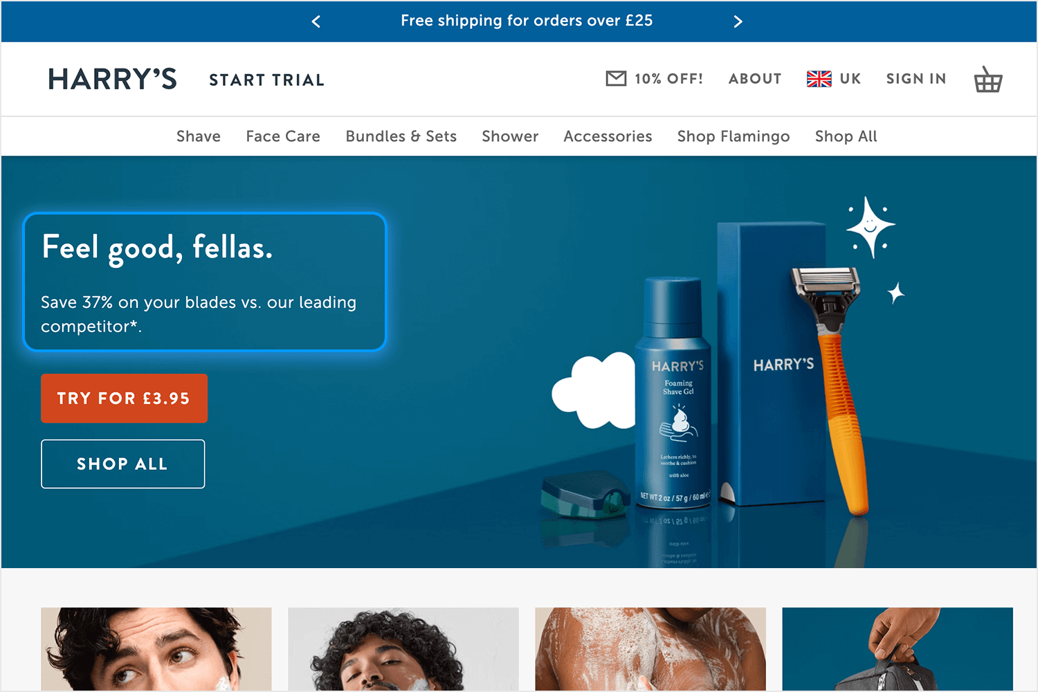
Harry’s nails the art of approachable microcopy with “Feel good, fellas.” It’s simple, casual, and welcoming, like a friend giving you a nudge in the right direction. Instead of bombarding the user with overly formal language, this headline sets a relaxed tone while staying perfectly aligned with their brand. The follow-up “Save 37% on your blades vs. our leading competitor”, is direct and practical, offering immediate value to back up the friendly introduction.
And then there’s the call-to-action: “Try for £3.95.” It’s not just a button; it’s an invitation that feels achievable and low-risk. Together, the copy balances a personable tone with a sense of trustworthiness, easing potential hesitations while keeping things light and encouraging.
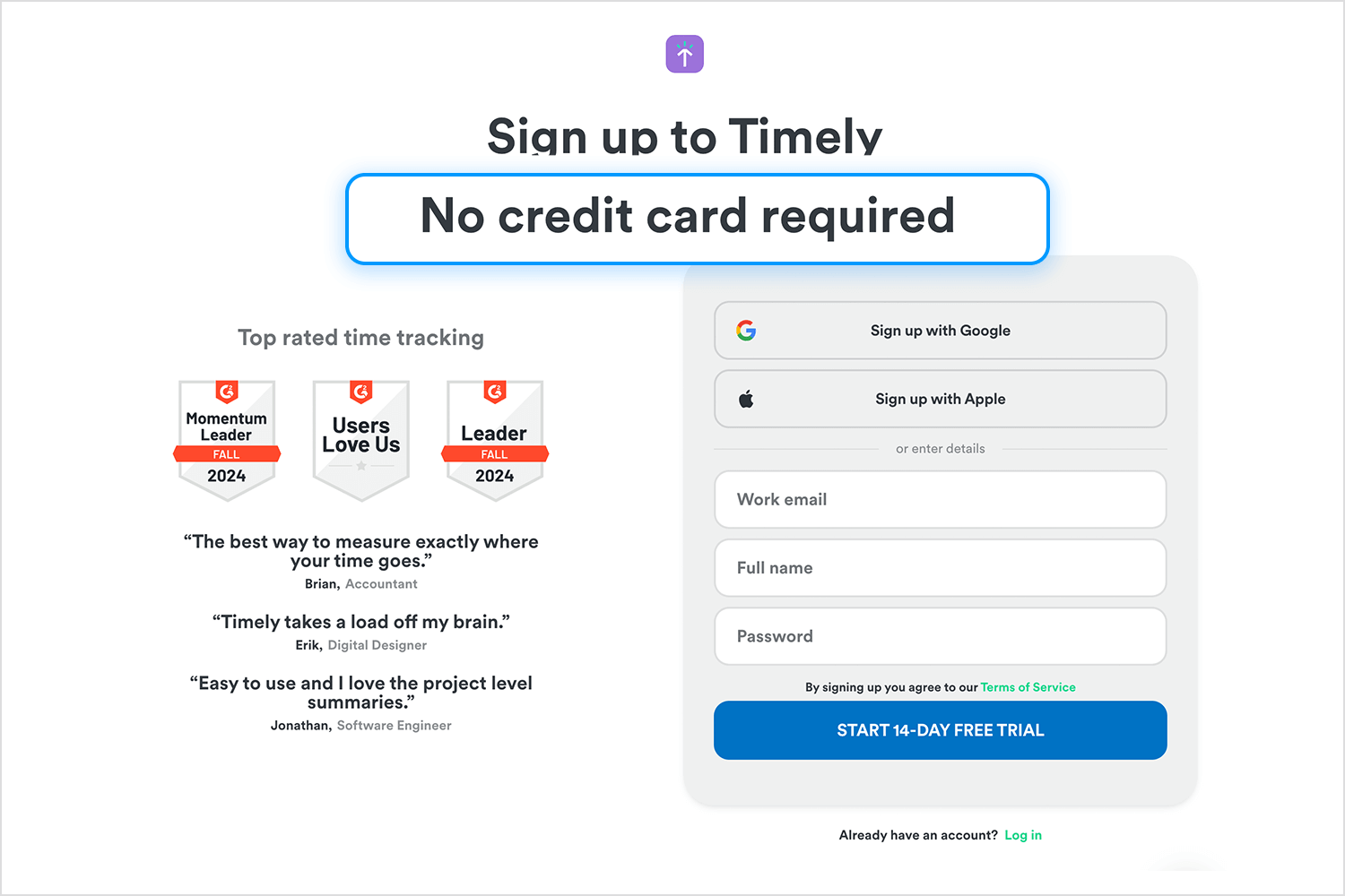
Timely’s sign-up page is a great example of how microcopy can instantly put users at ease. With a simple promise of no credit card required, it breaks down barriers and makes the process feel approachable. This kind of thoughtful microcopy doesn’t just guide users, but it also builds trust and confidence in a way that feels effortless and human. It’s proof that the right words can make all the difference.
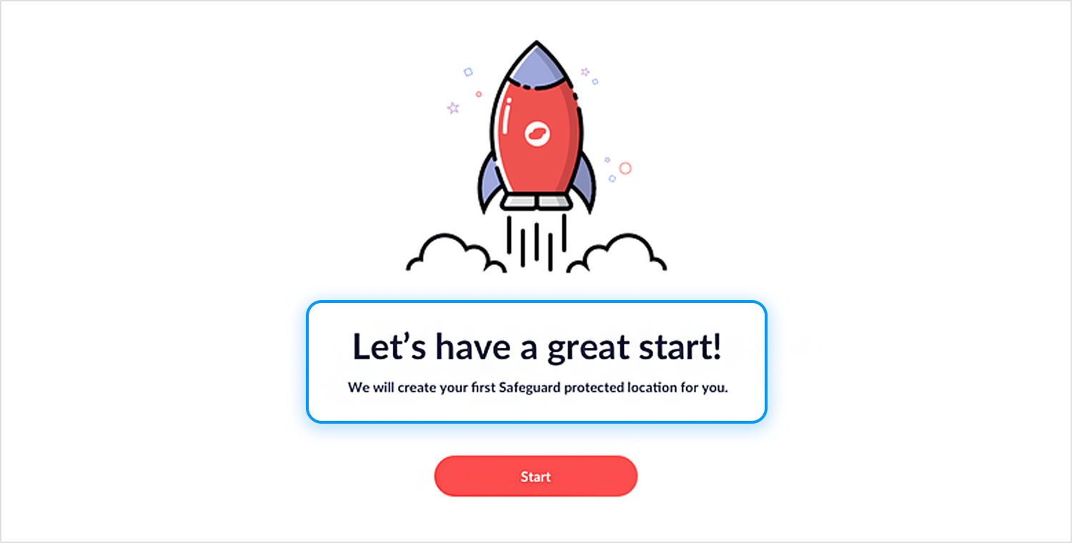
This onboarding screen, spotted on Dribbble, is a great addition to our list of microcopy examples that truly alleviate users’ worries. With a warm and inviting message like “Let’s have a great start!”, it creates a sense of positivity right away. The follow-up line, “We will create your first Safeguard protected location for you,”, takes the guesswork out of what’s coming next, letting users know they’re in good hands.
It’s a simple, friendly touch that reassures users and sets the stage for a smooth experience. A great reminder that small, thoughtful microcopy can do so much to build trust and confidence.
We love this example because it captures so much personality with so few words. “Where work happens” isn’t just a tagline but it’s a promise. It tells you exactly what Slack is all about without over explaining. Then, the simple reassurance, “Slack is free to try for as long as you like,” feels friendly and transparent, removing any hesitation about getting started.
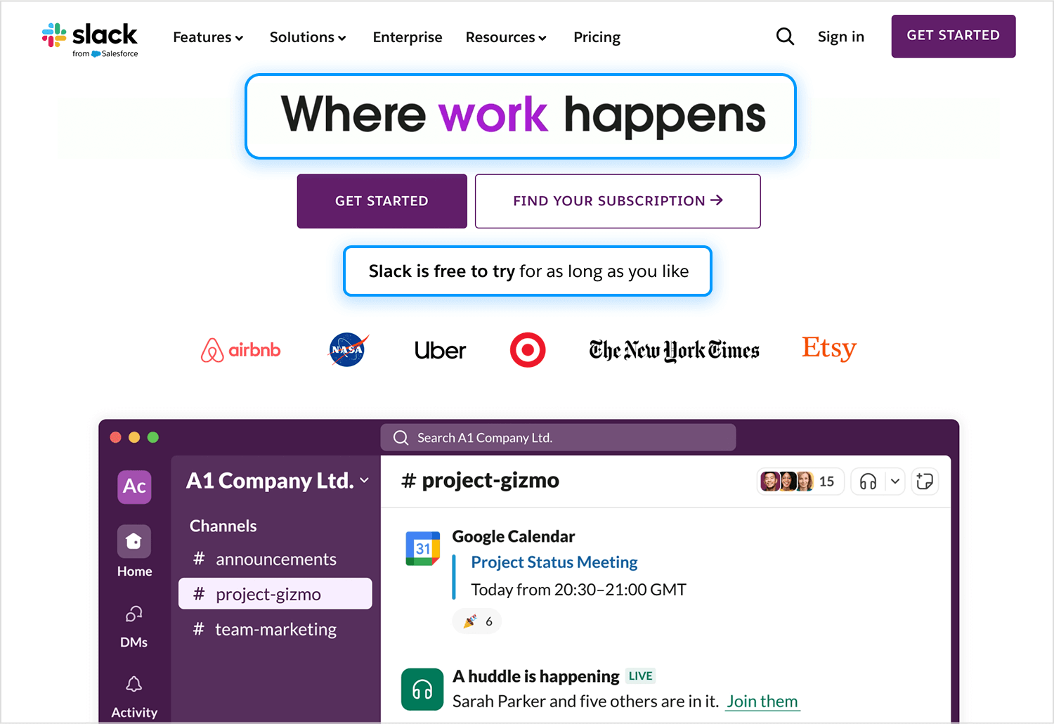
It’s these little touches of microcopy that make Slack feel approachable and trustworthy. The words aren’t just functional, they reflect a brand that understands its audience and knows how to speak to them. This is what building a brand through microcopy looks like.
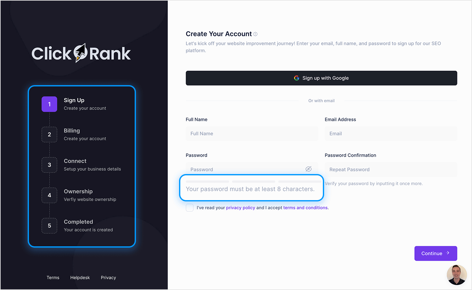
ClickRank’s signup flow does a great microcopy job of minimizing doubts by keeping things clear and straightforward. The step-by-step sidebar shows exactly what to expect, so users aren’t left wondering what’s next.
Little details, like the note under the password field about character requirements, make the process feel simple and frustration-free. Plus, linking to the privacy policy adds a layer of transparency, easing any concerns about data use. It’s all about making the experience smooth and worry-free.
Airbnb’s search bar is a great example of microcopy guiding users effortlessly. Instead of leaving it blank, it provides clear prompts that help users know exactly how to begin their search without feeling overwhelmed. It’s intuitive, approachable, and keeps the experience seamless.
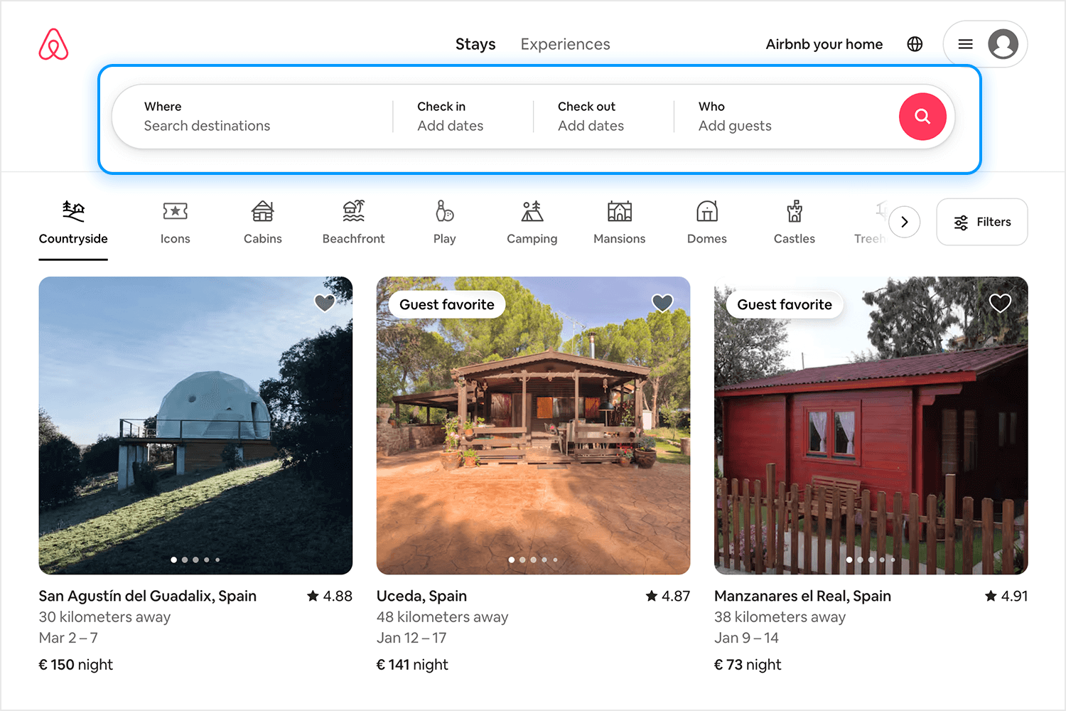
This kind of microcopy works because it’s intuitive. It doesn’t overwhelm you with instructions or unnecessary details. Instead, it feels like a friendly hand steering you in the right direction. It’s proof that even the smallest touches can make a platform feel effortless to navigate.
In this microcopy example, Mailchimp keeps things friendly when things don’t go as planned. When a username is already taken, you don’t just get a cold “Error” message. Instead, it says, “Great minds think alike, someone already has this username. If it’s you, log in.” It’s friendly, clear, and even a little clever.
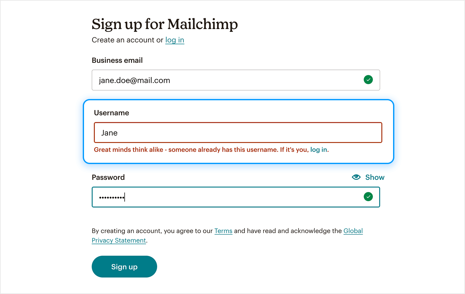
This kind of microcopy works because it’s not just about pointing out what went wrong but softens the blow and gives you an immediate next step. Whether it’s encouraging you to log in or try another username, it keeps the experience feeling smooth and human. Small details like this show how much thought went into making the interaction as painless as possible.
Design and prototype effective microcopy in your web and mobile apps with Justinmind

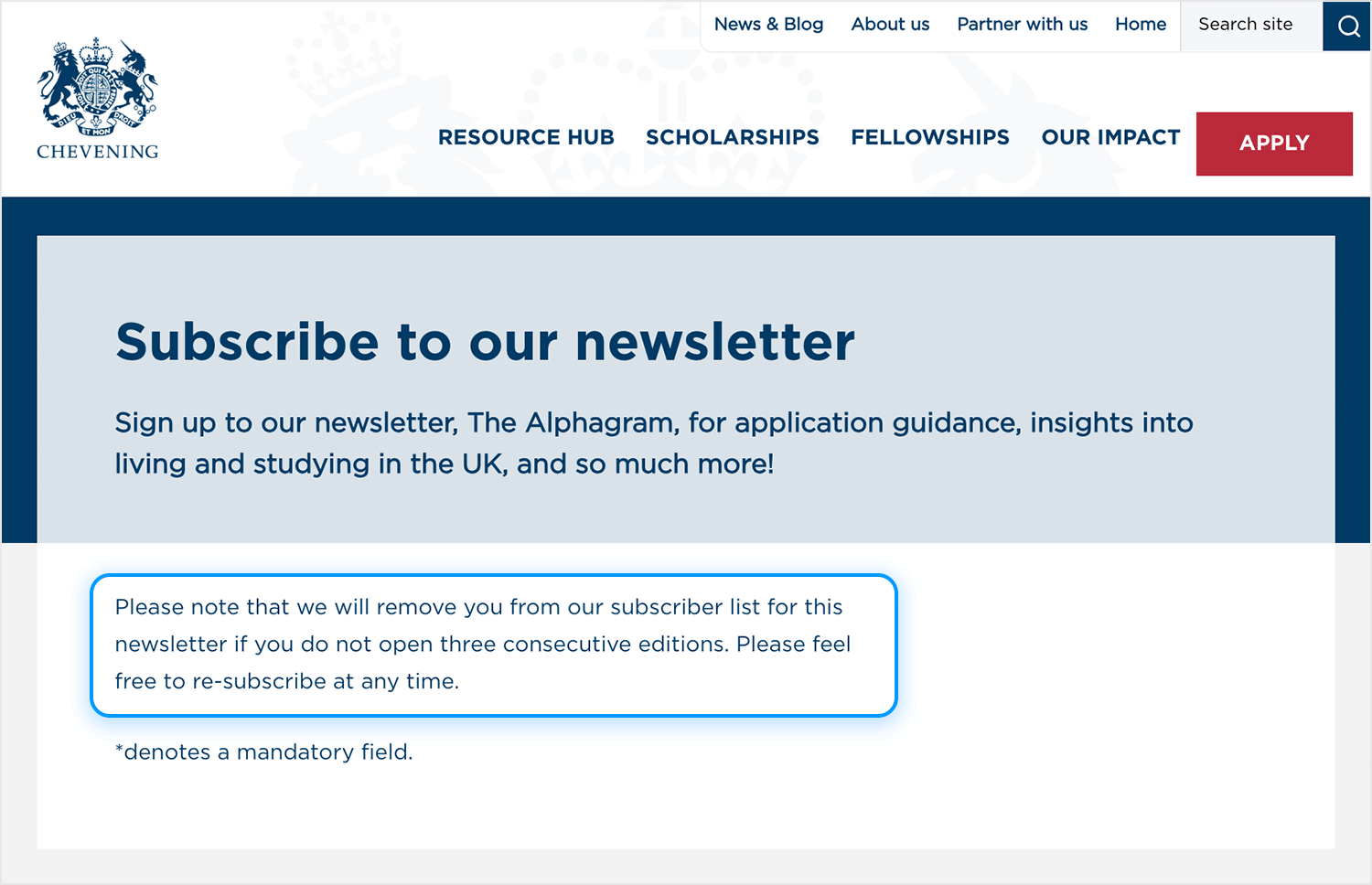
This is a great example of setting expectations in a clear and respectful way. The microcopy explains, “We will remove you from our subscriber list if you don’t open three consecutive editions,” which is both transparent and considerate. It tells users exactly how things work without any surprises down the line, while also offering the reassurance that they can re-subscribe whenever they want. It’s straightforward, no pressure, and keeps things honest, exactly how good microcopy should feel.
This is such a fun take on a 404 page. Instead of just saying the page isn’t available, it turns the moment into something playful with “Page was sucked into the vortex!” Hugoware does a good job here with the visuals, combined with the quirky message, make you smile instead of feeling annoyed. It’s a great reminder that even an error can be an opportunity to surprise and delight users, keeping the experience light and engaging.
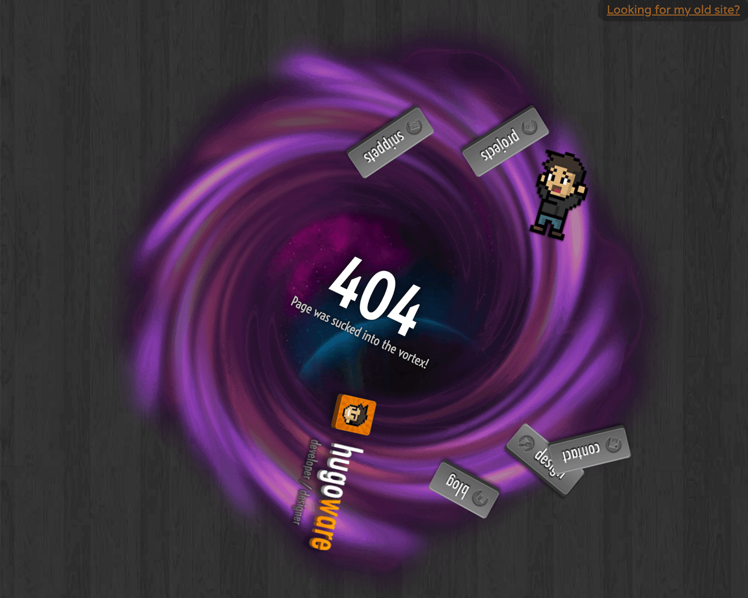
It’s a great reminder that 404 pages, when paired with thoughtful microcopy, can transform an error into a memorable and even delightful experience.
An empty cart doesn’t have to feel like a dead end, and Zalando proves it. Instead of leaving users hanging, they offer two clear and inviting actions: “Sign in” to continue where you left off or “Get inspired” to explore more. It’s not pushy, just helpful and it encourages users to keep moving forward in a way that feels natural.
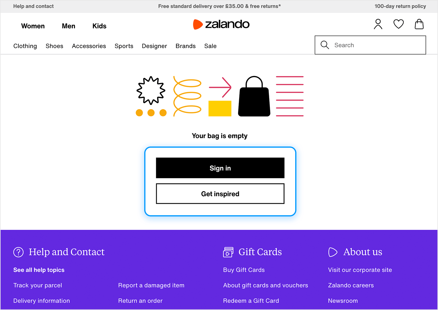
This microcopy works because it treats an otherwise static moment as an opportunity to re-engage. By giving users a gentle nudge without overwhelming them, it keeps the experience flowing and the user curious about what’s next.
This example from Google Docs’ accessibility settings keeps things simple and user-focused. Each feature comes with a quick explanation that tells you exactly what it does without overloading you with details, and the descriptions are clear and straight to the point.
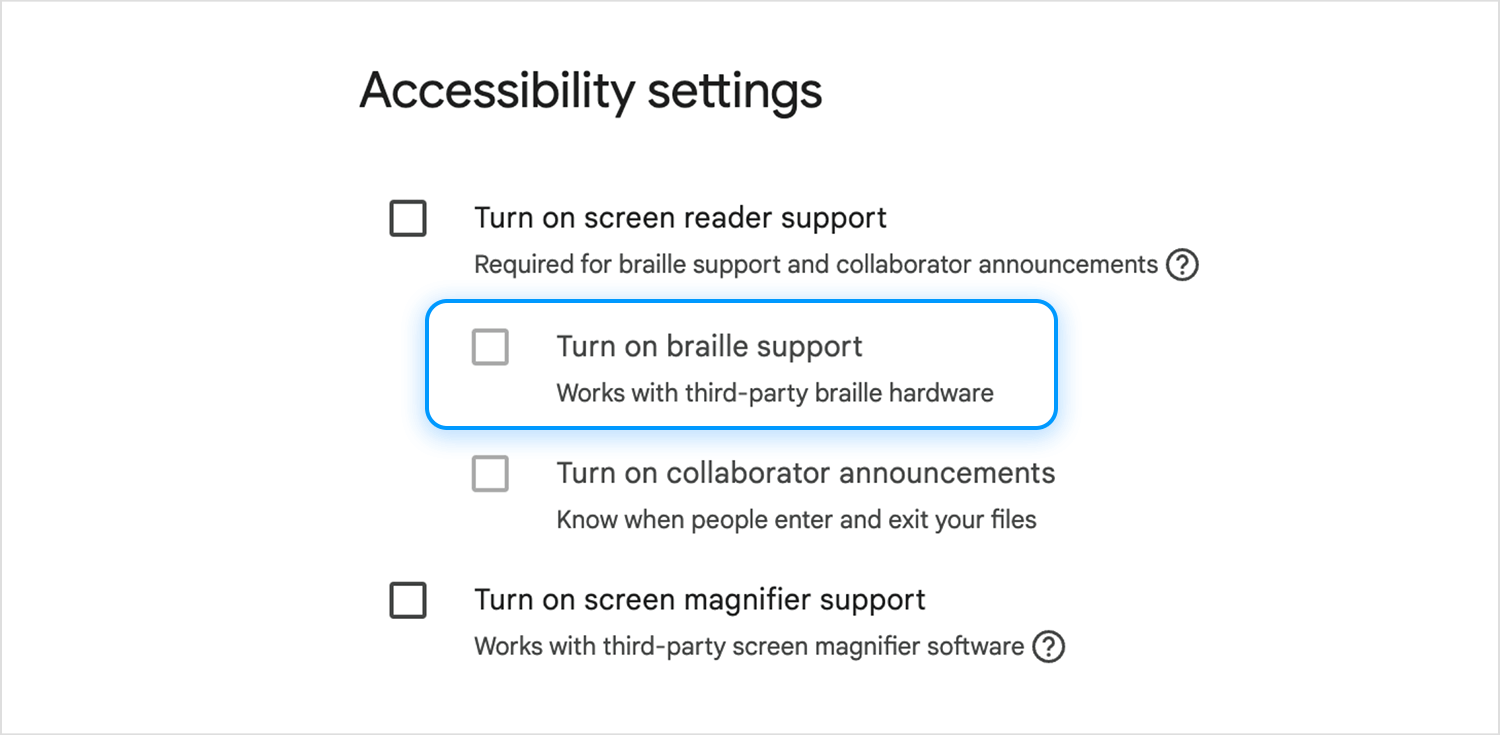
What’s great here is how naturally the microcopy fits into the interface, it feels like a gentle nudge, guiding users toward making their workspace more accessible. It doesn’t try to over-explain; it just gives enough information to help you make confident choices. It’s a reminder that good accessibility isn’t just about features, but also about making those features easy to understand and use.
This onboarding screen, spotted on Dribbble, is a great example of how to guide users seamlessly into their workflow. With a friendly headline and clear options, it makes the process feel straightforward and approachable.
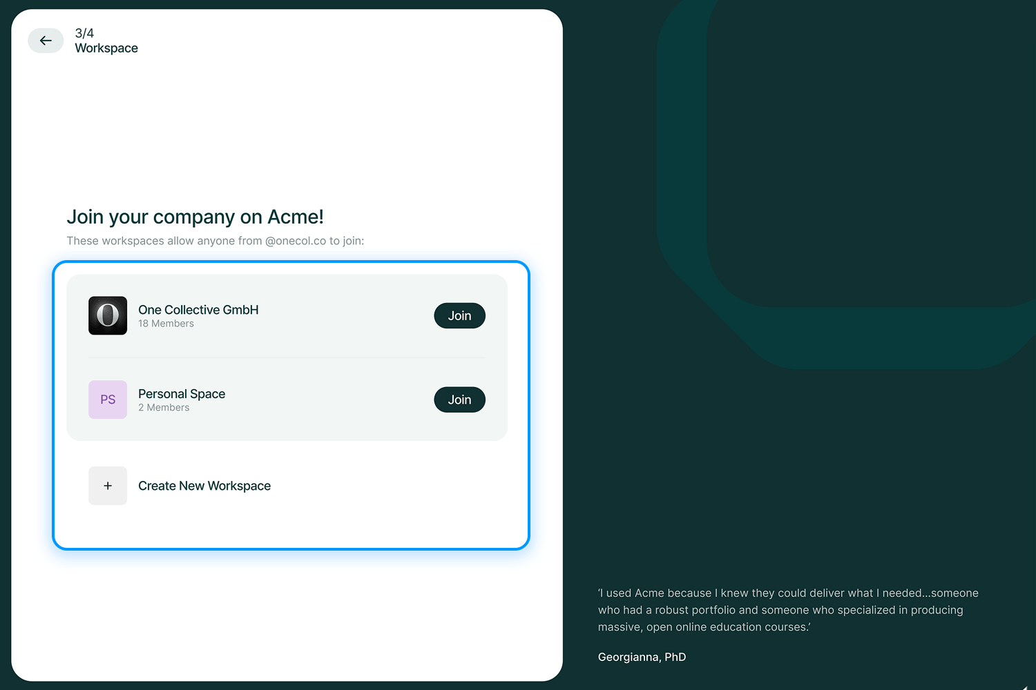
Good onboarding microcopy like this is clear, actionable, and keeps things easy. It provides just enough context, like explaining that workspaces are tied to the user’s domain, without overwhelming them. It’s the kind of thoughtful design that makes new users feel confident and ready to dive in.
Netflix’s “continue watching” feature is the perfect way to keep users hooked without any effort on their part. It’s like a friendly reminder of where they left off, making it easy to jump back into their favorite shows or movies.
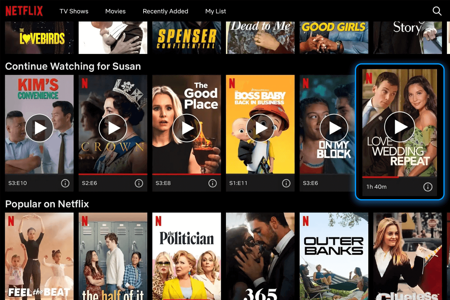
What works so well here is how unintrusive it is. There’s no pressure or over-explaining, just a subtle nudge that feels intuitive and effortless. It’s a small detail that keeps users engaged and coming back, strengthening their relationship with the platform in a way that feels completely natural.
As our last example, this screen from Face Yoga shows how microcopy can turn a small accomplishment into something meaningful. By celebrating the user’s success in a light, uplifting way, it makes the moment feel rewarding without being overdone.
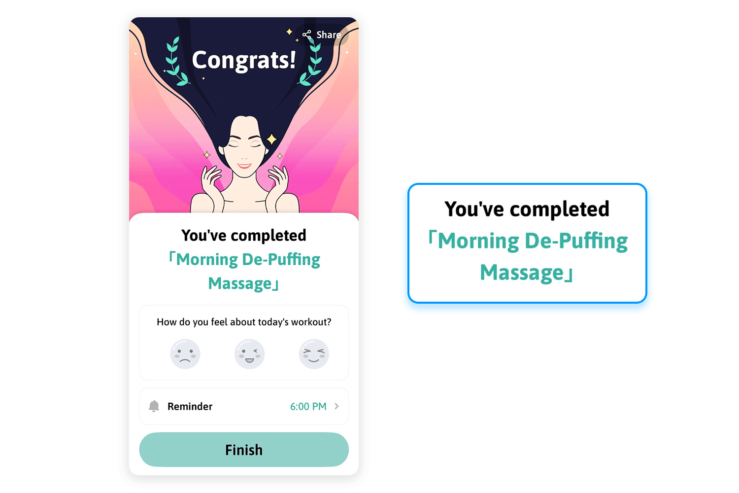
What’s clever here is the balance. It’s not just about recognition but also about keeping the momentum going. It encourages users to reflect on their progress while gently steering them toward the next step. It’s a perfect way to leave users feeling positive and motivated.
Using microcopy effectively in your UX design isn’t about sprinkling clever phrases at the end. It’s about weaving it into your workflows from the very beginning. Microcopy should work hand-in-hand with your research, design, and testing, just like any other UX element.
Start with research. Before you write a single word, take the time to understand your users. What are their pain points? What confuses or frustrates them? Microcopy can’t solve problems you don’t fully understand, so digging into user feedback, interviews, and testing data is where the real work begins.
Next, collaboration is key. Writers, designers, and developers all bring different perspectives to the table, and microcopy sits right at the intersection of all three. Maybe a designer spots an opportunity for a tooltip, or a developer flags how the character limit for a button might change the wording. When you collaborate early, microcopy becomes part of the design, not an afterthought.
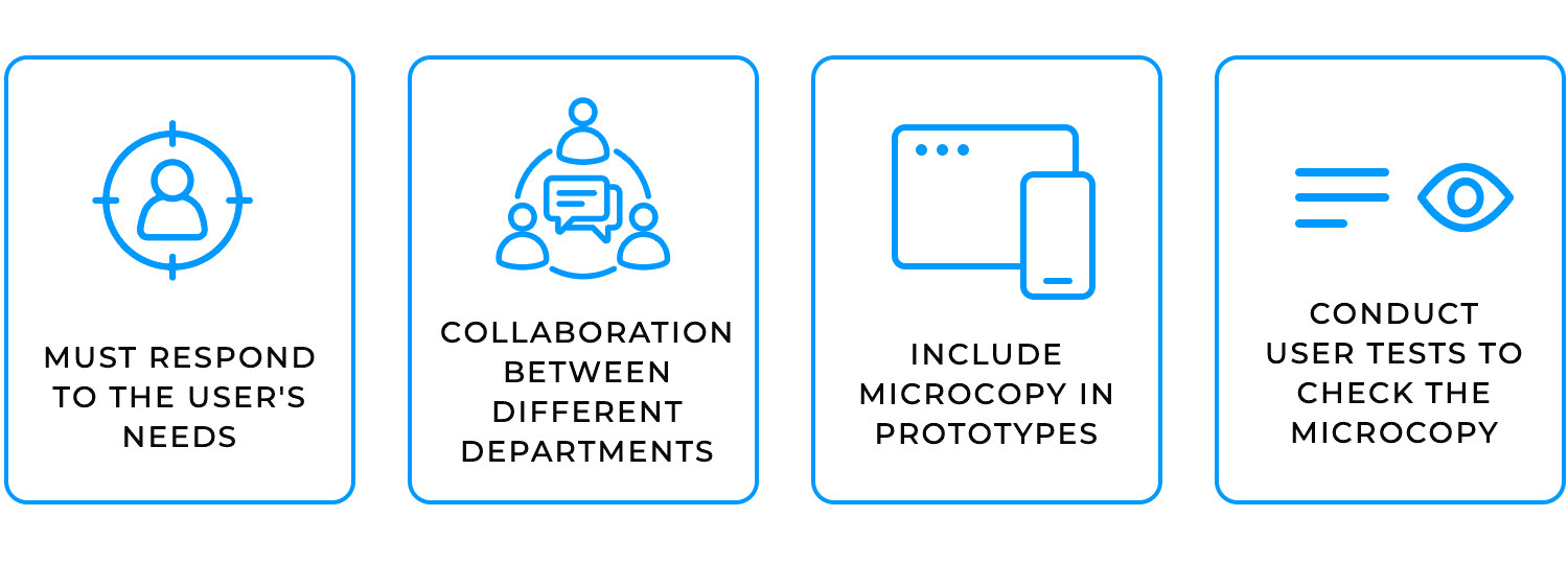
Microcopy might be small, but its impact is massive. It guides users, builds trust, alleviates worries, and even brings a little joy to the experience. From shaping brand identity to explaining errors or reducing doubts, it’s an essential part of great UX design. But good microcopy doesn’t just happen, it’s the result of research, collaboration, testing, and a deep understanding of your users.
When done thoughtfully, it transforms everyday interactions into something intuitive, engaging, and human. It’s a reminder that even the smallest words can make the biggest difference.
PROTOTYPE · COMMUNICATE · VALIDATE
ALL-IN-ONE PROTOTYPING TOOL FOR WEB AND MOBILE APPS
Related Content
 Learn how to design better e-learning platforms with user-centered UX principles, real examples, and high-fidelity prototyping tips to boost engagement and learning outcomes.13 min Read
 Infinite scroll keeps users engaged, but it’s not always the best choice. This guide breaks down when to use it, when to avoid it, and how to design it right.14 min Read
 Learn how to design web and mobile app prototypes, how to test them and what to look for in a prototyping tool in this complete guide.15 min Read
