Prototyping, project management software and awesome user interfaces. All in a day’s work for Basecamp’s Jonas Downey.
If you were looking for the most popular and lauded project management software around, you’d be hard pressed to find one with more glowing reviews that Basecamp. Described by CreativeBloq as “the grandaddy” of project management tools, Basecamp helps teams stay on the same page about whatever they’re working on.
They do it through a unique bundle of features that provide everything you need to get a project done — tasks, discussions, files, and deadlines all live together happily in Basecamp.
We wanted to find out how the designers at Basecamp stay ahead of the curve, so we spoke to Jonas Downey, who has been product designer with Basecamp since 2011. As well as generating awesome interfaces for Basecamp, Jonas contributes to their blog Signal vs Noise, enjoys playing around with apps and making pancakes.
We spoke to him about designing intuitive UIs, managing software development projects, and how prototyping helps his team stay at the forefront of software development.
Hi Jonas! Can you describe your average day in the Basecamp headquarters?
Since we’re a remote company, I might work from my kitchen, basement, coffee shops, or wherever else I feel like setting up shop! I also happen to live close enough to our Chicago office that I can commute there once or twice a week if I want to see some friendly faces.
In a typical day, I spend the early morning catching up on what’s new across the company and what’s happening with the projects I’m working on (all of that information lives in Basecamp.) I usually try to get something significant accomplished by mid-morning to keep my mood up, and then pause for a bit to have lunch and see my family or co-workers. Then I aim for another 2-3 hours of productive work in the afternoon, followed by more catch-up and review.
Depending on what I’m doing, that work time might include sketching ideas, writing a proposal for a chunk of work, drafting UI copy variations, iterating on a layout, or writing code directly in Rails.
Basecamp prides itself on being “world famously easy to use”. How do you and your team prototype intuitive UI interfaces?
Our product design team is tiny, which means that we have to be efficient. We accomplish that by cutting out any inessential parts of our process. So when we’re prototyping new ideas, we begin with rough marker/chalkboard sketches and then jump right into building them for real so we can try them out. We don’t do wireframes or other intermediate documentation steps.
Our designers are full-stack people, which means we’re able to hook up UI fundamentals with HTML/CSS/JS/Ruby. We all have a local copy of the Basecamp app that we work on directly, so it’s easy to crank out prototypes.
We’re also open to other methods when it makes sense. Sometimes tricky problems call for Photoshop mockups or a sample flow in a tool like Justinmind before we start building. Our mobile app teams also use interactive prototyping tools since it’s harder and more time consuming to test interactions directly with native code.
What are the main challenges of pulling off successful software development projects, and how does prototyping help you solve them?
A couple of years ago I tweeted this:
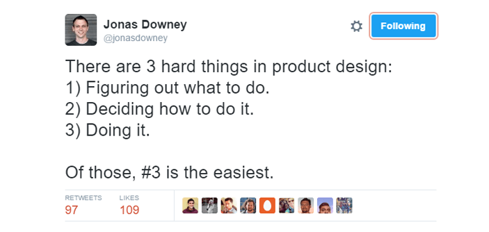
I think that still holds true! The two biggest challenges are finding the right problems to solve, and then figuring out what to do to solve those problems. Prototyping helps with the latter, because it gives you a way to narrow down the possibilities into a handful of real things you can critique and refine.
Can you give us an example of a time a prototype helped Basecamp solve a tricky situation or design something really cool?
For us, the line between prototypes and shipped products is pretty blurry. Since our prototypes are functional right off the bat, they often serve as a first draft for the final thing we end up launching to customers soon after. (Or they might hit the trash bin! It’s about 50/50.)
We also explore wild ideas a lot. For example, I’ve worked on prototypes for a few entirely separate products that we never shipped. Even though they didn’t see the light of day, those projects still bore fruit as incubators for UI concepts that we ended up exporting back to Basecamp.
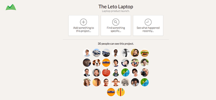
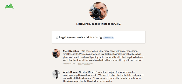
Here are some examples of a prototype I made for Basecamp 3, back before it became Basecamp 3. We were experimenting with a card UI, and for a while we considered a horizontally-scrolling timeline concept. We also designed pages for things like to-do conversation threads and the overall project page. These exact screens didn’t make it into the final product, but you can still see the DNA of these ideas in the production app.
Collaboration is one of the keys to successful project management. How do you design UIs to promote and facilitate collaboration?
It helps to constantly study how people work together and communicate with each other. We do this by dogfooding our own products internally, and gathering feedback about what’s working and what’s not.
We’re always talking to customers too, so we can gain a clearer understanding of their struggles. What caused someone to shop for a product like Basecamp? What were they hoping to accomplish? What does success look like for them? Once you’ve started to form ideas and opinions around those big-picture questions, you can apply that knowledge to specific features or UI flows.
There are also a few practical things we do to make Basecamp an enjoyable collaborative space, like showing people’s faces as often as possible, showing progress and activity in lots of places, and making almost everything in Basecamp commentable.
That way, the newest action is always visible and conversations can happen anywhere, regardless of how someone chose to organize their project. Basecamp is the central communications hub for a lot of businesses, and we want it to have a cozy, friendly vibe, so people feel comfortable working there and talking to each other.
You’ve advocated for “big, messy interfaces” . Do you think we’ll see a trend for more complex interfaces anytime soon?
To be clear about that…my post isn’t really advocating for more big, messy interfaces. I’m not suggesting that we should all go make complicated products on purpose. Rather, I’m pushing back on the notion that interfaces must be simple and beautiful in order to be successful. That’s an increasingly popular assumption that just isn’t true.
In general our industry’s collective lust for design trends is problematic. I think news sites like trends because they’re easy stories, and designers rely on them because it makes their jobs less scary. “Oh we’ll just do everything this same way and it’ll probably be fine.” That mindset is a copout.
Good design requires keeping an open mind about all the possibilities — regardless of what other people are doing this year or what’s been done before. In fact, I’ve found it’s much easier to make great work when you intentionally ignore all of that trend stuff and focus solely on the problem you’re solving (and who you’re solving it for.)
How does Enterprise UX differ from customer-facing software development?
I don’t think the two are particularly different, except that enterprise users may have a higher tolerance for complexity since they have more expertise in their domain. For example, a music producer who uses Pro Tools is likely to have more sophisticated knowledge and expectations than a teenager who’s just getting started in GarageBand.
For the teenager, Pro Tools would be overwhelming; for the producer, GarageBand would be underpowered.
The design process for both applications can be the same, but the surface area of the problems Pro Tools solves is bigger. This means Pro Tools needs more screens, flows, menus, and interactive elements. It also means Pro Tools is harder to master, but the payoff for mastery is bigger too.
There are more and more project management tools and software to choose from. How does prototyping help Basecamp stay ahead of the curve?
Iterative prototyping is really the only way our small team can ship an entirely new version of Basecamp, written from the ground-up, in under 2 years. Basecamp 3 is the most expansive version we’ve ever made — it’s bigger and more capable than anything we’ve done before. The only way we got there was by rapidly prototyping a huge range of ideas, trying them out for real, and constantly iterating.
How has developing project management software changed you as a designer?
I’ve always had a weird, opinionated, and experimental mind, but working at Basecamp has given me the discipline and skills to channel those impulses into building great products that work for thousands of people in a myriad of different scenarios. The truth is, I used to think I knew some things about design, and then I started working at Basecamp and quickly learned just how much I didn’t know!
The project management domain is great fun, too. It’s a complex area with near infinite possibilities. I think we’ve only scratched the surface. Seeing that potential is exciting, and helping our customers run their businesses better or make cool stuff is wonderful and rewarding.
I’m also incredibly fortunate to work with some of the best people on Earth. They’ve changed me not just as a designer, but as a human person.
Thanks to Jonas for revealing the user interfaces design secrets of Basecamp HQ. If you’d like to see what iterative prototyping can do for your software design process, download Justinmind for free at the link below.
Related Content
 Learn how to design better e-learning platforms with user-centered UX principles, real examples, and high-fidelity prototyping tips to boost engagement and learning outcomes.13 min Read
 Infinite scroll keeps users engaged, but it’s not always the best choice. This guide breaks down when to use it, when to avoid it, and how to design it right.14 min Read
 Learn how to design web and mobile app prototypes, how to test them and what to look for in a prototyping tool in this complete guide.15 min Read
