Prototyping plays a key role in SEI's workflow: it unifies and validates. Check out how SEI uses prototyping to put things into perspective.
Systems Evolution Inc. (SEI) is a large technologic consulting firm that has made quite the name for itself. With over 250 consultants across 8 offices in the United States, SEI offers its clients a variety of services with the expertise it’s built up over the last 25 years.
For us here at Justinmind, one of the most interesting aspects of SEI is their Agile Transformation Delivery service – which is basically a service that helps companies adopt the Agile workflow. Changing workflows in any company is challenging, but when it comes to large scale design or teams that have tight deadlines – changing the way things are done ain’t easy.
That’s why we were very excited to hear all about how SEI itself uses the Agile framework in its business – straight from the source. We welcomed Tim Gagnon, UX and Prototyping Lead at SEI, to hear all about how SEI benefits from the Agile framework – and the role prototyping plays in it.
More specifically, we’ll take a close look at how rapid prototyping helps SEI deliver faster, while improving the flow of their work across different teams – such as designers and developers.
Live from San Francisco! “Integrate UX in Agile projects” by UX expert Tim Gagnon
Posted by Justinmind Prototyping Tool on Thursday, 5 October 2017
Tim started off by admitting that most people in the room already knew what prototypes are and what the act of prototyping entails. But just knowing what is it can only take you so far – in order to understand the real value behind the act of prototyping a design, one needs to grasp the full picture.
Tim kicked off the presentation with a great analogy of a crucial point in the design process of any product: the moment when all stakeholders gather and actually see the solution everyone has been working on. This is usually closely related to usability testing, when people in the team actually experience the solution for the first time.
This decisive moment tends to have a huge impact on the design process, because that is when everyone who put in work can see the solution for what it is – Tim called it the “AHA moment”. It creates a debate within the team about the expectations of the design, what it is needs to get there and how that can be achieved.
Here is the key takeaway from the AHA moment analogy: in a product development process without prototyping, it would only happen right before deployment. This feedback is important in the design process – but what can you do if you get this feedback too late?
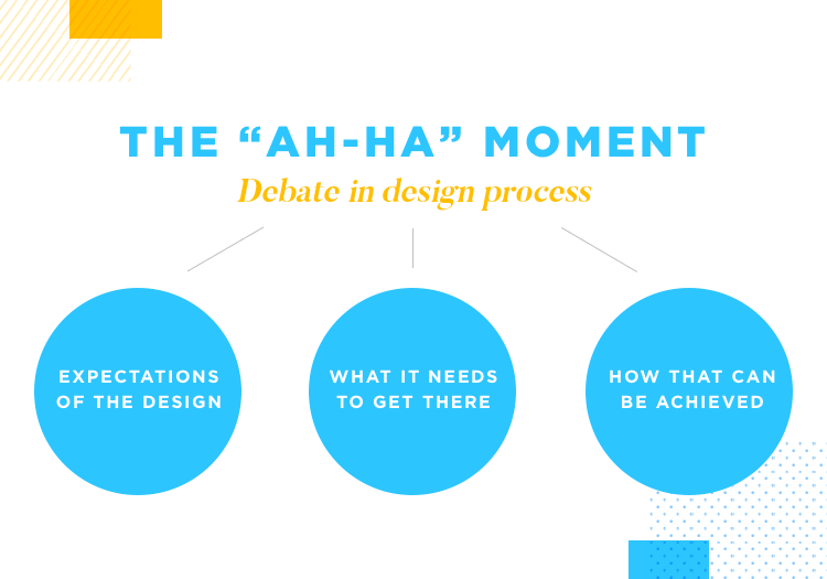
The AHA moment is when stakeholders are faced with the true performance of the product. If this moment comes right before deployment, the team needs to decide between deploying the product with all its flaws or define what needs to be changed, and redo the work.
Logically, neither of these options is ideal – launching a flawed product can disappoint users, while redoing work negatively impacts deadlines and budgeting.
That is why prototyping is such a key part of the design process at SEI. By prototyping their ideas and making them tangible, SEI effectively pushes the AHA moment to a much earlier stage of the product design process. This, in turn, spares the team from being stuck between a rock of flaws or the expensive hard place of postponing release dates.
It’s important that the team experiences the solution early, so they can build on it and improve the quality until all user needs are met. Tim brilliantly compares how things were done now and before, when prototyping wasn’t accessible to most teams out there. Instead of a real prototype, they’d have text-based design requirements.
These written requirements worked as a description of the solution, and included just about everything from features, navigation to user stories.
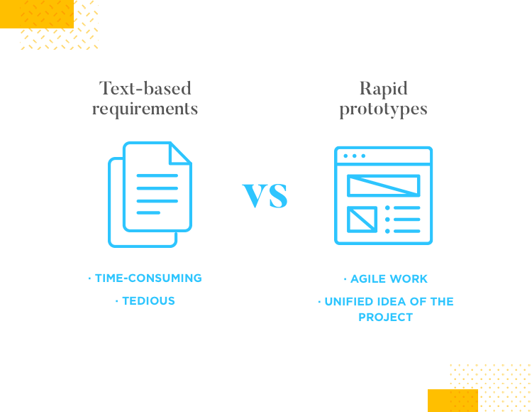
When our audience was asked to describe the meetings where these texts were reviewed, words like “tedious” and “time-consuming” were thrown around – Tim shared that, to him, those meetings were just mind-numbing.
It’s easy to see why. This text could be hundreds of pages long, and it was easy to lose track of what had been covered or not, and picturing the finished solution represented a real challenge to their imagination. According to Tim, a long list of requirements didn’t translate to a well-planned product.
Yes, the definition of what a prototype is can vary to a surprising extent. For some, a bunch of post-its arranged in a certain way can be a prototype. For the people at SEI, a prototype is a clickable mockup, usually made with a drag and drop prototyping tool such as Justinmind.
The key thing about prototypes is that they are flexible – allowing several team members to make changes, add things and remove things in no time at all. As prototyping tools’ interfaces become more and more user-friendly, designing and changing the prototype becomes easier and faster.
Portability: It's important for Tim is that prototypes are portable. It shouldn't be an issue to have the prototype open on your desk , but have it remain accessible to other people in your team.
With the evolution of prototyping tools, collaboration features have become a centerpiece in the UX game. You can review the prototype, send it to other stakeholders and find their comments and observations within the prototype itself.
This is important, not just because of the collaboration aspect of prototypes, but also because it unifies the visions of every person in the team into a single tangible solution. This means there aren’t any surprises – no disparities between team members’ expectations and final design.
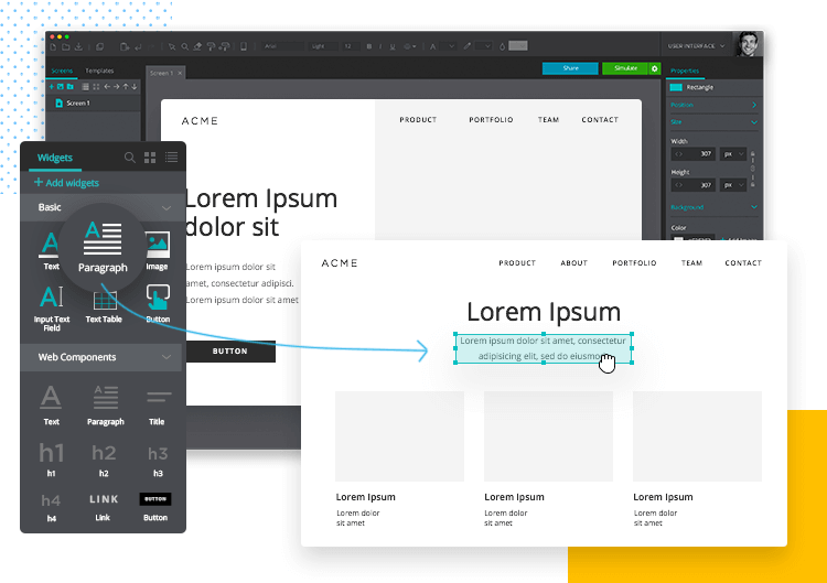
Current prototypes also enjoy enhanced design requirements, which far exceed the old text-based method. Having the requirements made into a real solution means there is less chance things will be overlooked, or that different requirements will be in conflict with each other.
When it comes to real and tangible benefits that SEI enjoys due to their prototypes, Tim highlighted:
- Less re-work: more freedom to test and modify, more transparency for the team. Both benefits lead to an overall more efficient process before development. Tim shared estimates that SEI does about 80% less re-work as a direct result of prototyping.
- Faster time to delivery: the prototype provides a clear vision for the solution. This means that people work on the right things, and excludes having to go back just before reaching the finish line.
At SEI, it all starts with user scenarios. Think of user scenarios as brief, concise phrases that expose what the user wants or needs to accomplish. This statement is then broken down into the steps that the user would need to go through in order to reach that goal.
Example: Tim gives us the simple example of a user who wants to buy an item of clothing at an online store. They would need to look for the item, put in the cart, then proceed to checkout, and so on.
Once the team has a clear idea of where the user wants to go, and the necessary the user needs to take, they move on to prototyping.
At first, Tim’s team focuses on creating a low-fidelity prototype – which is most composed of boxes and arrows. This phase isn’t so much about every tiny usability aspect of the solution, but rather showing how the user would reach the goal through the interface. It’s the bare bones of functionality, with particular attention paid to navigation.
SEI makes a distinction between medium and high-fidelity prototypes. Following the low-fidelity prototype, stakeholders then use that initial prototype as a base on which they can build the design. More complex issues are dealt with in the medium-fidelity prototypes, such as Information Architecture.
That’s when high-fidelity prototypes come in. Tim admits that at SEI, high-fidelity prototypes are used sparingly due to the amount of time and effort they require. That is due to the nature of high-fidelity prototypes, which ought to be a very faithful representation of the finished product. In fact, the prototype should be nearly indistinguishable from the real thing.
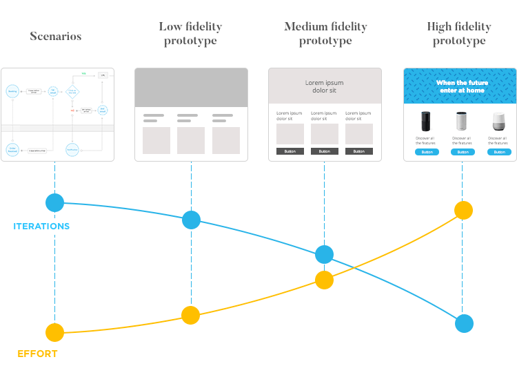
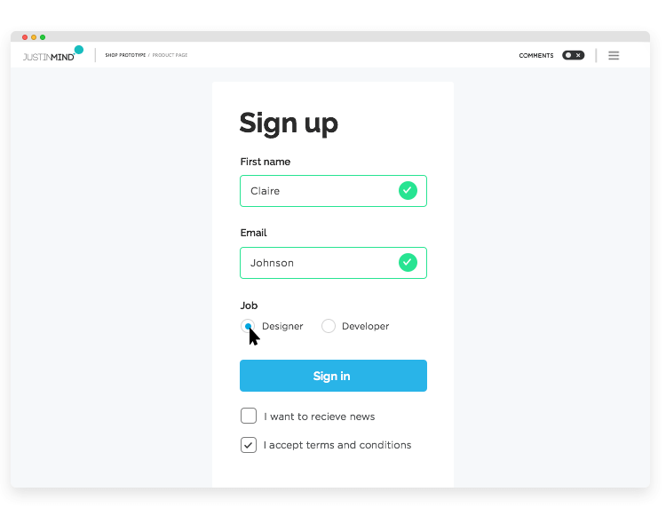
These high-fidelity prototypes should have all the basic elements as well as advanced ones, such as data elements and all the visual design. These prototypes should also be highly interactive, as it’s generally preferred to have all the details in place for the heavy-duty usability testing.
Each level in the process of building the prototype from the ground up is meant to force the team to reach a consensus. After all, what do we want? What is missing? Where do we want to take the design? According to Tim, these conversations can be overlooked in the absence of prototypes – and are crucial in having a unified vision for the design.
In his presentation, Tim recognizes that prototyping at SEI works in a very specific way. This formula doesn’t work as a one-size-fits-all recipe, nor is it meant to. Each company will find itself in a unique situation that requires some adaptation.
What’s really crucial, Tim says, isn’t that the audience tries to copy SEI’s tactic. The real lesson they should take home is the role that prototyping plays within SEI, and how it works to add value to all their projects. It’s all about not straying from the original user scenarios, and maintaining the actual soul of the solution all the way to the end of the design process.
Your prototypes work so that the team may gain true understanding of where the product needs to go, and how we can get there. It’s effect in the design process of making the team face tough questions up front and getting everyone’s vision into a single cohesive design is, possibly, the prime benefit of prototyping as a whole.
When you develop your prototype from a simple user scenario all the way to a high-fidelity representation of the real thing, you want to document everything. Each different type of documentation can be leveraged and help you build on the prototype some more. User stories and user scenarios, in particular, are very helpful throughout the prototyping process.
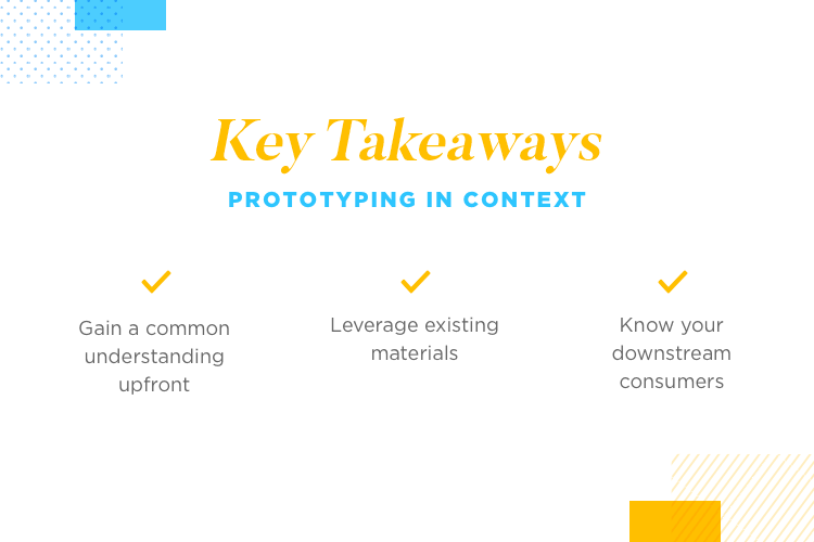
The key thing to remember when adding more complexity to your prototypes is that your user scenarios haven’t changed. Never forget who the prototype is for – you want to tailor the prototypes specifically for the users that will enjoy it later on. Their needs and wants are the rules of the game here.
The process for carrying out a project at SEI can differ slightly from other design sprints in the industry – but it works perfectly for the team under Tim’s command. The process makes room for getting feedback not just from users but from team members too.
It all starts with the product planning, in which user stories play an important role in putting a product feature of characteristic in evidence. After product planning, the team takes all they’ve defined and store it in the backlog.
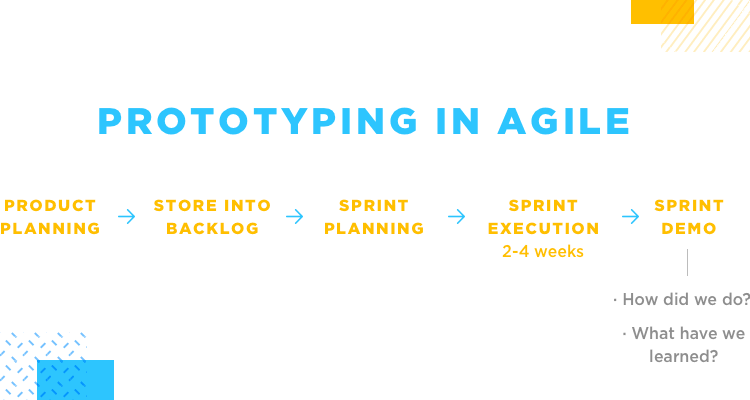
Once everything is packed nicely into the backlog, the team can do the sprint planning – which defines what tasks from the backlog can be tackled in the sprint.
Lastly, we have a sprint demo. In short, the sprint demo is a chance for all the stakeholders to get together and review the performance and results achieved in the sprint. This is when the team asks “how did we do?” and “what have we learned?”.
The user stories, as we’ve learned, play an important role in prototyping. Once we have a user story, it is broken down into steps users must take in the solution – it must also include acceptance criteria. Where is the line between a happy and satisfied user and a disappointed one?
Getting the user to the final goal also means that the design team has to go through certain tasks so that completing the user goal is possible. According to Tim, the trick is to tie your prototyping to a specific user story – or even a specific task for the design team that derives from the user story.
Rule of thumb: You don’t want to over complicate your life, so just aim to reflect the user stories on the prototype.
Tim draws our attention to something important: having the right way of doing things and the right tools to do them can make a huge difference. When it comes to prototyping in the Agile framework, he points out that many prototyping tools now have integrations with Agile management tools.
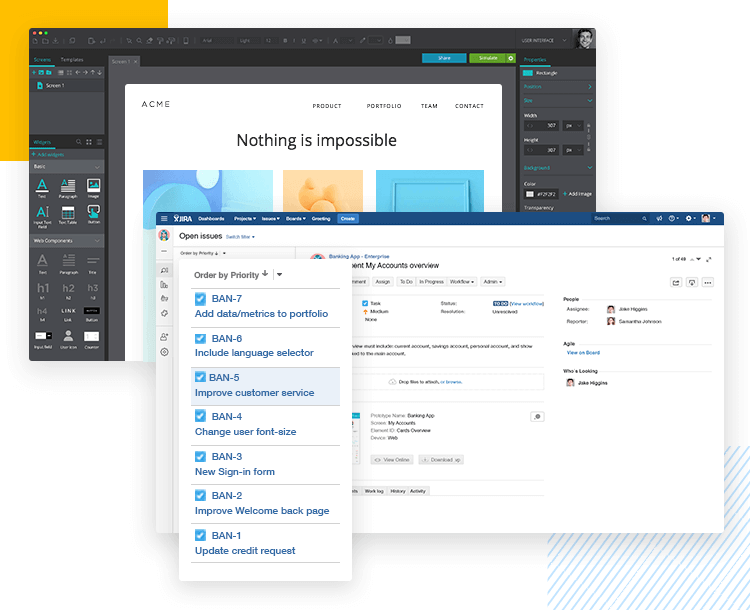
These integrations end up having a huge impact on the flow of the team, as they work to make sure the team can see the connection between the scenarios and certain parts of the prototype. For example, a user story that comes with a link that goes directly to a certain screen or even a specific element in the prototype.
Luckly, Justinmind is one of those prototyping tools that offer users an integration with an Agile management tool: Atlassian’s JIRA. That way, you and your team can focus on the more complex creative decisions, while our prototyping-agile integration minds the little details.
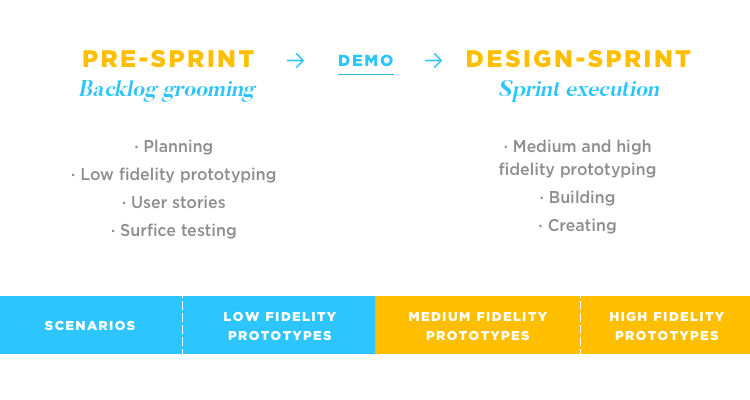
As we’ve seen, prototyping comes in many levels in any given project. The initial stages of prototyping, which include user scenarios and low-fidelity prototypes, don’t actually happen in the design sprint. As Tim explains, both these types of prototypes are too rough around the edges, and involve more planning than doing. No visual design, no real usability testing.
Both user stories and low-fidelity prototypes go in the sprint planning phase – only medium and high-fidelity prototypes actually enter the design sprint. This separation worked really well for SEI, as it allowed for a more accurate estimation of the time and effort needed for each task in the product development process.
This way of doing things also helps Tim and his team have a better overview of what has been done and what is left, providing a better perspective over the entire project. This results in a more informed decision-making and better prioritization of tasks.
This is where things get very interesting. Now that we know that the planning phase that comes before the actual sprint involves both user stories and low-fidelity prototypes, it becomes clear that the planning step is crucial in the workflow – in more ways than one.
The sprint planning involved a lot of defining and deciding on what is to be done – and it includes so many important factors and decisions, that Tim considers it a sprint in of itself.
With a large team that involves a lot of different types of professionals, keeping everything in the design sprint was a challenge. People have different focus-areas and conflicting schedules. A single sprint compressed too many things into the same time-frame – which rendered the whole Agile framework moot.
Creating a pre-sprint helped divide people according to their tasks and roles, and led the entire team to work more efficiently. In the backlog grooming sprint, SEI does all the planning, prioritizing, low-fidelity prototyping and the surface testing.
Once all of those things are done during the backlog grooming sprint, all of the outcomes are neatly stored in an organized fashion for developers and other team members. From there, the design sprint starts so that those outcomes can be built on and improved as stakeholders add detail and complexity.
Side note: This pre-sprint is complete with its own sprint demo, where the team looks back and defines how they performed and how it could all be improved.
As these grooming sprints are vital to developers, they tend to be ahead of the design sprints. As for the duration of the backlog grooming sprint, it can extend for the same amount of time as the design sprint – which tends to be 2-4 weeks long.
These second sprints, according to Tim, tend to go by quite faster. This is when people start doing, building and creating as opposed to planning and preparing.
Tim does point out that at SEI, the designers are meant to always be a step ahead of the developers. This is because they can start to build and develop certain elements and structures that are defined in the backlog-grooming sprint – but the heavy duty developing doesn’t start until after usability tests.
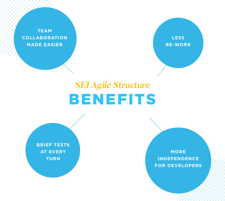
This Agile structure manages to help a large and diversified team work together, in a smooth way. Part of why everyone can work efficiently is that by focusing on developing the things that are certain while design conquers unknown waters, the dependency developers have on the design team is minimized.
One of the interesting takeaways from this structure is that even though the heavy-duty usability testing doesn’t start until the prototypes have a certain level of fidelity, brief tests are carried out at every turn. As we learned from our friends over at DropBox, continuous testing can be a powerful thing – even if done at a small scale.
Tim Gagnon was a wonderful speaker, and captivated our audience by covering not just the basics but also exploring the SEI way of doing things. By having clear definitions of the different prototype levels and recognizing how this workflow benefits SEI, Tim managed to paint a picture we can all appreciate.
UX design isn’t an exact science, and it ain’t a walk in the park either – it takes careful planning and requires a good grasp on what users want. Tim did a wonderful job at showing us all how SEI manages to keep the user in sight from day one all the way to launching.
Tim’s story goes to show that when we prepare and know exactly what the pieces are, we can achieve great things and deliver top quality results. Taking prototyping and elevating it to play a central role in the entire design process at SEI has really paid off!
PROTOTYPE · COMMUNICATE · VALIDATE
ALL-IN-ONE PROTOTYPING TOOL FOR AGILE WORKFLOWS
Related Content
 Learn how to design better e-learning platforms with user-centered UX principles, real examples, and high-fidelity prototyping tips to boost engagement and learning outcomes.13 min Read
 Infinite scroll keeps users engaged, but it’s not always the best choice. This guide breaks down when to use it, when to avoid it, and how to design it right.14 min Read
 Learn how to design web and mobile app prototypes, how to test them and what to look for in a prototyping tool in this complete guide.15 min Read

