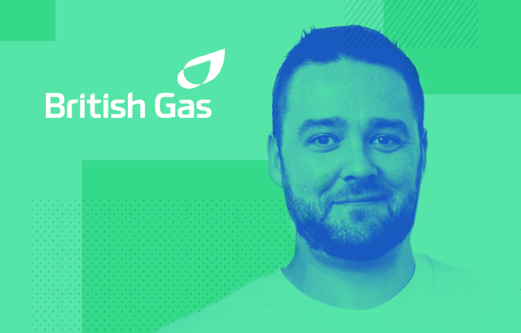
IoT innovation, smoke and mirrors prototypes, and why Miles Davis is a UX inspiration – British Gas Head of UX & Design explains his user experience philosophy
When the team here at Justinmind read that Conor Ward has not only sky-jumped off the Las Vegas Stratosphere but has also given P.Diddy saxophone lessons, we knew we had to interview him. But we were more interested in his role as the Head of UX and Design at British Gas than in his celebrity skydiving credentials.
In his role at the UK’s biggest energy supplier (12 million homes served and counting), Conor dedicates himself to fomenting UX innovation, building a strong, strategic UX team, and embedding user-centric design into the heart of the enterprise.
In his 17 years in the industry, he’s worked for the likes of Adobe, Cisco, Freeview, Mastercard, Virgin and more; oh, and he also played sax with P. Diddy. Did we mention that already??
We caught up with Conor to find out about user research at British Gas, how his team use wireframe tools, and why Miles Davis is the epitome of good UX.
British Gas isn’t the kind of company one associates with UX innovation. What do you and your team spend your days working on?
Well for one we’re trying to ensure we’re associated with UX innovation. Hence why I do interviews like this and talk at UX conferences, to get the word out about the amazing work we’re doing. I’ve been at British Gas for almost two years now.
When I joined, I took over a UX team that had organically grown out of lots of different places. I’ve repurposed the UX team within our business and changed them from a creative delivery team into much more of a strategic voice of the user within the business.
Our aim is to help everyone stick to the principle that if every effort goes towards solving your users’ proven needs and problems, we will continually achieve the most important goal, which is to win for our customers. The knock on effect of this is that business benefit will inevitably follow.
How does British Gas’s user research lab work, and what are your top tips for conducting usability testing?
I built a usability lab very soon after joining British Gas and we have been every improving it since. Each month we make some improvements to either the technical setup or our method.
A good tip for the setup is to link the observation room next door with the testing computer using a very long HDMI cable through the roof or the floor. This way you get live video feed of the screen without having to rely on screen sharing software that can drop and have delays.
A good moderating tip is to always sit behind and to the side of the user so they can only focus on the screen when carrying out the testing tasks, therefore reducing the influence of the person in the room too.
Another great point is that it really doesn’t matter who does the moderating, so I have been training up the rest of our product management and development teams to do this too. As long as they stick to the script and know how to respond to questions it works really well.
This means that the UX designers can focus on facilitating the observation room with all of the product team members and any interested stakeholders; this in turn means research bias is actually reduced rather than increased, because in-between each customer session the full product team shares their behavioral observations and together the team affinity map these into emerging patterns of behavior and identified issues.
This type of full team involvement in objective research works fantastically well for us.
The Internet of Things will be a big change area for energy companies in the near future. Are you guys working on any IoT based interfaces?
There is a lot going on in this area, much of which I am unable to share the detail of. We already have very large involvement in the Smart & Connected Home arena with the world of Hive (covering thermostats, smart lights, plugs etc) and Boiler IQ (malfunction detection) and we are enjoying the world of VUI, which is already upon us too.
Watch this space with us, it’s going to be a fun few years!
What are some of the challenges facing British Gas in its attempt to become more user-friendly?
One of the challenges is finding the top tier people we need to join our already top tier team. This is of course the same for any UX team that has a extremely high bar of talent. Our methods and practices are being seen by those in the industry as cutting edge and highly user-centric, so that has attracted some amazing talent to join our already fab team.
UX Designers are absolutely not the experts in having the right solution, instead they are they experts in finding the path to that solution.
Our largest challenge which is also our largest area of success is that we are embedding User Centred Design in a company of this size. It is a great challenge to have and Digital is certainly leading the charge when it comes to UCD. It’s very exciting to be a part of.
Can you tell us where prototyping fits into the design and development process at British Gas?
We have no specific processes to follow. Instead we have developed a set of Design Principles, Product Management Principles and finally a set of Technology & Engineering Principles. So if we think a prototype is needed it must be because it is going to help us learn something about our users.
If not, then it is likely not needed as we don’t spend time here on creating deliverables for handover. Our collaborative techniques means these kinds of assets just aren’t needed anymore for that. However if we are getting into a lab and showing our customers something to get feedback, then we create the least possible for that to minimize waste and maximize speed of learning.
Can you give us an example of a time the British Gas UX team solved a tricky situation in a creative way?
We had a great time with a smoke and mirrors prototype recently during a Google Ventures Design Sprint, where we had to create an SMS solution followed by a Voice User Interface (VUI) solution for the new Amazon Echo and its Alexa OS.
Seeing that we only had a few hours to build the prototype as part of the week long design sprint, we got really creative and just had someone in the next room sending copied/pasted text to the customer so that it looked automated, with a text-to-speech capability meaning the Echo seemed to be speaking to the participant as it normally would.
We also had a repeating triggered video clip of the Echo “thinking” as it processed on the screen each time, which gave us the time to choose and enter the relevant text.
We learned a huge amount about our customers reactions to this type of VUI interaction. It was a ridiculous amount to achieve in a few hours and yet to the customer it seemed like a fully working system. Super fun! We’ve done lots of clever things like this in 2016 to become faster and more user-centric.
Your recent talk at mobile UX London was based around Miles Davis’s creative process. What have you learned from the great jazzman, and do you have any other unlikely design heroes?
My talk focused on three areas:
- Improvisation, collaboration & experimentation
- Minimalism: playing the notes that are not there
- Creative leadership: Embracing knowledge & failure.
There’s a lot to be said for the creative process of improvisation in jazz music and how it links to the design thinking process behind a lot of good UX work. In a nutshell, it’s about experimentation, iteration and embracing uncertainty, qualities that Sir Miles had in spades.
We’ve read that you run a team packed with ‘unicorns’ – what makes a good enterprise UX team, in your opinion?
Yes, I’ve written a lot about my belief in the UX Unicorn approach as the most positive setup a UX team can have. I’ve been very excited about this idea of multi-skilled, user-focused UX unicorns ever since I heard Jared Spool discuss them a few years ago, and that’s the direction I’ve taken the UX team in.
These UX Unicorns are user researchers, usability testers, data analysts, accessibility & security analysts, information architects, interaction designers, user researchers, workshop facilitators, UI designers, etc.
They’re a very impressive bunch of people really, and even only after 2 years with them, I would pit them against any large UX department in the world in terms of UCD maturity, breadth of talent and passion to do the right thing for our customers. We certainly don’t think we’re the best by any means, but we’re working our socks off every day to try to be for our users benefit!
Tell us one pet peeve you have as a designer, and how you would improve it.
People thinking that UX Designers should have the right answer as they are the ‘experts’. UX Designers are absolutely not the experts in having the right solution, instead they are they experts in finding the path to that solution. And that path must involve users at every step, understanding their needs.
There are no such thing as best practices when it comes to UI/Product or Experience design, only specific insights about our specific customers within a specific context of use. Once everyone realizes this, then they realize the value of getting as close as possible to your actual users and staying close to them regularly.
Large upfront research and quantities of data are no substitute for regular and sincere empathy.
Related Content
 Learn how to design better e-learning platforms with user-centered UX principles, real examples, and high-fidelity prototyping tips to boost engagement and learning outcomes.13 min Read
 Infinite scroll keeps users engaged, but it’s not always the best choice. This guide breaks down when to use it, when to avoid it, and how to design it right.14 min Read
 Learn how to design web and mobile app prototypes, how to test them and what to look for in a prototyping tool in this complete guide.15 min Read


