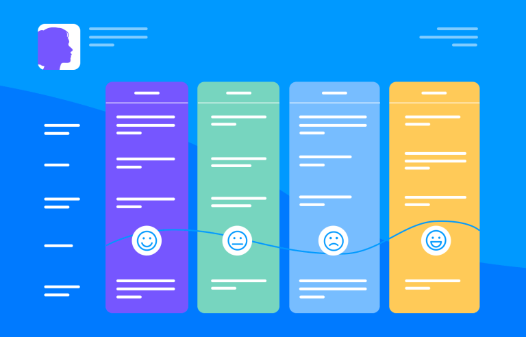
User journey maps help us navigate the sometimes choppy waters of UX design to get a usable product faster. Discover how they can work for you in this post!
Imagine you could have a UX design GPS that points to user satisfaction as you prototype. Sounds good, right? That’s where well-thought-out user journey maps come in!
Start prototyping new apps today. Enjoy unlimited projects!
Nowadays, digital products have come a long way in terms of usability. UXers often spend incalculable amounts of time conducting thorough user research before they even begin prototyping.
User journey maps are like a roadmap for understanding how your users interact with your product. They help you step into your user’s shoes and see the experience from their perspective, not yours.
Let’s break it down: before you can solve a user’s problem, you need to define what that problem actually is. This means diving deep into their pains, motivations, and goals. Think of it as detective work, you’re uncovering what drives them, frustrates them, and ultimately what they hope to achieve.
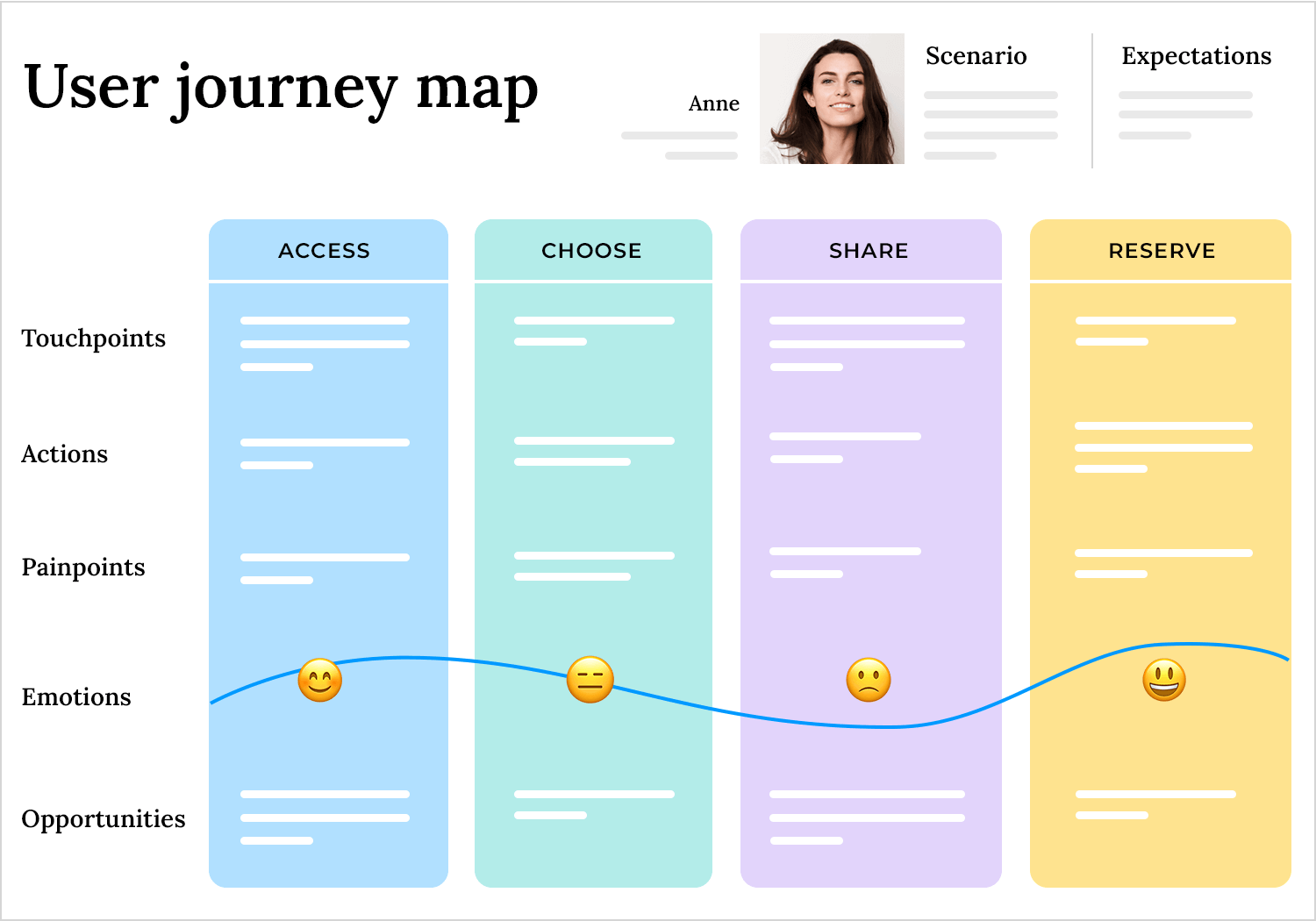
Once you’ve nailed down the user’s goal, the real magic begins. A journey map lays out all the steps they take to achieve that goal, from the moment they realize they need something, to discovering your product, using it, and (hopefully!) reaching their goal with it. It’s not just about what happens when they use your product; it’s about their whole experience, even before they know you exist.
User journey maps use various tools and components to bring this process to life. For example:
- Timelines: the sequence of user actions. For example, visiting a homepage or adding a product to the cart.
- Touchpoints: the points where users interact with your product or service.
- Emotional curves: the highs and lows users feel during their journey.
- Opportunities: ideas for improvements found at key points in the journey. For example, if users get frustrated during checkout, you might simplify the process or add support to help them.
In a nutshell, a user journey map combines these elements to give a complete picture of the user’s experience. It’s your key to designing a product that feels intuitive and solves real problems.
Solving a problem for the user means first understanding what that problem is from the user’s perspective.
For that reason, the initial question isn’t how to help a user reach their goal, but in defining that goal itself – something which requires research. And lots of it. Determining the users’ pains and motivations will help you in understanding what their goals are.
User personas and scenarios make these maps user-centric. Personas reflect who your users are, while scenarios place them in real-world contexts, showing how they interact with your product to solve specific challenges
User personas are fictional but realistic representations of your target users. They’re crafted using data from interviews, surveys, and observations, making them a valuable tool for understanding who your users are. A persona might include details about a user’s background, goals, frustrations, and motivations. These personas help you empathize with the user, allowing you to design with their needs and behaviors in mind.
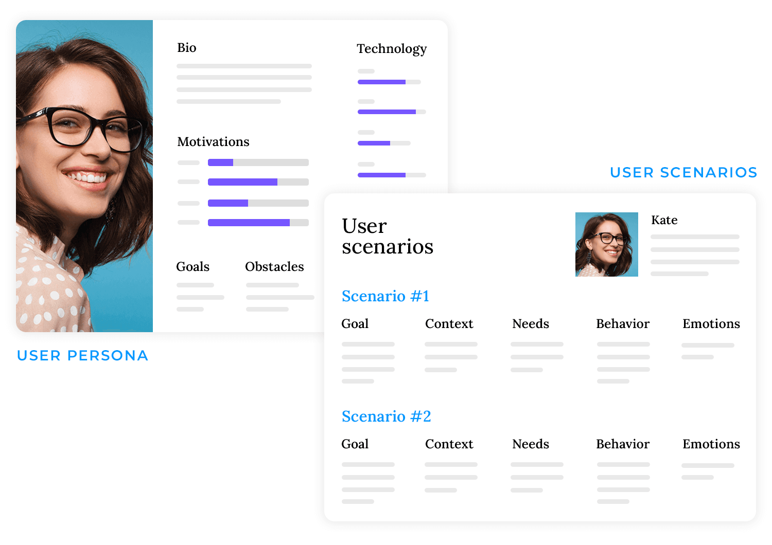
Scenarios, in other ways, are the stories that place these personas in specific situations. They describe the context in which a user interacts with your product while trying to solve a problem or achieve a goal. Scenarios focus on what the user is trying to accomplish, the challenges they face, and how your product fits into their journey.
Together, user personas and scenarios guarantee that user journey maps are grounded in reality. They provide a clear, relatable picture of the people using your product and the contexts in which they do so. This makes them indispensable tools for creating designs that truly meet user needs and expectations.
Start prototyping new apps today. Enjoy unlimited projects!

Now that we’ve explored how timelines capture the flow of a user’s experience, it’s worth noting there’s more than one way to create a journey map. Different situations call for different approaches, so let’s take a look at a few common types and when you might want to use each one.
Current state journey maps: focus on what’s happening right now. For example, if you have an e-commerce site and want to see why customers abandon their carts, a current state map will highlight each step in the checkout process. It paints a clear picture of the user’s real-time experience, helping you spot the bumps in the road.
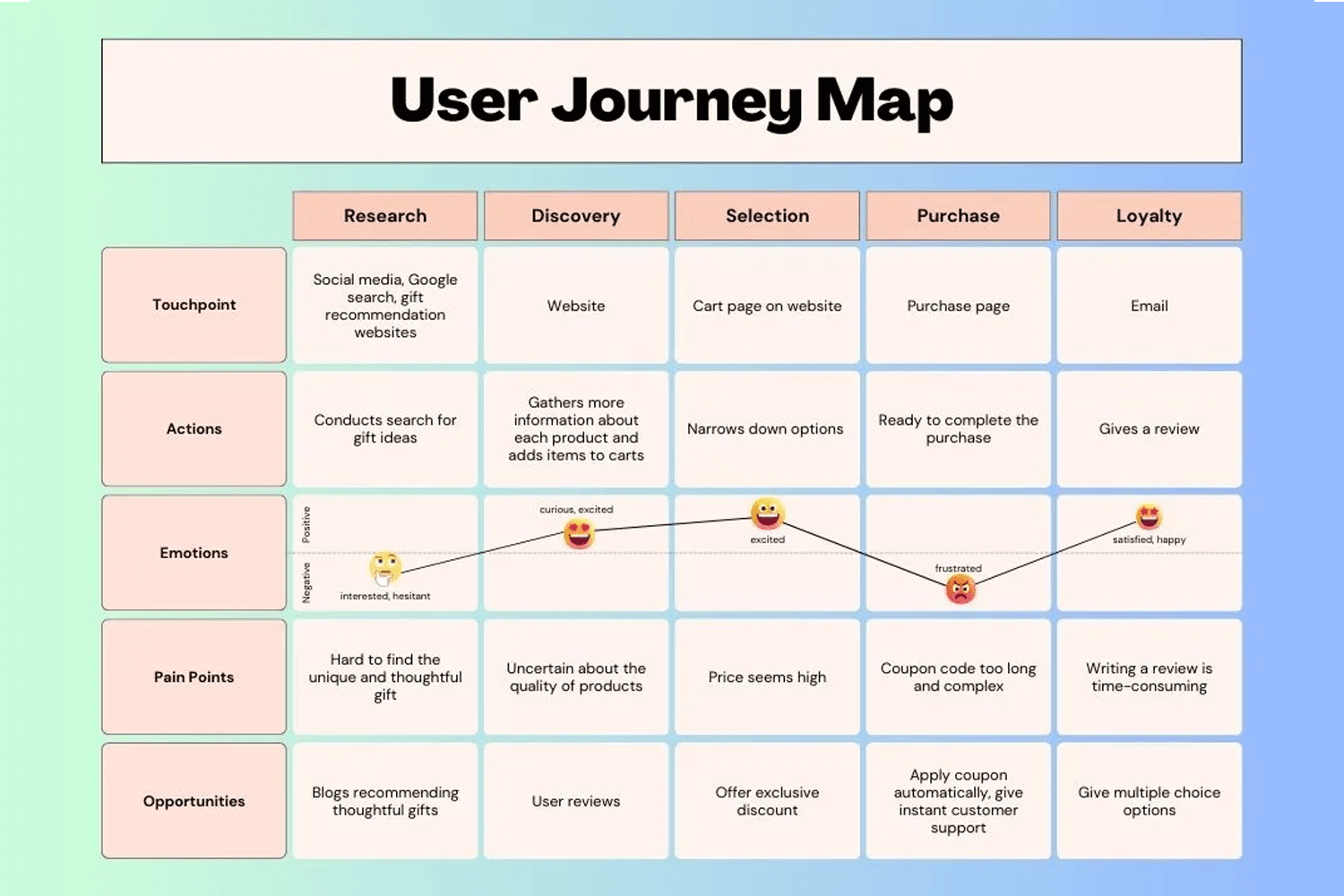
Future state journey maps: are all about imagining possibilities. Maybe your product team is planning to add a new feature, like personalized recommendations. A future state map lets you visualize how that feature could fit into the user’s routine before you even build it, allowing you to catch potential pitfalls early on.
Day in the life maps: take a wider lens, showing how a product fits into a user’s typical day. If you’re designing a productivity app, for instance, you’ll see how your tool competes for attention during breakfast, commute time, and late-night planning. This broader perspective helps uncover opportunities you might miss if you only look at interactions with your app in isolation.
Service blueprint journey maps: go behind the scenes. Suppose you run a subscription box service and you want to see how users’ orders are fulfilled. These maps don’t just track user actions; they also reveal internal processes, like inventory management or customer support workflows, offering a complete picture of your service’s ecosystem.
Emotional curve journey maps: spotlight the highs and lows of a user’s experience. Imagine a gaming app where players feel both the rush of leveling up and the frustration of losing a match. When you plot these emotional peaks and valleys, you clearly see when users are most engaged or likely to drop off, giving you clear targets for improvement.
Chronological journey maps: finally, let’s talk about chronological journey maps, the most straightforward type of journey map. These focus entirely on the sequence of user actions (what happens and when), without diving into emotions or motivations.
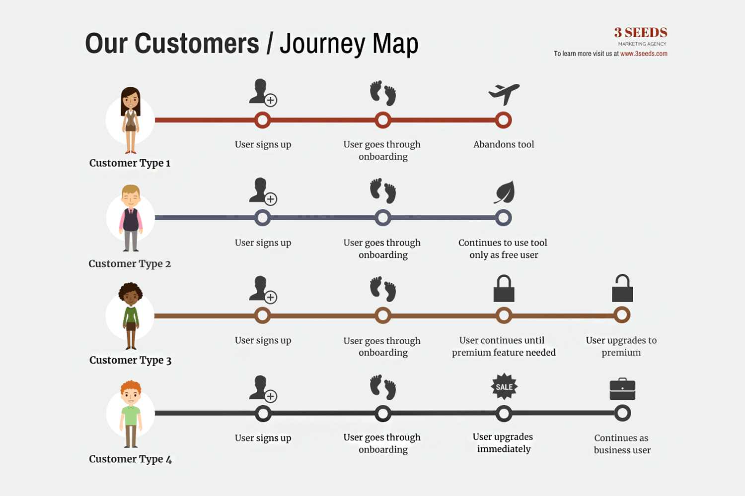
For example, see in the image how it tracks different customer types as they progress through their journey:
- Customer type 1 signs up, completes onboarding, but abandons the tool.
- Customer type 2 stays as a free user after onboarding.
- Customer type 3 upgrades when premium features become necessary.
- Customer type 4 upgrades immediately and continues as a business user.
This simple structure focuses on the step-by-step progression of user actions, helping you refine specific processes like onboarding or checkout. Each type of map serves a unique purpose. The key is choosing the one that best fits the question you’re trying to answer about your users and the journey they take with your product or service.
Start prototyping new apps today. Enjoy unlimited projects!

Without the user, there’d be no product. There would be, you say? Then let me rephrase that – by designing a product with no users in mind, we are essentially designing a product that will have no users! That’s why user journey maps are so valuable: they transform piles of research and raw data into a compelling, visual narrative that puts the user front and center. Let’s explore how they do this.
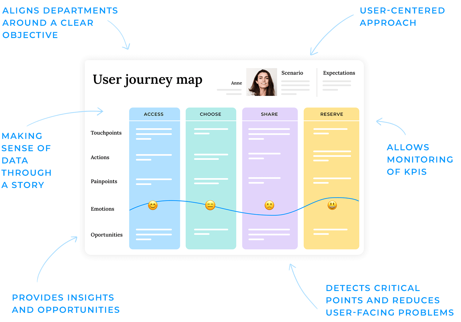
Make sense of the data
Ever tried memorizing pages of stats or dense research notes? It’s tough. The human brain naturally relates to stories better than lists of facts. That’s the beauty of user journey maps that they condense and organize complex user information into a story that’s relevant to your project.
It’s the difference between scrolling through spreadsheets and looking at a clear picture of where users struggle, succeed, or drop off. And just to clarify, user journey maps aren’t the same as user stories. While journey maps offer a high-level overview of the user’s experience and feelings, user stories get more technical and detail each part of the UI design.
Provide insights and opportunities
Beyond simplifying data, user journey maps help you see opportunities for product improvement. Match user behaviors and pain points against your proposed solution, whether it’s an app, website, or service, to see what’s working, identify any gaps, and discover new features that might delight your users in unexpected ways.
Maintain a user-centric approach
User journey maps keep the user’s perspective front and center in every discussion. Instead of guessing what the user might want, you have concrete insights backing up each design decision. This helps everyone; designers, stakeholders, and customer service reps stay focused on what the user actually needs, rather than what we assume they need.
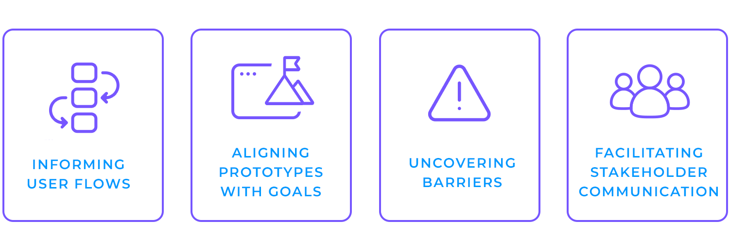
- Informing user flows: journey maps capture each step of the user’s path and help you structure screens and interactions around their expectations, so you never have to guess which page comes next.
- Aligning prototypes with goals: when you know exactly what a user wants at each stage, it’s easier to design interfaces that meet (and hopefully exceed) those needs. That keeps the prototype laser-focused and relevant.
- Uncovering barriers: sometimes, a confusing checkout flow or an overly complex form can derail your users. Journey maps highlight these red flags early, so you can address them before launch.
- Facilitating stakeholder communication: prototypes backed by journey maps tell a clear story, making it simpler to explain design decisions. Stakeholders can see exactly where users get stuck or excited, keeping feedback productive and user-centric.
Basically, user journey maps turn raw data into design direction. They show you where to focus and how to tackle potential issues, all while keeping the user’s experience in the spotlight. That way, when you start prototyping, you’re not just building something that looks good, you’re building something that’s truly useful.
Start prototyping new apps today. Enjoy unlimited projects!

You’ve seen why user journey maps matter, and now let’s talk about how to actually make one. Here’s a simple plan to guide you through the process.
Before you start, make sure the team understands the purpose of a user journey map. Show them how it turns research into actionable insights, keeps everyone focused on the user, and helps the project run smoothly. A quick conversation or short presentation is usually enough to highlight the benefits and get people excited about collaborating.
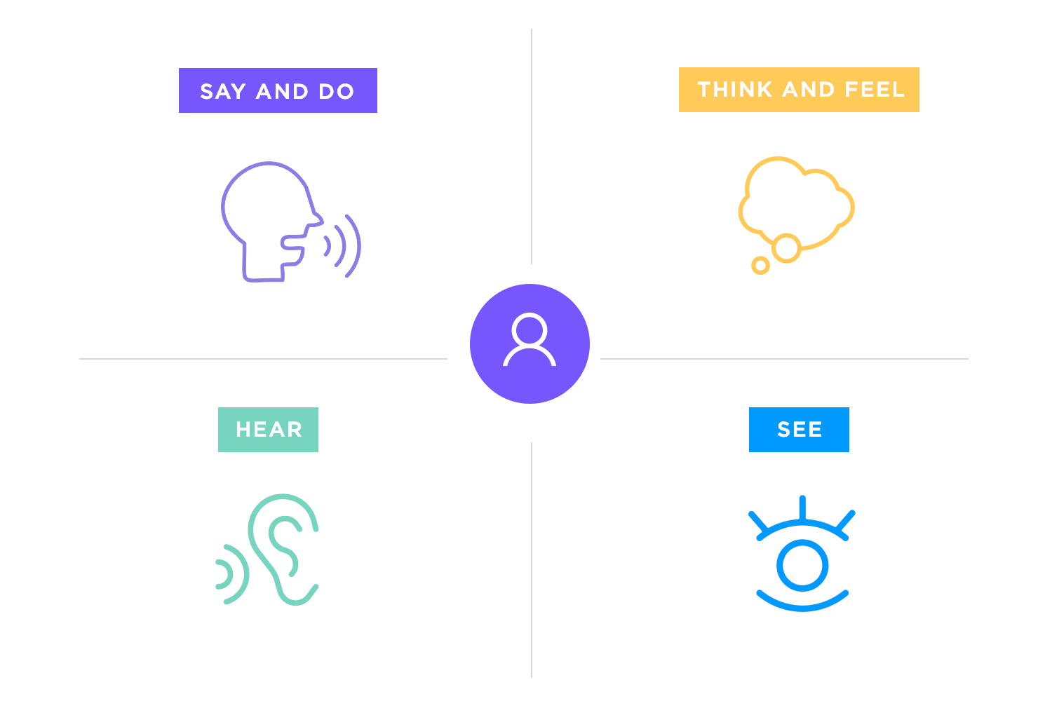
Once everyone is aligned, the next step is to capture who your users really are. This is where empathy maps come in. They’re visual tools that let you organize user data, like what people say, do, think, and feel, into one simple layout. Unlike a deep dive into detailed spreadsheets, an empathy map presents the emotional and behavioral side of your audience. This birds-eye view makes sure you’re zeroing in on genuine user concerns, rather than abstract numbers.
After creating empathy maps, group similar findings together and craft user personas; fictional yet data-driven representations of your users. Each persona has a backstory, motivations, frustrations, and goals.
Now, link those personas to your user journey map. Let’s say you have two personas: Maire (a college student) and Paul (a stay-at-home dad). Both want to save money on groceries, but they have different contexts and expectations. Instead of forcing both into one journey map (which can muddy the waters), give each persona its own map.
This way, you’ll clearly see where Maire and Paul differ in motivations, experiences, and touchpoints. You can then design separate paths or features that speak directly to their needs.
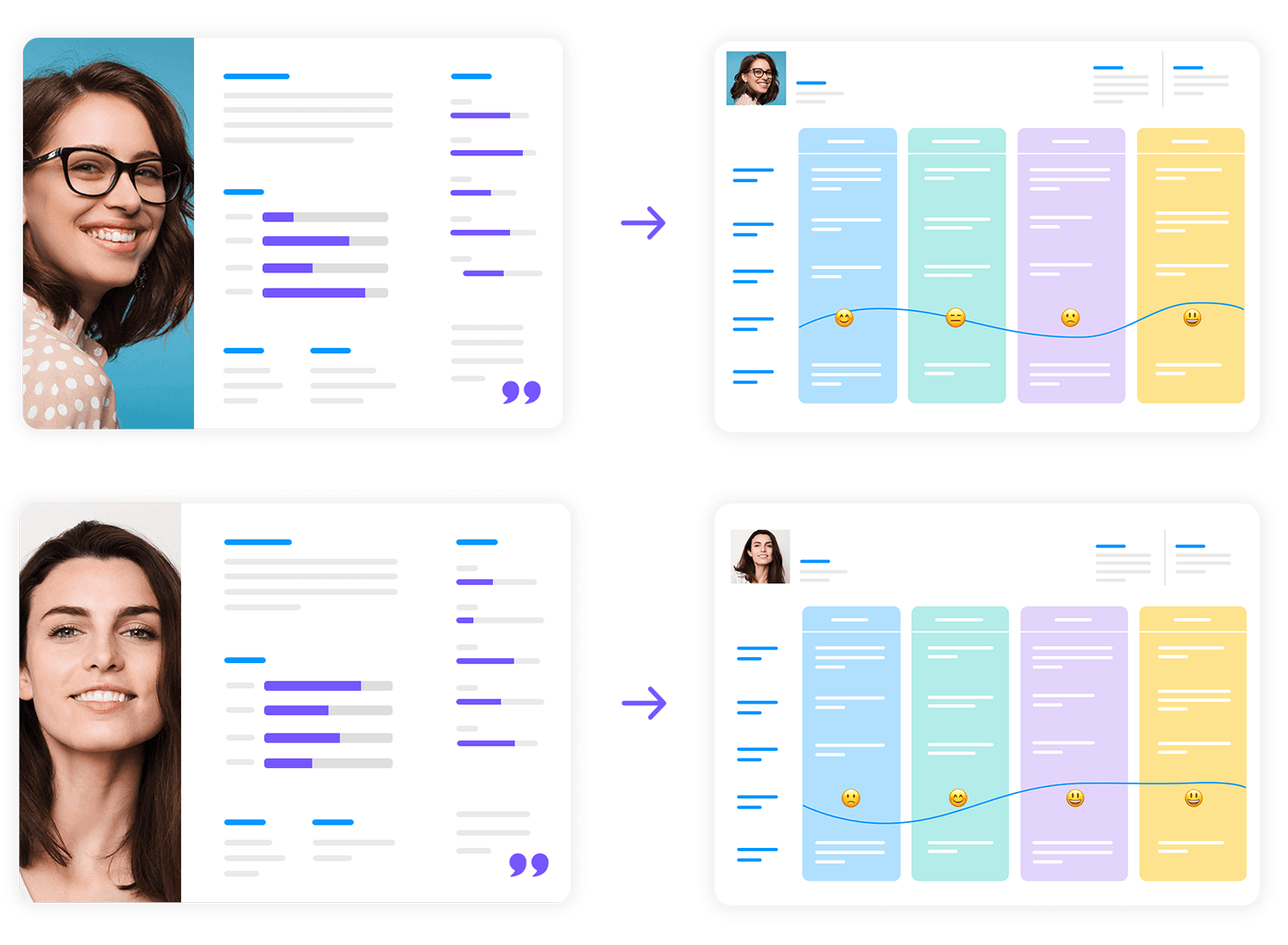
Following these steps, aligning the team, building empathy, and connecting personas to distinct journey maps, results in a clear roadmap that reflects real user experiences. This approach guarantees that design decisions remain grounded in genuine user insights, rather than guesswork.
It’s easy to mix up user journey maps and user flows because both focus on how people interact with your product. However, they serve different purposes.
- User journey maps look at the bigger story. They capture a user’s entire experience, from discovering a need to accomplishing a goal. They reveal emotional highs and lows, context, and motivations. Everything that shapes how a user feels about your product.
- User flows home in on the specific screens and paths within your product. They show exactly how a user navigates from one page or feature to the next, making them incredibly useful when it’s time to prototype or build actual interfaces.
- User story mapping focuses on breaking down the product’s features into smaller, actionable steps from the user’s perspective. It highlights the tasks users perform to achieve their goals and helps prioritize which features to build first.
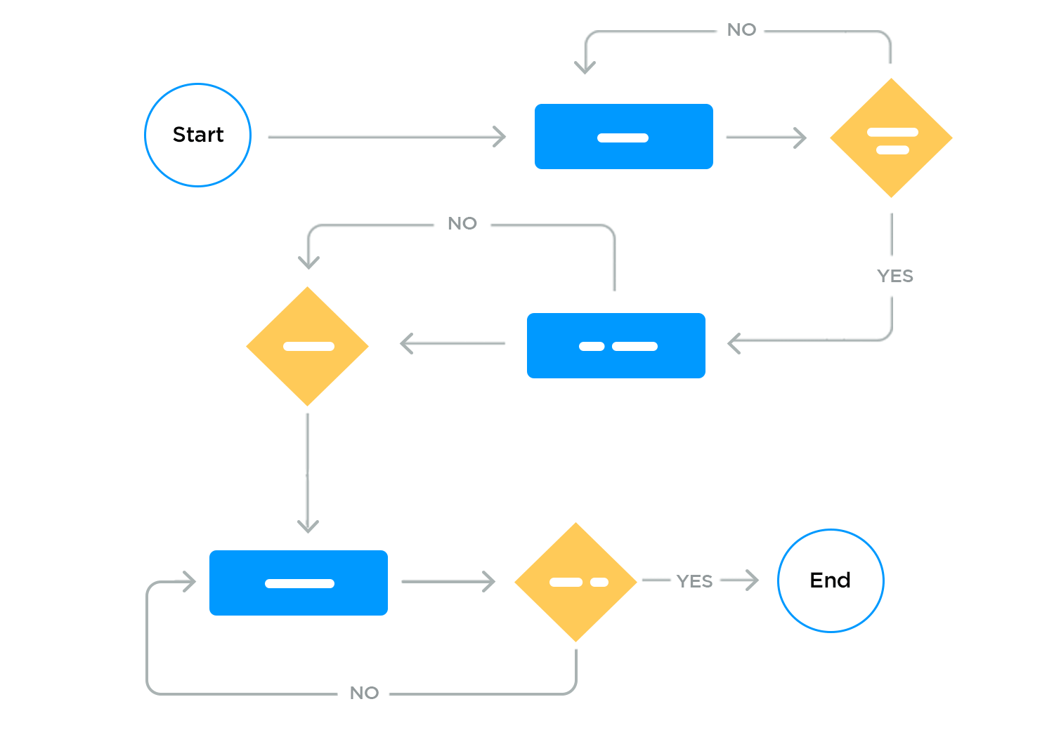
Think of it this way: user journey maps help you see the forest (the overall experience), user flows help you see the trees (the detailed paths in your interface), and user story mapping zooms in on the actions users need to complete their journey.
- Confusing tools: try not to treat user journey maps and user flows as interchangeable. They complement each other but offer different insights.
- Skipping user research: both journey maps and flows rely on real user data. Creating them without proper user research often leads to assumptions that don’t reflect actual needs.
- Overlooking edge cases in user flows: remember to account for every possible path, even the ones users might only take occasionally. Missing these edge cases can create frustrating dead ends in your design.
- Overcomplicating journey maps: a journey map should be clear, concise, and easy to understand. Adding too much detail can make it overwhelming and less actionable for your team.
Start prototyping new apps today. Enjoy unlimited projects!

Here are some great user journey map templates to kickstart the process. We’ve included some variety so you can decide the best way to represent your user research. You can also mix and match to create your own, taking inspiration from these templates.
Qualaroo does a visually simple, yet appealing and complete user journey map template that you can download for free.
In the header it groups together all the basic information about the actor, such as their user persona bio, the challenges (pains) they face, along with some attributes, i.e. tech savvy and patient. The events (stages), touchpoints and emotions are grouped into horizontal rows so that you can easily create a storyboard.
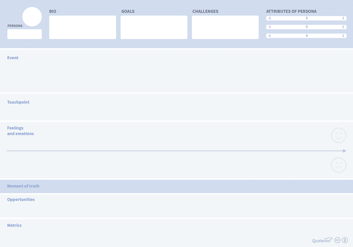
If you’ve never put together a user journey map before, then this is a great place to start because of the Qualaroo template’s simplicity.
Moqups offers a well-structured user journey map template that’s perfect for breaking down the entire user experience into clear, actionable phases.
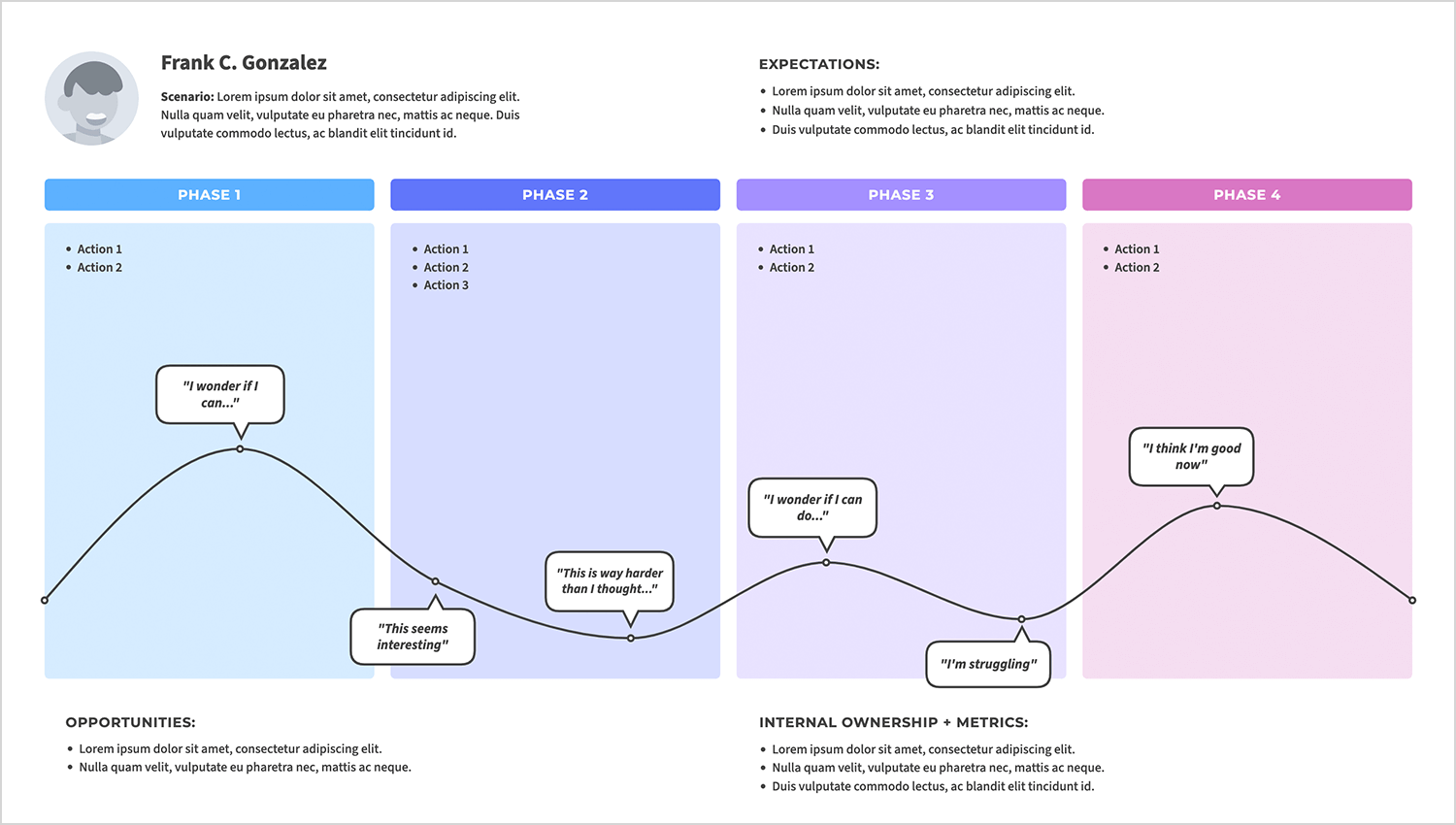
This user journey map UX stands out for its detailed segmentation of actions, expectations, and emotions throughout each phase. The emotional curve helps you understand the highs and lows of your users’ journey, from moments of curiosity to overcoming struggles and building confidence. It’s an excellent choice for teams aiming to identify opportunities for improvement while keeping the user’s perspective front and center.
If you’re looking for a more detailed user journey map template that’s highly visual at the same time, Edraw does a brilliant free template that you can download as a PDF, and that you can later convert to a Word document.
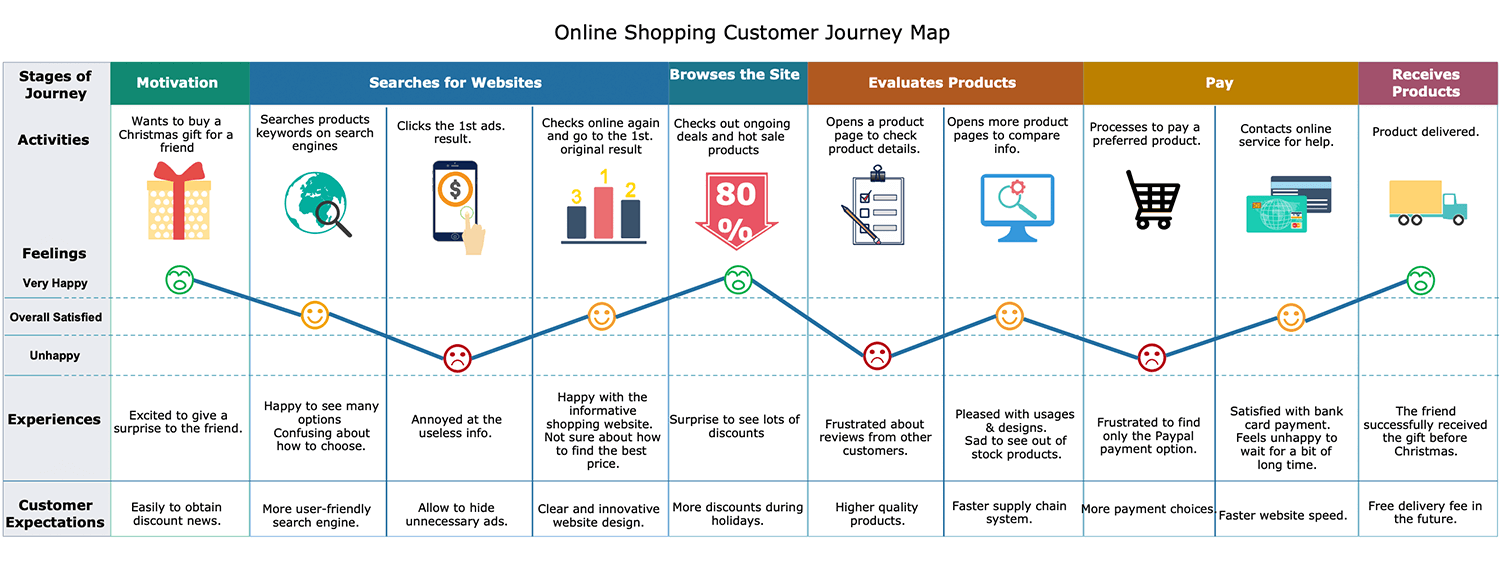
What we like about this user journey map is that it gives so much insight at each stage. It also contains images, as well as a graph with emojis that makes the information easy to understand at a glance. It also provides space to give plenty of detail for each stage for more in-depth reading.
Custellence’s customer journey map template is a great way of coming up with new solutions to existing problems, as well as exploring new opportunities. It’s also works well as a beginning-to-end customer journey.
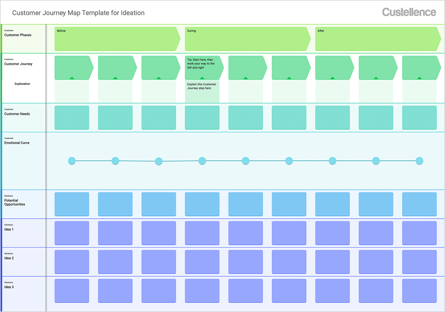
The stages are mapped into three main groups: before, during and after. It’s an ideal way of getting the full picture of your user’s experience even when they’re not using your product. It also contains an emotional curve to track the user’s emotions at each stage at a glance – something that’s always helpful to a UXer.
Lucidspark’s user journey template includes an emotional curve that provides a quick and easy way to visualize how the user feels throughout their journey. Whether they’re starting off satisfied or hitting some bumps later, this curve helps pinpoint exactly where improvements are needed. It’s especially useful for brainstorming solutions as you can tie specific pain points to actionable ideas in real-time.
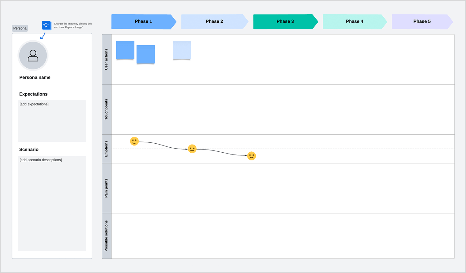
Lucidspark’s layout is simple yet comprehensive, making it a great option for teams looking to collaborate on understanding and improving their user’s journey.
Canva is another good source of user journey map examples. This template is bright, color-coded, and easy to tweak in real time, perfect if you prefer a clean, visual way to organize your thoughts. Each row and column feels like its own sticky note zone, so you can quickly add objectives, needs, or emotional barriers and move them around as your ideas evolve.
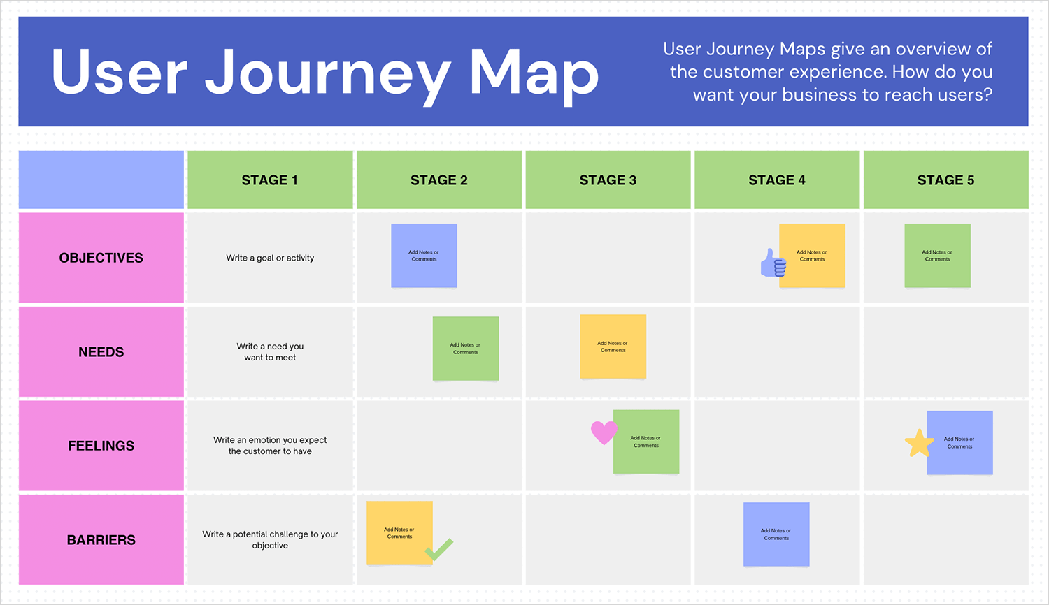
It’s like a digital whiteboard, keeping everyone engaged and on the same page without getting tangled in overly complex charts.
If you’re looking for something a bit more collaborative, Miro’s user journey mapping example might be your go-to. It’s set up like a digital whiteboard, complete with sticky notes and step-by-step prompts that guide you through each interaction in the user’s experience.
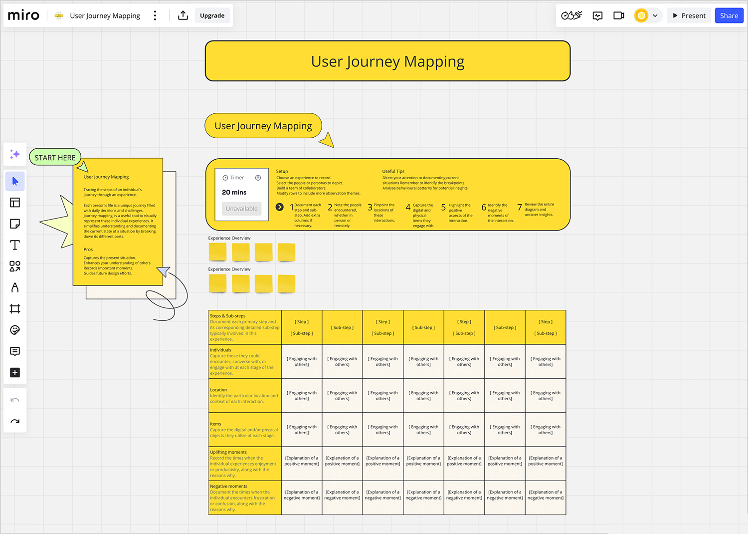
What’s great is that multiple team members can join in real time, perfect for hashing out new ideas or addressing pain points on the fly. It strikes a balance between structure and flexibility, making it easy to capture every detail without feeling boxed in.
If you’re looking for something straightforward and easy to follow, Visual Paradigm keeps it simple and clear. Think of it as a step-by-step guide to the user’s journey, with each phase laid out in order, complete with bold icons and short descriptions.
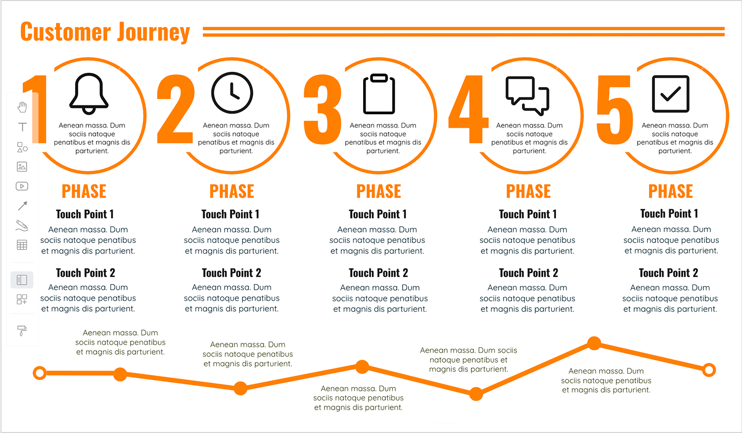
It’s perfect for when you need a clean, no-fuss way to show what’s happening at each touchpoint. Whether you’re presenting to a team or just organizing your own thoughts, this user journey example makes it easy to focus on the essentials without getting overwhelmed.
This time from ClickUp, we have one of the best user journey maps for teams starting out or working on straightforward projects. It organizes the user’s journey into clear phases, while allowing space to capture specific details like customer actions, touchpoints, and emotions.
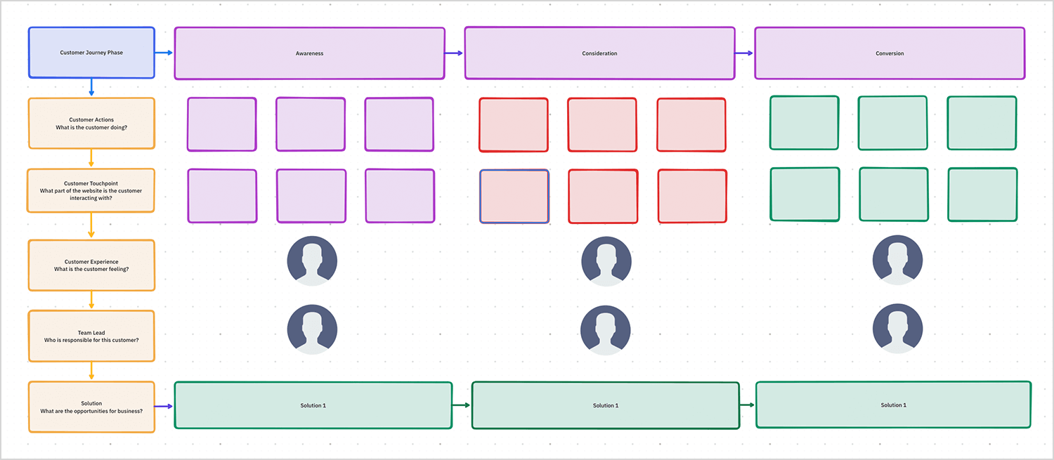
What’s great about this template is how much it emphasizes teamwork. It’s not just about tracking what the customer is doing or feeling, it also shines a light on who’s responsible for each step and where the business can grow. It’s a nice balance of looking at the customer journey and making sure the team is aligned. The layout is clean and colorful, which makes it super easy to follow and work with.
To wrap up our list of the best user journey mapping examples, the one from Xtensio is clean, flexible, and just feels effortless to work with. It gives you space to outline your persona, their goals, and key stages without overcomplicating things.
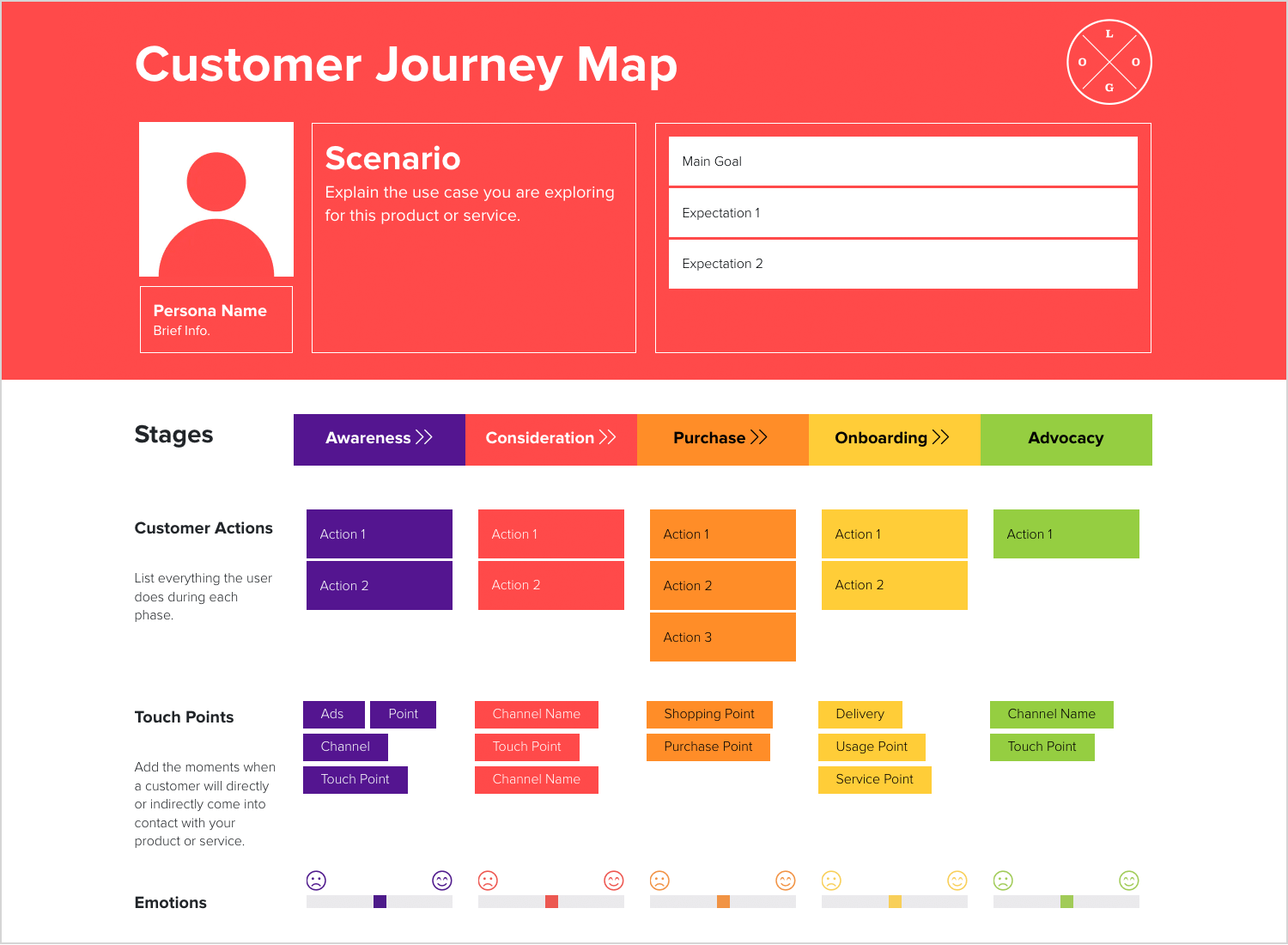
It’s pretty customizable, so you can shape it to fit your project. It also looks great, which is always a bonus when sharing with your team.
With Venngage you can create a free account with Gmail or Facebook. You can then proceed to use their editor for free to create user journey maps. There are a myriad of templates available, and within the editor, you can edit the text, change the font, choose from over a hundred of their icons to add and preview it for a screenshot.
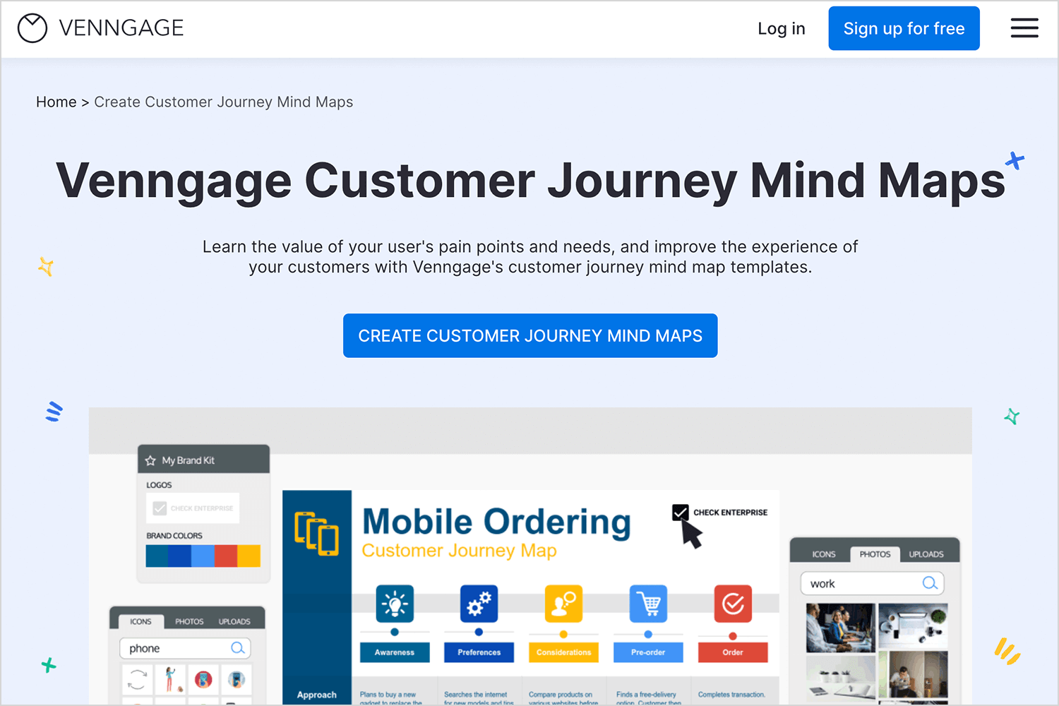
If you want to be able to share and distribute your user journey map as a PDF, you’ll have to purchase the premium option which is $19 monthly for an individual and $49 for their business plan.
Creately is a free web software tool that lets you edit their customer journey mapping templates for free and export your customer journey map as an image file. If you want to be able to download as a document or PDF, you’ll need to sign up to their personal plan which costs $5 a month or the team plan which sets you back by $25.
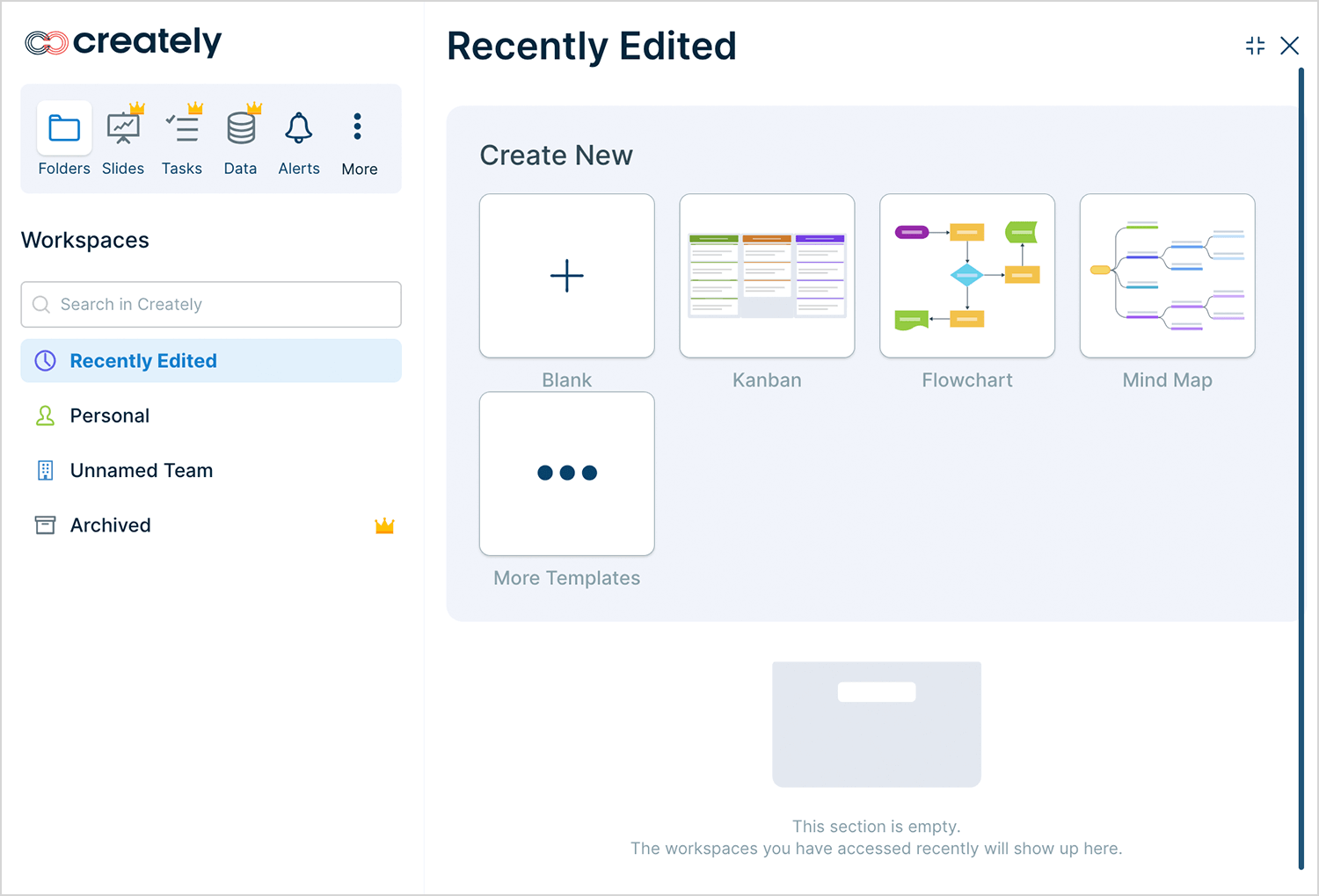
This tool also gives you access to a vast array of icons that you can use in your user journey map, as well as basic text editing features.
Lucidchart provides a great free user journey map editor that has an abundance of shapes, and text editor features to help you edit their template.
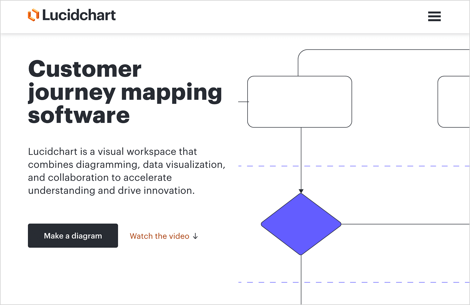
Their template includes the actor’s bio, along with a table listing the various stages such as awareness and evaluation. The vertical labels contain aspects that are typical of the empathy map, such as thinking, feeling and doing, but also for opportunities.
Another nice touch is that the shapes, arrows and lines available let you create flowcharts or many other sets of possible designs.
UXPRESSIA lets you edit their template of a user journey map using the free version of their tool. What we like about this template and editor is the simple and visually appealing nature of it.
The process by which you can edit the document is intuitive. You can click on any of the “neutral” emojis in the emotion curve to change the emotions to “joy”, “serenity” (if you can achieve serenity with a UI design then well done!). There’s a flow chart that lets you denote each stage of your user journey with an icon.
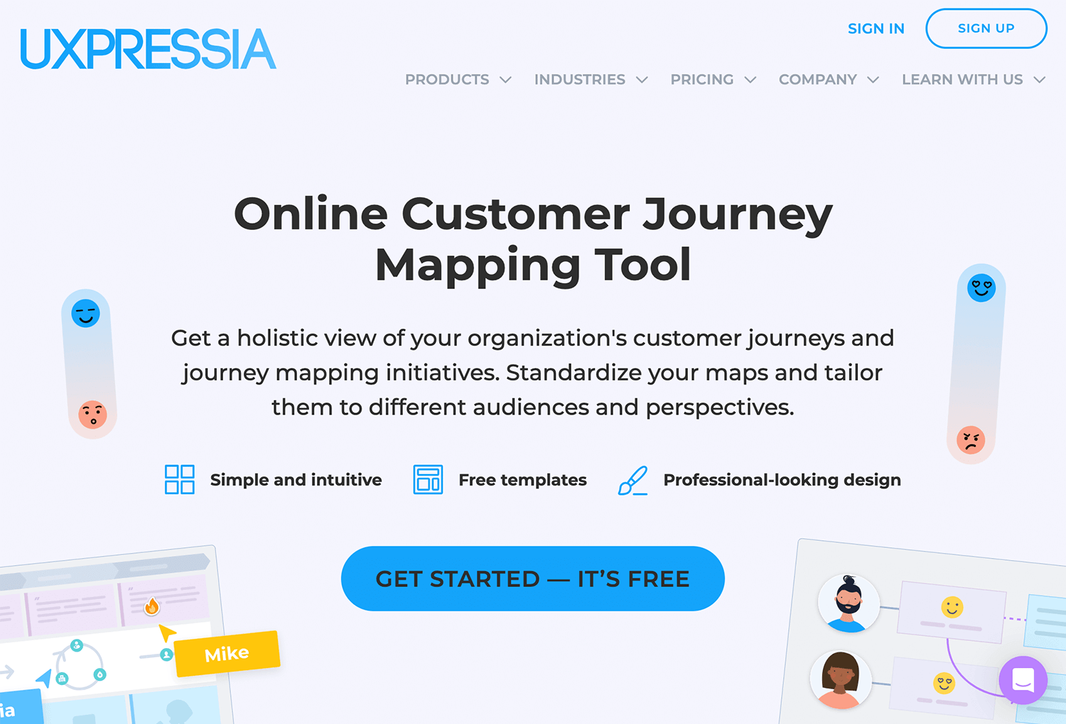
The best thing is that making a journey map with this tool lets you convey a wealth of information without it being overwhelming, letting you come away with a memorable PNG for your stakeholders for free.
Smaply is a user persona tool that you can avail of for free for up to 14 days without having to enter any credit card details.
The format of their user journey map template is relatively simple – you’re presented with three headers: pre-service, service, post-service, along with several rows of tabs. To these tabs you can add titles, descriptions and images.
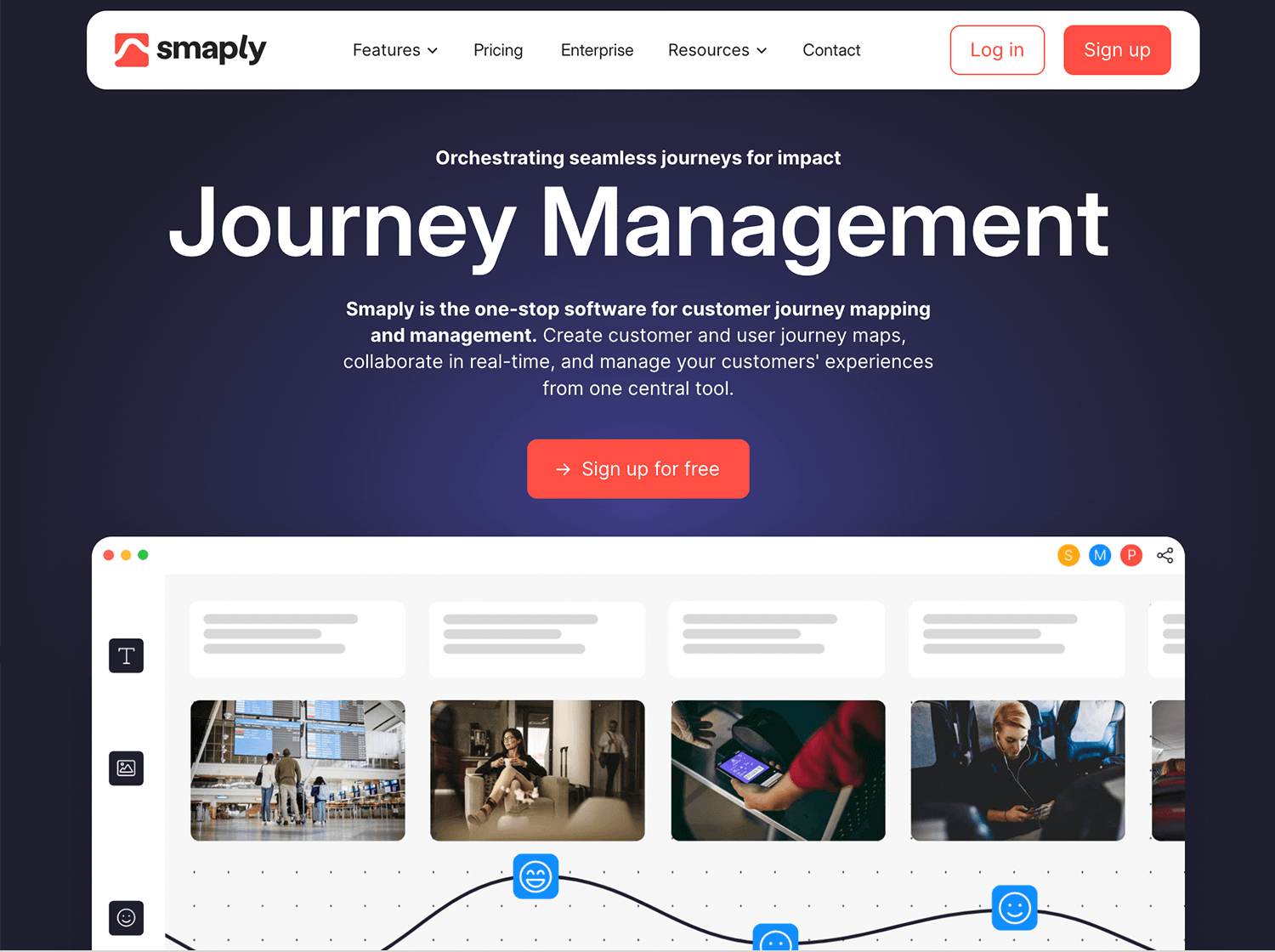
What we like about this tool is the low learning curve required to quickly get a user journey map drawn up.
MURAL is an online whiteboard that allows teams to brainstorm and create visual maps collaboratively. It offers templates for user journey maps and allows users to add sticky notes, icons, and diagrams in real time.
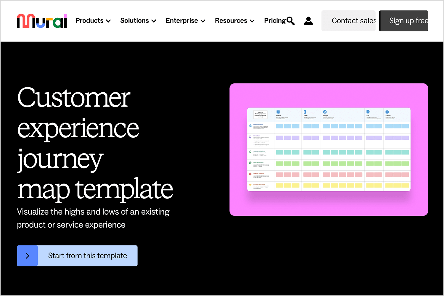
It’s particularly useful for remote teams who want to work together on mapping the user experience interactively.
If you’re looking for something simple and easy to use, Gliffy might be just what you need. It’s a straightforward tool that lets you map out user journeys with clean, drag-and-drop visuals. You can quickly add touchpoints, connect steps, and keep everything organized without overcomplicating things. Plus, it works seamlessly with tools like Confluence and Jira, making it a great choice for teams already working in an agile setup.
FlowMapp isn’t just about user flows, it’s also a great tool for creating user journey maps. It gives you everything you need to lay out each step of the user’s experience, from touchpoints to emotions, in a way that’s easy to understand and share with your team.
What makes it great is how seamlessly it ties in with other features like personas and site maps, giving you a complete picture of the user’s journey. It’s simple, intuitive, and perfect for teams who want to dig deeper into user behavior without overcomplicating the process.
UserTesting might not be a traditional journey mapping tool, but it’s perfect for gathering real-world insights to inform your map. With its ability to capture live feedback and user behavior, you can take the data straight from actual users and build a journey map that reflects real experiences.
It’s great for identifying pain points, validating assumptions, and making sure your journey map is rooted in reality. Think of it as the research phase made simple and actionable.
And finally, to round out our list, Whimsical is a great option for teams who value speed and simplicity. It’s a lightweight, visual tool that makes sketching out user journey maps feel effortless. You can quickly outline phases, add touchpoints, and connect everything in a clean, organized way.
What’s nice about Whimsical is how easy it is to brainstorm and make changes without getting stuck in complicated features. It’s the perfect choice when you need something quick, clear, and collaborative.
Start prototyping new apps today. Enjoy unlimited projects!

Creating a user journey map is like what we said at the beginning of this post, it’s like putting yourself in your user’s shoes, it’s a chance to really see things from their perspective. It helps you and your team understand what’s working, what’s not, and where you can make things better. It’s not just about avoiding mistakes; it’s about building something that feels right for the people who’ll actually use it.
If you’ve already built a user persona, taking the extra step to map their journey is worth it. It’ll guide you through the design process, keep everyone on the same page, and help you create a product that doesn’t just function but feels great to use. In the end, it’s about making the experience seamless and rewarding for you and your users.
PROTOTYPE · COMMUNICATE · VALIDATE
ALL-IN-ONE PROTOTYPING TOOL FOR WEB AND MOBILE APPS
Related Content
 Learn how to design better e-learning platforms with user-centered UX principles, real examples, and high-fidelity prototyping tips to boost engagement and learning outcomes.13 min Read
 Infinite scroll keeps users engaged, but it’s not always the best choice. This guide breaks down when to use it, when to avoid it, and how to design it right.14 min Read
 Learn how to design web and mobile app prototypes, how to test them and what to look for in a prototyping tool in this complete guide.15 min Read
