What are web animations? How do they make websites more interactive and fun? Here’s everything you need to know
Have you ever visited a site where everything just feels smoother and more alive? That’s the magic of web animations at work. Whether it’s a button that changes color when you hover over it or a cool transition between pages, animations are what make a website interactive and engaging.
Design and prototype web animations with Justinmind.
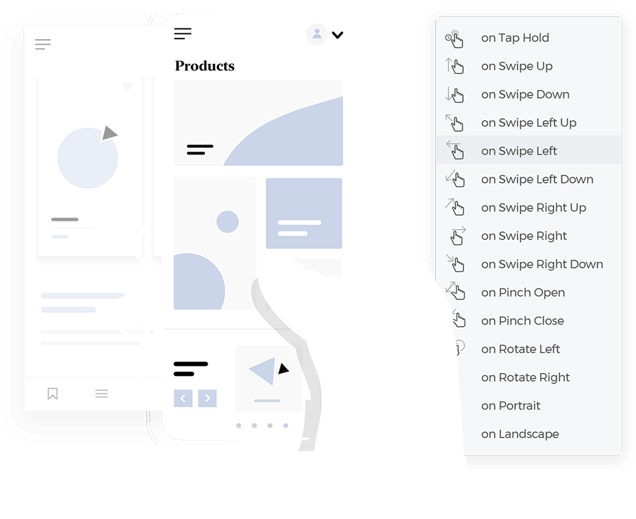
But animations aren’t just about looking good, they play an essential role in guiding users and enhancing the overall experience. From a progress bar that shows how far you’ve come to a micro-interaction that confirms your action, animations make website navigation easier, more intuitive, and definitely more fun to explore.
In this post, we’ll walk through what makes web animations so effective, share some examples of the best web animations out there, and show how you can use them to elevate your own designs.
Web animations breathe life into a website. They might be as subtle as a button changing color when hovered over or as dynamic as smooth page transitions or engaging loading animations. But animations go beyond looks, they’re essential tools to enhance how we interact with a site.
In terms of UX design, animations help guide users. For example, they can show where to click, confirm that an action has been successful, or help you understand what’s happening, like when a page is loading. This makes websites easier to use and more intuitive.
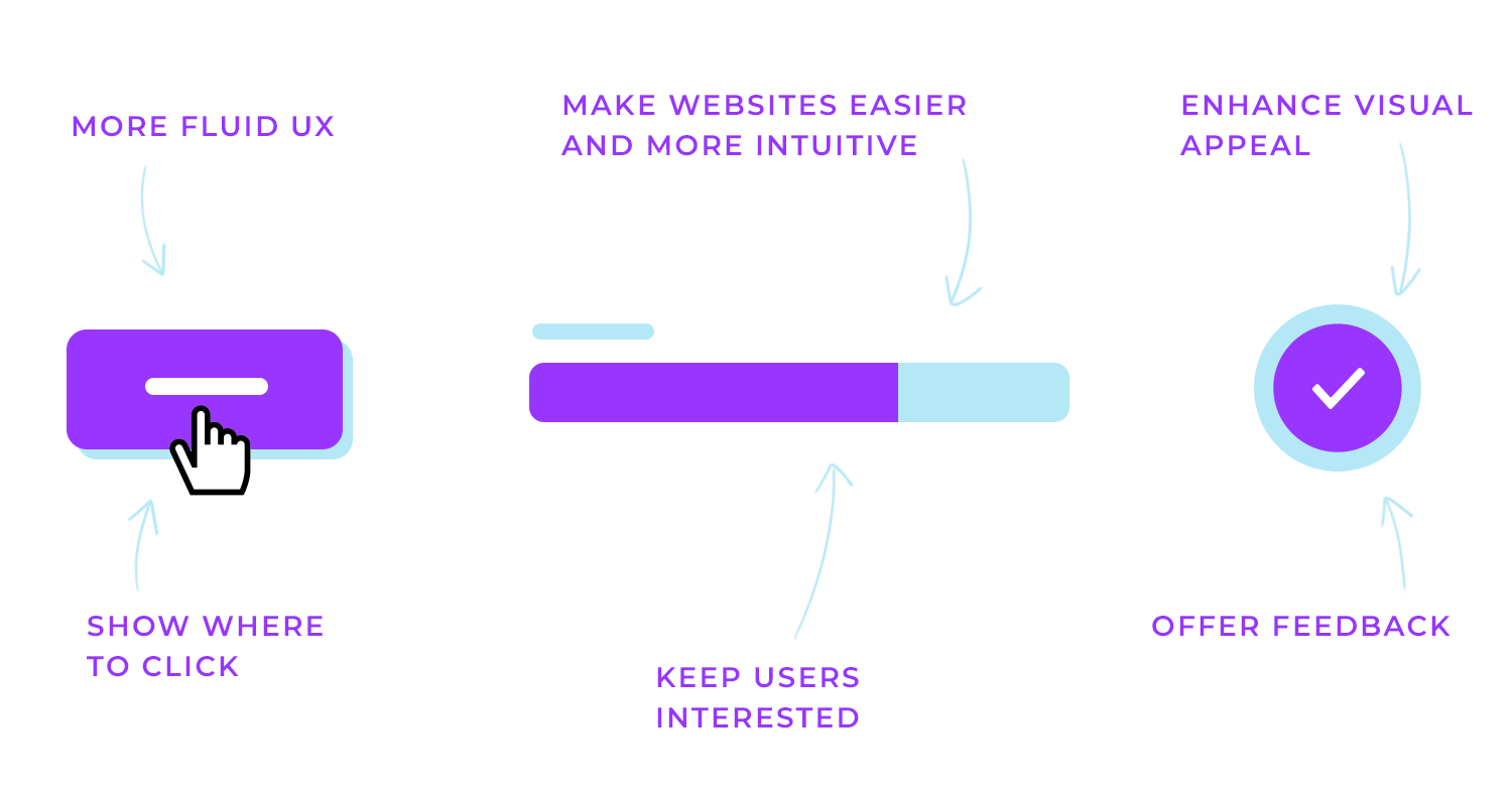
Animations also play a big role in keeping users engaged. A website that feels interactive and alive is more interesting to explore. Plus, animations can highlight important information or direct the user’s attention in a way that feels natural, making the overall experience smoother.
Animations also boost the site’s visual appeal, making it feel polished and professional, while adding personality. When used thoughtfully, animations not only improve functionality but also turn the user’s journey into a more enjoyable and memorable experience.
Designing web animations is all about ensuring they improve the user experience while maintaining visual appeal.
When it comes to prototyping and testing your animations, tools like Justinmind allow you to create interactive prototypes with animated interactions. This helps designers test animations in real-world scenarios, ensuring they work as intended before the final build.
Let’s explore the key principles of effective animation that can help you achieve that balance.
Purpose-driven animations
Animations should always have a purpose. They need to guide users, provide feedback, or highlight important actions. For example, a button that subtly changes when hovered over invites users to interact, while a small shake on an error field quickly signals that something went wrong. The key is to make sure every animation is functional and not just decorative.
Clarity and simplicity
Animations work best when they are simple and clear. Too many flashy effects can be distracting, so it’s important to keep things clean. A smooth hover effect or a gentle fade-in can enhance user experience without overwhelming the page. Simplicity ensures that users stay focused on the content rather than the effects.
Timing and easing
The timing of an animation is crucial to making it feel natural. If an animation is too fast, it can feel jarring; if it’s too slow, users might lose patience. Using easing functions, where an animation starts slowly, speeds up, and then slows down, helps create a smooth, fluid experience that mimics real-world movement.
Consistency
Animations should feel like a natural part of the site. Using the same animation style across your website creates a more cohesive experience. Whether it’s page transitions, button interactions, or loading indicators, keeping animations consistent helps the design feel connected and intentional.
Accessibility
It’s important to design animations with accessibility in mind. Some users might be sensitive to motion, so offering an option to reduce or turn off animations ensures that your site remains usable for everyone. This approach makes sure that all users, regardless of their needs, can have a comfortable experience.
Subtlety and restraint: make sure animations blend naturally into the design rather than becoming the center of attention. A simple, understated animation is often more effective than something that’s too flashy or distracting.
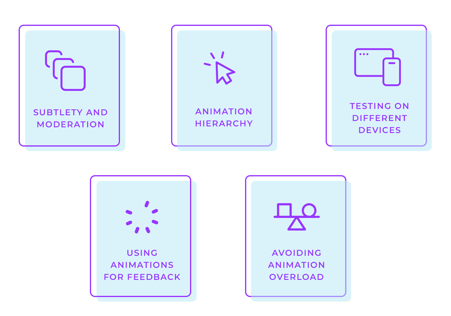
Animation hierarchy: not all animations should have the same importance. Focus on those that enhance the user experience, such as transitions or highlighting key buttons, and let these be more prominent than purely decorative animations.
Testing on different devices: always check that your animations perform well across desktops, mobile devices, and tablets. What works smoothly on one platform might not look or function the same on another, so testing across different devices is key to maintaining a consistent user experience.
Using animations for feedback: animations can provide valuable feedback to users. For example, a quick animation when a button is pressed can confirm that an action has been completed, while a small shake on an error field can highlight an issue that needs attention.
Avoiding animation overload: while animations can make a website more engaging, too many of them can overwhelm users or slow down the site. It’s important to find the right balance, use animations to enhance the experience, but avoid relying on them too much.
The way animations move can make all the difference in how smooth and natural they feel. It’s not just about making something shift or change, it’s about doing it in a way that feels right to the user.
That’s where easing functions come in. These are what make animations feel more lifelike. Instead of moving at a constant speed, easing allows for changes in speed that feel more natural.
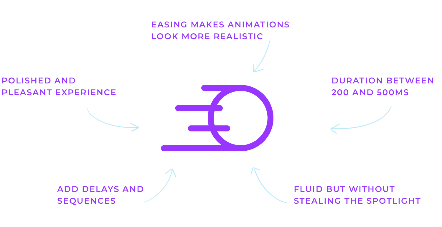
For example, an animation might ease in, starting slow and then speeding up, or ease out, slowing down at the end. There’s also ease-in-out, where the animation starts slow, speeds up in the middle, and then slows down again. These variations make the movement feel much more like how things work in the real world.
The timing and duration of animations also matter. For most interface animations, sticking to something between 200 and 500 milliseconds is a good rule. If an animation is too fast, it feels rushed and jarring. If it’s too slow, users can get frustrated waiting. You want to hit that sweet spot where the animation feels smooth but doesn’t steal the spotlight.
Adding delays and sequencing can take your animations up a notch. For example, a small delay between actions or arranging animations in a certain order can guide the user’s attention in a more thoughtful way. Imagine one element sliding in, and just as it finishes, another smoothly appears, this kind of sequencing makes everything feel more connected and intentional.
In the end, getting the timing, easing, and sequencing right ensures your animations flow naturally and make the overall experience feel polished and enjoyable.
Design and prototype web animations with Justinmind.

These are the small, purposeful animations that give users feedback when they interact with elements, like a button click or a toggle switch. Micro-interactions make the interface feel more responsive and engaging by showing users that their actions have been registered.
Let’s take a look at some great examples of micro-interactions in action:
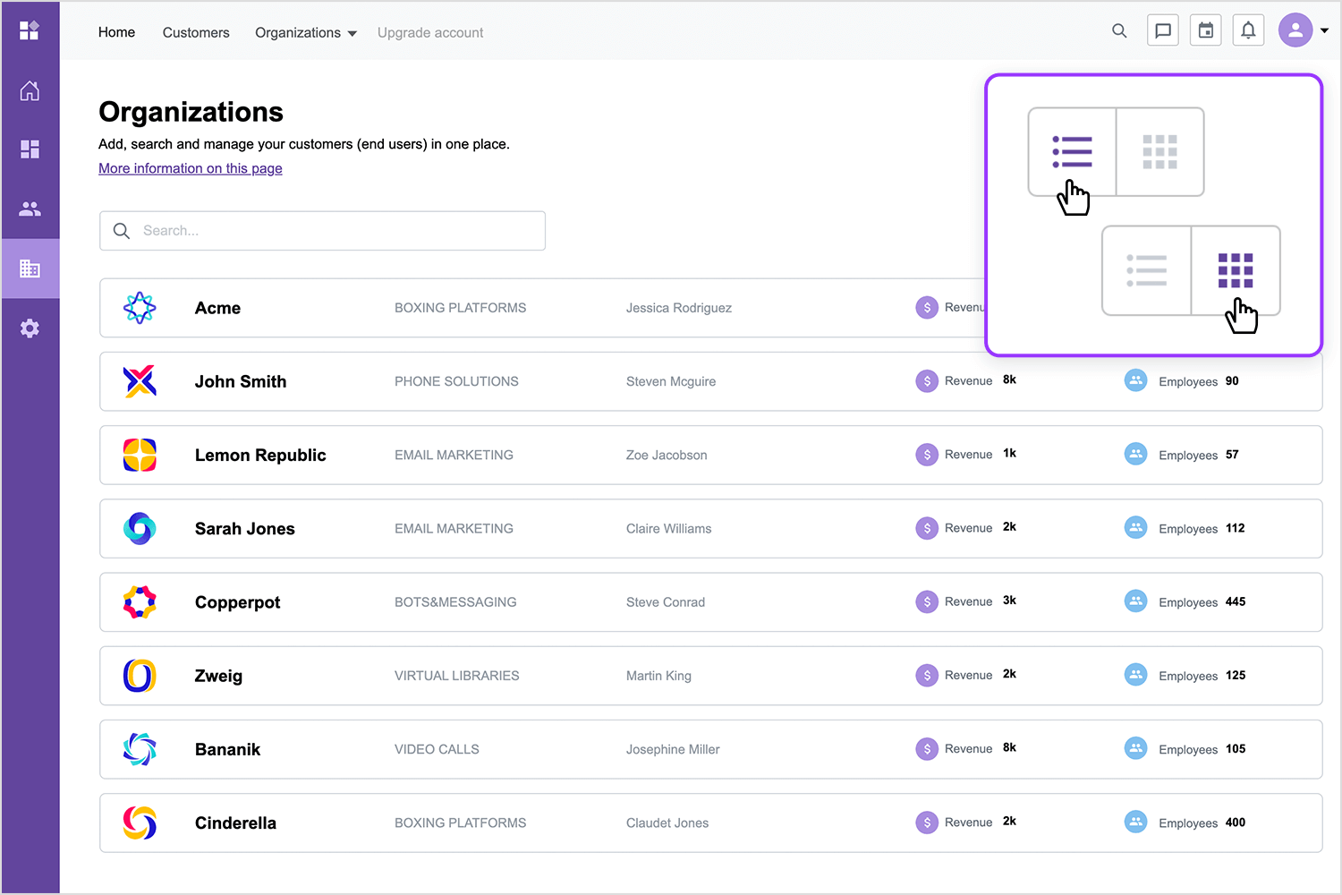
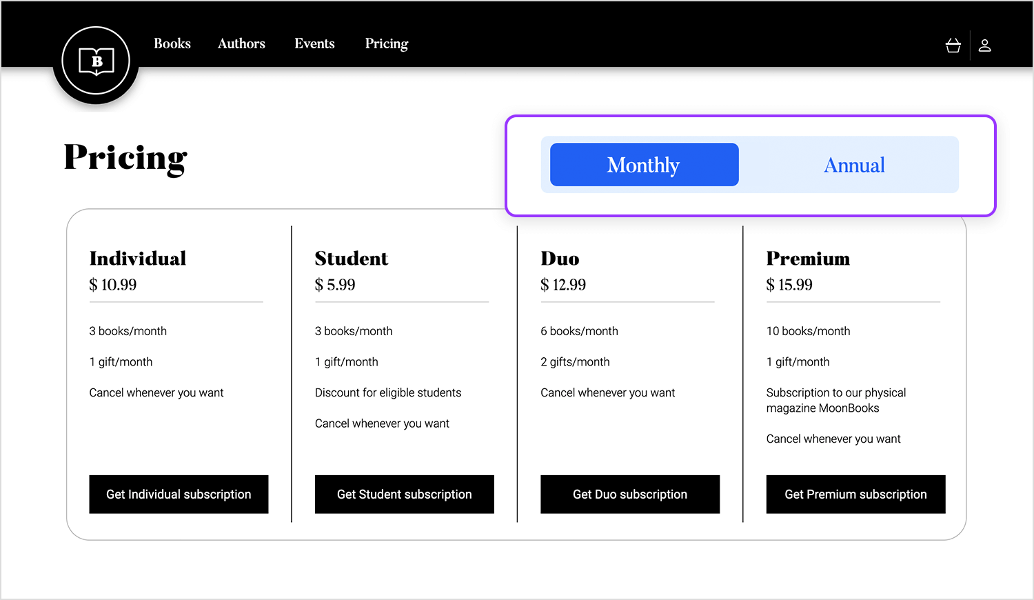
Toggle button for list/grid view
This simple toggle button lets users switch between a listview and a grid view with ease. When clicked, the button smoothly transitions between the two options, providing instant feedback through the change in icon.
This micro-interaction helps users control how they view content, making the experience feel more personalized and responsive.
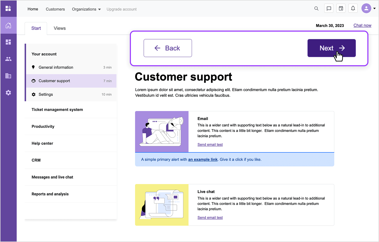
Interactive navigation buttons
These buttons make moving between sections simple. With a click, they offer quick feedback and a smooth slide effect, guiding users to the next or previous section. This keeps navigation clear, helping users know where they are and what to do next.
Back and next buttons for navigation
These buttons make navigating between sections super easy. When clicked, the buttons provide instant feedback by subtly highlighting and moving the user smoothly to the next or previous section. This makes navigating easily, helping users feel in control as they move through content without interruptions.
When users are waiting for content to load, keeping them engaged with loading animations, like spinners or progress bars, can make the wait feel shorter. These animations help reduce frustration and keep the experience seamless.
Let’s see some examples.
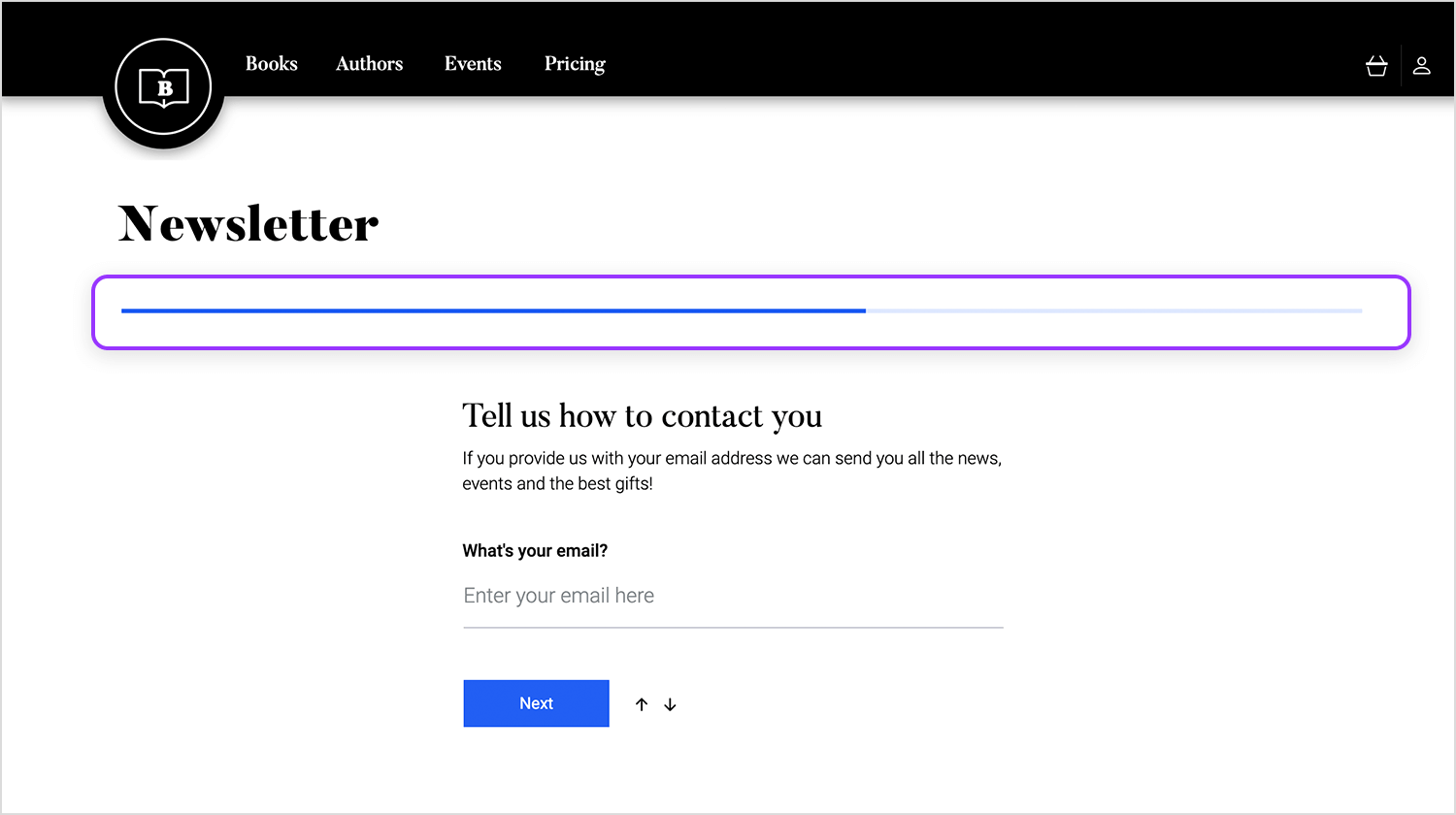
Progress bar in a multi-step form
In this form, a progress bar at the top lets users see how far they’ve come and how many steps are left. As they select their preferences and move forward, the bar fills up, giving clear visual feedback about their progress.
This simple yet effective animation helps keep users motivated and reassured as they work through the form, making the process feel smooth and straightforward.
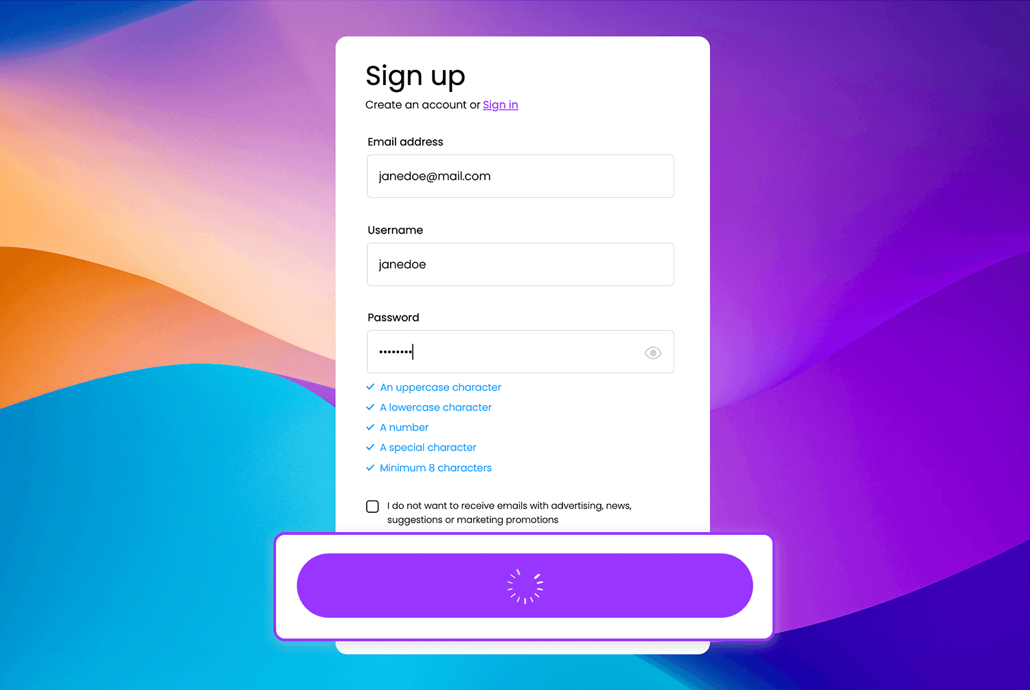
Loading in sign-up forms
In this signup form, the moment the user clicks to submit their information, a subtle loading spinner appears on the button. This little animation not only provides feedback that something is happening but also helps manage the user’s expectation while waiting for the process to complete. It’s a small touch that keeps the experience smooth and prevents confusion.
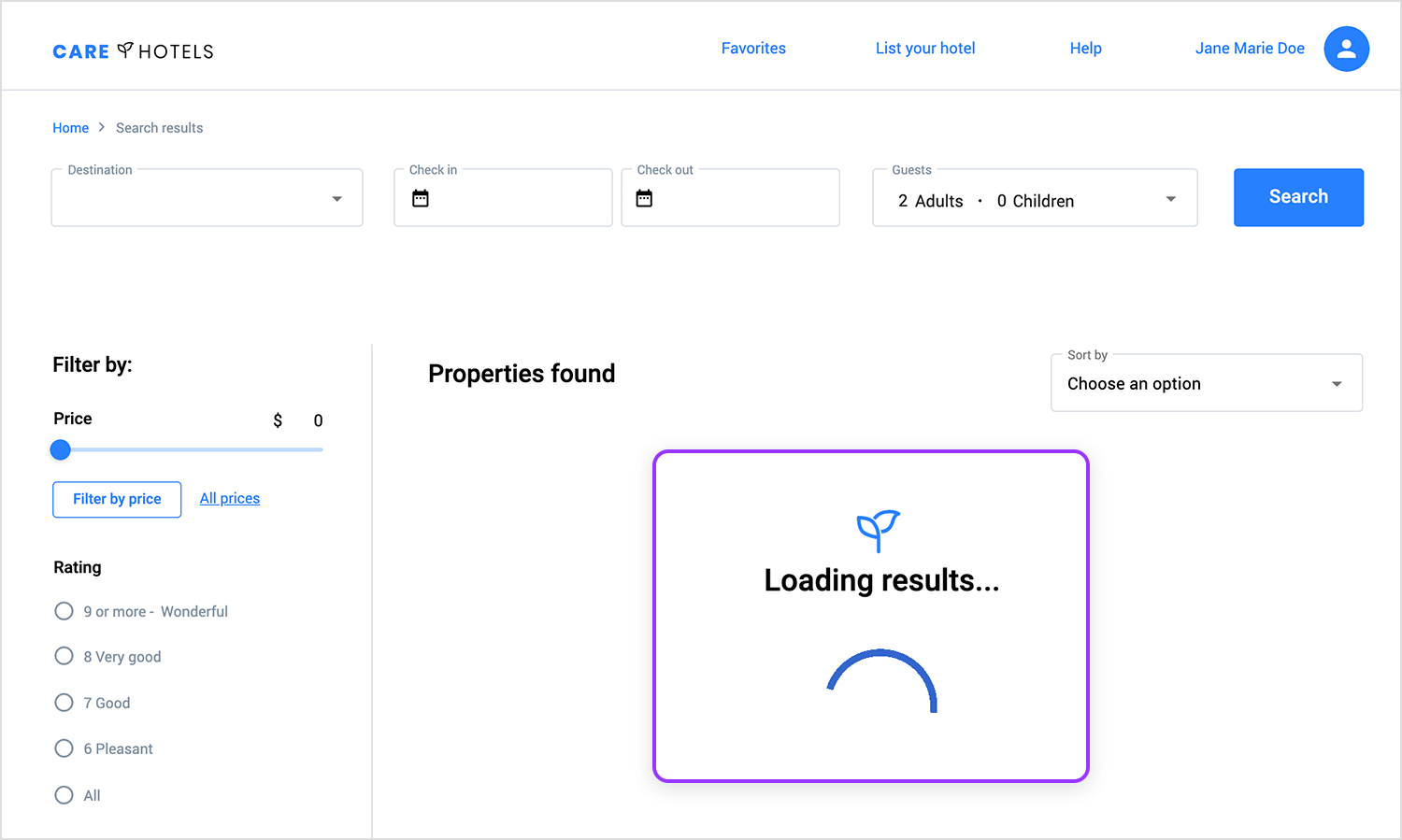
Search loading indicator
This loading indicator gives users instant feedback when they perform a search. While waiting for results, the subtle animation reassures users that the system is working, preventing frustration during the wait. This micro-interaction helps manage user expectations by showing progress in a clear and visually engaging way.
Page transitions create a smooth flow when users move from one part of a site to another. Instead of an abrupt jump from one page to the next, transitions guide the user’s journey and make navigation feel more fluid.
Let’s have a look at some examples.
Seamless page transition
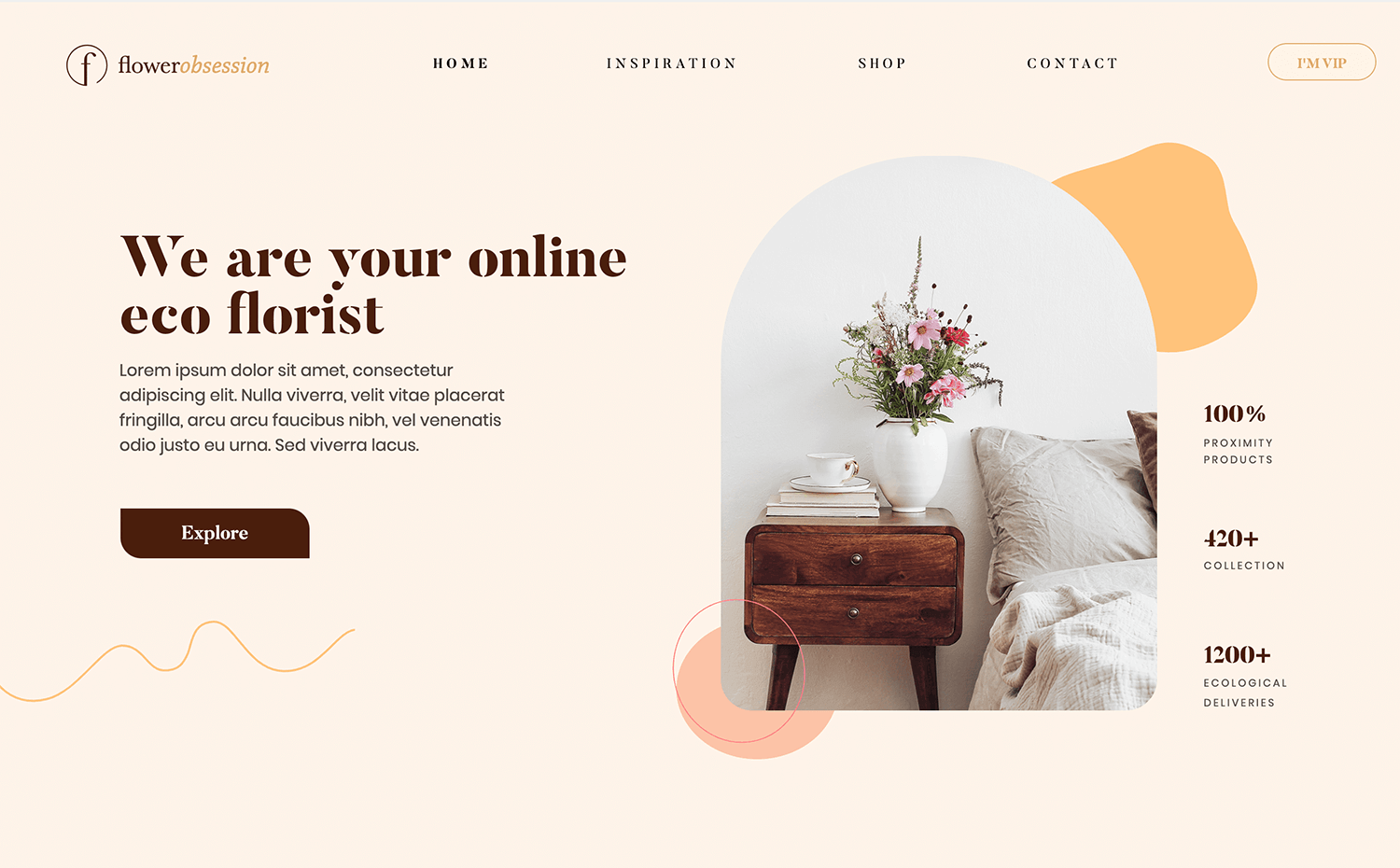
In this transition, moving between screens feels smooth and natural. The animation flows without any abrupt jumps, making navigation feel effortless. It keeps the user experience fluid and ensures that each step in the interaction is clear and intuitive.
Smooth page transition
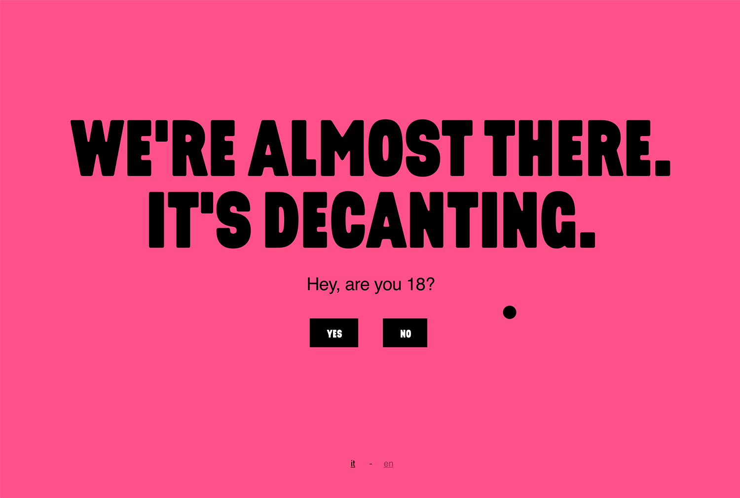
Another example of a good page transition is found on Bottle on the Table’s website. In this case, the movement from one section to the next feels smooth and uninterrupted, giving users a sense of flow as they explore. The transitions aren’t just visually appealing, they make navigation feel intuitive and cohesive, enhancing the browsing experience without being too flashy.
Seamless sliding transition
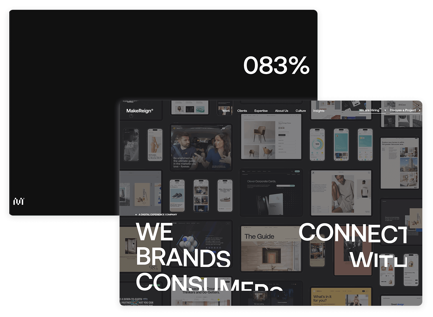
A great example of animated page transitions can be found on the MakeReign website. As you move between different sections or pages, the transitions are animated with subtle fades and sliding effects. The animations are smooth and flow naturally, creating an immersive experience where the content seems to move in and out of view seamlessly, giving the site a modern and engaging feel.
Scrolling animations are triggered when users scroll down a page. Parallax effects or reveal animations make the content come to life as users explore, adding depth and making the site feel more dynamic.
Here are some examples.
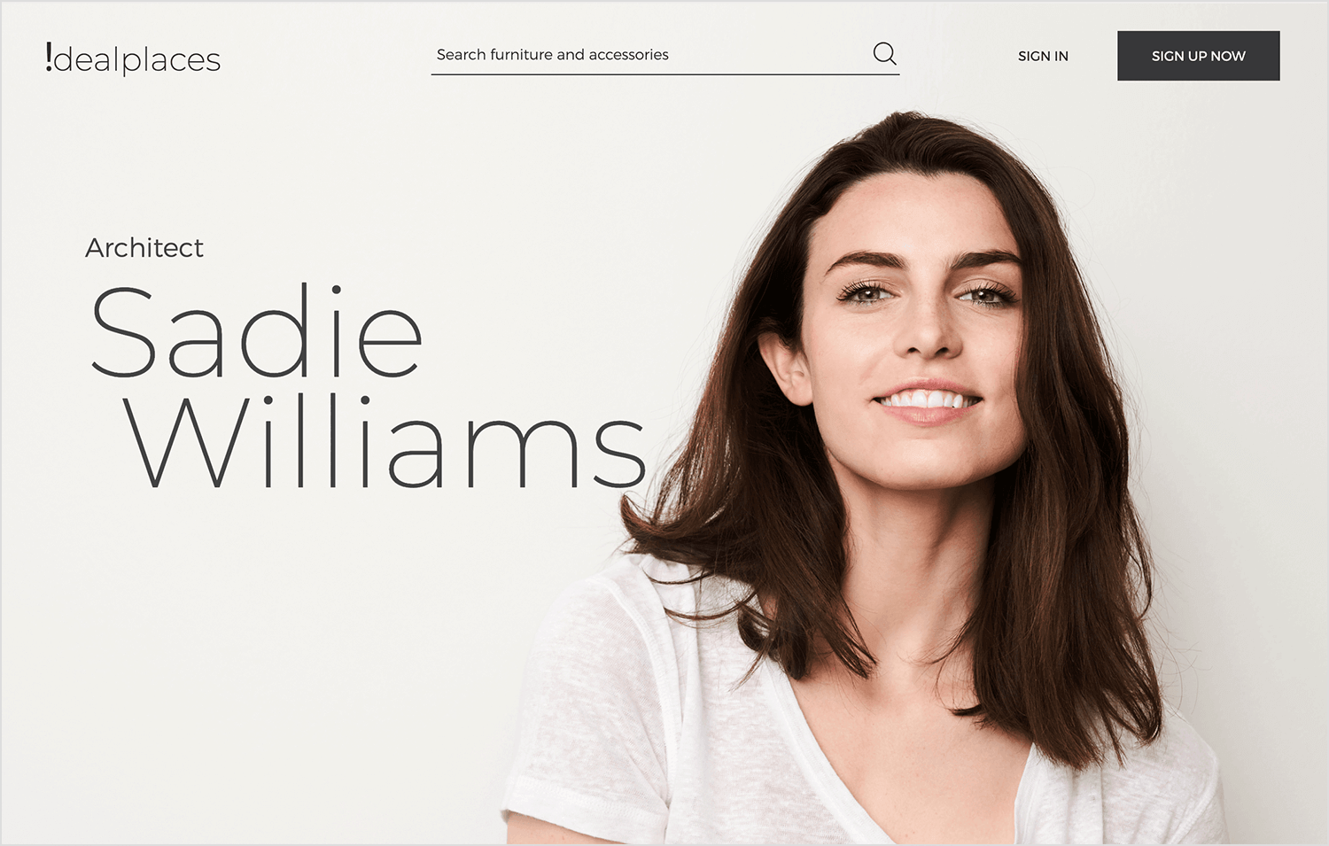
Parallax example
In this example of parallax, as you scroll down the page, text and images smoothly slide or fade into view. This adds a nice, flowing feel to the content, making the page more fun and engaging to explore. Instead of everything appearing at once, elements come in bit by bit as you scroll, which helps guide your attention and keeps you interested in what’s next.
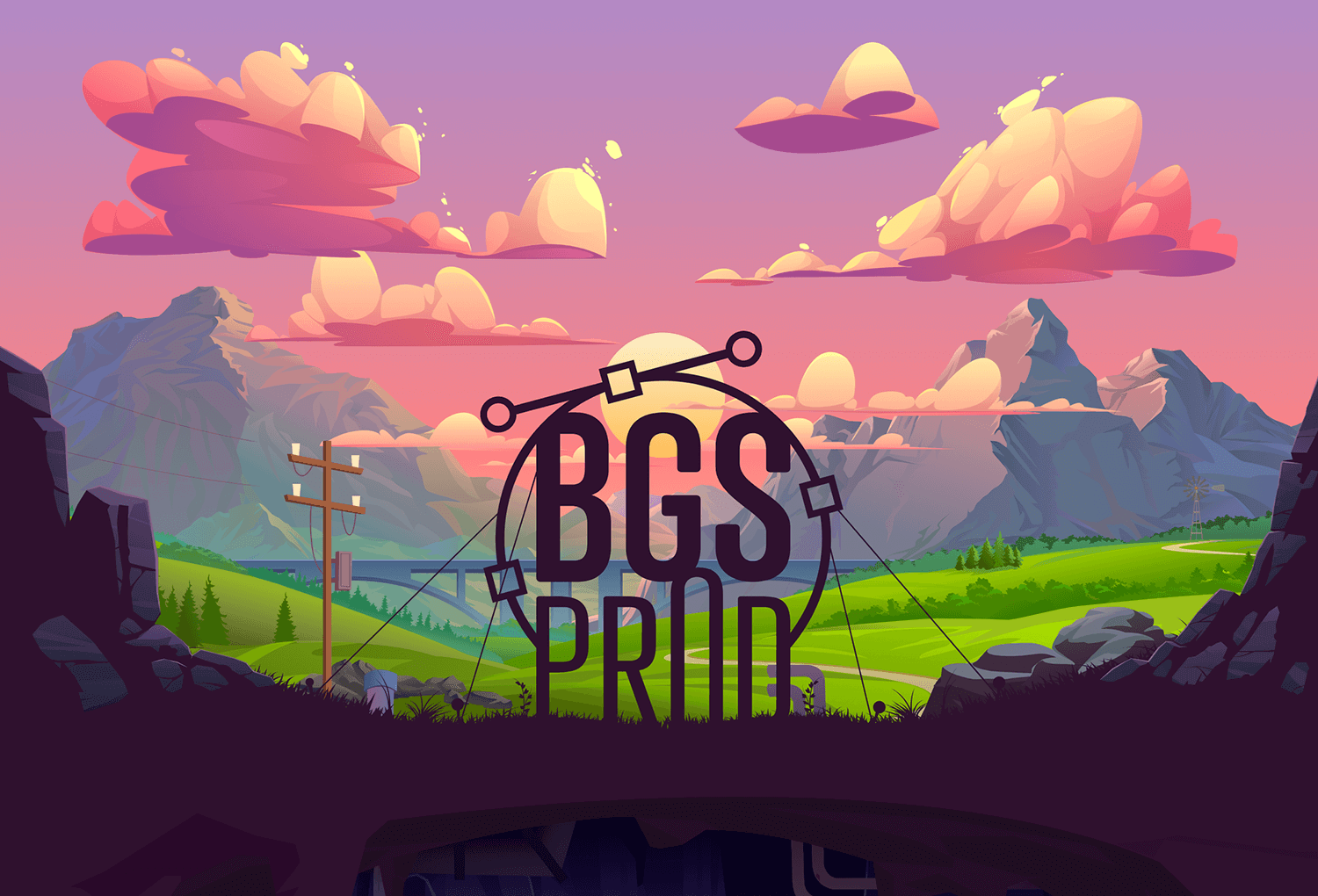
Layered parallax scrolling
Building on the smooth effects from before, this example takes parallax to the next level. As you scroll, the background of BGSPROD moves slower than the text and images, creating a layered 3D effect. It makes the page feel more interactive and gives it extra depth.
The different speeds of the layers make the scrolling experience feel more dynamic and visually exciting, keeping users engaged as they explore the site.
Parallax scrolling
In this example from Dropbox, as you scroll through the homepage, the layered elements move at different speeds, creating a subtle parallax effect.
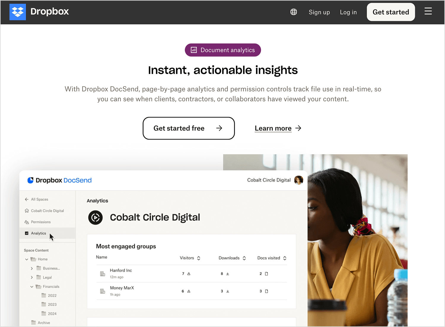
This adds depth and a more immersive feel to the content, making the experience visually engaging without distracting from the important information on the page.
Design and prototype web animations with Justinmind.

These animations provide instant feedback when users hover over or focus on interactive elements, like buttons or links. A hover effect can highlight an element, making it clear that it’s clickable, and enhancing the overall interaction.
Let’s take a look at a few examples of how hover and focus animations can make interactions more intuitive and engaging.
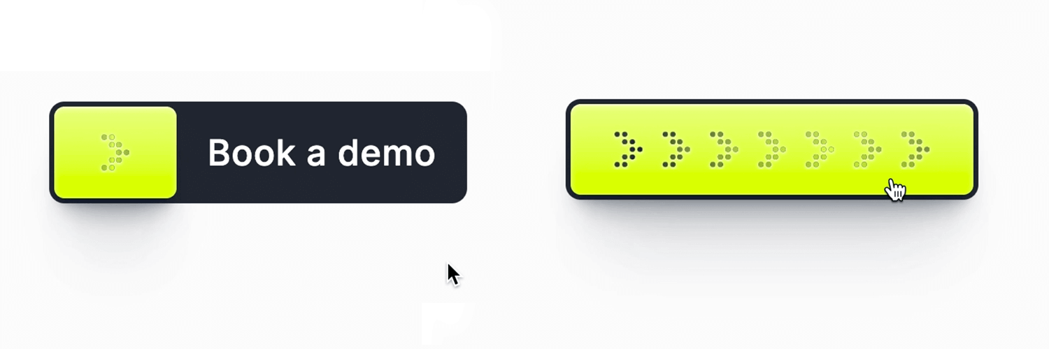
Book a demo button hover effect
When you hover over the “book a demo” button in this example from Dribbble, it lights up with a glowing effect, making it clear that it’s clickable. The button becomes more vibrant, drawing attention to it and encouraging users to take action.
Hover effect on scrolling cards
In this Dribbble example from Abron Studio, as you hover over each card, the content slightly elevates and shifts, giving immediate visual feedback. The smooth transition makes it clear that the card is interactive, enhancing the overall user experience by adding a subtle, engaging touch to the interaction.
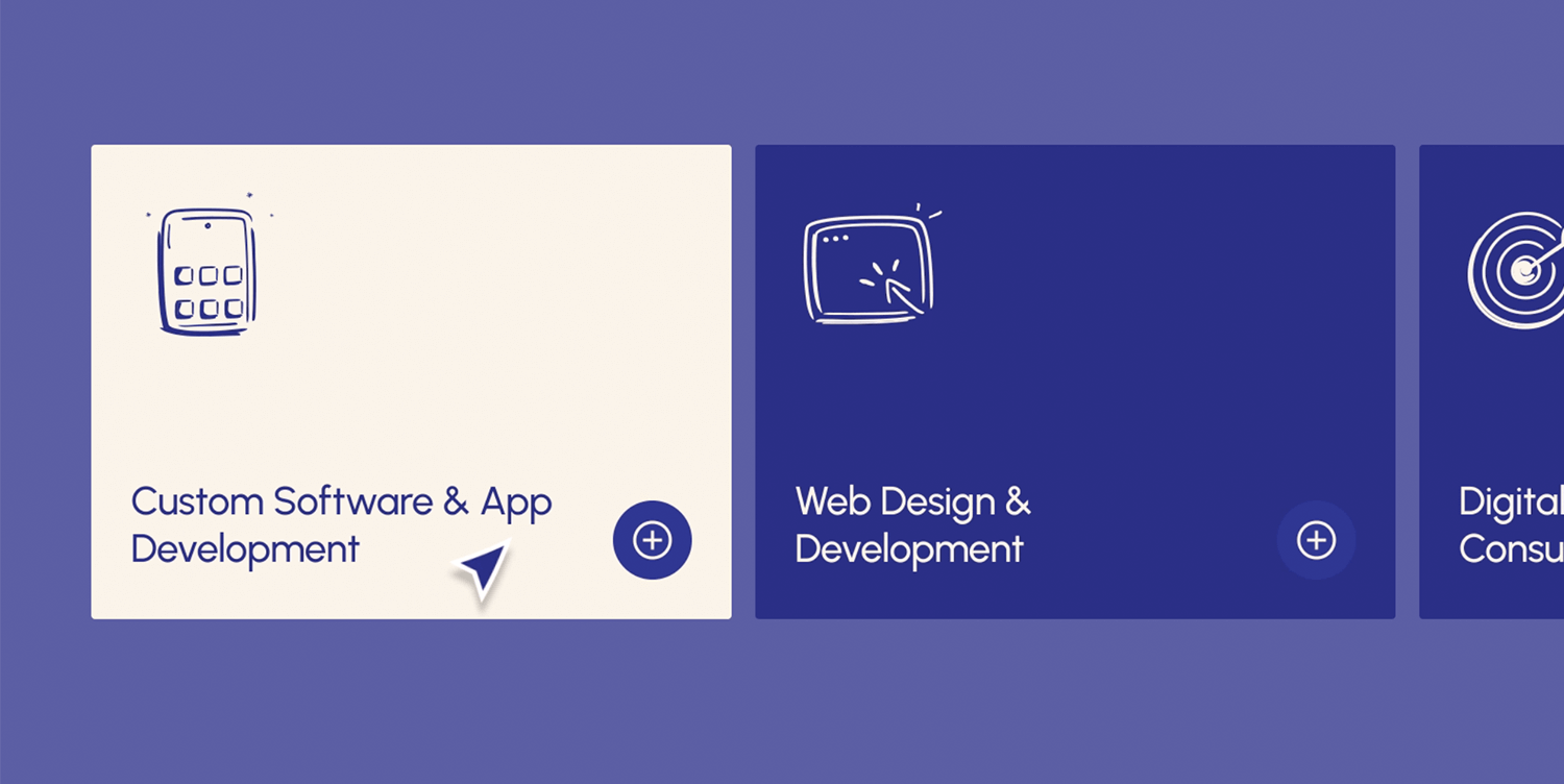
Subtle hover animations on a landing page
Another creative example on Dribbble is this one from Leon Abramovic shows how a landing page uses hover animations to bring elements to life. As users hover over different sections, text or images gently shift or light up, adding subtle movement. These animations not only grab attention but also give the page a polished, interactive feel without overwhelming the design.
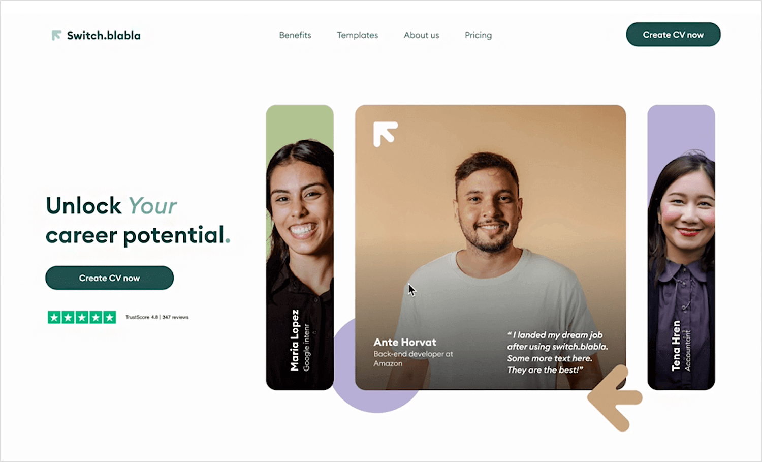
Animations can also be used to bring personality to a site through moving illustrations and icons. These animations make the design feel more alive and engaging, helping to capture the user’s attention.
Here are some examples of how animated illustrations can make visuals more engaging.
Animated 3D illustrations
In this example from Dribbble, 3D illustrations are brought to life with smooth animations. The subtle movements add depth and make the visuals more engaging, helping to tell a story or explain a concept in a way that’s easy to understand. These kinds of animations are perfect for grabbing attention and making the content feel more dynamic.
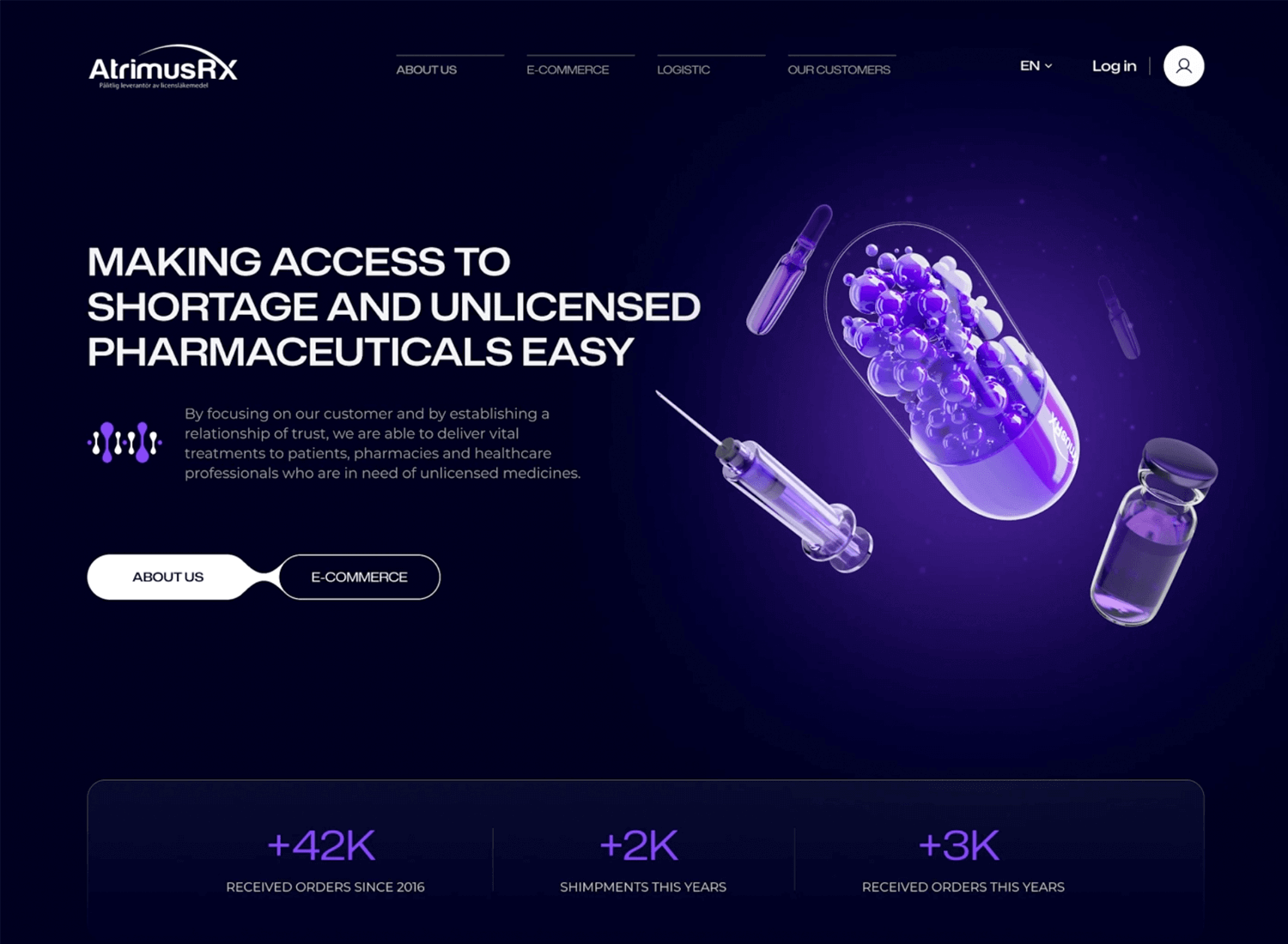
Atomic animation in motion
Here’s another great example from Dribbble where Spencer Gabor brings an illustration to life with simple, smooth movements. The animation adds energy and makes the design more engaging without overwhelming the user. It’s a fun way to present information and keep users interested.
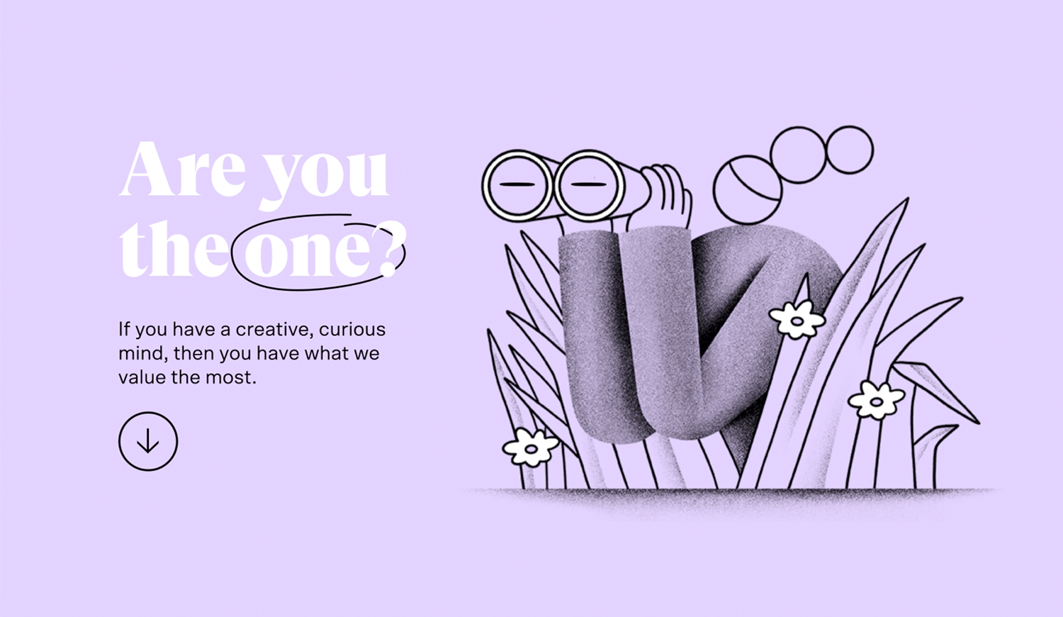
Recycling in motion
Think about how much easier it is to understand something when it moves. That’s exactly what this example from Andrew for Zajno on Dribbble does. By animating the recycling process, each step comes to life, making it clear and simple to follow. It turns a basic concept into an engaging visual journey.
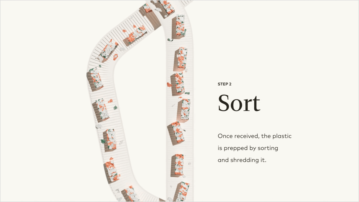
These animations aren’t just for decoration, they have a clear function. Whether it’s guiding users through a form or helping them navigate a complex interface, purpose-driven animations serve to enhance usability.
Below are a few examples from well-known brands.
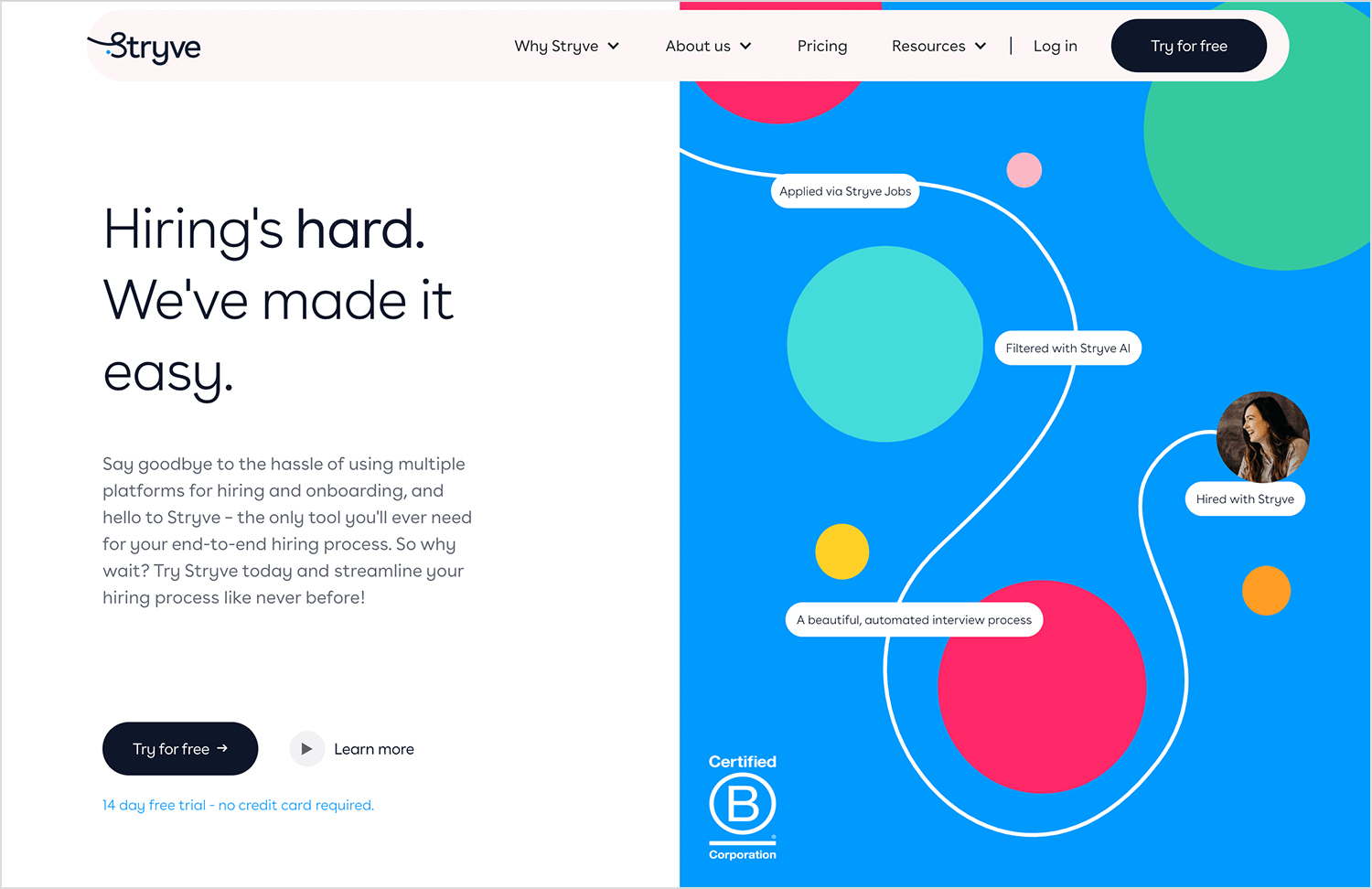
Stryve
Stryve uses purpose-driven animations to enhance the user experience by guiding visitors smoothly through the site. Subtle animations highlight key sections and help users easily navigate the content. These animations aren’t just for aesthetics; they provide clear feedback, improve usability, and make the overall experience more intuitive and engaging.
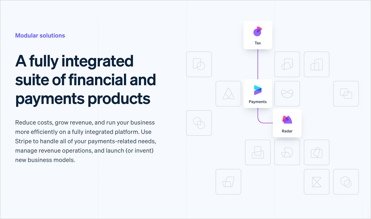
Stripe
On Stripe’s website, animations are used to break down complex payment processing information. As you scroll, different sections smoothly appear, leading you through Stripe’s features one step at a time. It’s a clean, easy way to understand everything without feeling overloaded.
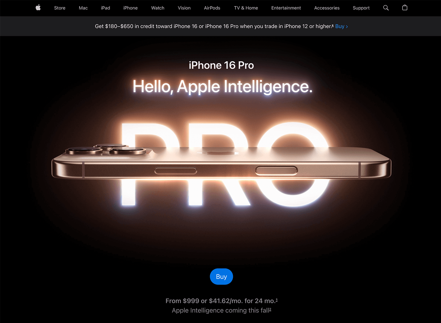
Apple
Apple’s product pages are filled with sleek animations that showcase features as you scroll. These animations aren’t just for show, they help users explore products without needing tons of text. It’s a smooth, engaging way to learn about what Apple has to offer.
After exploring different types of animations, it’s important to understand the difference between JavaScript and CSS/SVG animations, and when to use each.
JavaScript and CSS/SVG both offer ways to add animations to your website, but they’re suited for different situations.
- Think of CSS/SVG animations like the quick, simple movements on a website, perfect for smaller tasks. JavaScript is like the muscle behind the scenes, doing the heavy lifting when you need more complex, interactive animations.
- JavaScript is your go-to for more complex animations that respond to what users do. Whether it’s clicking a button or scrolling down a page, JavaScript lets you create animations that feel more interactive and customized.
JavaScript shines when it comes to event-driven animations. These are animations that react to what the user is doing, whether it’s scrolling, clicking, or hovering over an element. For example, a section might animate and slide into view only when the user scrolls down to it. This type of animation helps make the user experience feel more interactive and dynamic.
Animations aren’t just for large elements, they work wonders for logos, icons, and illustrations too. Adding subtle animations to these smaller visual elements can have a big impact. For instance, animated logos can add a sense of personality to a brand, while animated icons can make interactions more intuitive. Whether using CSS or JavaScript, these animations help bring your visuals to life, making the experience more engaging without overwhelming the user.
Design and prototype web animations with Justinmind.

Thoughtful use of animations can really change the way users experience your website. From micro-interactions that guide users to more complex event-driven animations, the right animations can improve usability and keep users engaged. Whether you’re using CSS, JavaScript, or SVG, the key is to ensure your animations serve a purpose and enhance the overall experience without overwhelming the design.
So, the next time you’re designing, think about how animations can make the journey smoother and more enjoyable for your users.
Related Content
 A fun look at different data table designs, from basic lists to smart, interactive ones, based on how complex the data is and what users need.18 min Read
 Single page design v multi-page design – everything you need to help you choose the right design for your site’s content18 min Read
 Website backgrounds can be a powerful tool in creating an experience. But what kind of experience can you convey and how? We got the full run-through for you!14 min Read
