
Your 404 page is a landing page no one wants to land on. But if users will land there anyway, why not make the most of it? We'll show you how.
You know the feeling. You click an interesting-looking link to a blogpost that you want to read, and Bam! 404. Page not found. It’s an automatically annoying and negative experience. But how does that 404 page talk to you? Is it helpful? Delightful, even?
Design and prototype 404 pages with Justinmind. Download it free!

Think of 404 as essentially a landing page, albeit a landing page that no one really wants to land on. And then, think about how much more work goes into a regular landing page than an error page. A well-designed 404 page can make a huge difference in how a user experiences a brand. A bad one is a missed opportunity.
But what makes a good 404 page? What should you be aiming for or what should you include in it when putting the page together in your favorite wireframe tool? Don’t worry! We have the full run-through for you here, as well as some of the greatest 404 pages from around the web to get you inspired.
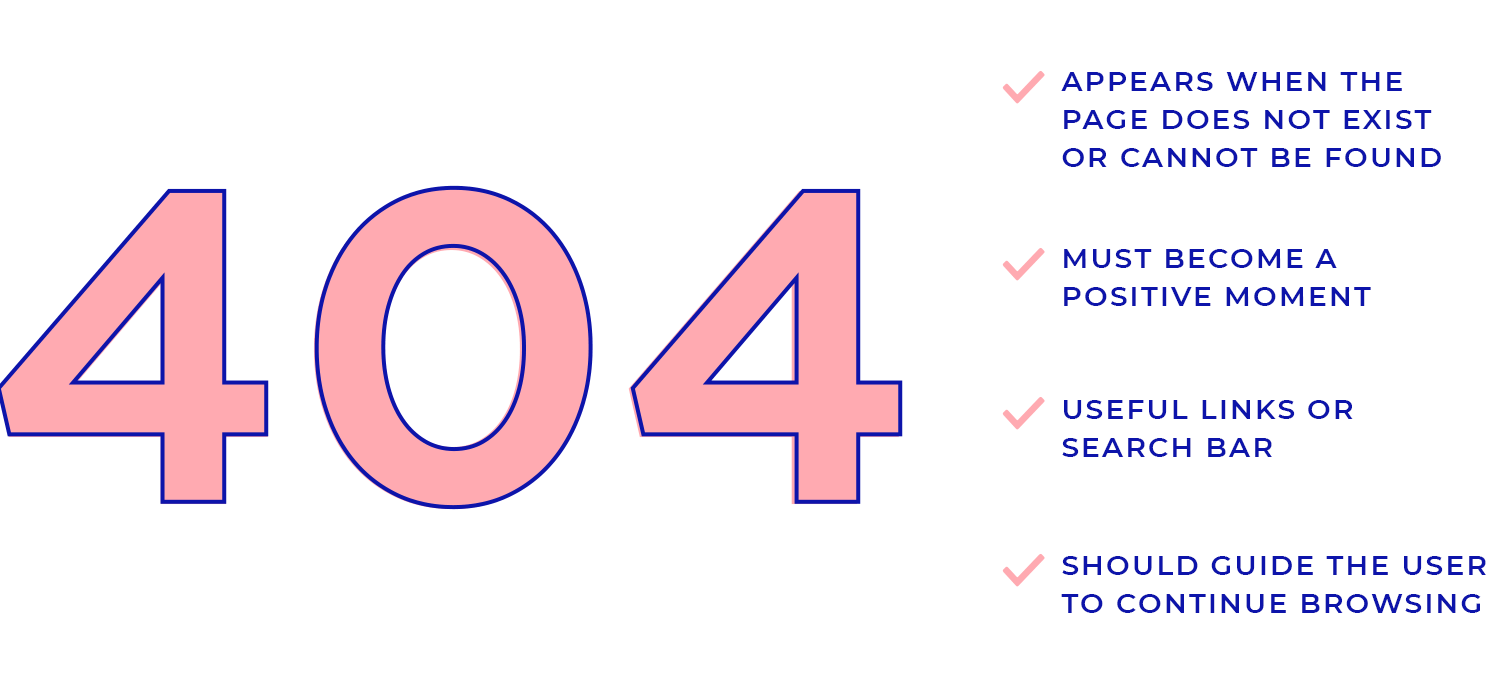
A 404 page is what you see when you try to visit a webpage that doesn’t exist or can’t be found. It happens when the link you clicked or entered leads to an error. Think of it as a polite way of saying, “Oops! This page isn’t available.” While it may sound technical, a 404 page is just a simple notice that the content you’re looking for isn’t there.
The best 404 pages don’t just stop at the error message; they turn it into a positive moment for the user. Good 404 page design focuses on keeping things light and guiding visitors back to the main website, offering helpful links or a search bar so they can find what they need. Instead of feeling frustrated, a well-designed 404 page can actually make the user smile and keep them engaged with your site.
Many websites go the extra mile with creative 404 page examples that use humor, brand elements, and useful navigation tools. These thoughtful designs show users that even when something goes wrong, the brand is still there to help. From quirky illustrations to links to popular content, the best 404 pages are all about turning a small mistake into an opportunity for a better user experience.
A standard, out-of-the box 404 page gives users only one option – go back to where they came from. What a downer. You want to design 404 pages that allow users to progress to other parts of your site, commonly the home or features pages.
And don’t just give them links. Add a search box to the 404 page to give users back a sense of control over their experience and facilitate task success.
Overwhelming the user with a 404 page jam-packed with links to every nook and cranny of your site is a surefire way to cognitively overload an already frustrated user. And as NN Group guru Kathryn Whitenton makes clear, cognitive overload and usability don’t match.
The best practice is to design a 404 page with a handful of key links, including a link to the Home page as an easy get-out for users who’re not sure what they’re looking for yet. Other options to include might be to a blog, product features or About Us page.
For many users, a 404 page might be the very first interaction they have with a brand. That’s a lot of pressure for one little error page. Follow basic best practices such as ensuring that the aesthetics of the page fit with the rest of the site. Make sure microcopy mirrors the tone throughout, and that icons and visuals are coherent with other sites or products.
Design and prototype 404 pages with Justinmind. Download it free!
Your 404 page may vary depending on your brand, but there are a few essential elements that every error page should have:
An error message: your users need to know right away that they’ve landed on an error page. Make it clear and noticeable so there’s no confusion.
Brand look and feel: ensure that your 404 page reflects your site’s overall design. Keep the same logo, colors, and style so it feels like part of the website and not a mistake.
A light touch: adding a bit of humor or a lighthearted message can make the experience less frustrating for the user. Just be careful not to overdo it.
Link to your best content: provide 3 or 4 links to popular or interesting parts of your site. This can help redirect lost visitors and keep them engaged instead of leaving your website.
Call to action: since your 404 page functions like a landing page, include a CTA (call to action). This could be a signup button, download link, or at the very least, a search box so users can easily find what they’re looking for.
When crafting a 404 page, it’s not just about fixing an error; it’s also an opportunity to make a great impression. Here are some best practices to keep in mind.
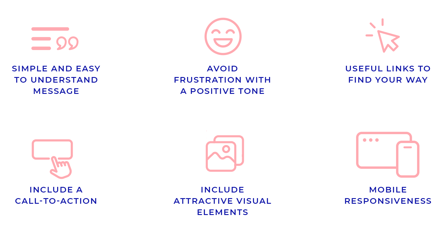
Start by making sure your error message is simple and easy to understand. Instead of using technical jargon, choose friendly language that connects with your users. You can even add a bit of personality or humor where it feels right, to soften the blow of landing on an error page.
It’s important to keep the tone positive. Instead of making users feel like they’ve made a mistake, reassure them that everything is okay. A quick-loading page helps avoid further frustration, and offering ways to explore other parts of your site can keep them engaged. The goal is to prevent users from feeling stuck and encourage them to continue browsing.
Make it easy for users to find their way back. Provide links to the homepage, popular pages, or recent posts. A search bar can be a helpful tool for users who want to quickly find what they were looking for. When you offer these options, you can guide them back on track without interrupting their journey too much.
Your 404 page can serve as more than just a dead end. Suggest helpful actions like “Go back to Home” or “Browse Products.” Adding clear CTA buttons gives users a direction to follow, whether it’s exploring your site or contacting support.
Don’t forget to make your 404 page visually appealing. Engaging graphics, illustrations, or even subtle animations can brighten the user experience. Just make sure that the visuals fit your brand’s tone and complement the rest of your site.
Since so many users will be visiting from mobile devices, it’s crucial that your 404 page is optimized for smaller screens. Keep the design responsive, ensuring that everything – from text to visuals, looks great and functions smoothly on any device.
Design and prototype 404 pages with Justinmind. Download it free!
Here are a few websites that ticked all the right boxes with their 404 pages. Be it in the form of smart branding or engaging humor, each of the following pages caught our eye because of the experience they offer users. Let’s check them out!
Justinmind’s 404 page brings a fun, space-inspired vibe with its vibrant astronaut design. It turns a simple error into an engaging experience, offering easy navigation back with helpful links.

The playful tone and striking visuals show off Justinmind’s creative side, making this 404 page both memorable and user-friendly.
Mailchimp is one of those names that most people will recognize nowadays. Their website is all about branding and personality, and the 404 page delivers the same result! We love that Mailchimp gives a brief explanation of how they couldn’t find the page the user was looking for, as well as the branding of the illustration.

Pixar’s 404 page brings its signature charm and humor. The goofy character and funny message instantly lighten the mood. They playfully admit that “no one even knows what ‘404’ means” but reassure you that everything’s going to be fine.

The suggestion to “just hit that back arrow” adds to the casual, lighthearted feel. It’s a great example of how 404 page design can reflect a brand’s personality while keeping things easy and fun for users.
This is a peculiar 404 page design. There is no logo, no smart illustration. Instead, we have a simple link to the homepage and a distinctive box with quotations from famous movies – slightly modified to fit the 404 page.

We love that the branding is subtle, as IMDb users are all about cinema and are very likely to recognize the quotes. It makes for a funny and enjoyable experience – which, for a 404 page, is a success.
Omelet is a creative agency that offers different services, from social media management all the way to film productions. It shouldn’t be a surprise, then, that their 404 page design is a big winner.

The bold use of color adds flare, while the navigation menu is sufficiently integrated in the page so that it doesn’t need any additional links. Then, there is that wonderful copy that engages and surprises the user. We love it!
The coffee giant we all know, Starbucks, did a wonderful job with their 404 page design. The page designs offer users an explanation of why they’ve run into an error page, as well as a couple of key links to the homepage, contact page, and the sitemap.

We love the creative touch. The spilled coffee cup illustration adds a playful twist to the missing page, blending subtle branding with humor in a way that only Starbucks can pull off!
20th Century Studios also went for a movie reference in its 404 page – and some great branding. It includes a background with an iconic scene from one of their movies, as well as a quote. We love that the large white font makes an impact, and maintains readability as the colors in the background move with the video.

Google keeps its 404 page short and to the point, with a simple message: “That’s an error.” The page explains that the requested URL wasn’t found, and that’s all they know. The minimalist text, paired with a cute, broken robot illustration, keeps the tone light and functional.

This 404 page design is exactly what you’d expect from Google, straightforward, with just enough charm to make users smile before they move on.
Medium keeps things super simple, which fits their style perfectly. Instead of using flashy visuals, they go with clean text and a light message: “My personal online journal.” It’s subtle but still gives off the right vibe. Plus, the handy search bar right below encourages you to keep exploring without feeling lost.

It’s a minimalist approach, but it totally works for Medium’s brand and makes the experience feel smooth and easy.
The New Yorker’s 404 page is as classy as you’d expect. With a simple “Oops” message, it acknowledges the error with humor and charm. The illustration, a top hat flying off a person’s head, fits perfectly with The New Yorker’s signature style, adding a clever touch. There’s a button that lets users quickly navigate back to the homepage, keeping things straightforward while staying true to the brand’s unique personality.

It’s a simple, yet effective way to handle a missing page.
Who could be mad at a missing page when greeted by Rocky, one of Amazon’s adorable office dogs? Amazon’s 404 page pairs a sincere apology with the lovable face of Rocky, softening the blow of not finding what you were looking for.

With a simple option to search again or head back to the homepage, this 404 page design adds a personal touch that makes an error feel more like a warm, friendly detour.
Airbnb has the whole brand personality thing figured out. They even have their own font: cereal. And so, it’s no surprise that their 404 page is another hit. The gif to the right of the screen is a great way of representing the way users feel in a 404 page – it adds both humor and flare to an otherwise simple page.

The 404 page also includes 7 links to their homepage and other important pages of their website. Like we mentioned before, the use of 7 links can feel a bit excessive to some – but Airbnb pulls it off.
Ahrefs brings a playful twist to their 404 page with a bright, space-themed design featuring a floating character and an astronaut dog. The message is lighthearted yet informative, explaining the concept of a “broken link” and offering a helpful tool to check for more.

With bold visuals and a direct link to their broken link checker, Ahrefs turns an error into an opportunity to engage users while providing a practical solution. This is a great example of how 404 page design can be both fun and functional.
Dan Woodger is an illustrator and graphic designer that has worked for the big fish, such as McDonald’s, Bloomberg’s and the New York Times. We love that his 404 page design is fun and casual, with few things aside from the illustration of a hamburger saying he’s sorry about the missing page. Sometimes, that’s all you need.

Mashable’s 404 page keeps things light and fun with a playful twist. Instead of overwhelming users, it shows a meditating potato character with a calm message: “We couldn’t find the page you’re looking for.” It’s a great reminder that even a 404 page can be enjoyable. The quirky design and friendly “Ooops! – 404” make this one of the best 404 pages that turns a simple error into a lighthearted experience.

It’s a perfect example of 404 page design done right, keeping the mood easy while giving users a chance to smile.
Design and prototype 404 pages with Justinmind. Download it free!
Blue Path is a Data Science consultancy that offers users a great 404 page. The page is great because of its humor and simple graphics, all of which are text and a graph. The humor of placing a map on the left and signaling the user would be way off that map, to the right? Great analogy!

KonMari’s 404 page stays true to its message of simplicity and mindfulness. With a calming image and a gentle note about “tidying up” the website, this page gracefully lets users know that the content is no longer available, much like letting go of items with gratitude.

The “Keep Browsing” button encourages visitors to continue exploring, keeping the experience peaceful and on-brand. This is a great example of a thoughtful and elegant 404 page design that perfectly matches the KonMari philosophy.
When eBay says, “We looked everywhere,” you know they mean business. With a quirky illustration and a simple message, this 404 page acknowledges the hiccup while quickly guiding users to the help pages or homepage.

It’s efficient, to the point, and keeps the shopping experience moving, proving that even when something’s missing, eBay’s got your back.
Wendy’s turns a 404 page into a retro gaming experience! Instead of just telling you the page is missing, they invite you to play a game, turning a frustrating error into a fun challenge. With its pixelated design and playful vibe, this 404 page goes beyond a simple message, letting users “turn a 404 into a 444” by stacking up burgers.

It’s a creative, interactive way to keep users engaged while embracing the brand’s playful spirit.
Slack’s 404 page delivers its signature friendly tone with a message that feels both lighthearted and helpful. The floating islands and colorful landscape add a whimsical touch, making the error page visually engaging. Instead of leaving users frustrated, it offers clear options to either go back or check out the Help Centre for assistance.

This playful yet practical approach to 404 page design shows Slack’s commitment to a user-friendly experience, even when things go wrong.
Lost? No problem. Discord’s 404 page makes it feel like you’ve wandered into a cozy noodle shop. With a fun, “Wrong Turn?” message and a warm invite to sit back with a bowl of virtual noodles, it turns a dead end into a delightful detour.

The playful design and helpful links to support and status pages keep the experience light and user-friendly, proving that even mistakes can be memorable.
Dribbble turns a missing page into a colorful, creative showcase. Their 404 page is a visual treat, featuring a vibrant display of designs that form the numbers “404.” While you may have lost your way, Dribbble encourages you to explore popular designs that match the color #fa0ff, giving users something inspiring to look at.

It’s a great example of how to transform a simple error into a moment of discovery, staying true to their artistic community.
LinkedIn’s 404 page stays calm and professional, just like its brand. With a clear “Page not found” message and a serene blue illustration featuring a telescope, it encourages users to either return to their feed or visit the Help Center for support. It’s a clean and efficient way to keep users on track, offering help without any fuss.

YouTube’s 404 page keeps things light with a friendly purple monkey holding a magnifying glass, as if it’s on the lookout for the missing content. The message is simple and apologetic: “This page isn’t available. Sorry about that.”

Users are encouraged to try searching for something else with the search bar conveniently placed below. This playful yet practical design keeps the experience fun and easy, even when something goes wrong.
Looks like Flipkart’s got a little rain cloud over this one! With a simple illustration of a storm cloud and a missing page symbol, the 404 page gets straight to the point. The message lets users know the page has either moved or been deleted, but the bright “Go to Homepage” button ensures getting back on track is just a click away. Clean, clear, and efficient, this page does the job easily.

Looks like you’ve reached the outer edge of the internet! Freepik’s 404 page humorously tells users the page is “outside of the universe.” With bold typography and playful elements, this error page still guides users back to the homepage with a clear call-to-action button.

It’s a lighthearted way to let users know something went wrong while keeping the navigation smooth and fun.
When you stumble upon Blizzard’s 404 page, you’re greeted by a familiar face, the rescue Murloc. With a whimsical touch, this page sends out the Murloc to guide you back to safety. The playful sound effect button adds humor while staying on-brand with the Warcraft universe. It’s a fun and immersive experience, turning a wrong turn into an adventure.

Marvel’s 404 page doesn’t hold back, featuring Deadpool fixing up a robotic mess with his usual cheeky attitude. The playful text captures the superhero’s humor perfectly. With this 404 page, Marvel embraces its quirky brand and makes you smile even when you’ve landed in the wrong place.

Heinz brings humor and a touch of drama to their 404 page with the phrase, “Oh, the horror,” accompanied by an almost-empty ketchup bottle. The imagery immediately captures attention, as it plays on the feeling of panic when you’re out of their famous ketchup.

The simple yet clever message reassures users that while something went wrong, they can easily make it right with a click to “Return home.” It’s a playful and brand-relevant way to handle an error page, turning a frustrating moment into an opportunity for a smile.
And to wrap up our list, we’ve got QuillBot’s 404 page! It brings a calm, almost zen-like vibe, with the QuillBot mascot sitting in a meditative pose. The message, “It appears you are lost… Let QuillBot show you the way,” is light and reassuring.
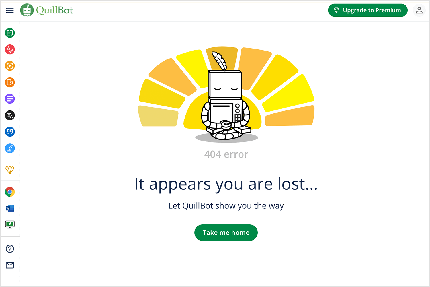
Paired with soft, warm colors, this design takes all the stress out of landing on a 404 page. With just one click, you’re right back on track. Simple, peaceful, and oh-so-QuillBot.
Design and prototype 404 pages with Justinmind. Download it free!
Your 404 error page is an opportunity to showcase some creativity and get the user on your path. Something went wrong, but everything’s fine. Treat this page as a sort of landing page and it could end up helping to build on your brand and deliver conversions.
This is the moment where you take a moment that tends to be filled with frustration and negativity and turn it into something good. Make it memorable for the right reasons!
PROTOTYPE · COMMUNICATE · VALIDATE
ALL-IN-ONE PROTOTYPING TOOL FOR WEB AND MOBILE APPS
Related Content
 Learn how to design better e-learning platforms with user-centered UX principles, real examples, and high-fidelity prototyping tips to boost engagement and learning outcomes.13 min Read
 Infinite scroll keeps users engaged, but it’s not always the best choice. This guide breaks down when to use it, when to avoid it, and how to design it right.14 min Read
 Learn how to design web and mobile app prototypes, how to test them and what to look for in a prototyping tool in this complete guide.15 min Read


