Web design is constantly attracting people to the field, but what do web designers do? What do they study for their practice? Read on and find out!
Web design is a field in constant expansion, with demand for designers increasing year after year as more digital products are needed. But what do web designers do? How did they become professional designers?
Free design tool for websites and web apps

Let’s take a moment today to explore the world of web design. From what it is and its relationship with UX to crucial elements like typography – this guide has it all. Keep your UI design tool on standby, cause you’re bound to feel inspired to create new things.
Web design is all about creating the look and feel of a website or digital product. It’s how we make sure a site not only looks good but also works well for anyone using it. From colors and fonts to layouts and images, web designers bring all these elements together to build an engaging experience.
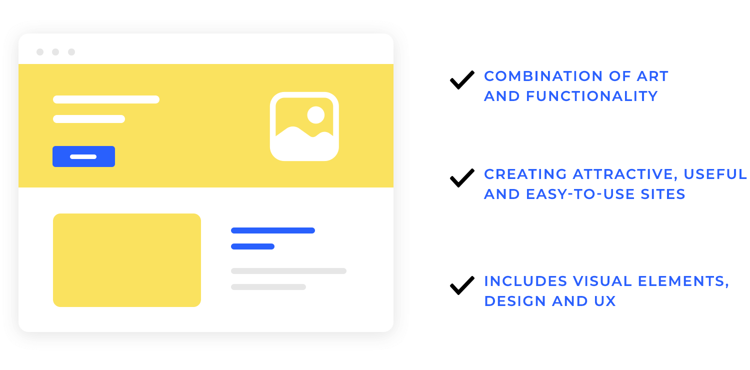
In simple terms, web design is the mix of art and functionality in a digital space. It’s about how we create websites that aren’t just visually appealing but also useful and easy to navigate for visitors.
Web design and web development often get mixed up, but they’re quite different. Web design focuses on how a website looks and feels, working with visuals, layout, and user experience. On the other hand, web development is about building and coding that design, making sure everything works behind the scenes.
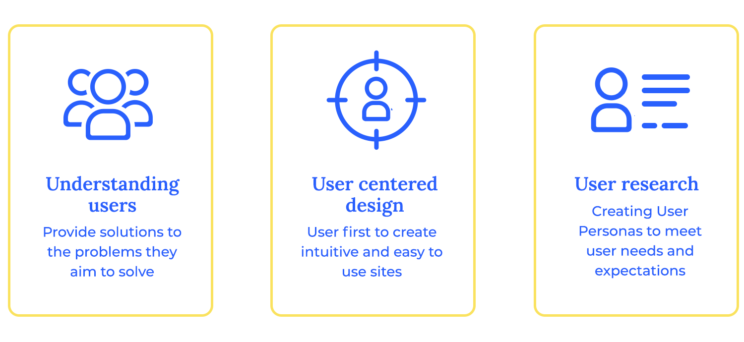
Good web design starts with understanding who will be using it. What do they want? What problems are they trying to solve? Using an information architecture guide can help you organize your website structure to create designs that feel tailored just for them, making it easier for them to find what they’re looking for.
When we really understand our users, we can make design decisions that match what they need and expect. This brings us to user-centered design, where we put users first and create websites that feel natural and easy to use.
User-centered design, let’s say it’s like a fancy way of saying we always put users first. It means every choice in our design, from colors to buttons, is made with the user in mind. This way, we make sure that the site is not only beautiful but also intuitive and easy to use.
Before jumping into design, it’s crucial to do some research. This helps us understand our users even better. Creating user personas – little profiles of typical users – lets us design with real people in mind, making sure that the final product meets their needs and expectations.
Web design isn’t just about making it look pretty. Using the right web design software can help you apply key principles that guide us to create something both functional and attractive. Let’s break down these essentials:
1. Simplicity: less is often more. A simple design helps users focus on what’s important, making it easier for them to find what they need. Clear layouts, easy-to-read fonts, and just the right amount of color make all the difference.
2. Consistency: keeping things consistent across your website means using the same fonts, colors, and button styles. This way, users feel more comfortable and confident as they navigate through your site.
3. Visual hierarchy: not everything on your site has the same importance. Visual hierarchy means organizing content so that the most important elements stand out. Think about using larger fonts for headlines, bold colors for call-to-action buttons, and images to draw attention to key areas.
4. Mobile-friendliness: nowadays, websites need to look good on any device, no matter if it’s a big desktop screen or a small smartphone. A responsive design ensures your site adjusts beautifully, no matter where it’s viewed.
5. Easy navigation: good navigation helps users find their way around your site without getting lost. Keep menus simple, use clear labels, and always provide a way to get back to the homepage.
6. Loading speed: nobody likes waiting. If your website takes too long to load, people might leave before they even see your content. Optimize images and reduce unnecessary elements to keep things fast and smooth.
7. Accessibility: a great web design is one that everyone can use, regardless of their abilities. This means designing with features like alt text for images, clear contrasts, and keyboard-friendly navigation to ensure everyone has a good experience.
8. Feedback and interaction: users appreciate little hints that show their actions are being recognized. Whether it’s a button changing color when clicked or a loading spinner, these small touches make the experience feel more interactive.
9. User-centric design: always design with your users in mind. Understand their needs, preferences, and behaviors, so your website feels like it’s made just for them. This way, you create a more engaging experience that keeps them coming back.
10. Testing and iteration: the best designs aren’t made overnight. Testing and iterating mean regularly checking how your design performs and making tweaks to improve it. This ongoing process helps keep your website effective and user-friendly over time.
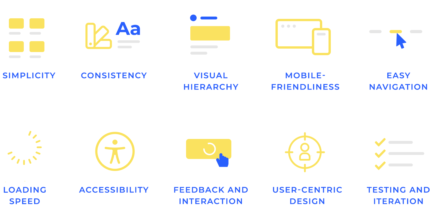
These principles come together to make websites that aren’t just nice to look at but are also super easy and enjoyable to use. When we remember these basics, we end up creating designs that really click with people.
When it comes to web design, the layout is like the backbone of your page. It’s what helps organize content, guide users, and make everything look clean and balanced. Let’s jump into the key aspects.
There are different types of layouts, but they all share one goal: to arrange content in a way that’s easy to understand and navigate. Some layouts are simple and straightforward, while others are more complex, but they all play a role in how users experience a web page.
Grids are one of the most popular ways to structure a layout. But what exactly is a grid? Well, think of it as an invisible framework made up of rows and columns. It helps organize content neatly, making sure everything is aligned and looks professional.
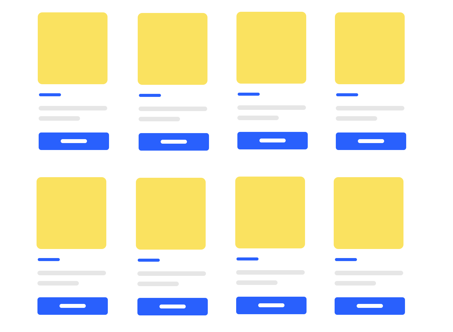
Grids are super handy because they make your design feel consistent and balanced, even if you’re working with lots of different elements. For example, if you have images, text, and buttons on your page, a grid helps keep them in line so nothing looks out of place.
Examples of grid usage:
- Magazines often use grids to arrange text and images in a clean, organized way.
- E-commerce websites rely on grids to showcase products neatly, helping users browse easily.
These days, people visit websites on all sorts of devices – from big desktop screens to tiny smartphone displays. That’s where responsive and adaptive design come in.
Responsive design means your layout adjusts fluidly to fit any screen size. Imagine your website is like water, taking the shape of whatever container (device) it’s in. It’s great because it ensures a smooth experience for users, no matter what device they’re on.
Adaptive design, on the other hand, involves creating fixed layouts for different screen sizes. Instead of adjusting to fit, the website detects the user’s screen size and selects the most appropriate layout. It’s like having multiple outfits ready for different occasions.
When to use each:
- Use responsive design when you want one layout that adapts seamlessly across all devices – it’s perfect for most websites today.
- Choose adaptive design when you want more control over how your site looks on specific screen sizes, especially if you expect users to visit from a variety of devices with very different screen sizes.
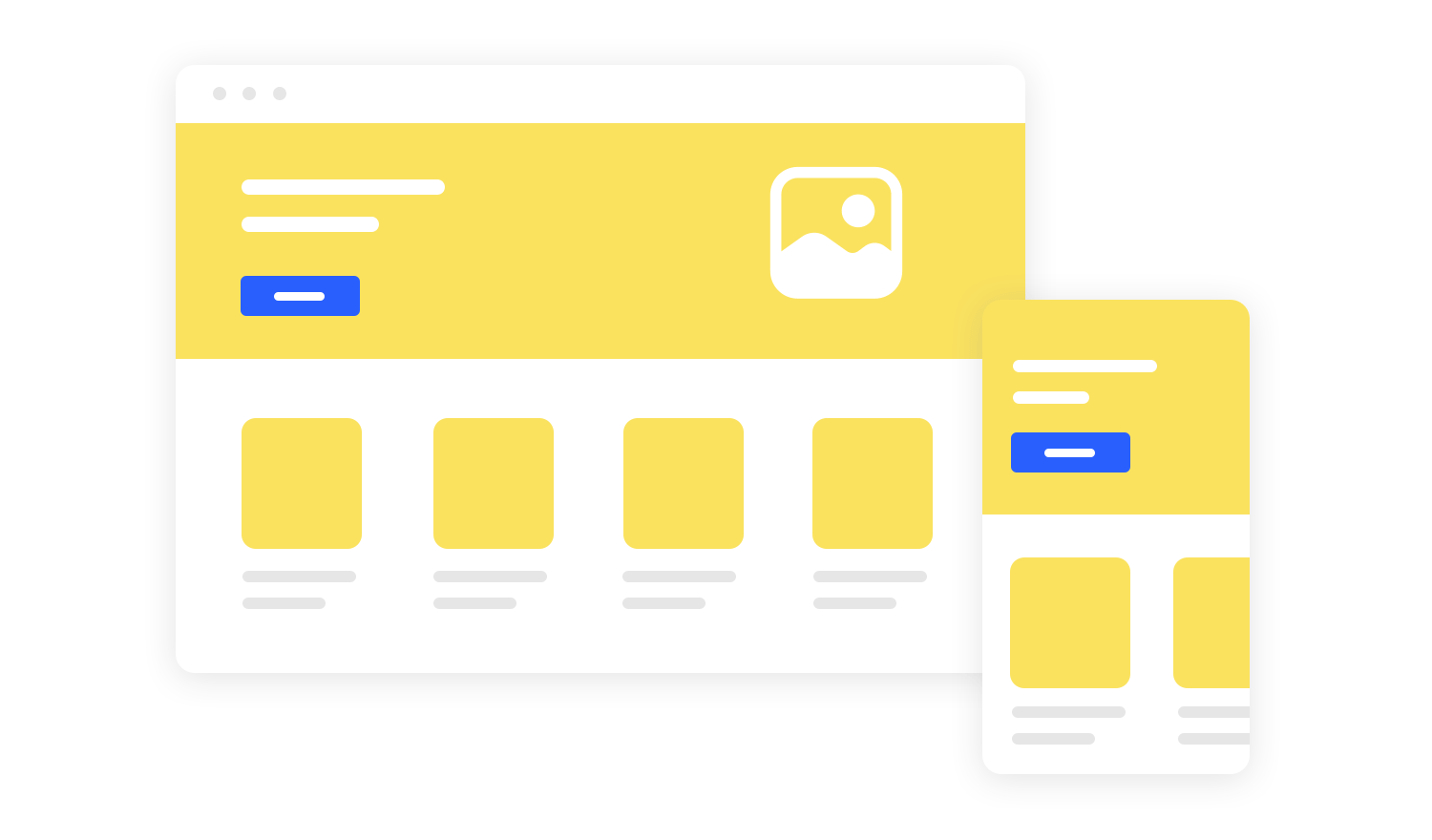
When designing layouts, it’s smart to start with mobile-first. Why? Because mobile screens are the smallest, and if your design works there, it’ll be much easier to expand it for larger screens. Here’s how to make sure your mobile-first design shines:
- Keep it simple: focus on essential content and features for smaller screens. Don’t overwhelm users with too much information.
- Prioritize touch-friendly elements: make buttons big enough to tap easily, and leave enough space around them to avoid accidental clicks.
- Optimize images: use smaller image sizes to keep load times fast, ensuring a smooth experience for mobile users.
Now, let’s talk about whitespace, also known as negative space. It’s the empty space around elements on your page. Some might think it’s just “blank,” but it’s actually a powerful tool.
Enhancing readability and focus: whitespace gives your content room to breathe, making it easier for users to read and understand. It draws attention to the most important parts of your page, guiding users’ eyes where you want them to go.
Balancing content and empty space: it’s all about finding the right balance. Too much content can feel cluttered, while too much whitespace can feel empty. When done right, whitespace helps create a clean, professional, and user-friendly design.
Free design tool for websites and web apps

After covering layouts, let’s see another important aspect of web design – the visual elements. These elements are closely tied to UI design and are the details that bring your website to life, like typography, colors, images, and videos.
Choosing readable and appropriate fonts: fonts play a big role in how people experience your website. The key is to pick fonts that are easy to read and match your brand’s personality. For example, a bold, playful font might be perfect for a kids’ website, while a clean, professional font works better for a business page. It’s all about finding that sweet spot between style and readability.
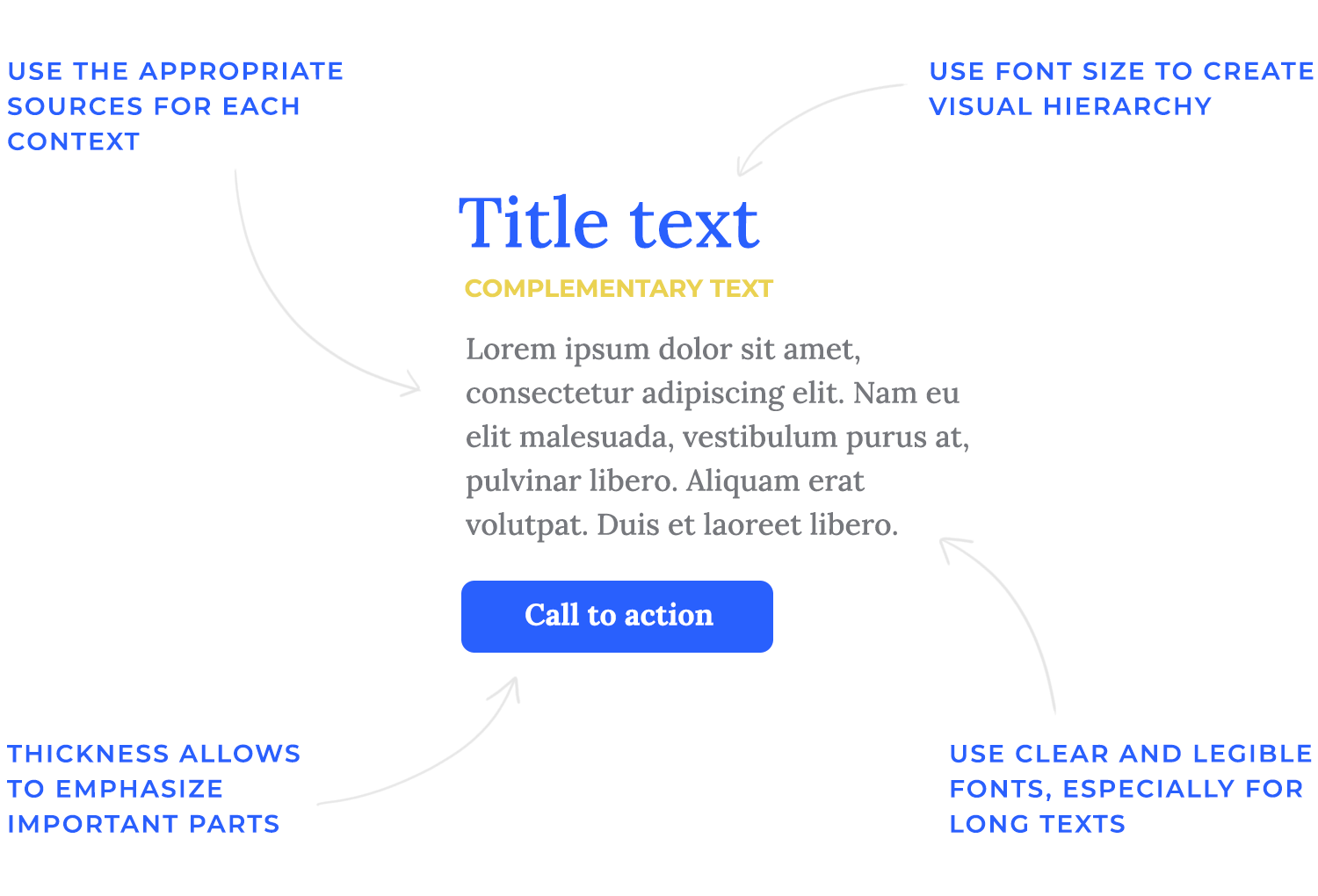
Establishing a typographic hierarchy: think of typographic hierarchy as a way to guide your readers through your content. It’s like giving directions: the biggest, boldest text is usually the most important (like headlines), while smaller fonts are for less critical details. By using different font sizes, weights, and styles, you create a clear path that helps users understand what to read first, second, and so on.
Choosing the right colors is about more than just making your website look good – it’s also about creating the right mood and making your content easy to understand.
Best practices for colors:
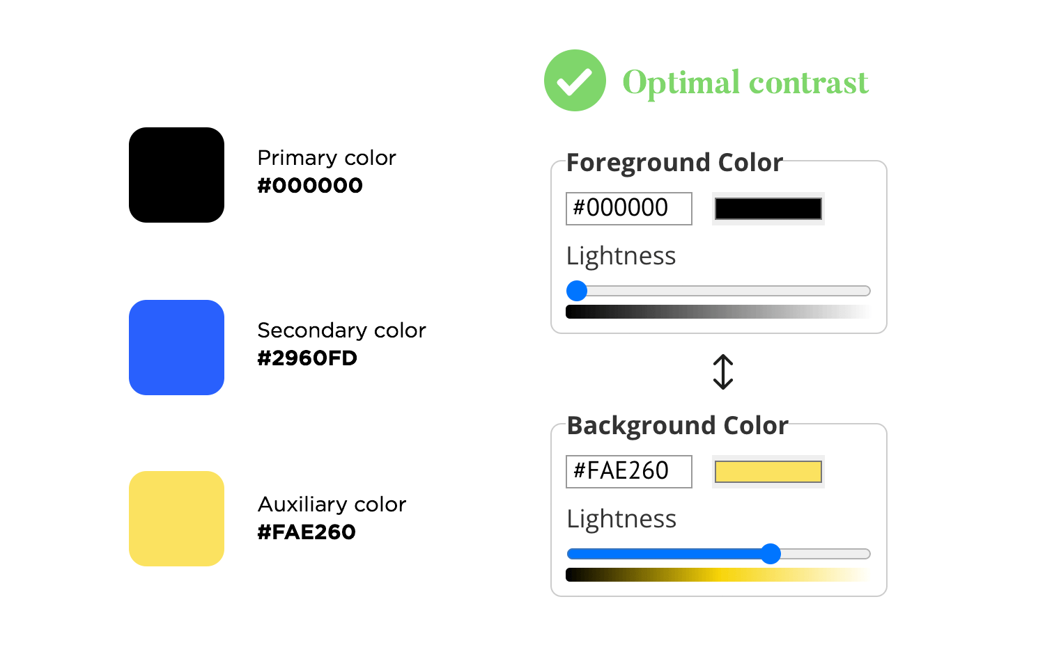
- Keep it simple: stick to a few main colors to avoid overwhelming your users.
- Ensure good contrast: make sure your text stands out against the background for easy reading.
- Stay consistent: use the same colors for similar elements (like buttons or links) to keep things looking neat and organized.
- Color schemes: there are different ways to pick a color scheme for your site. You could go for complementary colors (colors opposite each other on the color wheel), analogous colors (next to each other), or a monochromatic scheme (different shades of a single color). Each choice creates a different vibe, so pick one that suits your brand and message.
High-quality visuals can make a big difference on your website. You can easily find great images on stock photo websites like Unsplash or Pexels. If you’re looking for something more unique, consider creating images using AI tools or working with a graphic designer to get a personalized touch that matches your brand.
However, large files can slow down your site, which affects user experience. To avoid this, make sure to compress your images and videos before uploading them. This way, you get the best of both worlds – stunning visuals that don’t compromise your website’s performance.
Let’s think now about how users will actually interact with your website. User experience (UX) is all about making your site easy to navigate, enjoyable to use, and ensuring it performs well.
Navigation is like the roadmap of your website – it helps users find their way around. Menus and links are the main tools here, guiding people to different sections or pages. A clear, simple menu makes it easy for visitors to know where to go, whether they’re looking for your contact page or reading about your services.
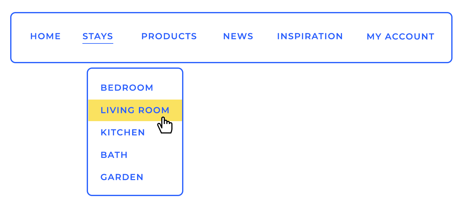
Accessibility is a key part of good navigation design. This means making sure everyone, including those with disabilities, can use your website without any trouble. For example, adding descriptive labels to menu links or using larger buttons can make a big difference for people who rely on screen readers or have motor difficulties.
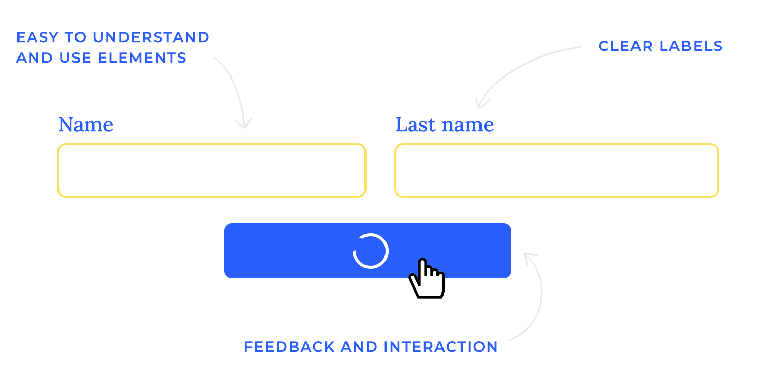
Interactive components are the elements users click, tap, or engage with on your site – things like buttons, forms, and other interactive features. They’re what make your website come to life.
When designing these components, always make sure they’re easy to understand and use. For example, buttons should look clickable, and forms should be straightforward with clear instructions.
Providing clear feedback and responses is really important, too. Let’s say someone clicks a button – they should see a change, like the button changing color or showing a loading spinner. This lets users know their action was recognized, giving them confidence that things are working as expected.
Nobody likes a slow website. Loading speed is a huge factor in user experience, as it impacts how long visitors stick around. If your pages take too long to load, people might get frustrated and leave before they even see your content.
Why is it important? A fast-loading website keeps users happy, improves search engine rankings, and boosts overall engagement. In other words, a quicker site means a better experience for everyone.
Some techniques for performance optimization:
- Compress images: use smaller file sizes for images to reduce loading times.
- Minimize code: remove any unnecessary code from your website to make it load faster.
- Use a content delivery network (CDN): this helps distribute your website’s files across multiple servers, speeding up access for users in different locations.
Free design tool for websites and web apps

With your design and user experience in place, it’s time to think about the content itself. A strong content strategy makes sure your website isn’t just visually appealing but also informative, engaging, and aligned with your goals.
Writing for the web is different from other forms of writing. It needs to be clear, concise, and quickly get to the point. Users often skim rather than read every word, so it’s important to make your content easy to digest.
Start by understanding what your users need and what your business wants to achieve. Your content should bridge the gap between the two, providing valuable information that speaks to your audience while supporting your business objectives.
A content inventory helps you organize what you already have and what you need. From there, build a sitemap – an outline of your website’s structure. This ensures all your content is in the right place and easy for users to find.

Focus on writing in a way that’s straightforward and to the point. Break up text with headings, bullet points, and short paragraphs to make it more readable. And always aim to create a friendly, engaging tone that resonates with your audience.
To make sure your content reaches the right people, SEO (Search Engine Optimization) is essential. Incorporating relevant keywords throughout your copy helps search engines understand what your website is about, making it easier for potential visitors to find you. Just remember, keywords should feel natural, not forced, within your content.
Words aren’t the only way to convey your message. Visual content, like images, infographics, and videos, can make your website more engaging and help explain complex ideas.
Use visuals that complement your text and add value to your message. For example, infographics can break down data into a more digestible format, while videos can showcase products or tell stories in a dynamic way.
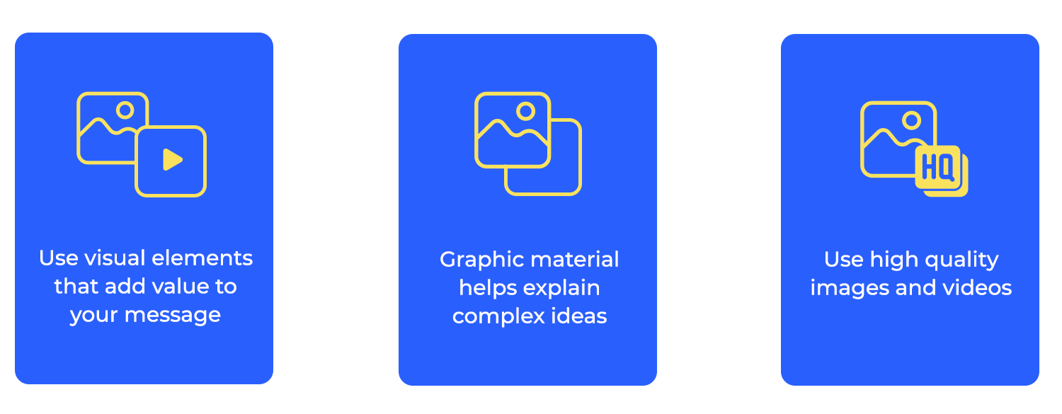
Visual storytelling is about more than just adding pretty pictures. It’s about using visuals to create a narrative that guides users through your content. Make sure your visuals are high-quality, relevant, and support the story you’re telling, creating a more immersive and memorable experience.
Making your website look great is important, but it’s just as essential to make sure everyone can use it, no matter their abilities. That’s where accessibility comes into play.
Inclusive design is all about making your website work for everyone, whether they have disabilities or not. It means thinking about how different people might experience your site and ensuring it’s easy for everyone to navigate and understand.
A good place to start is by following the Web Content Accessibility Guidelines (WCAG). These guidelines are like a handy checklist, helping you make sure things like color contrast, alt text for images, and easy navigation are all in place.
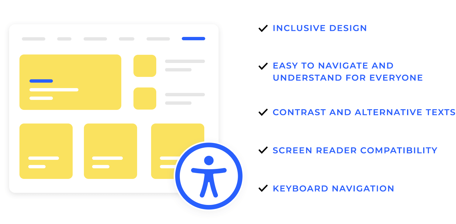
There are special tools that help people with disabilities use websites, and it’s important to make sure your site works well with them. For example, some people use screen readers that read the content out loud, while others navigate using just a keyboard instead of a mouse. Making sure your website supports these tools helps more people enjoy what you’ve created.
It’s great to design with accessibility in mind, but it’s also important to test it. You can use testing accessibility tools to check your site or, even better, get feedback from people who actually use these tools. This way, you can catch any issues and make sure your site is easy for everyone to use.
Once your web design is ready, it’s time to see how it performs in the real world. Testing is an essential part of the process to make sure your design works as intended and provides the best experience possible.
User testing is all about getting real people to interact with your website and see how they respond. This helps you spot any issues and understand what’s working well.
Conducting tests with real users
Invite a few people from your target audience to try out your site. Watch how they navigate, ask questions about their experience, and take note of any areas where they seem confused or stuck.
Gathering feedback and making improvements
The feedback you gather from user testing is pure gold. Use it to identify what needs fixing or adjusting, and don’t be afraid to make changes based on what real users are telling you. It’s all about improving the experience step by step.
A/B testing is a bit like an experiment where you compare two versions of your design to see which one performs better.
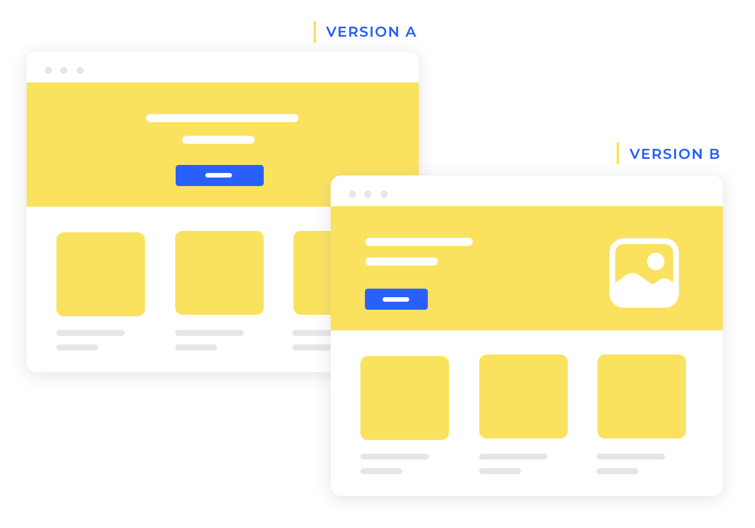
Importance of testing variations
Sometimes, even small changes – like the color of a button or the placement of a headline – can make a big difference. A/B testing lets you try out these variations to find out what works best for your audience.
Tools and techniques for A/B testing
There are plenty of tools out there to help you run A/B tests, like Google Optimize or Optimizely. These tools let you set up different versions of your page and track how users interact with each one, so you can see which version gets the best results.
Testing your web designs with real people and using A/B tests helps you improve your website and make it work better for everyone.
Free design tool for websites and web apps

If you’re ready to get into web design, there are plenty of ways to learn – from online tutorials to intensive bootcamps and comprehensive courses. Here’s a guide to get you started on your journey.
Online tutorials are a great way to dip your toes into web design at your own pace. Here are some popular options.
1. freeCodeCamp: with millions of subscribers, freeCodeCamp offers a variety of free web design tutorials, perfect for beginners. Their tutorials are detailed and cover everything from HTML and CSS to more advanced topics.
Envato Tuts+: this detailed video tutorial from Envato Tuts+ covers the essentials of responsive web design, teaching you how to create flexible layouts that look great on any device.
Flux Academy: this beginner-friendly tutorial takes you through all the web design basics. It’s a 3-hour deep dive, perfect if you want to get started with web design and learn the essentials in one go.
If you’re looking for a more immersive learning experience, bootcamps can be a great choice. Here are some top bootcamps in both the USA and Europe.
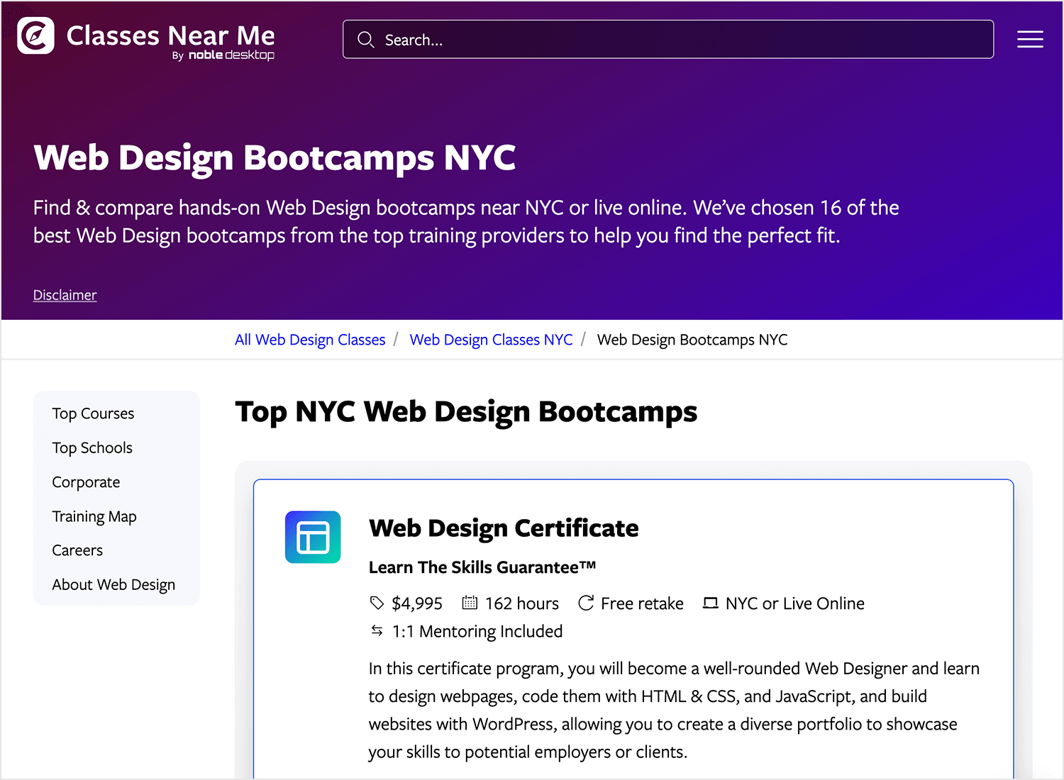
Noble Desktop: offers a range of web design bootcamps, from beginner to advanced levels. Nobel Desktop covers everything from HTML and CSS to UX/UI design, providing hands-on experience with real projects to build your portfolio.
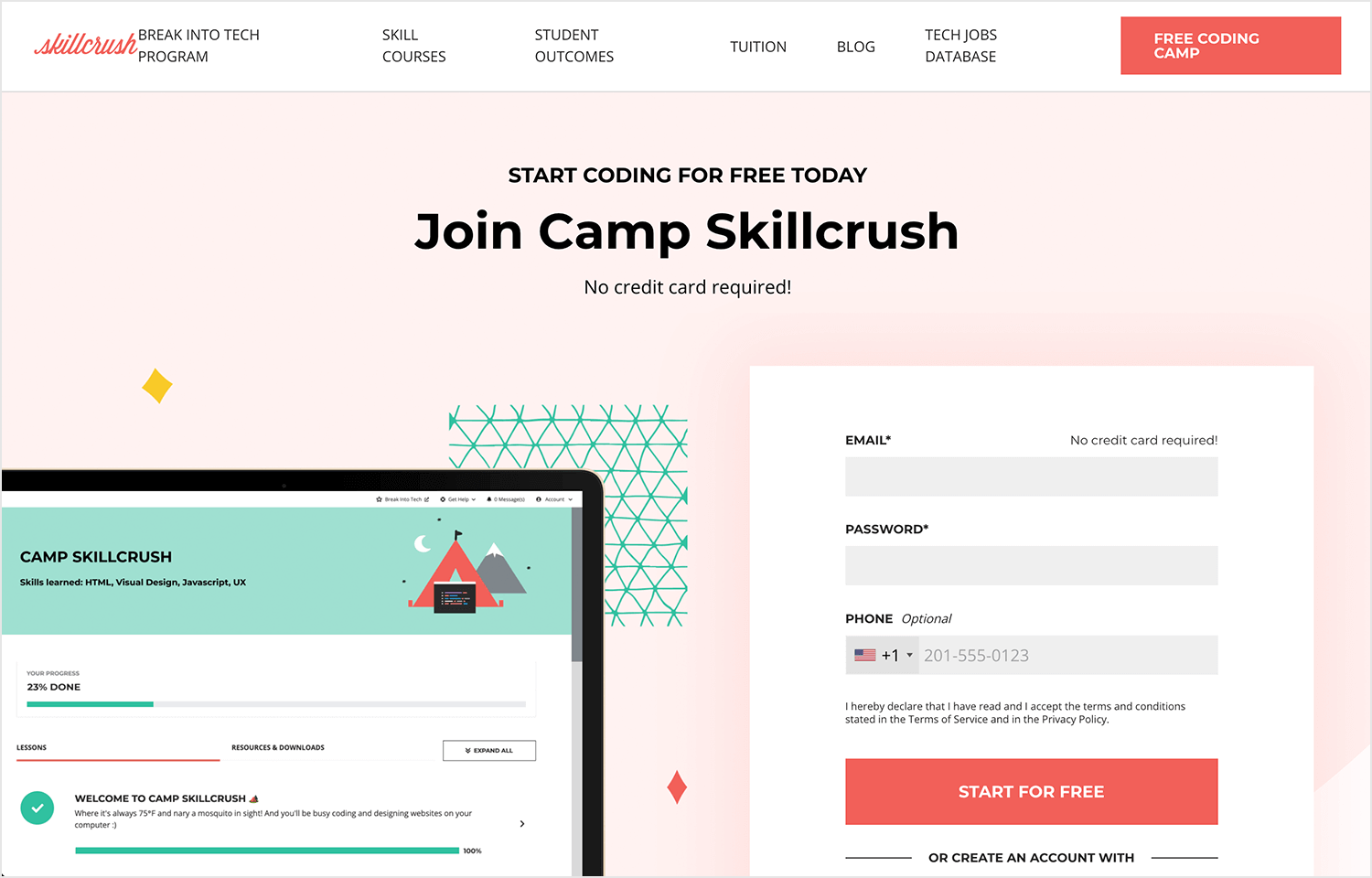
Skillcrush: this free bootcamp gives you a taste of web design, perfect for beginners who want to see if web design is right for them. It covers the basics, from HTML and CSS to some design principles, and it’s a great way to get started without any cost.
BrainStation: the courses BrainStation offers are perfect if you want to learn web design from scratch. You’ll cover everything from the basics to more advanced skills, with plenty of hands-on projects to help you really get the hang of it.

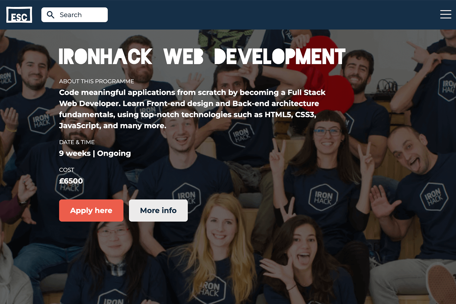
Ironhack (various locations): offers web design bootcamps in major cities like Berlin, Madrid, and Amsterdam. Their courses are practical and fast-paced, ideal for those who want to jump into the industry quickly.
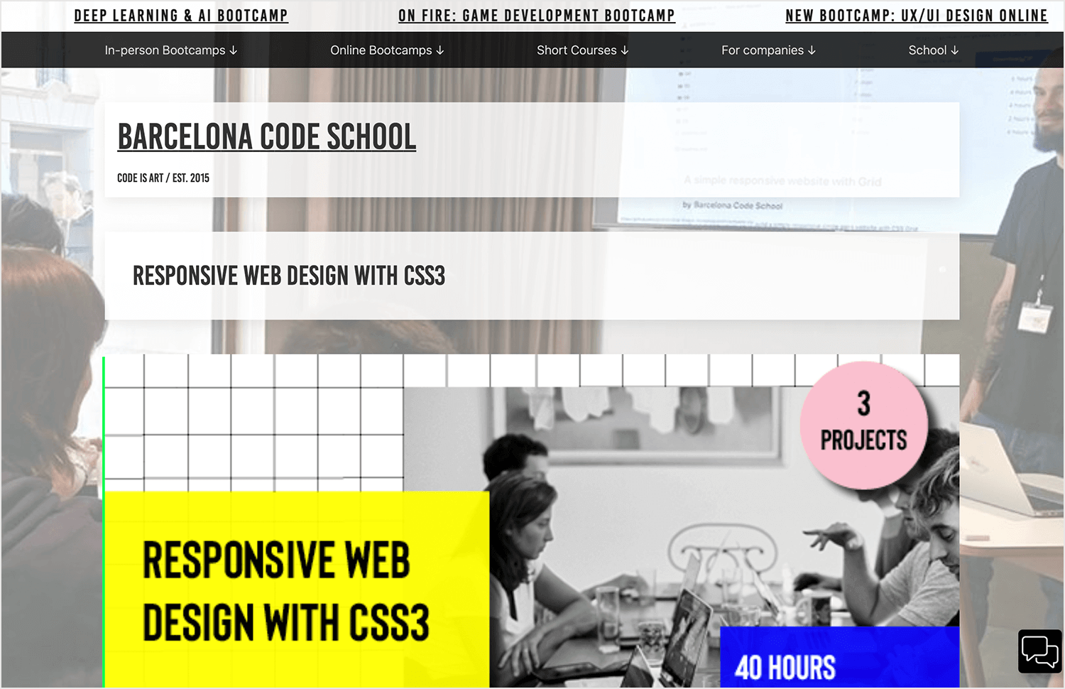
Barcelona Code School: the responsive web design course focuses on teaching you how to create modern, responsive web designs using CSS3. It’s perfect for those who want to learn how to build websites that look great on any device, with hands-on projects that help you master responsive design techniques.
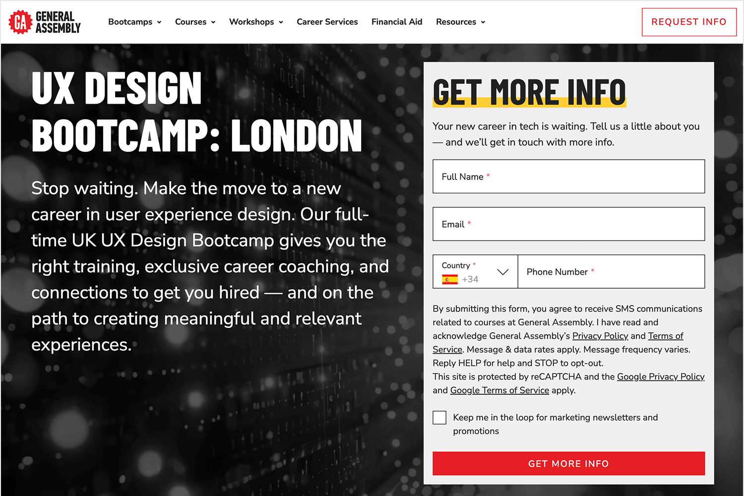
General Assembly – London, UK: while this bootcamp from the General Assembly isn’t focused entirely on web design, it does cover the essential skills you need, like HTML, CSS, and responsive design. You’ll get hands-on experience in a friendly, in-person environment, perfect for building your skills and meeting others on the same journey.
If you prefer learning at your own pace, there are also some great online courses that can help you kickstart your web design journey, whether you’re a complete beginner or just want to brush up on your skills.
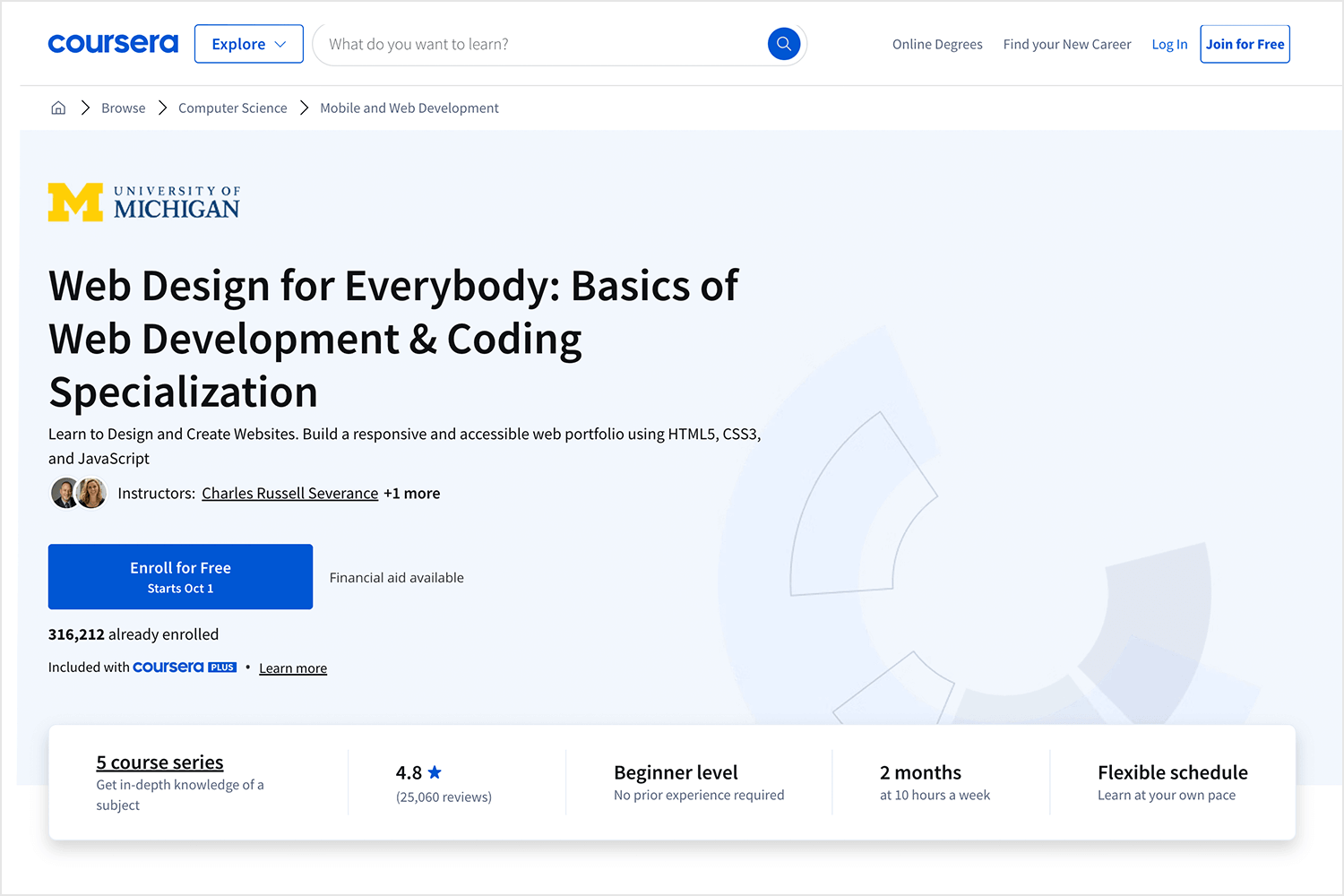
Coursera: this online course for web design is perfect if you’re starting from scratch. It covers everything from HTML to creating responsive designs, all in bite-sized lessons. Great for learning at your own pace.
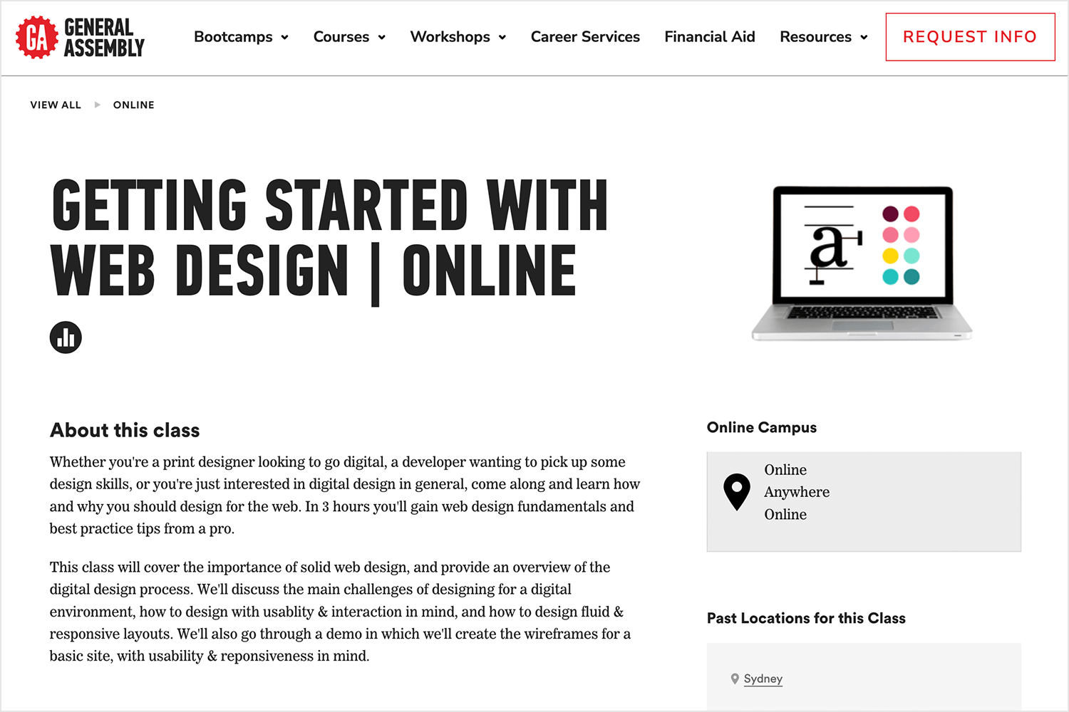
General Assembly: this web design course gives you a solid intro to web design, covering the basics in a friendly and easy way. It’s super beginner-friendly and a great first step if you’re curious about web design.
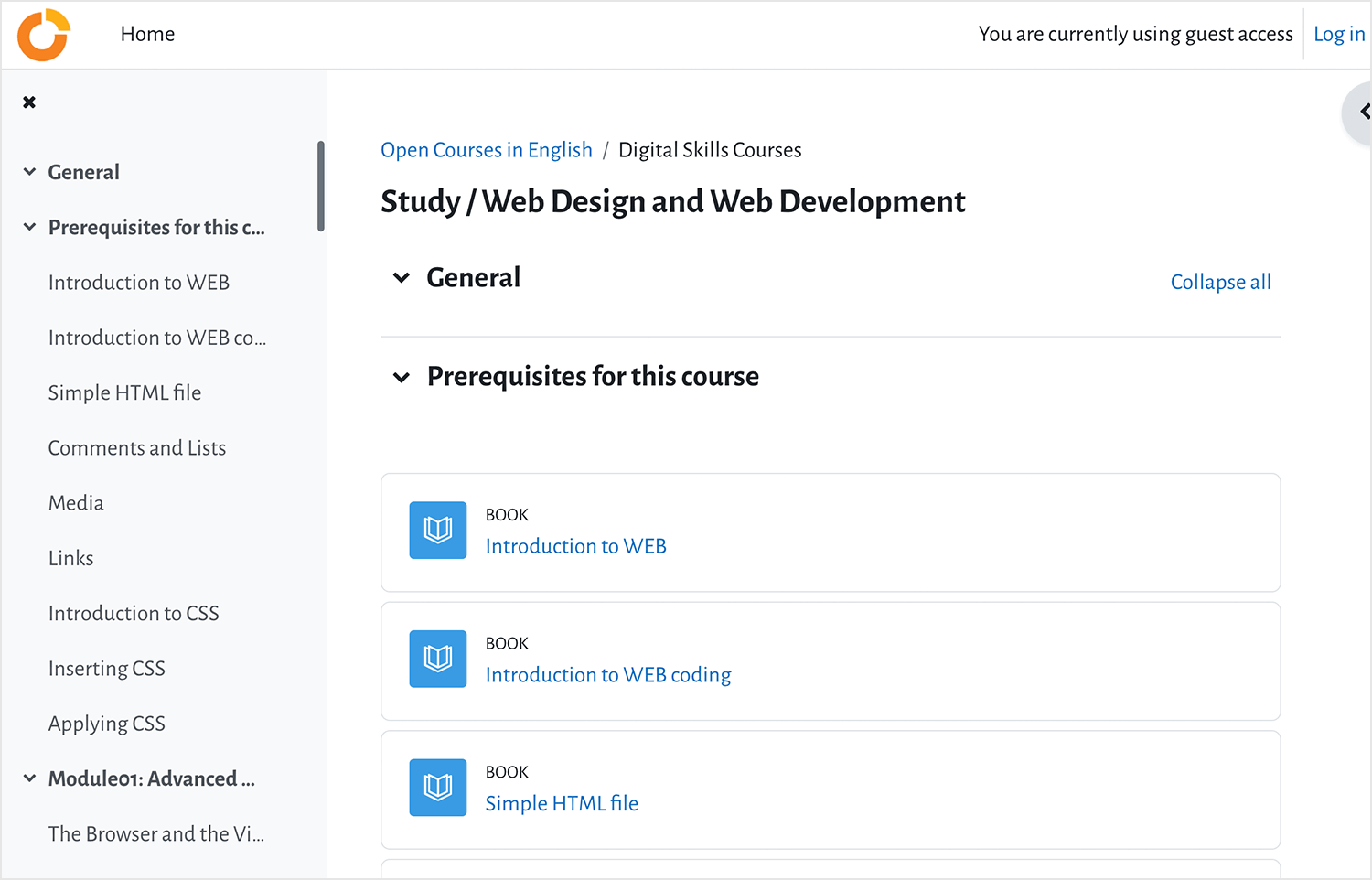
Ellak.gr: a straightforward course that’s perfect for beginners, teaching you the fundamentals of web design with easy-to-follow lessons. It’s a great way to dip your toes into web design without feeling overwhelmed.
And if you’re looking to dive even deeper into web design, these books are fantastic resources. They’ll guide you through everything you need to know, whether you’re starting out or aiming to master your skills.
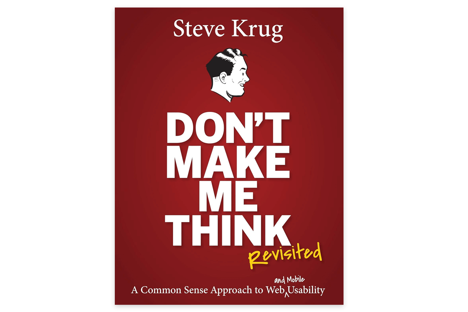
Don’t Make Me Think by Steve Krug: a classic, easy-to-read guide on web usability that helps you understand how to create user-friendly designs. It’s packed with practical tips and insights that every web designer should know.
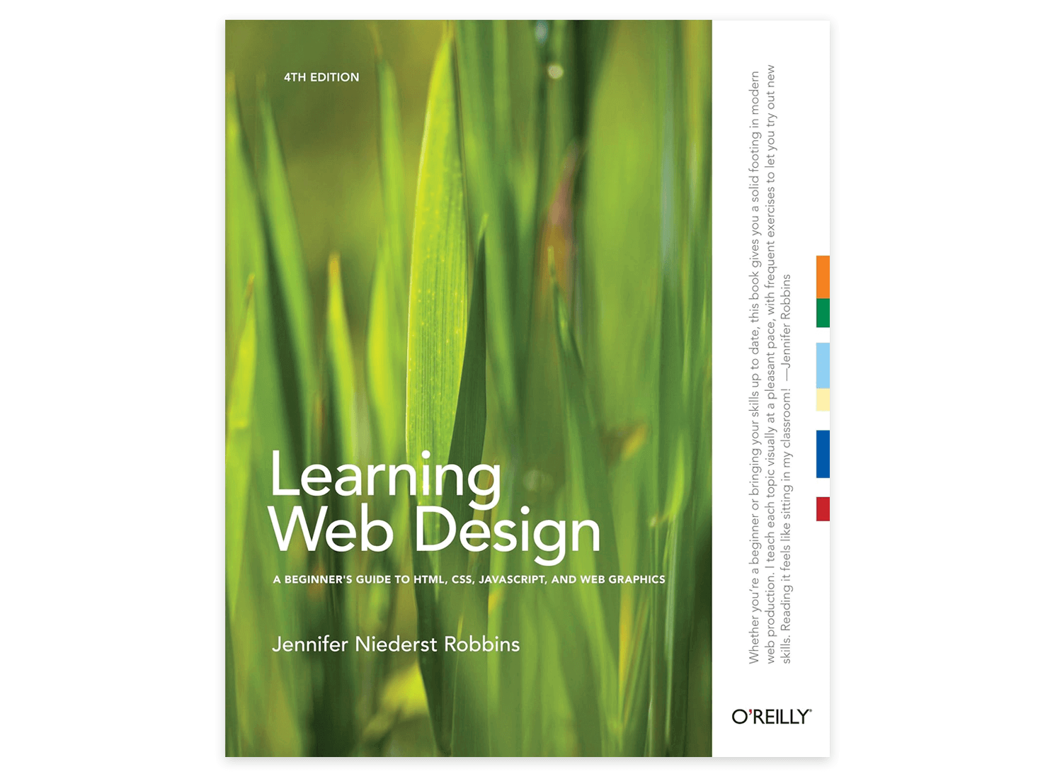
Learning Web Design: A Beginner’s Guide to HTML, CSS, JavaScript, and Web Graphics by Jennifer Niederst Robbins: this comprehensive web design guide by Jennifer Niederst takes you through all aspects of web design, from the very basics to more advanced concepts, in an easy-to-understand way. It’s perfect for beginners who want to get a solid grasp of web design fundamentals.
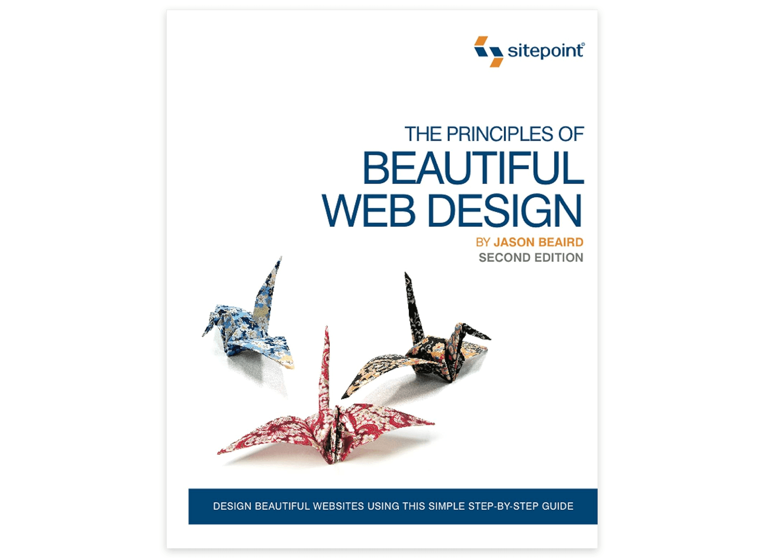
The Principles of Beautiful Web Design by Jason Beaird and James George: a great web design book that walks you through the fundamentals of web design, covering layout, color theory, typography, and imagery. It’s perfect if you want to build a strong design foundation.
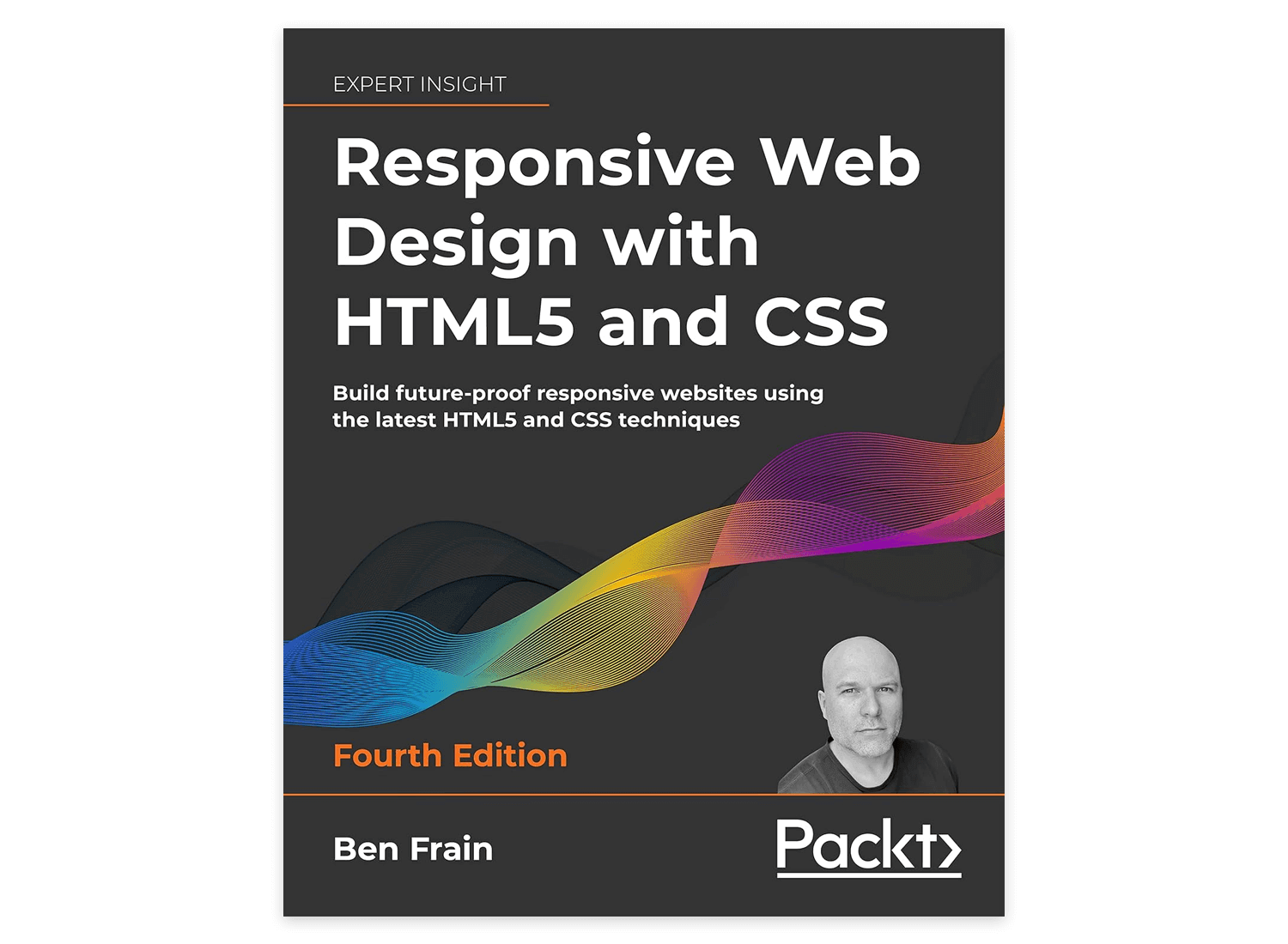
Responsive Web Design with HTML5 and CSS by Ben Frain: ideal for those looking to dive into responsive design, this responsive web design book offers practical techniques for building flexible, adaptable websites that look great on any device.
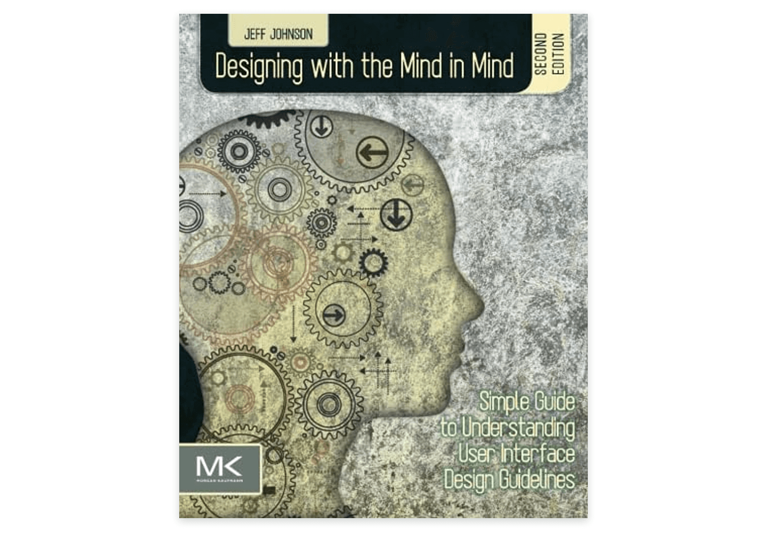
Designing with the Mind in Mind by Jeff Johnson: this design book offers insights into the psychology behind web design, helping you create websites that feel intuitive and easy for users. It’s a fantastic read if you want to understand the ‘why’ behind good design.
Web design is a fascinating mix of creativity, strategy, and functionality, and it plays a huge role in how we experience the digital world today. As you’ve seen throughout this guide, it’s not just about making things look pretty as we already mentioned but about creating a web design that’s easy to use, enjoyable, and tailored to the needs of your audience. From understanding the basics to exploring web design principles like layout, typography, and responsive design, each element works together to create a seamless experience for users.
Whether you’re just starting out or looking to deepen your skills, there are plenty of resources available, from tutorials and bootcamps to online courses and books. So, take the next step in your web design journey, keep practicing, and remember that the key to become skilled at web design is to always keep the user in mind. With the right mindset and a bit of creativity, you’ll be crafting stunning web designs that stand out and truly connect with your audience in no time. Happy designing!
PROTOTYPE · COMMUNICATE · VALIDATE
ALL-IN-ONE PROTOTYPING TOOL FOR WEB AND MOBILE APPS
Related Content
 A fun look at different data table designs, from basic lists to smart, interactive ones, based on how complex the data is and what users need.18 min Read
 Single page design v multi-page design – everything you need to help you choose the right design for your site’s content18 min Read
 Website backgrounds can be a powerful tool in creating an experience. But what kind of experience can you convey and how? We got the full run-through for you!14 min Read
