
Need fresh ideas for your hotel website? We’ve put together 20 standout examples that get UX, booking flow, and design just right.
A hotel website should do more than look good—it should make finding information and booking a stay effortless. Whether it’s a cozy boutique hotel or a high-end resort, the best sites balance style and usability.
Great web design follows key principles that apply across industries. If you’re looking to refine layouts, interactions, or navigation, these UI design examples offer practical insights into what makes a seamless user experience.
Design hotel websites with great UX. Start with Justinmind now!

Check out these inspiring examples and see what makes a great hotel booking experience.
A great hotel website design isn’t just about aesthetics, it’s about creating a seamless user experience that makes finding and booking a stay effortless. From a web design perspective, this means intuitive navigation, fast-loading pages, and a layout that prioritizes key details like room options, pricing, location, and amenities.
The best hotel websites anticipate user needs, guiding them smoothly from browsing to booking without unnecessary steps or distractions.

A well-structured site does more than showcase a hotel; it builds trust and encourages direct reservations. A slow, cluttered, or confusing design can frustrate potential guests and push them toward competitors or third-party booking platforms.
Whether it’s a boutique hotel website design that highlights charm and personality or a luxury hotel website design that immerses visitors in an upscale experience, the goal is the same: create an intuitive and engaging journey that turns visitors into guests.
Design hotel websites with great UX. Start with Justinmind now!
A great hotel website design should be both visually appealing and highly functional. The most effective sites make it simple for visitors to navigate, access important details, and complete their booking with ease. These key elements help create a smooth and engaging user experience:
- High-quality visuals: guests want to see what they’re booking. Large, high-resolution images or videos showcasing rooms, amenities, and surroundings help create an emotional connection and drive bookings.
- Easy navigation: users shouldn’t have to dig for essential details. A well-organized menu and clear layout ensure they can quickly access room options, pricing, availability, and policies without frustration.
- Visible CTAs: booking should never feel like a scavenger hunt. The “Book Now” button should be prominent and consistently placed, often in the top right corner or fixed on the screen as users scroll. A clear, easy-to-spot CTA increases conversions by reducing friction.
- Responsive design: travelers browse on all kinds of devices, from desktops to smartphones. A responsive design guarantees a smooth experience across screen sizes, preventing drop-offs from frustrated users.
- Ratings and reviews: social proof matters. Featuring reviews and star ratings directly on the website builds trust and reassures potential guests, increasing the likelihood of a booking.
- Appeal to target users: a boutique hotel website design might emphasize unique decor and intimate spaces, while a luxury hotel website design could focus on elegance and exclusivity. The design should reflect what makes the hotel special and attract the right audience.
- Interactive UX features: subtle animations, parallax scrolling, or interactive elements can enhance engagement and create a more immersive experience, just as long as they don’t slow down the site.
Each of these elements helps create a smooth, engaging experience that keeps visitors interested and encourages bookings. The easier and more enjoyable the process, the more likely guests are to choose your hotel over others.
A well-designed hotel website should guide visitors smoothly toward booking. Every detail, from the placement of a button design to page speed, plays a role in turning interest into action. Here’s how to optimize your site for higher conversions.
The “Book Now” button should always be easy to find and enticing to click. A contrasting color helps it stand out, and clear action-driven text, like “Reserve Your Stay” or “Check Availability,” makes the next step obvious.

Placement also plays a role by keeping the button above the fold and fixed on the screen ensures users can book at any moment. Testing different colors, text, and positions can fine-tune what resonates best with visitors.
The longer and more complicated the checkout process, the more likely users are to abandon it. Keep forms as short as possible, asking only for the essentials. Avoid forcing users to create an account by offering a guest checkout option speeds up the process.
Features like auto-fill and predictive search make entering details quicker and less frustrating, removing unnecessary barriers to booking.

A slow site can cost bookings before users even reach the checkout page. Large images and excessive scripts can make pages sluggish, leading to frustration. Compressing images, using lazy loading, and minimizing JavaScript keep things running smoothly. Ideally, server response times should be under 200ms to ensure a seamless browsing experience, especially for mobile users who expect fast-loading pages.
People trust other guests more than any hotel marketing, which is why reviews and ratings should be visible where they matter most; near booking CTAs. Seeing positive experiences reassures potential guests and increases confidence in their decision. Real-time updates, such as “5 people booked this room today,” create urgency, while security badges and certifications reinforce credibility and build trust.

Not all visitors book on their first visit, but recognizing return users can make a difference. Personalized recommendations based on previous searches or browsing history like highlighting a room they viewed before make the experience more relevant. Offering exclusive discounts for returning visitors or dynamically adjusting homepage content to showcase tailored deals can help turn interest into action.
Creating a sense of urgency can encourage users to finalize their booking. Messages like “Only 2 rooms left at this rate” subtly push users to act before they miss out. Countdown timers for limited-time offers or seasonal promotions add another layer of motivation. Highlighting early booking discounts not only rewards proactive guests but also helps secure reservations sooner.

With so many users booking directly from their phones, the mobile experience needs to be effortless. Buttons and form fields should be large enough for easy tapping, and spacing should allow for smooth scrolling.
One-click payment options like Apple Pay and Google Pay make transactions faster, reducing friction in the final step. Adjusting font sizes and ensuring text is easily readable without zooming improves the overall experience for mobile users.
A high-converting hotel website removes obstacles and builds trust, making it as easy as possible for visitors to complete a booking. The smoother and more intuitive the experience, the more likely they are to choose your hotel over the competition.
Design hotel websites with great UX. Start with Justinmind now!
Without further ado, here’s a roundup of the 20 best hotel and resort web designs. In this list, you’ll find everything from boutiques to apartment rentals.
Some hotel websites pull you in with over-the-top effects, but Phos Villas takes a different approach, it lets the destination speak for itself. From the moment you land on the site, you’re greeted with sweeping views of the Aegean, bathed in golden light. The design is understated yet immersive, using high-quality images and smooth transitions to create a sense of calm, much like the villas themselves.

Navigation is effortless. No distractions, no unnecessary clicks, just a clean layout that guides you through the essentials. Whether you’re exploring the accommodations, browsing the services, or checking availability, everything feels intuitive and seamless. The experience mirrors the villas’ philosophy: pure, elegant, and beautifully simple.
If a hotel website design should reflect a brand’s identity, Conscious Hotels absolutely nails it. As a chain of eco-friendly hotels in Amsterdam, their website embodies sustainability, not just in its messaging, but in its design. Everything feels light, effortless, and refreshingly simple, just like their approach to hospitality.
Navigation is smooth, and each hotel is presented with crisp visuals and just the right amount of detail, enough to inform, never too much to overwhelm. The “Book Now” button stays easy to find, making reservations seamless. What makes this site stand out isn’t flashy effects but clarity, users can quickly explore different locations, check availability, and book without friction.

It’s a great hotel website design example of how thoughtful UX and brand storytelling can work together to create a digital experience that feels as inviting as the stay itself.
A hidden retreat in the heart of Montmartre, Hôtel Particulier Montmartre has a website that reflects its intimate and exclusive atmosphere. The design is minimal, elegant, and easy to navigate, with large visuals showcasing the hotel’s lush garden setting and uniquely designed suites.

The site keeps things simple; no clutter, no unnecessary distractions, just a smooth experience that makes exploring the rooms, restaurant, and booking process effortless. It’s a great hotel website design example of how less can be more, using clean aesthetics and smart UX to create an inviting digital experience.
A hotel website design should capture the essence of the stay, and Le Mirabeau Resort & Spa does exactly that. The site welcomes visitors with stunning Matterhorn views, clean typography, and a modern layout that makes exploring easy.

The navigation is straightforward, guiding users through room options, dining, and wellness experiences without unnecessary clicks. Booking is seamless, with clear calls to action and an intuitive flow. What makes this site a great hotel website design example is its balance, visually appealing yet highly functional, making it easy for potential guests to get inspired and reserve their stay.
Bellevue Syrene’s website is a great example of a luxury hotel website design done right. It keeps things simple yet visually striking, using full-width images to highlight the hotel’s stunning location on the cliffs of Sorrento. The homepage immediately draws visitors in with high-quality photography, while the navigation remains clear and intuitive.

The site doesn’t overwhelm with excessive animations or cluttered layouts. Instead, it balances elegance and usability, making it easy to explore rooms, dining, and spa services. The booking process is straightforward, with clear calls to action guiding users seamlessly toward reservations. It’s a great hotel website design that proves you don’t need complex effects to create an engaging and high-end digital experience.
Here we have a hotel website design that feels immersive from the start. Resplendent Ceylon uses full-screen images to bring its luxury Sri Lankan resorts to life, from misty tea plantations to serene coastal retreats. The layout is clear and well-structured, making it easy to explore accommodations, dining, and experiences without any hassle.

What stands out about this site is how it keeps things elegant yet practical. The visuals draw you in, but the navigation remains straightforward, and booking is always within easy reach. It’s a great hotel website design example that delivers both beauty and usability.
Here we have a hotel website design that keeps things simple and inviting. SOL Beach uses a clean, modern layout with bold visuals that instantly set the mood for a laid-back, upscale beach experience. The navigation is straightforward, making it easy to explore dining, events, and booking options without distractions.

What makes this site work is its balance between style and usability. The design feels fresh and engaging, but it never gets in the way of functionality. The booking process is clear, and key information is easy to find. It’s a great hotel website design example that keeps the experience smooth and stress-free.
A good hotel website design should feel like an extension of the stay itself, and Casa Cook gets this just right. The site is minimal yet inviting, using large, immersive images to set the mood for its boutique beach resorts. Navigation is simple, letting visitors explore destinations, accommodations, and experiences without distraction.

What makes this design work is how effortlessly it blends aesthetics with usability. There are no unnecessary elements; just a clean, stylish interface that keeps the focus on the experience. The booking process is clear and intuitive, making it a great hotel website design example that feels as relaxed and refined as the hotels themselves.
Here we have a hotel website design that captures the essence of Alpine luxury. Hotel Schweizerhof Zermatt presents a clean and modern interface, highlighting the hotel’s warm wooden interiors and contemporary accents. The homepage features high-quality images of the hotel’s rooms, restaurants, and spa facilities, providing visitors with a visual taste of the experience awaiting them.

What makes this site stand out is its intuitive navigation and clear layout. Visitors can easily explore room options, dining venues, and wellness services, with concise descriptions and easy-to-find booking options. The design effectively balances visual appeal with user-friendly functionality, making it a great hotel website design example that reflects the hotel’s commitment to luxury and comfort.
The Samsara Ubud website makes you feel like you’re already there. With full-screen images of lush greenery and private villas, it sets the mood for a peaceful escape. The design is simple and well-organized, making it easy to explore without distractions.

What we like about this site is how easy it is to navigate. You can quickly find details about the villas, dining, and spa without searching too much. Booking is just as smooth, keeping the process simple. It’s a great hotel website design example that feels relaxing and simple, just like a stay at Samsara Ubud.
Design hotel websites with great UX. Start with Justinmind now!
Some hotel websites are polished and traditional, Michelberger Hotel is anything but. The design is playful, bold, and just a little rebellious, much like the hotel itself. Each section of the site shifts through vibrant color blocks with oversized, brutalist-style typography leading you to “Rooms,” “Restaurant,” or “What’s On.” It’s a design that feels more like an experience than a typical hotel website.

The structure is refreshingly simple. There’s no unnecessary clutter, just a creative approach to navigation that makes exploring the hotel’s spaces and events feel fun. The booking process remains clear and accessible, ensuring that while the design is unconventional, usability isn’t compromised. It’s a great hotel website design example of how personality and functionality can come together in an original way.
Not every hotel website design needs to be flashy to be effective. Lake House takes a more refined approach, using beautiful imagery and a soft color palette to reflect its peaceful lakeside setting in Daylesford, Australia. The homepage immediately draws you in with photos of its award-winning restaurant, luxurious spa, and tranquil accommodations, setting the tone for a relaxing getaway.

The site is well-structured and easy to navigate, making it simple to browse room options, dining experiences, and wellness retreats. Booking is straightforward, with clear CTAs guiding visitors to reserve their stay. This is a great example of hotel website design that keeps things elegant and functional without unnecessary complexity.
Elivi Hotels delivers a clean and elegant hotel website design that matches its luxury beachfront location in Skiathos. The homepage features stunning aerial views of the resort, setting the tone for a high-end escape. The design is minimal, with high-quality images and a natural color palette that aligns with the brand’s aesthetic.

Navigation is simple, with clear sections for accommodations, dining, spa services, and special offers. A prominent booking tool on the homepage lets visitors check availability right away, keeping the user experience smooth. This is a great hotel website design example that balances style with practicality, making it easy for potential guests to explore and book their stay.
Some hotel websites feel like a brochure, but The Ned’s design makes you feel like you’ve already stepped inside. The homepage sets the mood with warm lighting, rich textures, and a layout that flows easily.

As a collection of hotels in London, New York, and Doha, The Ned balances heritage and modern luxury, giving each property its own unique identity while keeping navigation consistent. The strong typography, immersive photography, and well-placed CTAs make exploring easy, whether you’re looking for a room, dining options, or membership details.
There’s something about Aman’s website design that instantly feels luxurious, probably because, much like their resorts, it’s all about simplicity and space. Amangiri’s site is a perfect example of this, using full-screen visuals, clean typography, and just enough information to create a feeling of exclusivity.

There’s no clutter, no unnecessary effects; just seamless navigation that lets users experience the resort’s desert landscape through stunning photography. It’s a great hotel website design example that shows how less is more when it comes to high-end travel.
A hotel on a remote Canadian island deserves a website that feels just as unique. Fogo Island Inn uses bold typography and striking visuals to tell its story, immediately drawing visitors into the rugged beauty of Newfoundland.

The site doesn’t follow the typical hotel website structure, but that’s what makes it work. Instead of overwhelming users with options, it guides them through an experience, weaving together the history, landscape, and mission behind the hotel. The booking process is clear and direct, proving that even unconventional designs can still be highly functional.
Some hotel websites take themselves too seriously; The Hoxton does the opposite. The design is playful and vibrant, making the experience feel less like booking a hotel and more like planning a fun getaway.

Large, bold fonts, animated elements, and engaging copy create a casual, welcoming tone that mirrors the brand’s personality. Each hotel has its own dedicated page with interactive maps, curated neighborhood guides, and easy-to-browse room options, making it feel more like an insider’s travel guide than a standard booking site.
While some hotels aim for a sleek, minimalist website, The NoMad Hotel embraces a more rich and immersive design. The deep color palette, sophisticated typography, and editorial-style layout make it feel refined yet inviting.

The homepage blends imagery with subtle motion effects, creating a scrolling experience that feels fluid and polished. Even with all these design details, navigation remains clear and intuitive, leading users seamlessly from storytelling to booking.
Here’s a hotel website design that does something most others don’t, it makes you feel nostalgic. TWA Hotel’s site leans into its retro branding, using bold red accents, vintage fonts, and striking visuals that transport visitors back to the golden age of air travel.

It’s a perfect example of how strong branding can shape the entire user experience. The design isn’t just about looking good; it’s functional and engaging, making it easy to explore rooms, dining options, and museum exhibits while staying true to the hotel’s distinct aesthetic.
The last one on our list takes us deep into the Botswana desert. Jack’s Camp isn’t your typical luxury hotel, and its website reflects that. Instead of modern minimalism, the design embraces a vintage safari aesthetic, using earthy tones, old-world typography, and stunning landscape photography to immerse visitors in the experience before they even arrive.

This site does a great job of balancing visual storytelling with ease of use. The design draws visitors into the experience while keeping navigation straightforward, making it easy to find accommodations, activities, and booking options. It’s a strong example of hotel website design that feels immersive without sacrificing functionality.
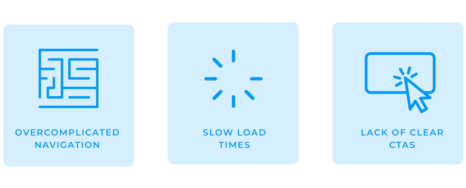
Even the most visually impressive hotel website design can fail if it doesn’t function well for users. Here are some of the most common mistakes that can hurt the experience and cost bookings.
When website navigation isn’t designed properly, users struggle to find key information like room details, amenities, or booking options. A cluttered menu, too many dropdowns, or inconsistent labeling can leave visitors frustrated, leading them to abandon the site entirely. Hotel websites should keep navigation clear, intuitive, and predictable, ensuring guests can access what they need with minimal effort.
A hotel website filled with high-resolution images and animations might look stunning, but if it takes too long to load, users won’t stick around to see it. Slow pages not only hurt user experience but also impact search rankings. Compressing images, enabling lazy loading, and optimizing scripts are essential to keeping performance smooth, especially for mobile users.
If visitors don’t immediately see where to book, they might not book at all. A “Book Now” button buried in the footer or lost in a crowded layout creates unnecessary friction. CTAs should be prominent, consistent, and always within reach, making it effortless for users to take action when they’re ready to reserve a stay.
Avoiding these pitfalls ensures a great hotel website design that’s not just visually appealing, but also user-friendly and optimized for conversions.
Design hotel websites with great UX. Start with Justinmind now!
A great hotel website goes beyond just looking attractive; it creates a seamless, user-friendly experience that guides visitors effortlessly toward booking. By focusing on key elements like intuitive navigation, fast load times, prominent CTAs, and easy booking processes, you can enhance the user experience and drive more direct reservations.
The best hotel websites strike a balance between stunning visuals and functionality, making it easy for users to find what they need, whether it’s room options, prices, or amenities. By keeping things simple, fast, and intuitive, you create an experience that feels as welcoming as the hotel itself. When done right, your website doesn’t just inform; it inspires guests to make that reservation.
PROTOTYPE · COMMUNICATE · VALIDATE
ALL-IN-ONE PROTOTYPING TOOL FOR WEB AND MOBILE APPS
Related Content
 A fun look at different data table designs, from basic lists to smart, interactive ones, based on how complex the data is and what users need.18 min Read
 Single page design v multi-page design – everything you need to help you choose the right design for your site’s content18 min Read
 Website backgrounds can be a powerful tool in creating an experience. But what kind of experience can you convey and how? We got the full run-through for you!14 min Read


