
Is it time for a website redesign? It’s not just about updating the look - it’s about improving usability, performance, and making sure your site meets both business goals and user needs.
But where do you start? And how do you avoid the common pitfalls that can make redesigns more frustrating than effective?
Free UX prototyping tool for your website redesign.

This guide will walk you through the process step by step, from defining clear objectives to optimizing for web design best practices. Whether you’re refreshing key elements or doing a complete overhaul, you’ll learn how to create a website that doesn’t just look better, but works better too.
A redesign should be beyond aesthetics, it’s about making it better; functionally, visually, and strategically. Sometimes, that means a complete overhaul, from structure to visuals to functionality. Other times, it’s a strategic refresh; tweaking layouts, refining navigation, or updating content to align better with your audience’s needs.
Think of it like renovating a house. You wouldn’t just repaint the walls if the foundation is cracked, right? A good redesign digs deeper to fix usability issues, optimize performance, and ensure your site actually helps users do what they came to do.
Your website is often the first impression people get of your brand so if it feels outdated, confusing, or slow, visitors won’t stick around. A well-executed redesign can:
- Improve UX design, making it easier for visitors to find what they need.
- Boost engagement and conversions by optimizing for user behavior.
- Keep your brand relevant with a fresh, modern design.
- Ensure your site meets current web standards, including mobile-friendliness and accessibility.
A polished design is great, but what really matters is how well the site serves your users. Otherwise, it’s just change for the sake of change.

Before diving into a redesign, take a step back. A new design won’t fix deeper issues if you don’t address them first. Here’s what to think about:
- Why are you redesigning? Is your site not converting? Outdated? Hard to navigate? Pinpoint the real problems before trying to solve them.
- What’s working (and what’s not)? Analyze user data, heatmaps, and feedback to understand what users love and what frustrates them. Not everything needs to go.
- Who is your audience? If your visitors have changed over time, your site should evolve with them. Build around their needs, not just aesthetics.
- Are your goals clear? A redesign should align with business objectives. More leads? Better SEO? Faster performance? Define success before you start.
- What’s your budget and timeline? A great redesign takes time and resources. Set realistic expectations for both.
Beyond aesthetics, a redesign should refine how the site functions, engages users, and meets business goals.
Free UX prototyping tool for your website redesign.
A website redesign isn’t something you dive into blindly. Once you’ve identified the need for change, set clear goals, and understood your audience, it’s time to start the actual process. From auditing your current site to launching and refining, here’s how to approach a redesign step by step.
Before changing anything, take a step back and figure out what’s actually working and what’s not. A website redesign shouldn’t be based on assumptions; it should be guided by real user behavior and data.
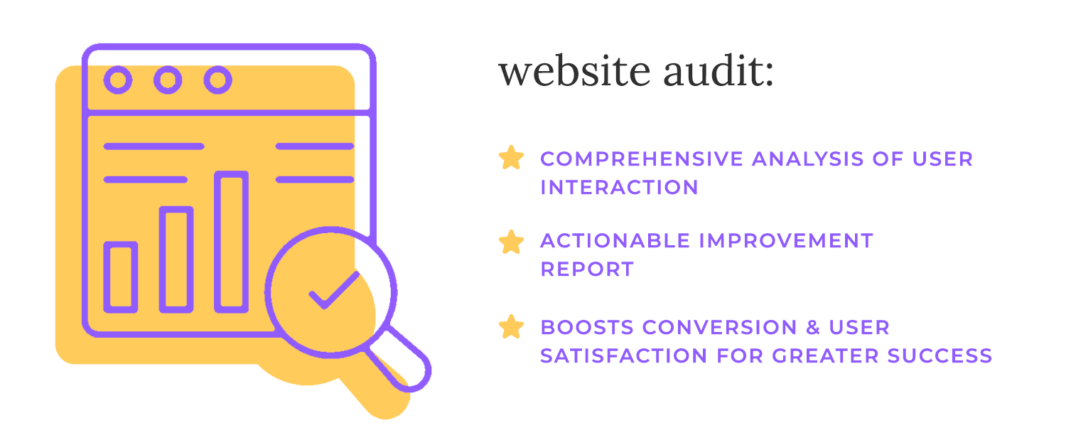
Look at how people currently interact with your site. What do they love? What keeps them coming back? Maybe it’s a smooth checkout process, helpful blog content, or a clean, intuitive layout. On the flip side, what’s frustrating them? Are they bouncing off certain pages? Struggling to find key information? Running into slow load times or cluttered navigation?
To get a clear picture, use tools like Google Analytics to track traffic and user flow, Hotjar to see heatmaps and session recordings, and PageSpeed Insights to check if sluggish load times are driving people away. But numbers only tell part of the story; run a usability test to watch real users navigate your site. Seeing where they hesitate, backtrack, or get stuck will reveal problems you might not have noticed otherwise.
A website audit isn’t about criticizing what’s there, it’s about understanding what’s worth keeping and what needs improvement. Once you have that insight, you can move forward with a redesign that actually makes a difference.
Before making any design changes, be clear on what you’re trying to achieve. A website redesign should have a purpose beyond aesthetics, whether that’s increasing sales, generating more leads, improving engagement, or boosting SEO performance.
Look at where your current site is falling short. Are visitors dropping off before making a purchase? Is traffic growing, but conversions staying flat? Are users struggling to navigate or find key information? Identifying these issues will help set focused, measurable goals.
Instead of broad objectives like “get more traffic,” aim for something concrete: “Increase organic traffic by 20% in six months” or “Reduce bounce rates on product pages by 15%.” Clear goals will guide design decisions and help you measure whether the redesign is actually working.

A successful website isn’t just about what looks good, it’s about what works for the people using it. Before making design decisions, take the time to understand who your audience is, what they need, and how they interact with your site.
Start by creating user personas; detailed profiles of your typical visitors. These aren’t just demographics like age or location, but real insights into their goals, pain points, and behaviors. Are they browsing for quick information, or do they need a more in-depth experience? Are they tech-savvy, or do they prefer a straightforward, no-frills layout?
Once you have a clear picture of your users, map their customer journey. How do they land on your site? What steps do they take before making a purchase, signing up, or reaching out? Identifying friction points, where users drop off or hesitate, helps shape a design that guides them smoothly to their goal.
It’s also worth checking out your competitors’ websites. Not to copy, but to see what they’re doing well (or poorly). Are they offering a better mobile experience? Do they have clearer calls to action? Spotting gaps in their design can help you create something that stands out.
The better you understand your audience, the more effective your redesign will be because a great website isn’t just one that looks good, but one that feels effortless to use.
Once you understand who your users are and how they navigate your site, the next step is making that journey as smooth as possible. A clear structure does more than improve usability, it guides visitors seamlessly to what they need.
Start by creating a sitemap, a visual outline of your website’s structure. This helps male sure everything has a logical place and that key pages aren’t buried under layers of unnecessary clicks. If your current site feels cluttered or hard to navigate, this is your chance to simplify.
Speaking of simplicity, navigation should be clear and intuitive. Visitors shouldn’t have to guess where to find information. Keep menus straightforward, limit the number of top-level links, and prioritize what matters most to your audience.
Lastly, organize content logically so users can scan and find what they need without friction. Group related topics together, use clear labels, and make sure every page serves a purpose. The easier it is to move through your site, the more likely visitors are to stay, explore, and take action.
With a well-planned structure in place, you’re setting up your redesign for success, making the experience effortless from the very first click.

With your website’s structure in place, the next focus is content. A well-organized site won’t be effective if the information on it is outdated, unclear, or irrelevant to your audience. Your content should work alongside your design to guide users, answer their questions, and help them take action.
Start by auditing your existing content. Identify what’s still valuable, what needs updating, and what no longer serves a purpose. Look at analytics to see which pages get traffic and engagement, and which ones users tend to ignore or bounce from. Anything that’s outdated or redundant should be improved or removed.
Once you know what stays and what goes, write new content that aligns with user intent. Visitors don’t just land on your site for the sake of it, they have a goal in mind. Whether it’s learning something, solving a problem, or making a purchase, your content should help them do that easily. Keep it clear, relevant, and to the point.
Finally, optimize for SEO so the right people can find your content. Use keywords naturally, structure pages with headings that make scanning easy, and ensure everything is readable on all devices. SEO isn’t just about search engines, it’s about making content more accessible and useful for real users.
With your content strategy in place, it’s time to bring structure and functionality to life. Instead of jumping straight into final designs, start with wireframing and prototyping; a process that helps refine the layout, navigation, and interactions before development begins.
Begin with low-fidelity wireframes, which are basic, sketch-like layouts that focus on structure rather than aesthetics. These help you figure out where elements should go, how users will navigate, and whether the flow makes sense, all without getting distracted by colors or visuals.

Once you have a solid foundation, gather feedback from your team or test with users. Even at this early stage, small usability tests can uncover friction points that might not be obvious to the design team. It’s much easier (and cheaper) to make changes now than after development starts.
As your ideas take shape, move to high-fidelity prototypes that include actual content, branding, and interactive elements. These prototypes let stakeholders and test users experience the site as it will function, making it easier to identify final refinements before handing it off for development.
A great website isn’t just visually appealing, it should be easy to use for everyone. Prioritizing user experience (UX) and accessibility ensures that your redesign isn’t just functional but also inclusive.
Start with readability. Text should be clear, well-structured, and easy to scan. Avoid tiny fonts, low-contrast colors, or long walls of text that overwhelm users. The goal is for visitors to find what they need without effort.
Next, keep buttons and navigation intuitive. Every action, whether clicking a button, filling out a form, or moving between pages, should feel effortless. Use clear labels, make buttons large enough to tap on mobile, and ensure navigation follows a logical flow.

Most importantly, make your site accessible for users with disabilities. This means using proper heading structures, adding alt text for images, ensuring good color contrast, and enabling keyboard navigation. Tools like WAVE, Axe, or Lighthouse can help check compliance with accessibility standards (WCAG).
Focusing on UX and accessibility isn’t just about meeting guidelines, it’s about creating a smoother experience for all users, making your website more usable, welcoming, and effective.
Once the design is finalized, it’s time to turn those wireframes and prototypes into a fully functional website. This phase isn’t just about building, it’s about making sure everything works smoothly before launch.
Start by working closely with developers to ensure the design is implemented as intended. Clear communication is key here; what looks great in a prototype might need technical adjustments in development. Stay involved, provide feedback, and collaborate to solve any challenges that arise.

As the site takes shape, test everything. Click every button, submit every form, and check that pages load quickly on both desktop and mobile. Navigation should be smooth, interactions should feel natural, and no element should be broken or unresponsive. Run performance checks to catch any slow-loading pages or potential roadblocks.
To fine-tune the experience, run A/B tests on key elements like call-to-action buttons, headlines, or layouts. Testing different versions helps you see what resonates best with users and ensures the final design isn’t just based on assumptions but actual user behavior.
Thorough testing now prevents frustrating issues later, making sure your redesigned website is not just live, but polished, functional, and ready to perform.
After all the planning, designing, and testing, it’s time to go live. But launching a website isn’t the finish line, it’s just the beginning of ongoing improvements.

Once the new site is up, monitor performance with analytics. Use tools like Google Analytics, Search Console, and heatmaps to track visitor behavior. Are people finding what they need? Are they staying engaged or dropping off quickly? These insights help you catch issues early and refine the experience.
At the same time, keep an eye on SEO rankings. A redesign can sometimes impact search performance, so track keyword rankings, organic traffic, and site indexing. If rankings dip, check for missing metadata, broken links, or structural issues that might be affecting visibility.
Most importantly, listen to your users. Gather feedback through surveys, support inquiries, and usability testing. What do they love? What’s confusing? Even the best-planned redesigns benefit from real-world input, so be ready to tweak and optimize based on what you learn.
A website is never truly “finished.” By continuously monitoring and refining, you ensure it stays effective, user-friendly, and aligned with your goals long after launch.
Free UX prototyping tool for your website redesign.
A well-planned redesign can transform your website, but if you’re not careful, it’s easy to introduce new problems along the way. After all the effort that goes into building a better site, the last thing you want is to make avoidable mistakes that hurt performance, usability, or SEO. Here are some common pitfalls to watch out for:

- Redesigning without clear goals: a new look isn’t enough. If you don’t define what success looks like, whether it’s higher conversions, better engagement, or improved navigation, you risk making changes that don’t actually help your business or users.
- Ignoring user feedback and real analytics data: your audience’s behavior tells you what’s working and what’s frustrating them. If you skip user research and data analysis, you might remove features they rely on or fail to fix existing issues.
- Overcomplicating the design: a sleek, modern site is great, but not at the cost of usability. Too many animations, cluttered layouts, or trendy elements that don’t serve a purpose can make the experience confusing instead of intuitive.
- Failing to preserve SEO rankings: a redesign can unintentionally hurt search rankings if you remove well-performing pages, change URLs without proper redirects, or neglect SEO fundamentals. If organic traffic is important, plan for SEO from the start.
- Skipping usability testing: what looks great in a mockup might not translate to a smooth experience in reality. Without usability testing, you risk launching a site that frustrates users instead of helping them.
- Launching without checking performance, speed, or mobile responsiveness: a new site might look perfect on a desktop, but what about mobile? Slow load times, broken layouts, or unresponsive elements can quickly drive visitors away. Always test before going live to make sure a responsive design.
Every change should remove friction, not add more obstacles. By avoiding these common mistakes, you’ll ensure your new website is not only visually appealing but also functional, user-friendly, and optimized for success.
We’ve picked 5 websites that have undergone redesign processes. We’ll take a look at how they were before the redesign and how they look now.
Before
Rev.com transitioned from an outdated design featuring a central carousel with retro graphics to a modern, clean layout emphasizing clear value propositions and intuitive navigation.

Current design
Today, Rev.com showcases a clean and minimalist interface. The homepage emphasizes their primary services with clear, concise descriptions and prominent call-to-action buttons. The navigation is straightforward, and the use of whitespace, complemented by subtle animations, guides users seamlessly through the site.

Before
Panos Pictures had a non-responsive design with limited navigation, making it challenging for users to explore their rich photographic content effectively.

Current design
The updated Panos Pictures website is fully responsive, featuring a dynamic, grid-based layout that adapts to various screen sizes. High-resolution imagery is prominently displayed, and interactive elements allow users to engage deeply with photo stories. The intuitive navigation, with clear categories and filters, enhances content discovery.

Before
Mailchimp underwent a significant rebranding, introducing a serif typeface, a reworked logo, and a vibrant yellow color scheme, accompanied by whimsical illustrations.

Current design
Building upon the 2018 rebranding, Mailchimp’s current design incorporates personalized user experiences. The homepage utilizes AI-driven content recommendations, interactive tutorials, and a modular design that adjusts based on user preferences. The aesthetic remains playful yet professional, with updated illustrations and animations enhancing engagement.

Before
UserTesting’s earlier design was cluttered, featuring a carousel and a somewhat jumbled layout that made it hard to grasp the core value at a glance.

Current design
UserTesting’s website now emphasizes a data-centric approach, showcasing real-time analytics dashboards, customer success stories, and interactive demos. The design is clean, with a focus on functionality, allowing users to quickly understand the platform’s benefits and navigate to relevant resources.

Before
The museum’s website had a fixed-width design with problematic carousels, limiting user engagement and accessibility.

Current design
The Art Institute of Chicago’s website offers an immersive virtual experience, allowing users to explore collections through interactive galleries and augmented reality features. Enhanced search functionality and personalized recommendations make art discovery intuitive. The design is visually rich, reflecting the museum’s diverse collection while ensuring accessibility and user-friendliness.

These redesigns demonstrate a clear shift towards user-centric design, with an emphasis on responsiveness, intuitive navigation, and personalized experiences. By aligning their digital presence with contemporary design principles and user expectations, these organizations have enhanced both functionality and engagement on their platforms.
Free UX prototyping tool for your website redesign.
A successful website redesign isn’t just about creativity, it’s also about making informed decisions based on real data and testing. Fortunately, there are plenty of tools that can help at every stage, from understanding how users interact with your current site to optimizing the final version for performance and conversions. Here are some of the most useful ones:
Before making changes, you need to know where your website stands. A UX audit helps you spot problem areas, whether it’s slow-loading pages, confusing navigation, or pages where users tend to drop off.
- Hotjar: visualizes user behavior through heatmaps, session recordings, and surveys.
- Google Analytics: provides deep insights into traffic, user flow, and engagement metrics.
- PageSpeed Insights: analyzes load times and suggests performance improvements.
These tools give you a clear picture of what’s working and what needs improvement, so you’re not redesigning blindly.
Once you’ve mapped out a better structure, the next step is prototyping; creating wireframes and interactive mockups to test how the new design will work before it’s fully built.
- Justinmind: great for high-fidelity prototypes with interactive elements.
- Adobe XD: a versatile tool for designing and testing UI/UX layouts.
- Figma: allows for real-time collaboration on design and prototyping.
Prototyping helps refine the user experience early on, so you can catch issues before they turn into expensive fixes.
Even after launch, there’s always room for improvement. A/B testing lets you compare different versions of a page or element like CTAs, headlines, or layouts, to see what resonates most with users.
- Google Optimize: a free tool for running A/B tests directly within Google Analytics.
- Optimizely: a powerful platform for split testing and personalization.
- VWO (visual website optimizer): helps run experiments and improve conversions.
By testing variations, you can make data-backed decisions instead of guessing what works.
A website redesign is an opportunity to improve how your site functions, how users interact with it, and how well it supports your goals. It’s not just a facelift, it’s a strategic update that enhances usability, performance, and engagement.
Every step of the process, from auditing the current site to prototyping, testing, and optimizing, plays a role in creating a better experience. Understanding your audience, defining clear goals, and using data to guide decisions ensures that changes aren’t just aesthetic but genuinely impactful.
A successful redesign doesn’t end at launch. Continuous monitoring, testing, and refinement help keep the site effective and aligned with user needs over time. By focusing on clarity, accessibility, and performance, you create a website that not only looks fresh but also works better for everyone who visits it.
Free UX prototyping tool for your website redesign.
Related Content
 A fun look at different data table designs, from basic lists to smart, interactive ones, based on how complex the data is and what users need.18 min Read
 Single page design v multi-page design – everything you need to help you choose the right design for your site’s content18 min Read
 Website backgrounds can be a powerful tool in creating an experience. But what kind of experience can you convey and how? We got the full run-through for you!14 min Read


